/
Detailed and Thumbnail View
Detailed and Thumbnail View
This wireframe is based on the v8 prototype. v9 prototype removes this distinction between Detailed and Thumbnail views
Intro
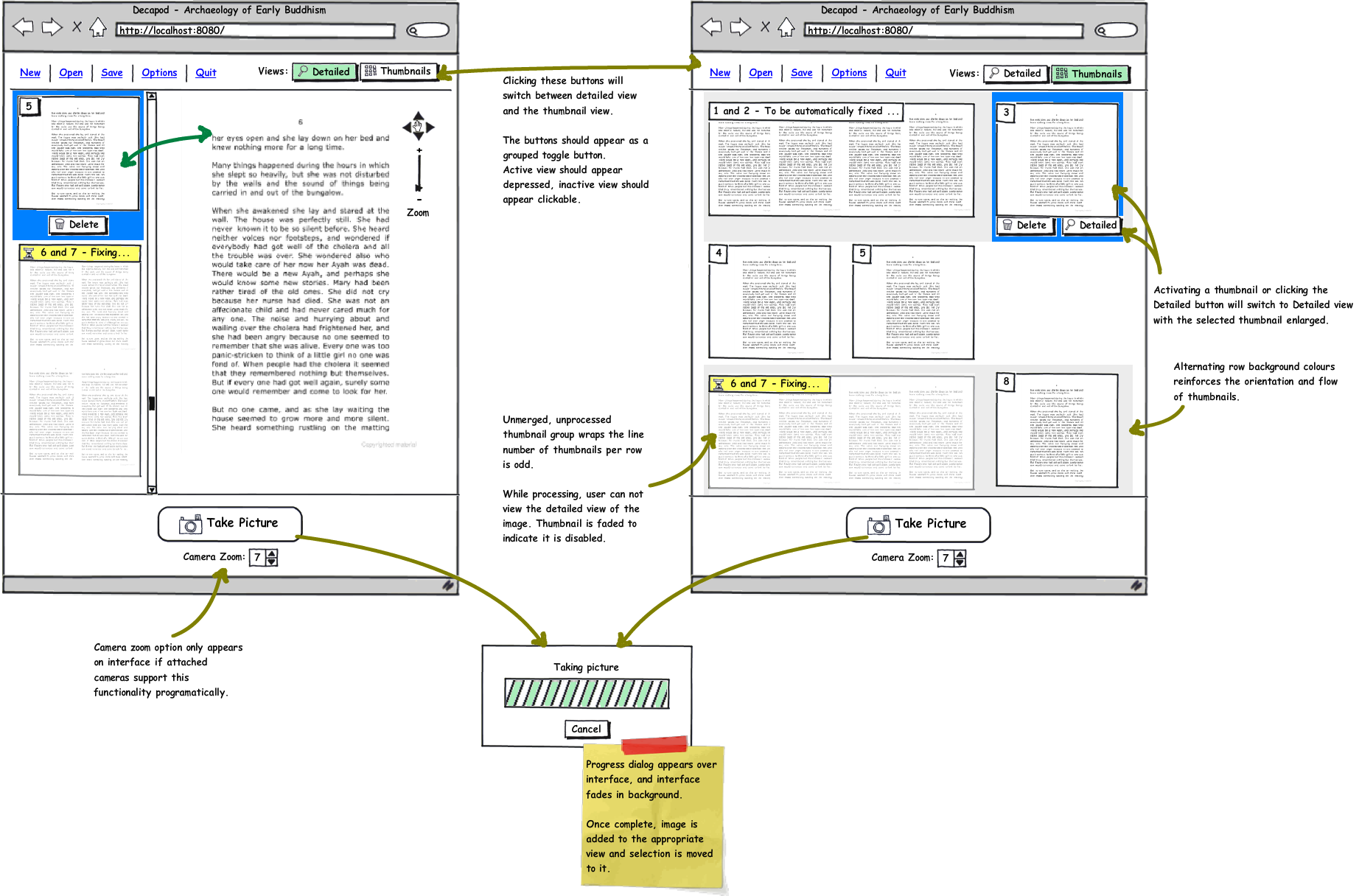
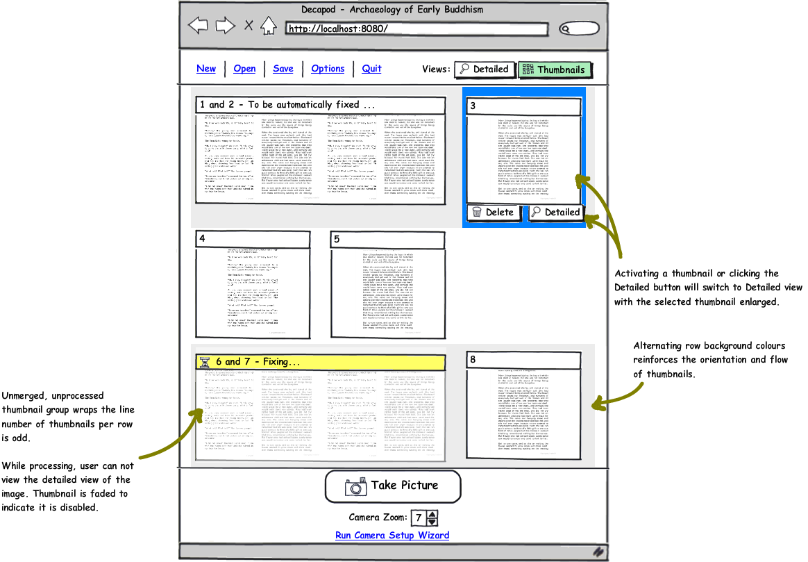
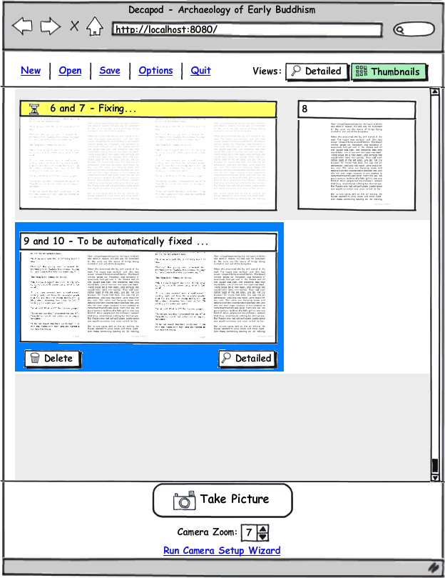
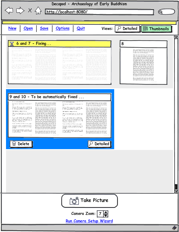
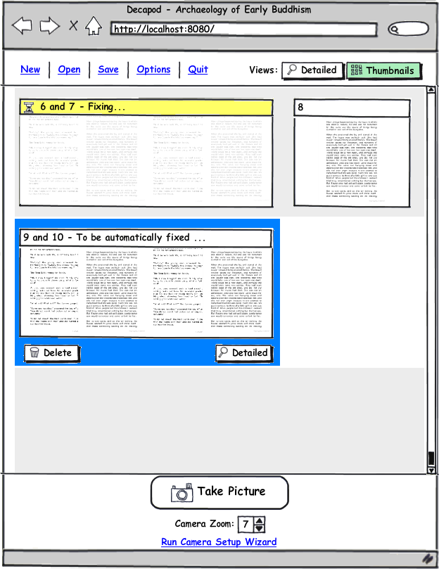
This is the Decapod interface where majority of the work occurs. There are two distinct views: Detailed view, and Thumbnail view. The user can freely switch between the two depending on their work.
Overview image:
Detailed View
Detailed View |
|||
|---|---|---|---|
|
|
|
|
|
|
|
|
|
|
|
|
|
|
|
|
|
|
|
|

|
|
|
|
|
|
|
|
|||
|
|
|||
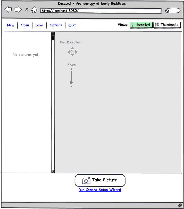
Image 1
- Initial view of a new Decapod project.
- The zoom/pan controls are disabled.
- Pressing "Take Picture" will run the Camera Setup Wizard and upon successful completion of the wizard will take a photo.
- Pressing "Run Camera Setup Wizard" will run just the wizard and not take a photo.
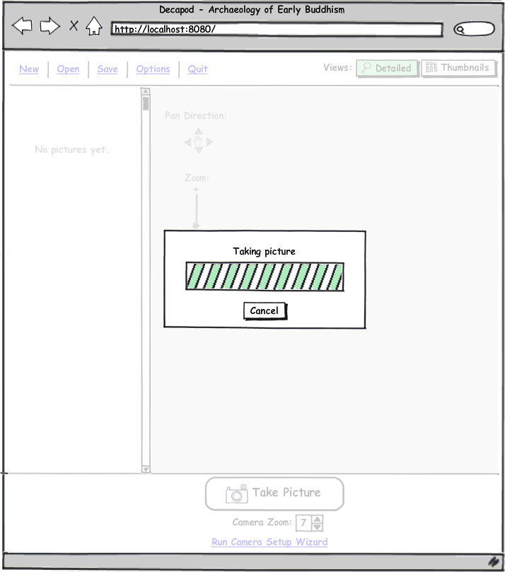
Image 2
- After the Wizard has been successfully run, the user can press "Take Picture", or a picture is taken automatically if the user pressed "Take Picture" initially.
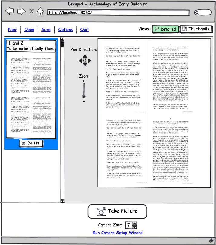
Image 3
- First pair of images have been captured.
Image 4
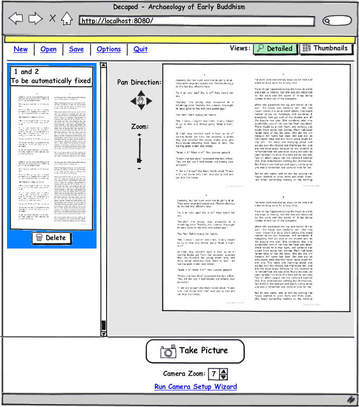
- By default the most recent capture is selected and appears enlarged in the right pane. There is a Zoom/Pan image component so they can discern quality of the image.
- On the screen there is also a thumbnail representing a stereo pair that has not been merged, dewarped, and split.
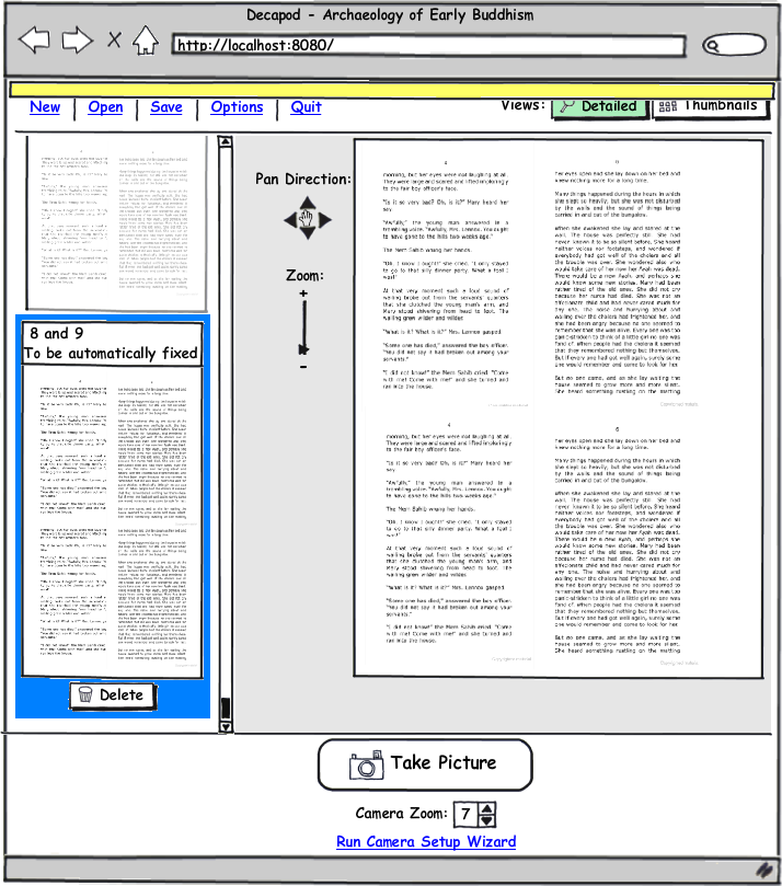
- A status box begins to slide into view.
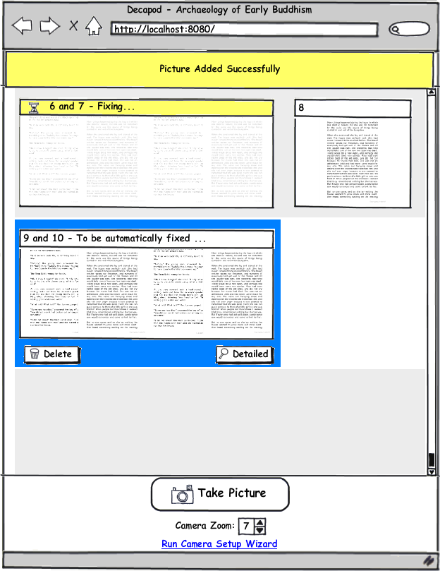
Image 5
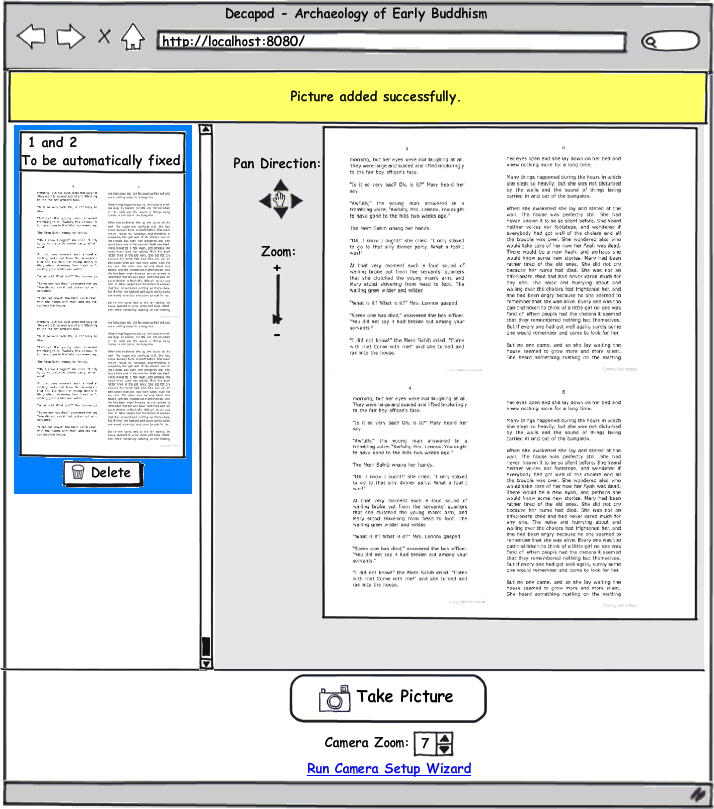
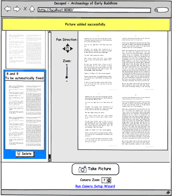
- The status box is now fully extended just beyond the top menu area and slightly into the main "work" area.
- A "Picture was successfully added" message appears in the box.
Image 6
- This is how the interface looks after a few more captures.
Image 7
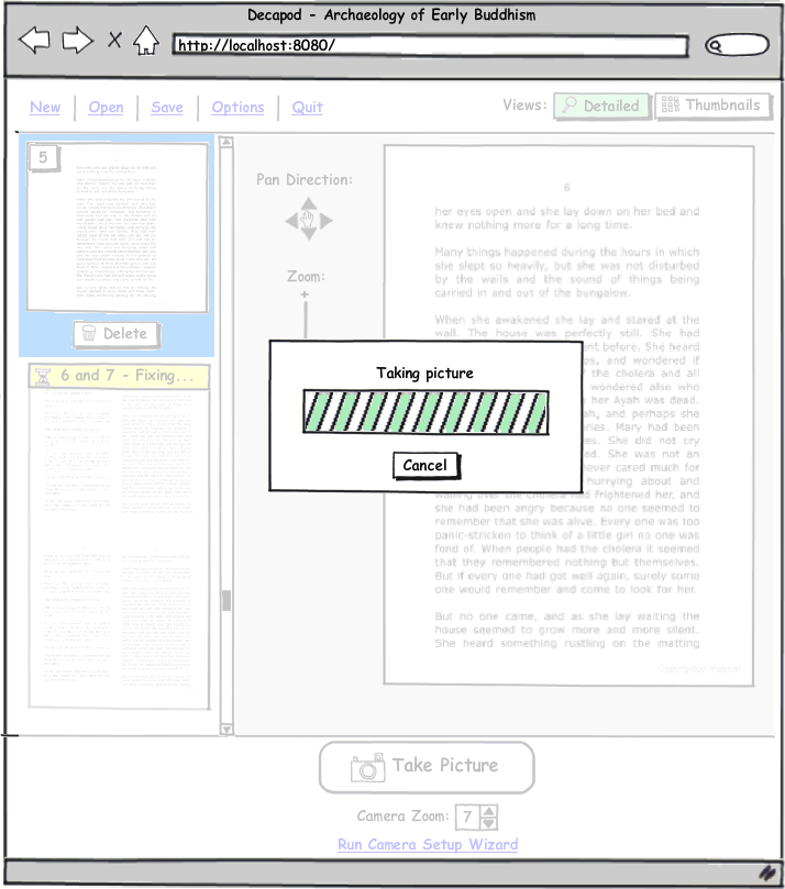
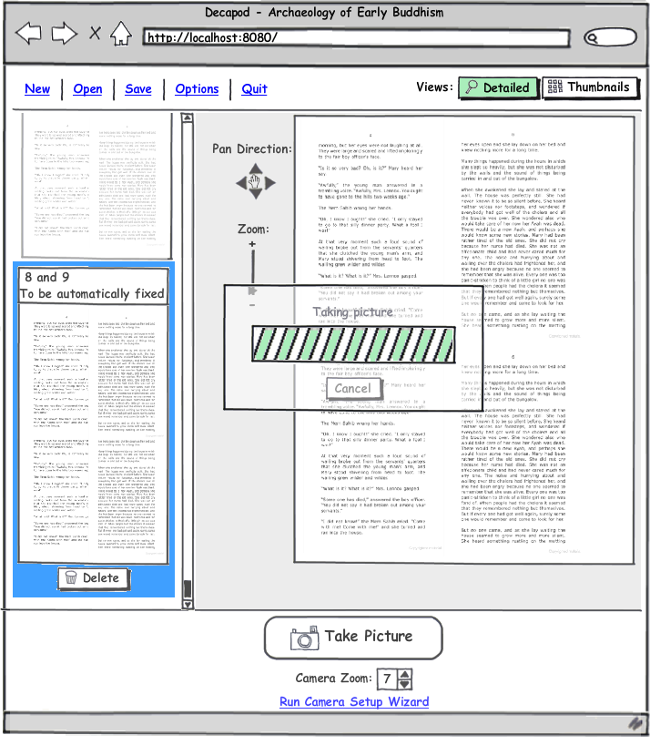
- The user has just activated the Take Picture operation by either clicking the button on the screen, pressing the Space bar, or by pressing the pedal / alternative input device.
- The UI in the background fades to indicate it's not clickable.
- A capture "busy" dialog box appears on screen.
- (!)Note: this kind of transition and progress dialog may not be necessary if the capture process is sufficiently quick. If this is the case, then the Take Picture button should disable and the mouse pointer should turn into a busy spinner.
Image 8
- The background quickly fades back into a normal state, and the progress dialog disappears.
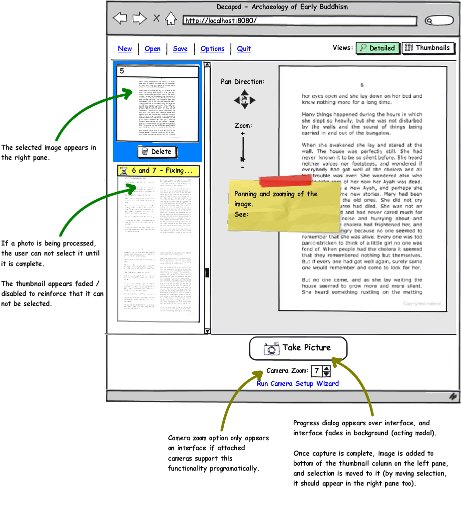
- The new stereo pair is added to the bottom of the thumbnail list.
- The thumbnail panel scrolls down to reveal the thumbnail to the user.
- Selection is moved to it and an enlarged version of the pair appears in the right pane.
Image 9
- Status message tray begins to slide into view.
Image 10
- Status message tray fully extended.
Image 11
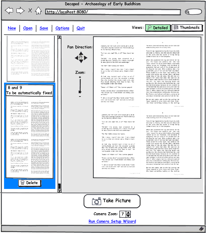
- Status message tray slides back up out of view.
Image 12
- The UI is back to a normal state with the new image pair in the list.
Image 13
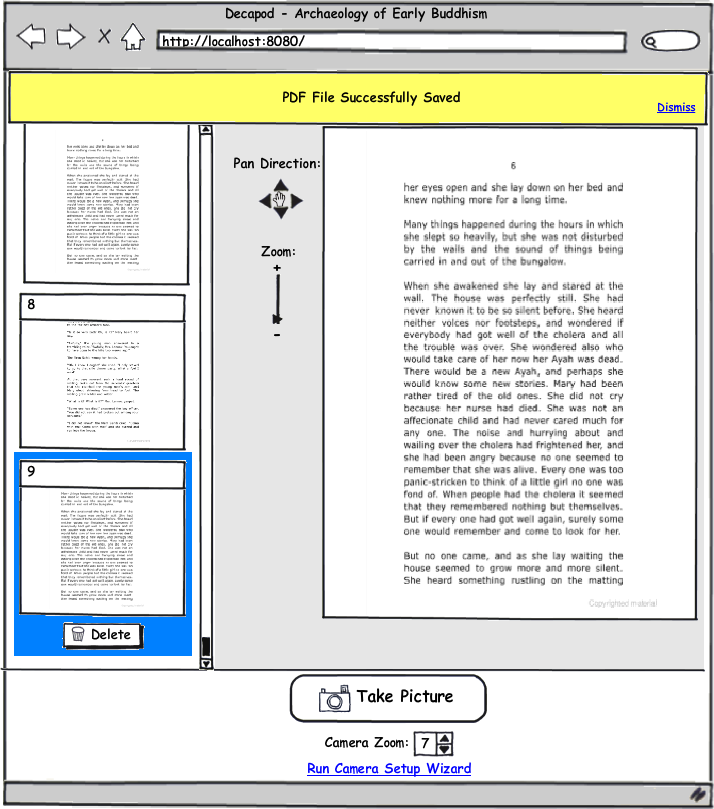
- This is what the user sees after exporting to PDF. The status tray does not automatically dismiss since PDF generation can take a while.
Thumbnail View
Thumbnail Grid |
|||
|---|---|---|---|
|

|

|
|
|
|
|
|
|
|
|
|
|
|
|
|
|
|
Other Notes
Status message interaction:
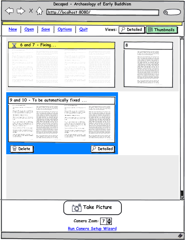
- Status messages slide into view from the top of the UI.
- The status message box should slide down past the menu options and just slightly into the work area. (See Wireframe)
- Status message box should be a different colour and not translucent.
- Status messages should appear and disappear promptly.
- In the case where two consecutive captures causes message boxes to "overlap", only 1 message box appears on screen. In the case where the 1st message box was receding, it should advance again without having to recede all the way.
- Careful testing should be done to determine if overlapping status messages are even possible.
The above wireframe and interaction should be optimized for speed and efficiency. As such the above design can change to make usable improvements to efficiency (i.e. fade transitions removed etc.).
, multiple selections available,
