uPortal Walkthroughs - Student Persona Ed (Kathy)
- Kathy Moore
- Paul Zablosky
- Allison Bloodworth
- Gary Thompson
(Accessibility and usability heuristic evaluations combined with cognitive walkthroughs)
Evaluation Completed by: Kathy Moore
URL: http://wiki.fluidproject.org/pages/createpage.action?spaceKey=fluid&fromPageId=328018
Date: September 12, 2007
Heuristic reviews and cognitive walkthroughs were performed on a Dell pc at 1152 resolution and millions of colors using Firefox on Win xp over a T1 connection.
See UX Walkthrough Heuristics for heuristics used in this evaluation.
Scope of Walkthrough
• See uPortal Evaluation Plan
User profile(s) and context of use:
Persona: Ed McClellan, Undergraduate
uPortal: Public/Guest page, Login, UBC WebMail, Info Finder, News, Classifieds
Profiles will generally only be used for the cognitive walk-through, not the heuristic evaluation. However, users may be set up with a certain role in the system (e.g. student, instructor) for the heuristic evaluation.
• See Sakai Personas
Scenarios
Scenarios will generally only be used for the cognitive walk-through, not the heuristic evaluation. However, it is fine to use these scenarios for the heuristic evaluation if it is helpful to evaluators in figuring out how to walk through the application. See uPortal Content Management Scenarios for a list of all possible scenarios. Evaluators will likely only cover some of the scenarios, in one of the roles, in their individual evaluations.
• General Overview (heuristic evaluation)
• Finding.....
• Scenario: Ed has just completed his first-time student registration process and is now going to the portal to check his institution email for the first time. Ed is also curious about what online services are offered and what the university portal is like. (portal, login, webmail)
• Scenario: Ed is finishing registering for spring semester classes for his freshman year and needs to clarify and verify the registration deadlines. (calendar and/or announcements)
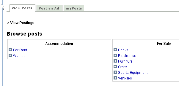
• Scenario: Ed would like to find out if anyone is selling a cheap couch that he can put in his dorm room. (classifieds)
Assumptions for this evaluation:
• [List any additional assumptions used in evaluation]
Positive Findings
All positive findings, from both the heuristic evaluation and the cognitive walk-through, should be placed in this section.
Usability Positives |
Tool |
Evaluator |
|---|---|---|
Tabs provide clear navigation |
Tabs |
Kathy Moore |
Window manipulation tools provide flexibility |
Minimize, maximize, delete, (detach) |
|
Page is clearly structured into (clearly-labeled?) logical sections |
Tabs, columns, channels |
|
|
|
|
|
|
|
|
|
|
|
|
|
|
|
|
|
|
|
Accessibility Positives |
Tool |
Evaluator |
Page is clearly structured into (clearly-labeled?) logical sections |
Tabs, columns, channels |
Kathy Moore |
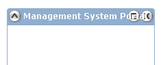
Channel controls (shade, focus, remove) show alt/title tags |
Shade, Focus, Remove |
|
|
|
|
|
|
|
|
|
|
|
|
|
|
|
|
|
|
|
|
|
|
Summary of Usability & Accessibility Issues Found
All usability & accessibility issues found, in both the heuristic evaluation and the cognitive walk-through, should be placed in this section.
Priority Legend:
High = Task cannot be completed
Medium = Task completed with significant effort and failed attempts
Low = Task completed with minor complications and/or annoyance
Usability Issues |
Principle |
Link to screen shots |
Priority |
Suggestions for solution |
Tool |
Component Identified? |
|---|---|---|---|---|---|---|
"Channel" language may be unfamiliar |
Match between system and the real world: The system should speak users' language, with words, phrases, and concepts familiar to the user. |
|
Low |
Is "window" a more familiar term? |
Channel |
|
"Channels" do not all follow same behavior; One allows use within uPortal, another appears in new tab. A few links replace uPortal in existing window. |
Consistency and standards |
|
Medium |
Use different visual metaphors and language to describe "channels" that do or do not keep the user in uPortal. |
Channel/ |
|
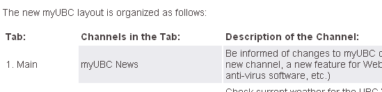
Some text overlaps on Win xp Firefox even at normal size, 1152px width; were designers on mac? |
Visibility |
|
Medium |
Allow text to stack |
|
|
|
|
|
|
|
|
|
|
|
|
|
|
|
|
|
|
|
|
|
|
|
|
|
|
|
|
|
|
|
|
|
|
|
|
|
|
|
|
|
|
|
|
|
|
|
|
|
|
|
|
|
|
|
|
|
|
|
|
|
|
|
|
|
|
|
|
|
|
|
|
|
|
|
|
|
|
|
|
|
|
|
|
|
|
|
|
|
|
|
|
|
|
|
|
|
|
|
|
|
|
|
|
|
|
|
|
|
|
|
|
|
|

Accessibility Issue |
Principle |
Link to screen shot |
Priority |
Suggestions for solution |
Tool |
Component identified? |
|---|---|---|---|---|---|---|
In win Firefox, Home screen scrolls horizontally at 800X600; rightmost of three columns is entirely hidden. |
screen should adjust to different resolutions |
|
Medium |
Lefthand column should collapse to share screen |
Channel? |
|
Is minimize (shade) omitted from the tab sequence? |
All functionality should be available via tabs |
|
|
|
|
|
Many links spawn new tabs/windows. Is this an accessibility issue? |
|
|
|
|
|
|
|
|
|
|
|
|
|
|
|
|
|
|
|
|
|
|
|
|
|
|
|
|
|
|
|
|
|
|
|
|
|
|
|
|
|
|
|
|
|
|
|
|
|
|
|
|
|
|
|
|
|
|
|
|
|
|
|
|
|
|
|
|
|
|
|
|
|
|
|
|
|
|
|
|
|
|
|
Cognitive Walkthrough Worksheet
This section should be used by evaluators to keep track of the steps & screens they followed through the application in the cognitive walk-through. Any positive results or issues found should be included in the two sections above.
Scenario 1: Ed has just completed his first-time student registration process and is now going to the portal to check his institution email for the first time. Ed is also curious about what online services are offered and what the university portal is like. (portal, login, webmail)
# |
Step |
Screen |
Comments/issues |
Principle |
Suggestions for solution |
|---|---|---|---|---|---|
1 |
Read some of initial screen |
|
|
|
|
2 |
Log in |
|
Works well, as expected |
|
|
3 |
Go through Webmail |
|
Seems to work well, consistent with other web-based email clients |
|
|
4 |
Try Info Finder tab; explore channels |
|
Useful services here: Bookmarks, Google, FAQ services |
|
|
5 |
Explore more channels in Info Finder |
|
Some links and submit buttons stay in uPortal, some launch a new tab;This is puzzling; at worst, the user can't figure out how to go "back." At best, he doesn't know, when launching a link, what to expect. |
Consistency and standards |
Maybe links that won't stay on uPortal should be segregated in another tab or column. |
6 |
Still exploring channels on Info Finder |
|
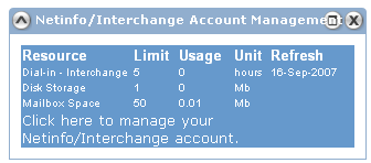
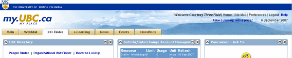
Long channel names overset control button in win Firefox; Title is hard to read, buttons very hard to click. |
Flexibility and efficiency of use. |
Stick to shorter titles where in control, Recode to let buttons appear in front of text so they remain more usable. |
7 |
Click caret-shaped button on "Vancouver - Ask Me" channel (far right) |
1 |
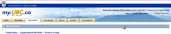
Channels resize oddly before page restores and channel display is minimized; first column expands to fill whole page. |
Flexibility and efficiency of use. |
This seems like a bug first and a design problem second. |
8 |
Exploring tabs: News |
See below |
|
|
|
9 |
Exploring tabs: News |
|
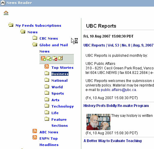
Next folder clicked will not open. |
Consistency and Standards |
|
10 |
Exploring tabs: News |
Click on headline in displayed listings on right (see above.) |
Clicked link comes up in new tab |
Consistency and standards |
Would prefer that all channels remained in uPortal |
11 |
Explore tabs, events |
|
OK |
|
|
12 |
Explore tabs, Classified |
|
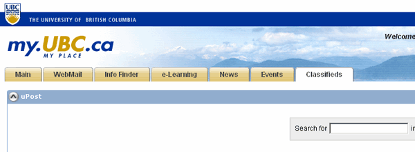
OK, easy to navigate |
|
|
|
|
|
|
|
|

Scenario 2:
Ed would like to find out if anyone is selling a cheap couch that he can put in his dorm room. (classifieds)
Question: Is the way this scenario plays out really about uPortal and its design, or is it about components and their design, perhaps about best practices in assembling content for uPortal?
That's my question about many of the scenarios . . .
It might be useful for Fluid to assemble "Best practices," a non-technical guide to creating and customizing a campus portal.
# |
Step |
Screen |
Comments/issues |
Principle |
Suggestions for solution |
|---|---|---|---|---|---|
1 |
See "Classified" tab |
|
|
|
|
2 |
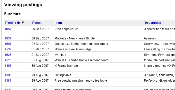
Click "Furniture" |
|
|
|
|
3 |
Find free couch! |
|
|
|
|
2b |
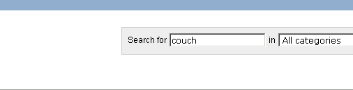
User search box |
|
|
|
|
3b |
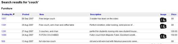
Find several couches! |
|
This works SO well!
|
|
|
|
|
|
|
|
|
|
|
|
|
|
|
|
|
|
|
|
|
|
|
|
|
|
|
Scenario 3:
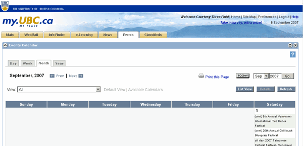
Ed is finishing registering for spring semester classes for his freshman year and needs to clarify and verify the registration deadlines. (calendar and/or announcements)
Question: Is the way this scenario plays out really about uPortal and its design, or is it about components and their design, perhaps about best practices in assembling content for uPortal?
That's my question about many of the scenarios . . .
It might be useful for Fluid to assemble "Best practices," a non-technical guide to creating and customizing a campus portal.
# |
Step |
Screen |
Comments/issues |
Principle |
Suggestions for solution |
|---|---|---|---|---|---|
1 |
Check events calendar |
|
|
|
|
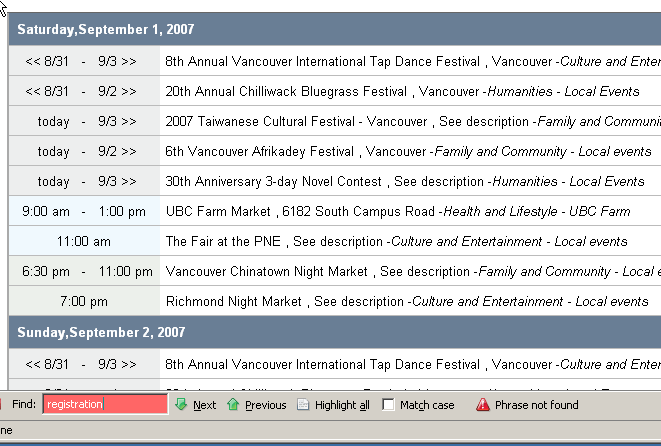
2 |
In calendar, try list view for easier scanning |
|
Neither refreshing nor rebooting seemed to do anything |
|
|
3 |
Log out and in, try again; |
|
|
|
|
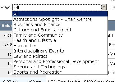
4 |
Check "View" box |
|
|
|
|
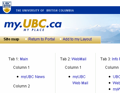
5 |
Check site map, do text search on "announcements," "academic." |
|
No academic category |
|
|
6 |
Return to portal |
|
The calendar has remained within the portal, so return is seamless |
|
|
7 |
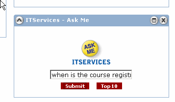
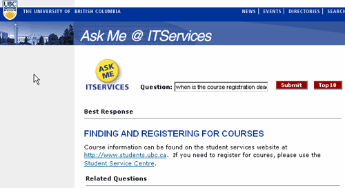
Start through tabs; See info Finder, IT Services--Ask Me. |
|
|
|
|
8 |
Bingo? |
|
Well, sort of "bingo." It still took lots of digging at http://www.students.ubc.ca/, but that isn't exactly myUBC's issue---is it? |
|
|
|
|
|
|
|
|

Scenario 4: Brief description
# |
Step |
Screen |
Comments/issues |
Principle |
Suggestions for solution |
|---|---|---|---|---|---|
|
|
|
|
|
|
|
|
|
|
|
|
|
|
|
|
|
|
|
|
|
|
|
|
|
|
|
|
|
|
|
|
|
|
|
|
|
|
|
|
|
|
|
|
|
|
|
|
|
|
|
|
|
|