uPortal Walkthrough - Student Email Scenario
Walkthrough Setup
Evaluation Completed by: Gary Thompson and Paul Zablosky
Date: August 22, 2007
Environment/URL: MyUBC uPortal 2.5.3
Scope of Walkthrough
uPortal: Public/Guest page, Login, UBC WebMail, Logout
User profile(s) and context of use
Persona: Ed McClellan, Undergraduate
Ed is a first time user of the portal. Ed has just completed a non-portal registration process and has been assigned a UBC CWL (student) account and an email account through the registration process and is familiar with those terms. Ed expects to access his UBC email via the portal, but does not know the scope and ability of the portal in relation to his being a student at the institution. Ed is accessing the portal via his laptop in a corner of the student union building through the wireless network.
User Expectations & Conventions
- Portals: MyYahoo, Facebook
- Email: Microsoft Outlook, Gmail
Scenarios
Ed has just completed his first-time student registration process and is now going to the portal to check his institution email for the first time. Ed is also curious about what online services UBC has to offer and what the university portal is like.
Walkthrough
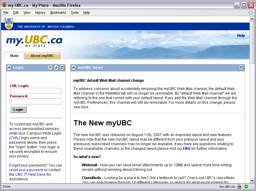
Public / Guest Page
Usability Issues |
Principle |
Priority |
Suggestions for solution |
Component Identified? |
|---|---|---|---|---|
|
Visibility of system status |
|
|
Page Header |
|
Consistency and standards |
|
|
|
|
Visibility of system status |
|
|
|
|
Visibility of system status |
|
|
Main Navigation/Tab Navigation |
|
Consistency and standards |
|
|
Portlet Container/Controls |
|
Consistency and standards |
|
|
Portlet Container/Controls, Help |
|
Consistency and standards |
|
|
Portlet Container/Controls |
|
Help and Documentation |
|
|
Help |
|
Help and Documentation |
|
|
Help |
|
Help and Documentation |
|
|
Help |
Login
Usability Issues |
Principle |
Priority |
Suggestions for solution |
Component Identified? |
|---|---|---|---|---|
|
Consistency and standards |
|
|
Login |
|
Consistency and standards |
|
|
Login |
|
Help and Documentation |
|
|
Login |
|
Help and Documentation |
|
More prominence to the login help links |
Login |
|
Error Prevention |
|
Probably should be highlighted as a warning |
Login |
|
Help users recognize, diagnose, and recover from errors |
|
|
Login |
|
Help users recognize, diagnose, and recover from errors |
|
Error message needs to be labeled as such, and made more identifiable (use a different color than is used on the input labels) |
Login |
Did not further assess the login help as it is specific to the institution and not to the portal
Home Page
Usability Issues |
Principle |
Priority |
Suggestions for solution |
Component Identified? |
|---|---|---|---|---|
|
Visibility of system status |
|
|
|
|
Recognition rather than recall |
|
Add icons, use more familiar labels |
Toolbar |
|
Aesthetic and minimalist design |
|
Create a promotion area in the content, ensure system tasks are clear and readable |
Promotion/Advertisement |
|
Aesthetic and minimalist design |
|
Create a reduced-size version of the Guest Page graphics and banner |
|
|
Recognition rather than recall, Visibility of system status |
|
Add a function that user can invoke to display login name, person name, and login time/date, duration etc. |
Mechanism for popping up status information, but not leaving it on the screen |
|
Recognition rather than recall |
|
|
|
|
Error prevention, Flexibility and efficiency of use |
|
|
|
|
Error prevention, Consistency and standards, Help users recognize, diagnose, and recover from errors |
|
|
|
|
Match between system and real world |
|
|
|
|
User control and freedom |
|
should be more prominent, use the term "home" instead of "portal" |
|
|
Match between system and real world |
|
|
|
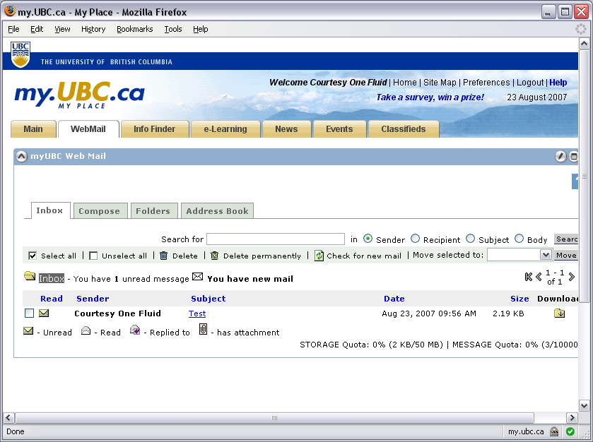
Webmail
Usability Issues |
Principle |
Priority |
Suggestions for solution |
Component Identified? |
|---|---|---|---|---|
|
Visibility of system staus |
|
|
|
|
Match between system and the real world, consistency and standards |
|
|
View Navigation |
|
Visibility of system status, Recognition rather than recall, Aesthetic and minimalist design |
|
Greater readability of the status message by increasing its prominence (remove other controls and actions that are only needed when there is email in the inbox, use more white space, indicate notice with an icon |
|
|
Match between system and the real world, consistency and standards |
|
|
Toolbar |
|
Match between system and the real world |
|
Use a more conventional icon (envelope, for instance) |
|
|
Error prevention |
|
Have only one delete action, move delete permanently action to the Deleted folder actions |
|
|
Visibility of system status |
|
|
Quotas |
|
Help and documentation |
|
|
Contextual Help |
|
Consistency and standards |
|
Follow platform standard for help location and treatment |
Contextual Help |
|
Consistency and standards, Recognition rather than recall |
|
Settings should appear in context and put with other Webmail views (inbox, compose, folders, etc.). Use a clearer view title. |
|
|
Error prevention |
|
Ensure this "code leak" gets plugged. |
|
|
Aesthetic and minimalist design |
|
More closely associate the form input labels to the inputs and provide more space and readability. |
|
|
Error prevention |
|
Present "add filter" inputs only when user starts an add filter workflow |
|
|
Consistency and standards |
|
Would be even better recognition and error prevention if the buttons were default standard submit button formatting |
|
|
Consistency and standards |
|
User should be returned to the view/mode they started from to complete the flow |
|
|
Aesthetic and minimalist design |
|
Use a standard grid, give more breathing room, use better icons, etc. |
|
|
Visibility of system status |
|
More clearly identify messages |
|
|
Visibility of system status, Match between system and the real world |
|
|
|
|
Aesthetic and minimalist design, Help and documentation |
|
If the icons are not immediately recognizable, they should be changed; if they are, the legend is not necessary. If determined to still be needed, the legend should be moved to the help. |
|
|
Visibility of system status, Consistency and standards |
|
|
|
|
Visibility of system status, Error prevention |
|
|
|
|
Flexibility and efficiency of use |
|
Add import/export and/or sync functionality |
|
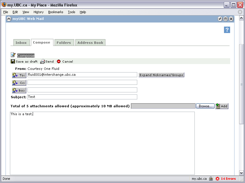
Summary: Ed decides that the portal webmail is usable - "I can send and receive email" - however, he doesn't like or enjoy the interface - "If I must use it I can, but I prefer and will use Gmail for everything else. It would really be cool to get my institution email through Gmail, because now I have two places to check mail."
Other Interaction
Ed might consider leafing through the other tabs to see what other content and functionality is available to him; in this review he does not
Logout
Usability Issues |
Principle |
Priority |
Suggestions for solution |
Component Identified? |
|---|---|---|---|---|
|
User control and freedom, Match between system and the real world |
|
Login/Logout notes and instructions should be associated with the login interaction. As help or warning for the user, this message should also be displayed as a notification that the user can remove when he/she is familiar with the instructions |
Login |
|
Visibility of system status, User control and freedom |
|
More association of logout to user identity, clearer "emergency exit". |
Login |
Navigate away from MyUBC to Facebook.
Accessibility
Guest / Login
B - surface up links in the login box
B - increase font size, too small for visually impaired
C - tested change in font size, if user has custom stylesheet or screen magnifier; does okay for a webapp, but has some issues - larger font moves tabs around, content shifts
C - tabs visually break at 4-5x magnification
C - + for focus starting in the login form
C - tabbing through page; loses focus in certain places in the tab order, tab order should be more logical and obvious
G - when lost in the tab order, hit Enter and minimized the news channel - with no visual indicator, it seemed to suddenly remove the content of the channel
C - had no content in the News channel in Firefox
C - links should be more contextual than "here" (e.g., click here)
C - tab order is confused by the channel icons/controls; removing unnecessary features would be good (e.g., shade/unshade)
Login
C - aside from the color, the error message is not otherwise labeled as such (should test with a screen reader and see if the error message is prominent enough)
C/B - red color of the error message matches the form input labels - should not use the same color for error messages as normal content
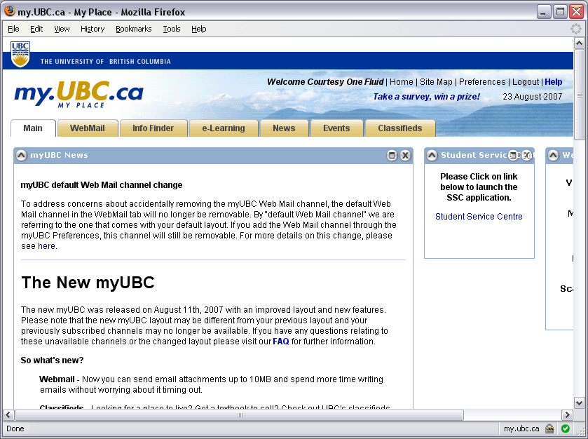
Home
B - preferences not clear, header information not clear (e.g., header links not formatter or underlined)
C - tab order starts with the header/system links rather than content
C - term "webmail" should be simplified to "mail" for greater recognition and clarity
C - lack of quick navigation features (no skipping, much tabbing to get to certain functions)
C - basic tab ordering is decent
C - would be good to have a function to tab-cycle through the portlets
Sidebar
P - suggested clicking on the Student Service Centre link; this launches a new window and loads content
C - similar branding and interface, enough similarity to make the connection, but clearly is a break from one interface to another
C - communication of when leaving the portal (or returning) is important
C - signaling the spawn of a new window
Webmail
C - two sets of tabs is troubling
C - chrome distracting (and unnecessary?) when there is only one channel
P - suggested looking at the focused view
B - not what the user expects
C - loss of main navigation disturbing
C - settings now more obvious
C - focused view could be more focused (less header, extraneous information) and tabbing gets quickly into the content
C - not apparent what all the tasks on the task bar do or are related to (initially recognized it to be a legend)


