uPortal Walkthrough - Student Find Instructor Contact Scenario
Walkthrough Setup
Evaluation Completed by: Gary Thompson
Date: September 19, 2007
Environment/URL: MyUW
Scope of Walkthrough
uPortal: Public/Guest page, Login, Home Page, Academics Page, UW Course Resources, Logout
User profile(s) and context of use
Persona: Ed McClellan, Undergraduate
Ed is in his freshman year. Ed has used the portal a few times and recognizes that there are a few valuable (though not highly usable) services within the portal. Ed is accessing the portal via his laptop from his dorm room.
User Expectations & Conventions
Scenarios
Ed is searching for his instructor's contact information to email a question regarding his assignment.
Walkthrough
Guest Page and Login
As I had to use the demo account, I could not properly evaluate the login or the guest page.
Home Page
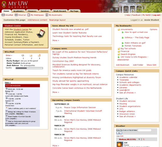
Usability Issues |
Principle |
Priority |
Suggestions for solution |
Component Identified? |
|---|---|---|---|---|
|
Visibility of system status, Aesthetic and minimalist design |
|
|
Header |
|
Aesthetic and minimalist design |
|
Re-design the header imagery to clearly display the header links |
Header, Host Links |
|
Match between system and the real world |
|
Do some user research and cardsorting activities to determine best labels |
Main Navigation/Tab Navigation |
|
Match between system and the real world |
|
Delineate the links from the tabs, give the group a label, and use familiar/standard icons |
Quicklinks/Featured Links |
|
Visibility of system status, User control and freedom |
|
Move the login status and info to a prominent place in the header |
Login Status/Logout |
|
Aesthetic and minimal design, Flexibility and efficiency of use |
|
Hide customization links in a menu under a single "Customize" label. This removes information when it is not wanted, yet provides a mechanism for quick access. |
Customization Menu |
|
Visibility of system status, Match between system and the real world, Recognition rather than recall |
|
Clearer, more readable titles. Content should better match user convention of popular applications. |
Portlet Container |
|
Consistency and standards |
|
Use conventional underlining of links |
|
|
|
Match between system and the real world, Recognition rather than recall, Flexibility and efficiency of use |
It seems that there may be a better label than Academics, but would require some research. Some kind of accelerator would be nice to see some kind of Academics status on the home page |
Main Navigation/Tab Navigation, Quicklinks/Featured Links, Content Cameo |
Academics Page
Usability Issues |
Principle |
Priority |
Suggestions for solution |
Component Identified? |
|---|---|---|---|---|
|
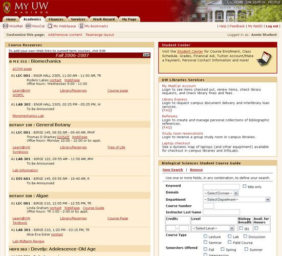
Consistency and standards |
|
Put the content in the same place or only have it in one place or the other |
component |
|
Match between system and the real world, Aesthetic and minimalist design |
|
Design better content cameos that gradually introduce the information and applications, use progressive disclosure |
Content Cameo |
|
Help and documentation, Recognition rather than recall |
|
Provide contextual help. Better yet, design a better presentation of the content such that help is less needed |
Contextual Help |
UW Course Resources
Usability Issues |
Principle |
Priority |
Suggestions for solution |
Component Identified? |
|---|---|---|---|---|
|
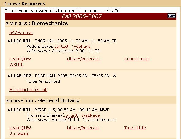
Recognition rather than recall |
|
A cleaner, more readable and digestible course list; use a consistent grid |
Course List |
|
Match between system and the real world |
|
Rename the link to Contact Instructor, and/or link the instructor's name. Consider following a standard contact card type of format. Provide a picture of the instructor to both increase speed of recognition and to associate the information as contact information (tied to a person) |
Contacts |
|
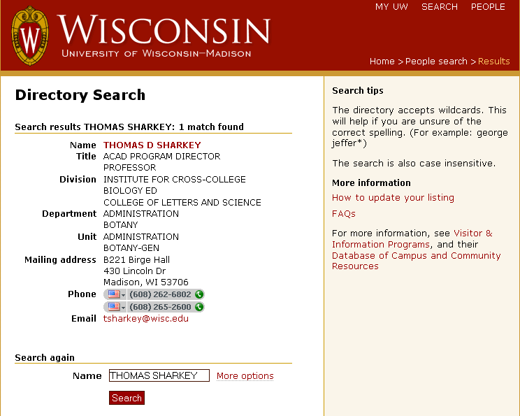
Recognition rather than recall |
|
Display the contact information in the portal, coupled with the office hours. Avoid popup windows |
Contacts, Balloon Content |
Ed calls his instructor on the phone and talks about the assignment.


