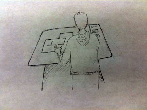
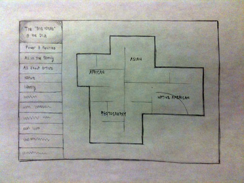
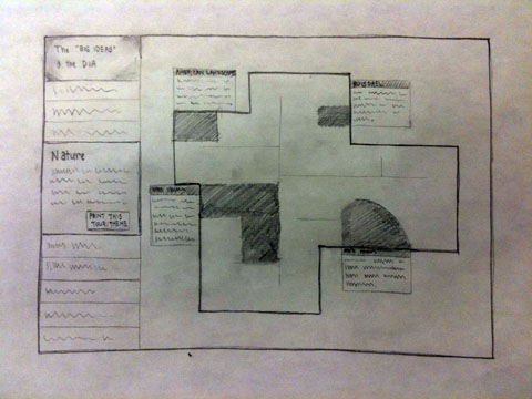
Kiosk idea sketches (Dec. 15, 2009)
Overview
This proposal, which for now will be called the DIA Exploration Map - seeks to accomplish the following:
- Give visitors an interactive visual (map) that will help orient them to all amenities provided by the museum, including galleries, exhibitions, washrooms, exits, cafeteria, washrooms, etc.
- Give the visitor a general to in-depth depiction of where themed galleries are based on their interests. These are listed as themed tours the visitor can take
- Give the visitor a map-print out (possibly large 17" x 22") so they can take this on their tour of the museum
This proposal is designed based on supporting data gathered through casual user-tests:
Feedback on 3 proposals for the in-museum kiosk were collected from 6 individuals. In light of this feedback, it was suggested heavily that the use-case for a kiosk that allowed visitors to "create an itineray" was not useful given that they would rather be shown quickly what was happening in the museum, and also to orient themselves in the museum space since many of these individuals rarely step into the same museum more than once a year. The notion of "creating an itinerary" seemed like "work" and the museum space is seen as an escape and a form of entertainment. In most cases, the tests subjects said they would rather start exploring the museum, rather than use a kiosk.
In an attempt to tie this critical feedback into the kiosk design, this proposal aims at providing both a means of orienting the visitor, as well as provide a way of exploring the gallery spaces via a large scale interactive map. Through its simplicity and printing capabilities, this proposal can achieve the goals the DIA set out - to focus more attention to the collections and gallery spaces, as well as augment the visitor's experience through orientation and interpretive information that's personal to the visitor.
Desired Outcomes:
- This interactive map will help lead people into the gallery space and identify high-level connections between the "Big Idea" galleries by providing visual didactics, which will be communicated effectively through interactive graphic design (i.e. multi-modal touch screen, playful animations, color coding, etc.) This in turn, will also help manage any uncertainty or discomfort the visitor may feel upon first entering the museum space.
- To help the visitor bridge the connections between gallery themes, the interactive map will provide high-level information about each gallery space and highlight prominent artifacts that speak to these themes.
- The map provides time estimates for each tour so visitors can maximize their time spent in each gallery (especially useful for visitors with a limited time-frame.)
- Visitors can choose themed tours based on their interests, allowing them to personalize their museum experience.
- Visitors can print out their map, which visitors can choose to keep as a souvenir of their experience at the DIA.
Scenarios
SCENARIO 1: The Out-of-towners visit the DIA
Visitors: Jessica and RyanAges: Jessica (26 yrs), Ryan (30 yrs)Purpose: Looking for something to do together in city
Jessica and Ryan are from out-of-town, visiting their family in Detroit for a week. Originally from Chicago, they are looking for some alone time since they've spent the last 4 days surrounded by relatives. They decide to spend the afternoon at the Detroit Institute of Arts, a local favorite for many residents in the area.
Jessica and Ryan arrive in the front entrance and take note of all the surrounding provisions; particularly where the info booth is and something called the Family Fitting Room. Jessica notices a group of patrons surrounding a tablet in the center of the mezzanine. She decides to walk over and to see what this tablet is all about. She observes a small child around the age of 11 taking control of the touch-screen, which Jessica clearly sees is a large interactive map. Intrigued, Jessica waits her turn to use the tablet. as she thought this was an interesting way to see where everything was in the museum. Ryan soon joins her and they manage to get a turn to use the map. Jessica was amazed to see just how massive the museum actually is - both she and Ryan hadn't realized just how many different galleries there were spread out over 3 floors! Feeling a little overwhelmed, Jessica wonders where they would start their exploration first. She looks over at the left side panel of the interactive map and sees a list of themed tours. Touching one of the icons, Jessica sees several galleries pop-out all over the map in distinct colors. She also sees the title of the map has changed to say "Your viewing tour: Power and Politics." With Ryan right beside her, he's asks to see what would happen if she touched one of the galleries. The galleries seemed touchable since they all had a pulsing glow emitting around them. Upon touching one of the galleries, a pop-up prompt came from the side of the gallery giving a brief synopsis, along with highlighted artifacts they should see. Enjoying the exploration and simple UI of the map, Jessica and Ryan spend a couple of minutes looking at a few more galleries in this way but realize there are other people gathering around them hoping to use the map as well. Feeling like they should give someone else a turn, Jessica notices a button at the bottom edge of the tour they selected that says "Print this map." She touches the button and a prompt appears in the middle of the screen with a preview of a 17" x 22" map of their chosen tour. Below the map is the following dialogue: "Are you sure you wish to print this map? ($1.00 per copy)"
Jessica and Ryan look at each other and consider whether the map is worth paying for. They could see the map is fairly large... not unlike a real city map. This seemed really cool and nostalgic and perhaps cost-worthy of a dollar. They also considered it being a helpful tool to take with them on their exploration of the museum space. Furthermore, it felt personalized since the map displayed their choice of the tour "Power and Politics," and would be something they would keep as a souvenir of their experience at the DIA. They decide to pay the dollar and immediately the tablet begins to print their map. With map in hand, Jessica and Ryan begin their exploration of the museum.
SCENARIO 2: Planning the school field trip
Visitor: Mrs. Flanders, Gr. 6 teacherAge: 30 yrsPurpose: Pre-visit planning for an Grade 6 field trip
Mrs. Flanders is a local elementary school teacher looking to plan her annual field trip to the DIA for her grade 6 students. Seeing this is as one of the highlights of the year, she hopes to plan something fun for the students but that also fits with her class objectives. Mrs. Flanders decides to do some pre-visit planning at the DIA in person and browse the museum to see what the kids might find useful for their class work.
Mrs. Flanders walks into the front entrance, pays the entrance fee and browses around the mezzanine. The museum is fairly quiet with a few patrons wandering around. She sees in the very center of the room a large tablet with a few people touching the top of the surface. Mrs. Flanders makes her way over to the tablet and sees it's an interactive map of the museum space. Intrigued, Mrs. Flanders waits her turn to have a browse. Upon first inspection, the UI seems fairly intuitive to her; there was only a left side panel which appeared to list different themed tours. She likes the map's simplicity, as it was fairly large and it showed all the gallery spaces on every floor. Once she understood where she was in relation to all the galleries, she decides to dive in and start browsing the themed tour options. She touches the themed tour called "Exploring Ancient Egypt" and several different gallery icons pop up all over the map. Mrs. Flanders is encouraged by this, as this tour fits her classes current subject matter. What's more is that she now has a detailed overview of where to lead her class. Mrs. Flanders decides to print the map in its default state (a general outline of where all the galleries are by color) as well as another map of the themed tour "Exploring Ancient Egypt". (She agrees to pay the printing cost of $2, which in her mind seemed entirely reasonable.) She takes her printed maps and browses a few of the galleries to see how useful the maps may be to her students, marking (with a pen) some useful artifacts to see in each gallery. After exploring the museum space , Mrs. Flanders manages to speak with one of the museum docents (Jeff) and asks for his advice on what's the easiest and shortest path for her students to take on the Egyptian tour. Jeff, who's worked at the museum for 5+ years, is well acquainted with the gallery collections and draws several paths for Mrs. Flanders to lead her students through. He also indicates where specific artifacts are in the gallery space that are most pertinent to the students research project. With Jeff's advice and plenty of information given by the maps, Mrs. Flanders leaves the museum to plan the finer details of the field trip at home.


