Kiosk brochure design
Brochure Design
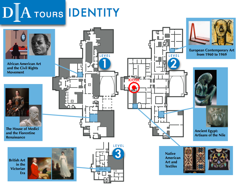
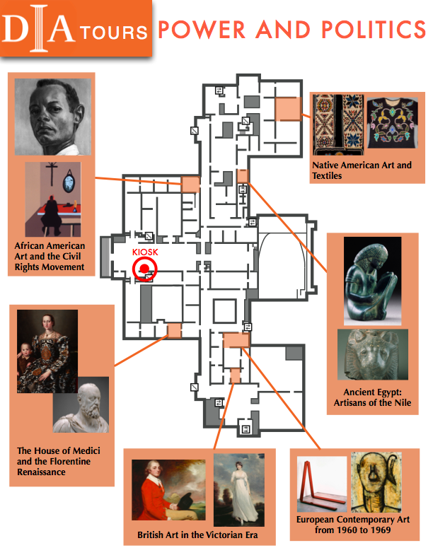
Several brochures designs were presented to the DIA on February 11th and February 18th, with the goal of establishing the information, content and basic layout of the brochures. This page includes an example of this iteration's brochures, as well as some notes, and considerations for the future.
Notes
- The maps should be oriented as shown above with Kirby street at the top, pointing north.
- If the entire tour only takes place on one floor, we should only show that floor.
Comments from the DIA to keep in mind: (We will work closely with DIA staff when we begin to finalize the design, at which time several of these issues could be moot, or could be reconsidered)
- Portrait page setup seem to make sense for the vertical orientation of the maps, but this will be up to the designers discretion.
- We do not need a one-to-one color coding of theme, so we do not need to worry about each theme having its own unique color. Selecting a half dozen or so colors that the themes can cycle through would suffice.
- Maps seems to flow into each other and could benefit from a clearer separation between floors.
- The translucent colored boxes which cover the galleries on the map do a better job than just a dot on the map of conveying that we are pointing to a gallery room, and not an artifact.
- Map could benefit from being less "schematic" and more "iconic" i.e. showing less detail.
- DIA staff will be available in a few weeks time guide us on the style and design of DIAs material.