/
(Floe) UI Options Design Walkthrough, C.1
(Floe) UI Options Design Walkthrough, C.1
- Former user (Deleted)
- Justin Obara
Owned by Former user (Deleted)
Panel
Navigating through Widget Boxes
- Arrow buttons
- clicking the right arrow button smoothly scrolls the boxes until last overlapped box is first (or to in the closest spot to the left if remaining boxes would not fill full width)
- Scrolling / Swiping
- scrolling/swiping moves boxes depending on distance scrolled/swiped, on release boxes smoothly snap in order for maximum amount to be fully visible and centred to the panel
- Tab Order
- once the UIO panel is opened, focus is moved to preference boxes (from first to last) followed by Reset and Display Preferences button
- focusing on preferences at the edge of the screen smoothly moves boxes over by one, next/previous arrows are not in tab order
Activating Preferences
- Mouse
- all UIO panel interactables switch to pointer cursor on hover
- slider uses both a pointer cursor on hover over the knob and the bar
- clicking on the icons at the beginning and end of a slider smoothly moves knob by 10%
- all UIO panel interactables switch to pointer cursor on hover
- Keyboard
- sliders and radio buttons are adjusted with arrow keys, check boxes and on/off switches are activated with space or enter
Widget Boxes Responsiveness
- adjusted margins to fit the maximum amount of boxes centred to the panel with 10-30% of next/previous boxes revealed on the sides
- minimum of 10px on right margins
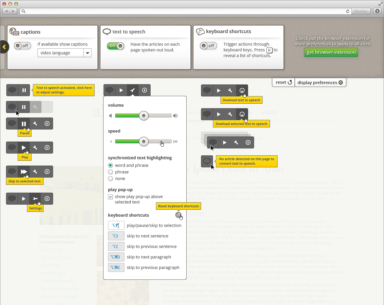
Text to Speech
Feature Priority:
- Play/Pause
- Play from text selection
- Keyboard navigation
- Synchronized text highlighting
- Settings
- volume adjuster
- speed adjuster
- play pop-up
- editable keyboard shortcuts
- synchronized highlighting options
- Auto-scroll interaction
- Download
- full audio
- audio from selection
- Movable widget
Widget
NOTE: New design ideas form Aug 28, 2018 design crit
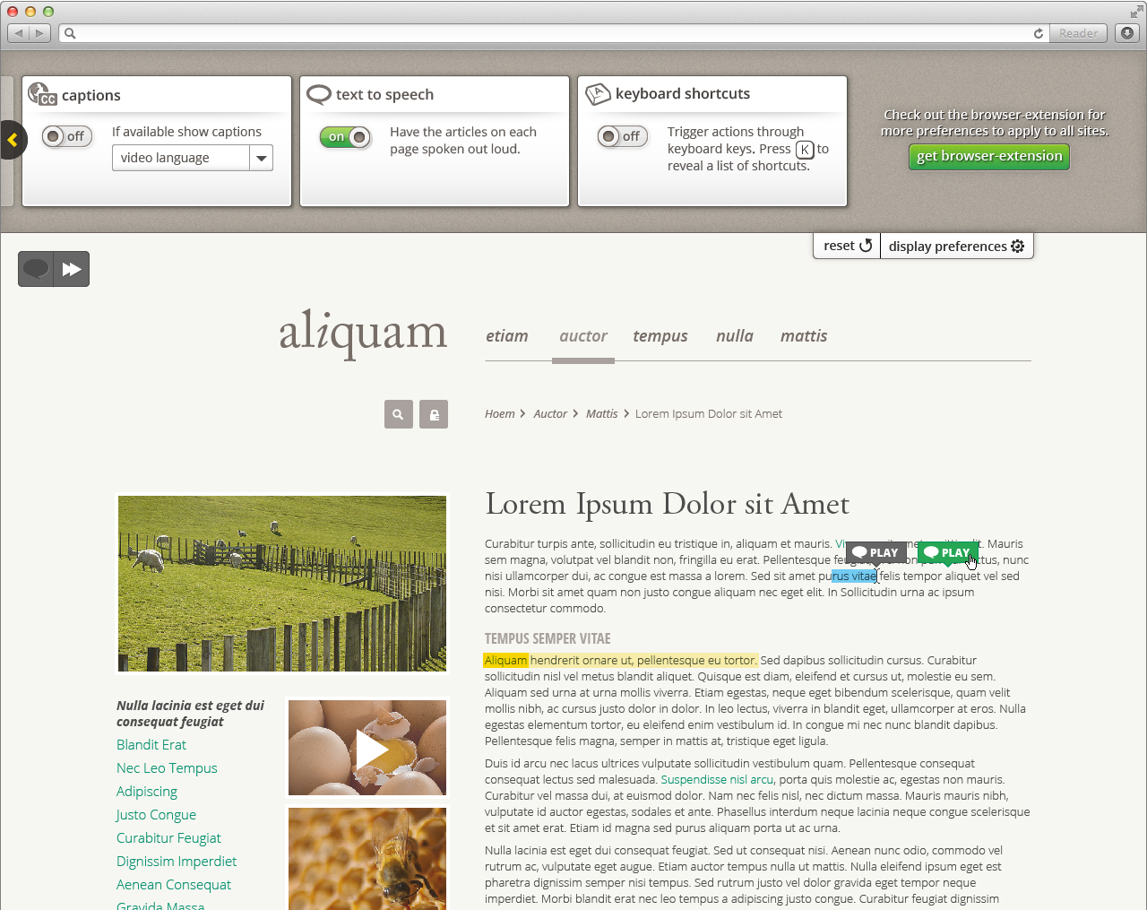
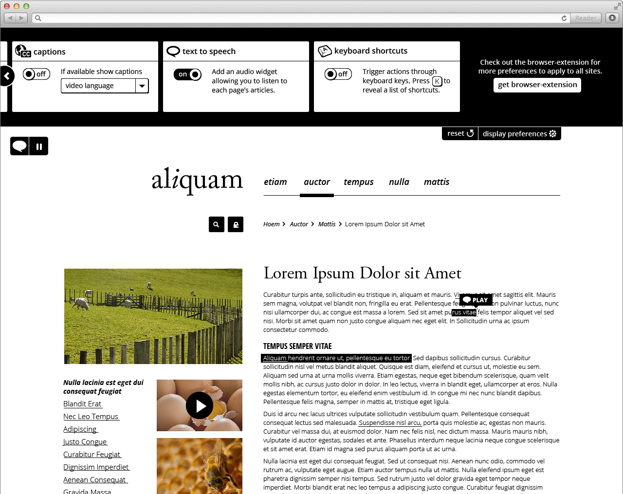
- Text to Speech preference activation:
- Focus jumps to the Text to Speech widget (widget is in tab order after the display preferences button)
- Message displayed and read 'Text to speech activated, use this button to adjust settings'
- If an article is not detected messages changes to 'Text to speech activated, article is not detected on current page' play, settings, and download buttons are unavailable
- Play is activated
- Hover: panel expands to reveal settings and download buttons
- Position: By default fixed on the top left corner (implementer can modify this to better fit the website layout)
- Widget can be moved around by clicking and dragging anywhere on the widget, or by using the arrow keys while in focus on any of the widget buttons
- If turned off and on widget goes back to default position
- If TOC is activated Text to Speech button goes on top and TOC below
- Widget can be moved around by clicking and dragging anywhere on the widget, or by using the arrow keys while in focus on any of the widget buttons
Play/Pause
- Hover: icons enlarge, tooltips 'Play/Pause/Skip to selected text'
- On initial activation Text to Speech starts reading current page
- On new page Text to Speech remains stopped until play is activated
- Playing from a specific point in the article:
- Text is selected and play/pause button changes to skip-to button, clicking it starts playing text from the beginning of the selection and continues passed it
- If the play pop-up is activated skip-to can be activated from the pop-up directly above the selection cursor
- After play is triggered from a selection, text is deselected
- Text is selected and play/pause button changes to skip-to button, clicking it starts playing text from the beginning of the selection and continues passed it
- When paused synchronized text highlighting remains on last section, pressing play continues from the selection (repeating the selection)
Settings
- Hover: button rotates, tooltip 'Settings'
- Volume slider and speed slider with audio feedback:
- If text to speech is playing volume/speed changes as slider is adjusted
- If text to speech is paused audio announces 'volume increased/decreased' / 'speed increased/decreased' on release as a preview
- Synchronized text highlighting by radio-buttons: word & phrase, phrase-only, or none
- In high contrast text is inverted (underlined & inverted with word & phrase highlight)
- Play pop-up check-box, appears above text cursor selection when activated
- Keyboard shortcuts
- Can be modified, reset keyboard shortcuts buttons appears after modifications have been made
- Hover: button darkens, tooltip 'Reset keyboard shortcuts'
- Turning Text to Speech off/on keeps modified shortcuts
- Resting UIO resets shortcuts to default
- Can be modified, reset keyboard shortcuts buttons appears after modifications have been made
Page auto scroll
- Page auto-scrolls until user scrolls
- Begin auto-scroll again after a period of inactivity (needs to be defined)
Download
- Hover: icon change, tooltip 'Download text to speech'
- Downloads text to speech as audio file
- If text is selected only selection is downloaded, tooltips changes to 'Download selected text to speech'
Simplify
- In Both: if not modified line spacing and text size increases to 110%
- adjusting line spacing and text size overrides this
Option 1: Responsive layout slider
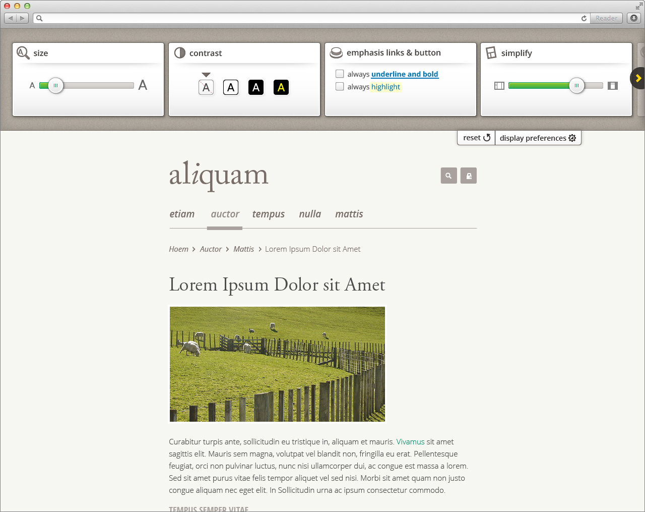
- move slider to decrease page width and activate responsive layouts where available
- layout becomes linearized and prioritizes, negative space increases
Option 2: Article-only with table of contents
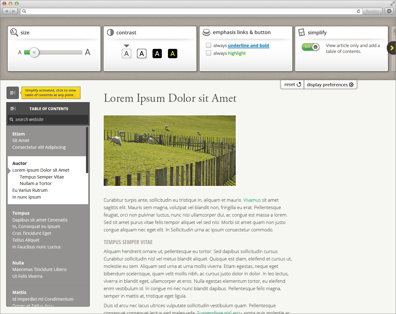
- view only page article
- navigate through the website using the TOC and search:
- hierarchical links to all pages of the website
- anchors to the headers of only the current page
, multiple selections available,
Related content
(Floe) User Interface Options (aka. Learner Options)
(Floe) User Interface Options (aka. Learner Options)
More like this
UIO+ vertical design
UIO+ vertical design
More like this
(Floe) User Interface (Learner) Options Mobile and Responsive Design
(Floe) User Interface (Learner) Options Mobile and Responsive Design
More like this
UIO 2.0
UIO 2.0
More like this
Design Options for Orator (text-to-speech) widget
Design Options for Orator (text-to-speech) widget
More like this
Sept 20, 2016 Design Crit Notes - UI / Learner Options
Sept 20, 2016 Design Crit Notes - UI / Learner Options
More like this