(Floe) UI Options Design High Fidelity, C.1
- Former user (Deleted)
- James Yoon
- Nicole Bryczkowski
For information about specific preference behaviour, visit Design Walkthrough
See Also:
(Floe) UI Options user testing results (November 2012)
(Floe) UI Options user testing report (November 2012)
(Floe) UI Options user testing protocol (September 2012)
On-page
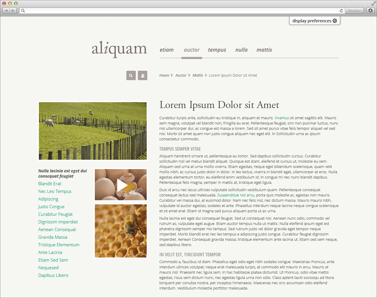
Closed panel
Open panel
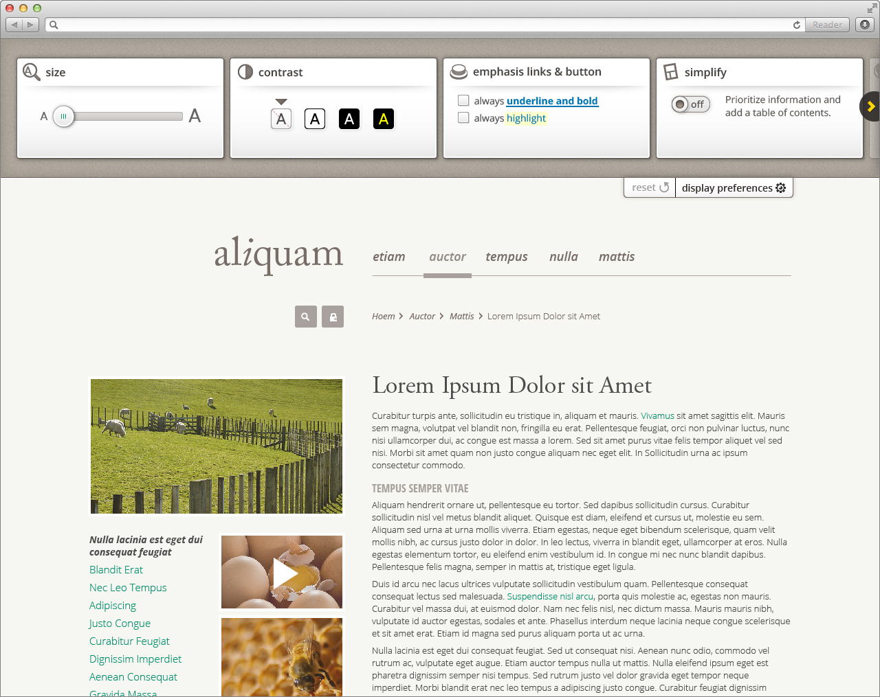
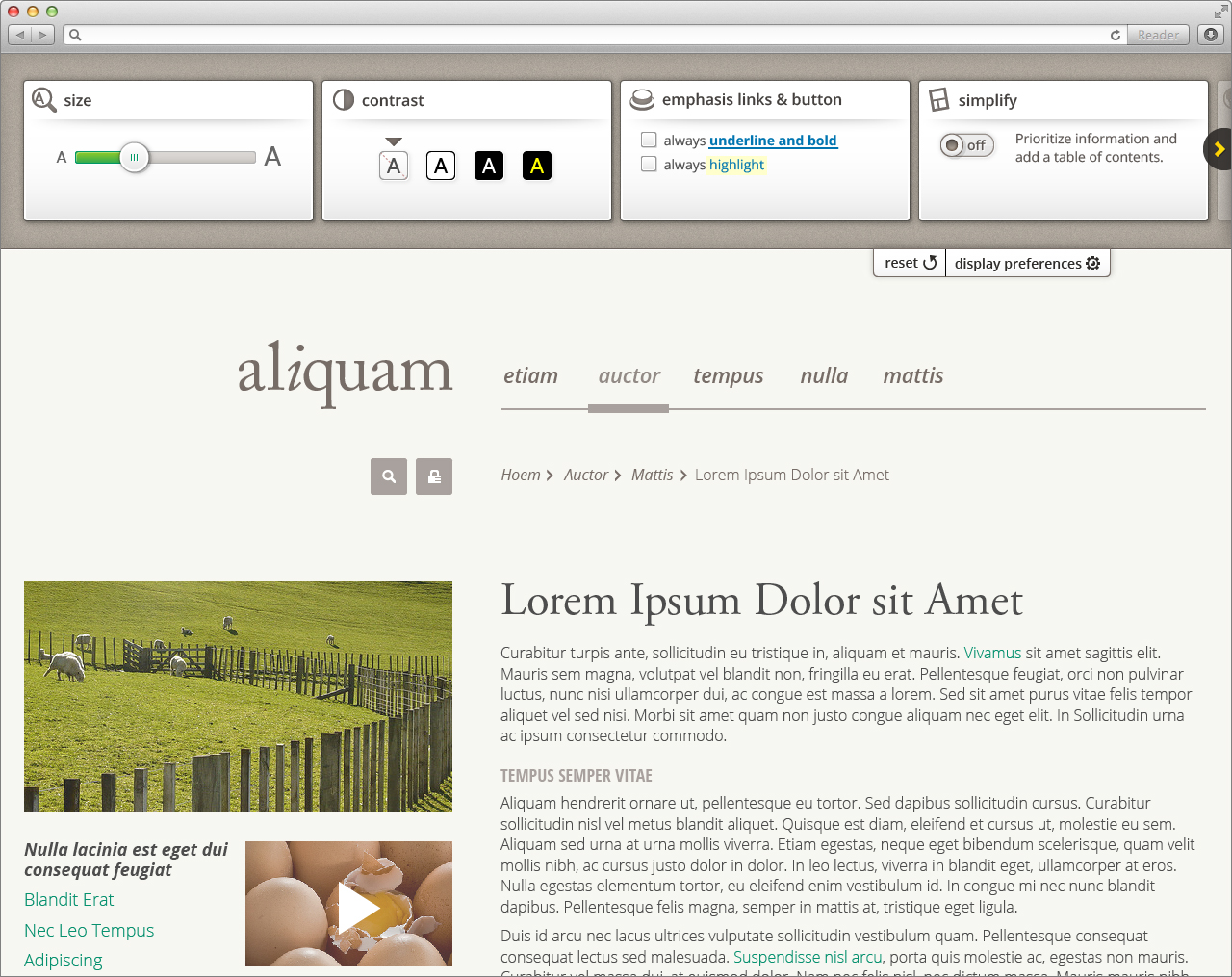
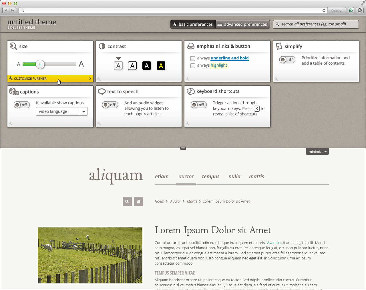
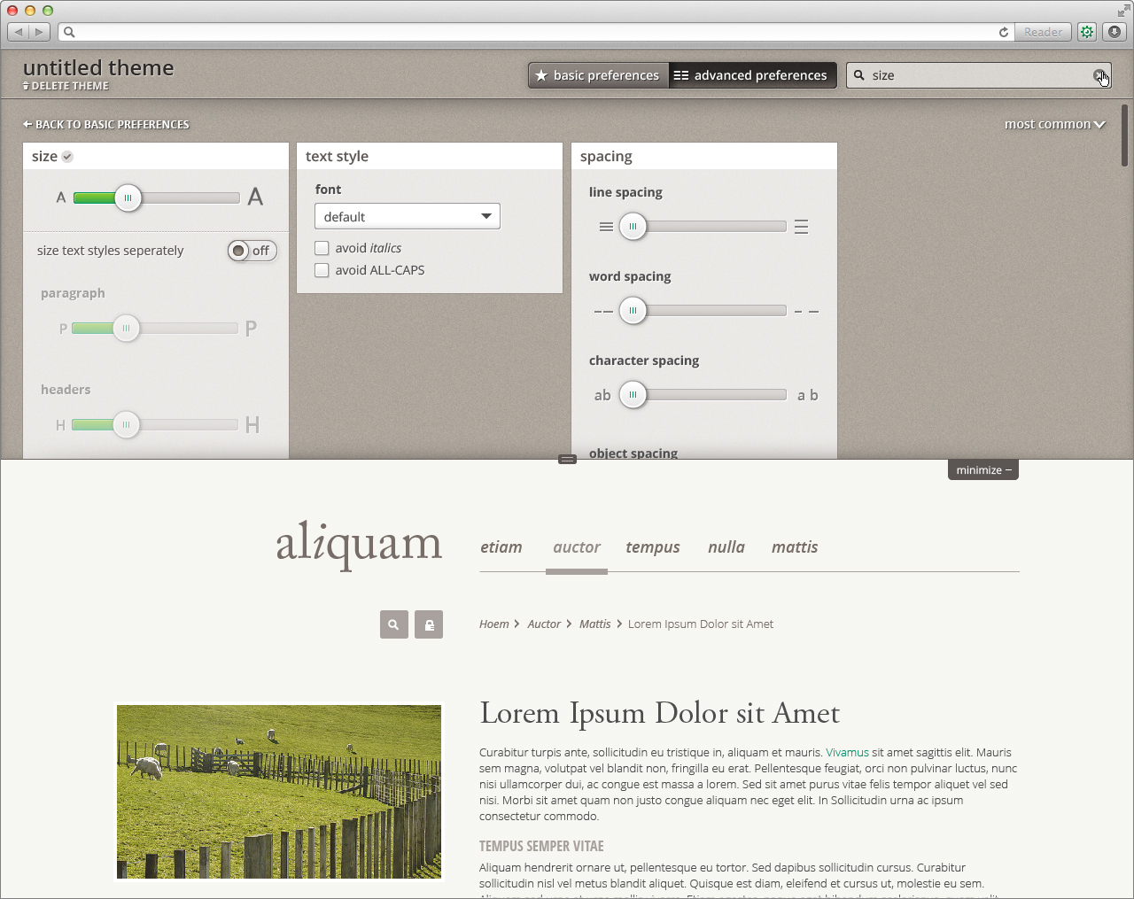
Size
Contrast
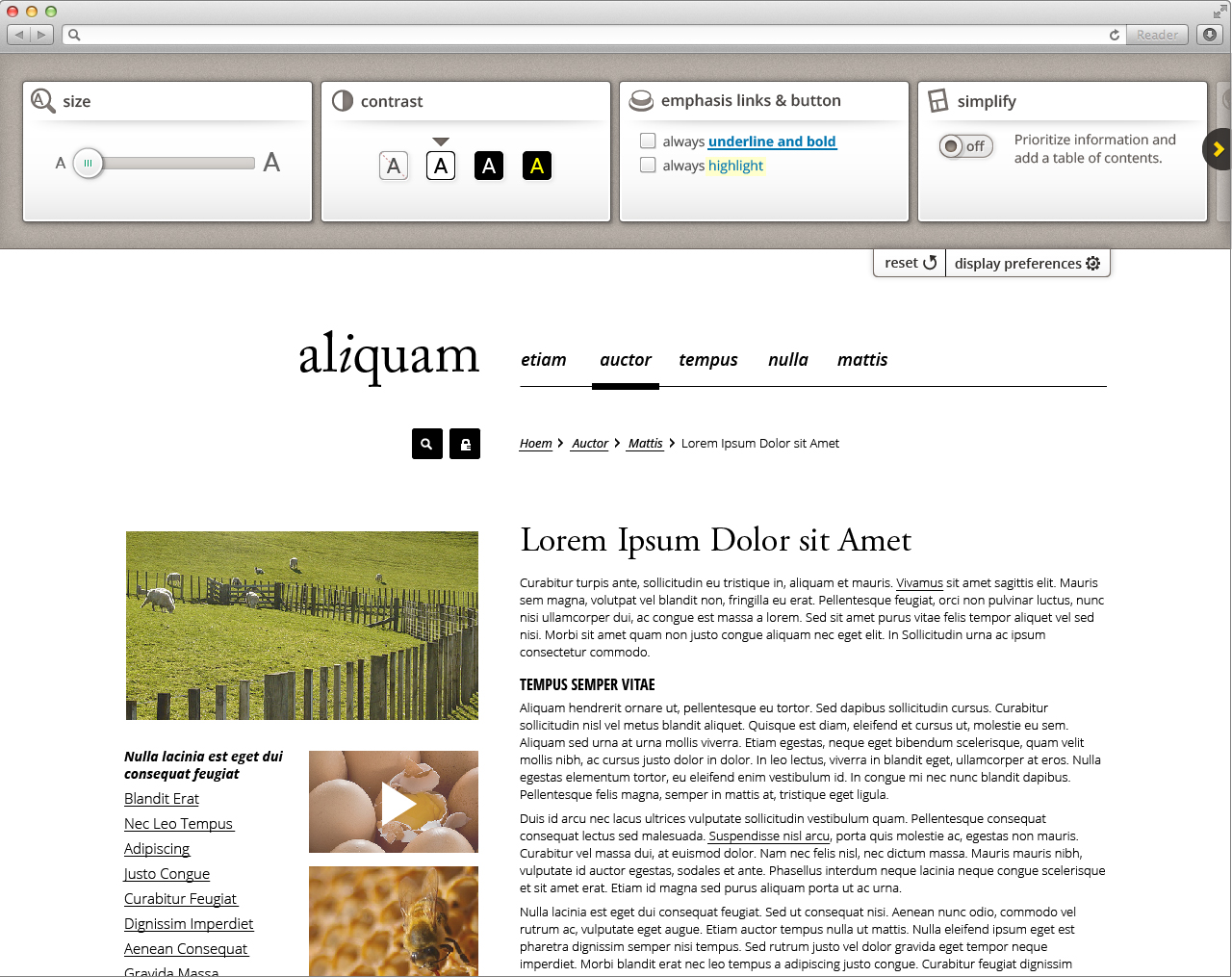
Emphasis links & buttons
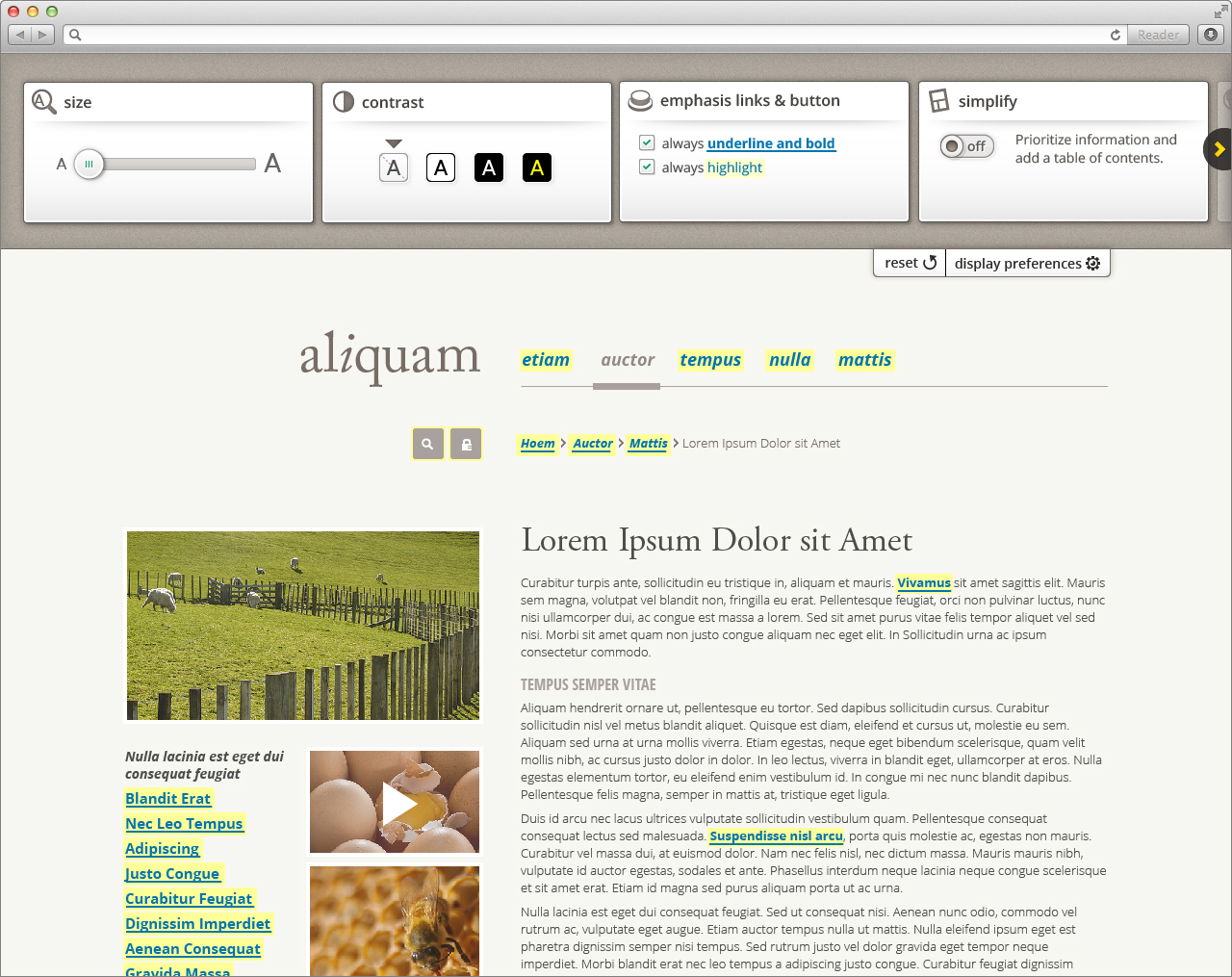
Simplify
For information about simplify behaviour, visit Design Walkthrough
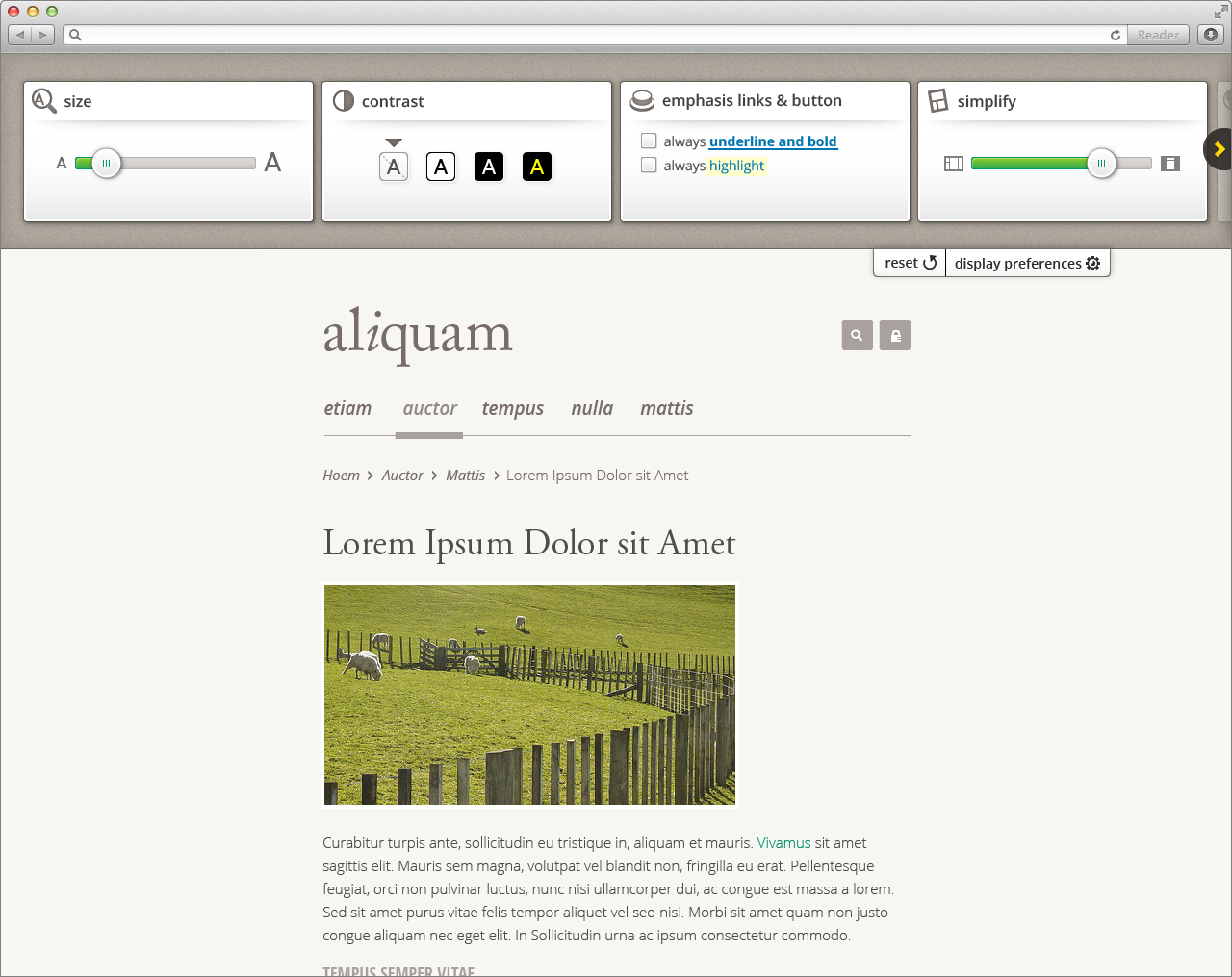
Option 1: Responsive layout slider
Option 2: Article-only with table of contents
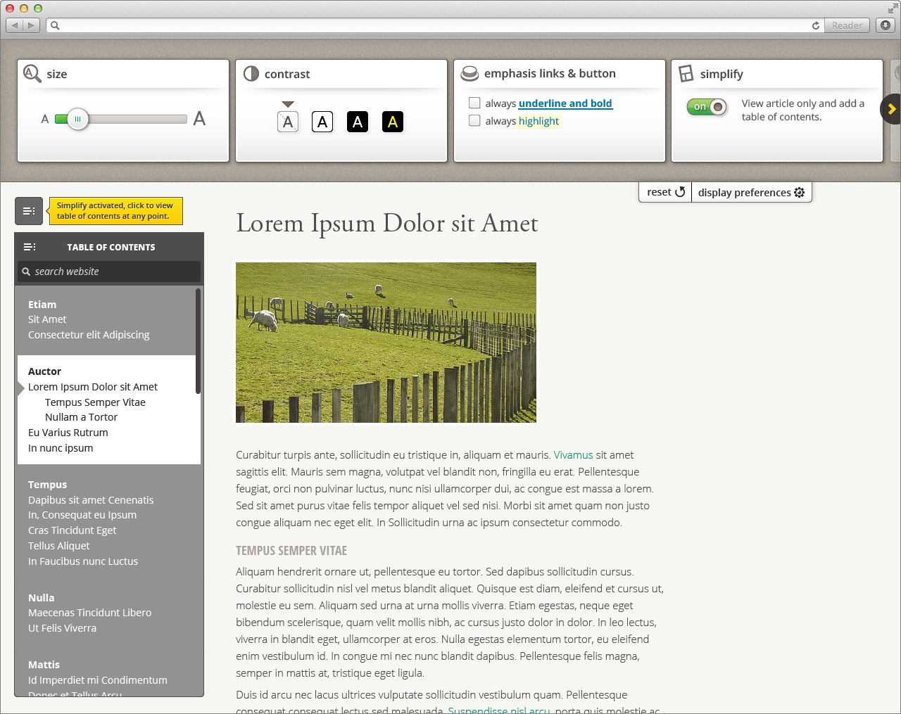
Panel slid
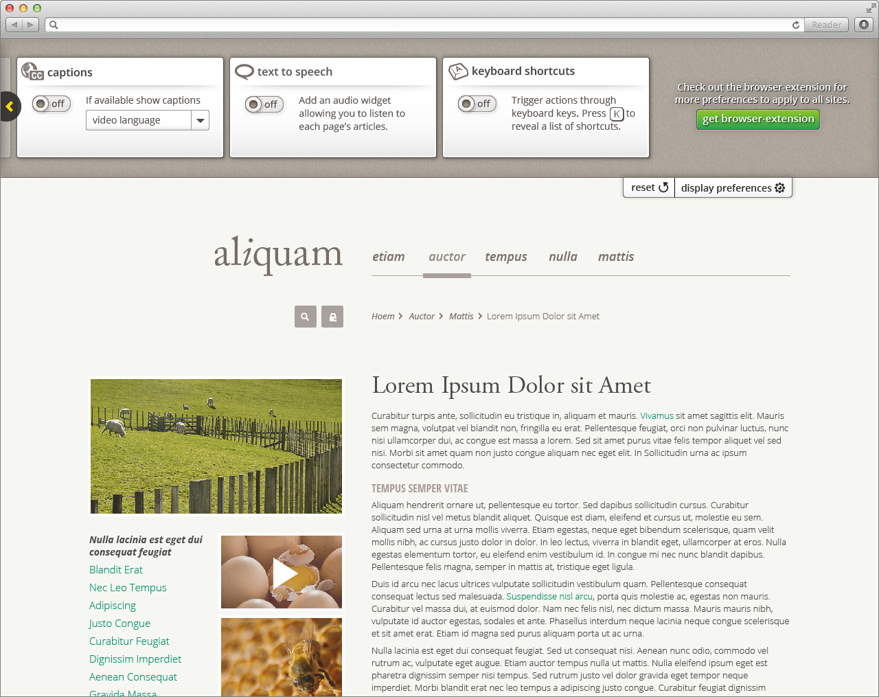
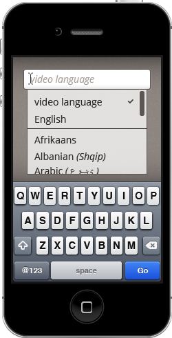
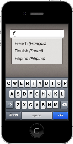
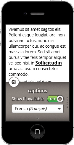
Captions
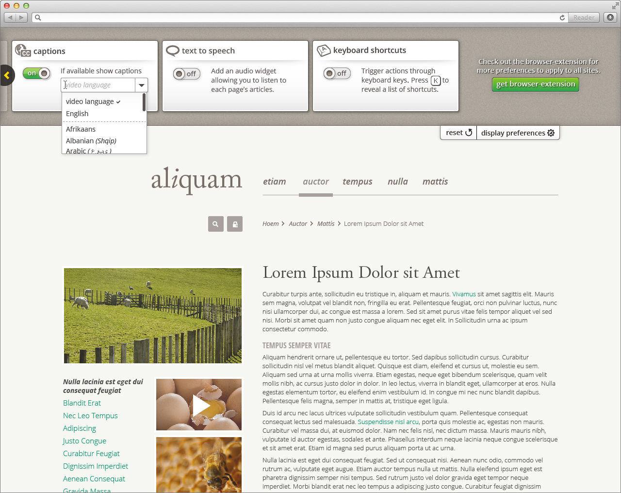
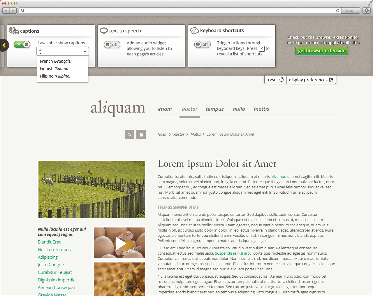
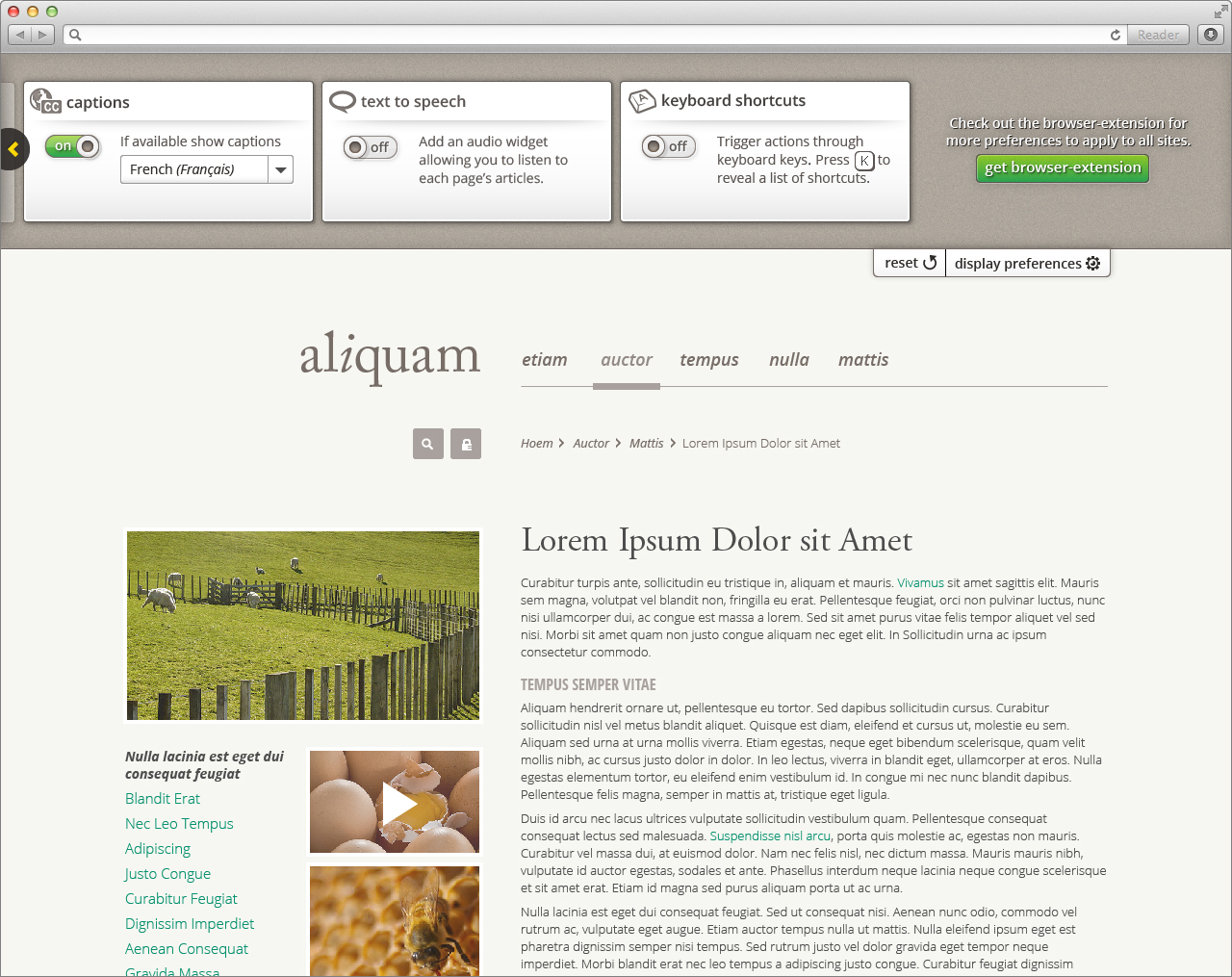
Text to speech
For information about text to speech behaviour, visit Design Walkthrough
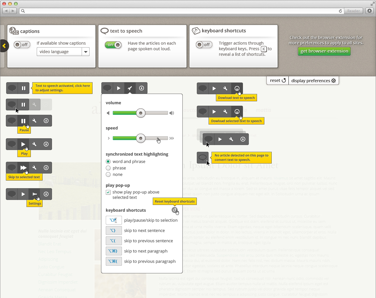
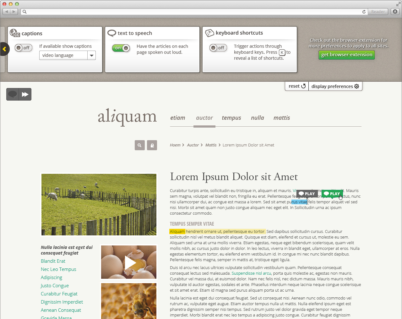
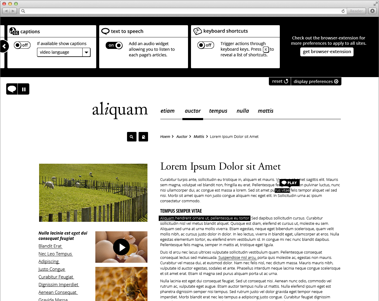
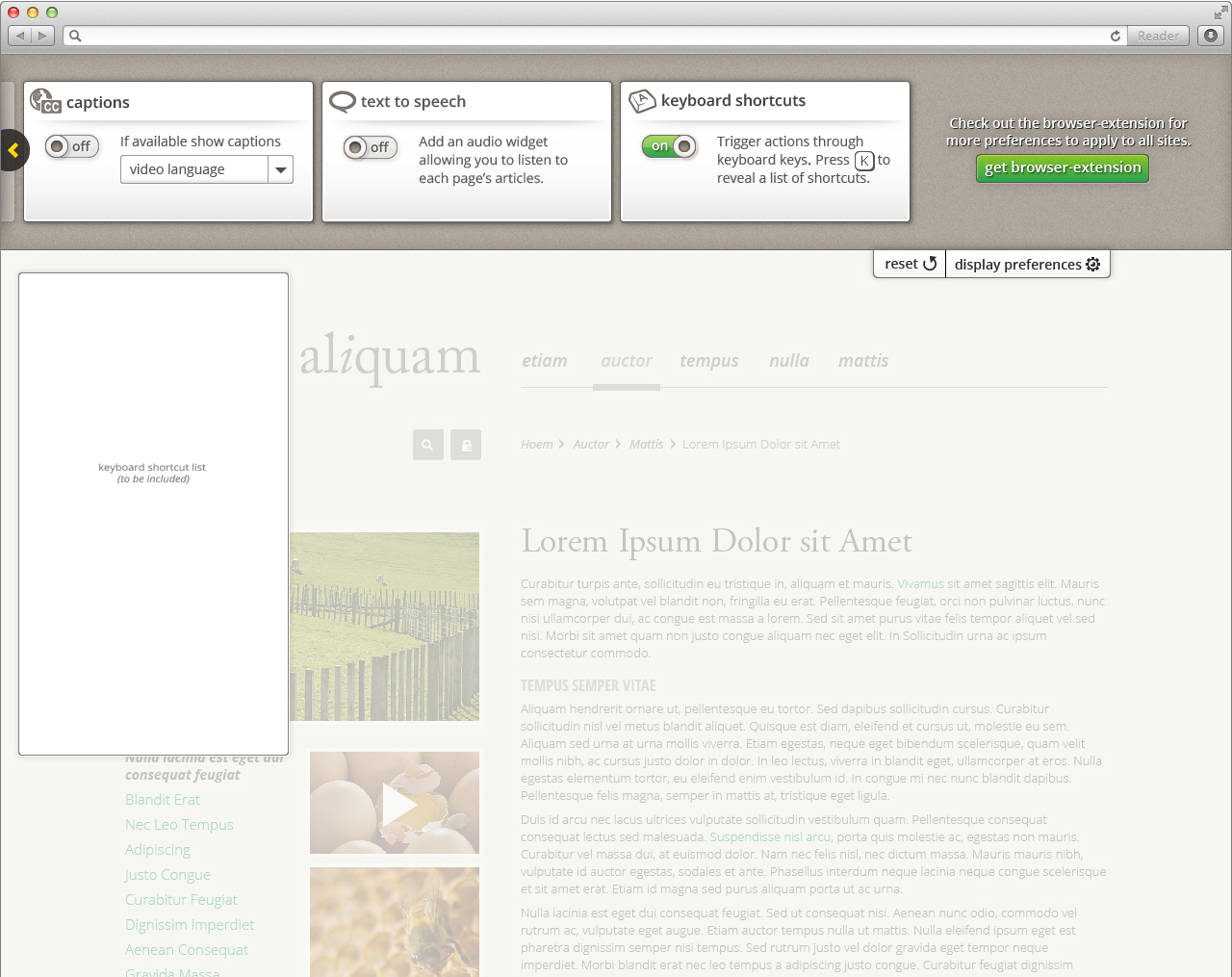
Keyboard Shortcuts
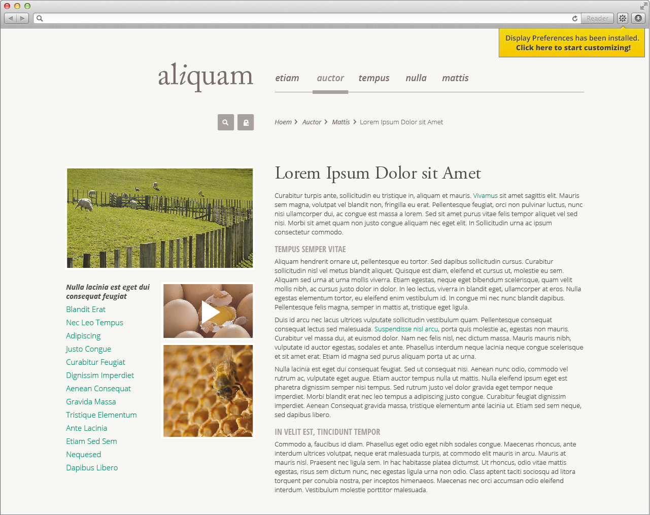
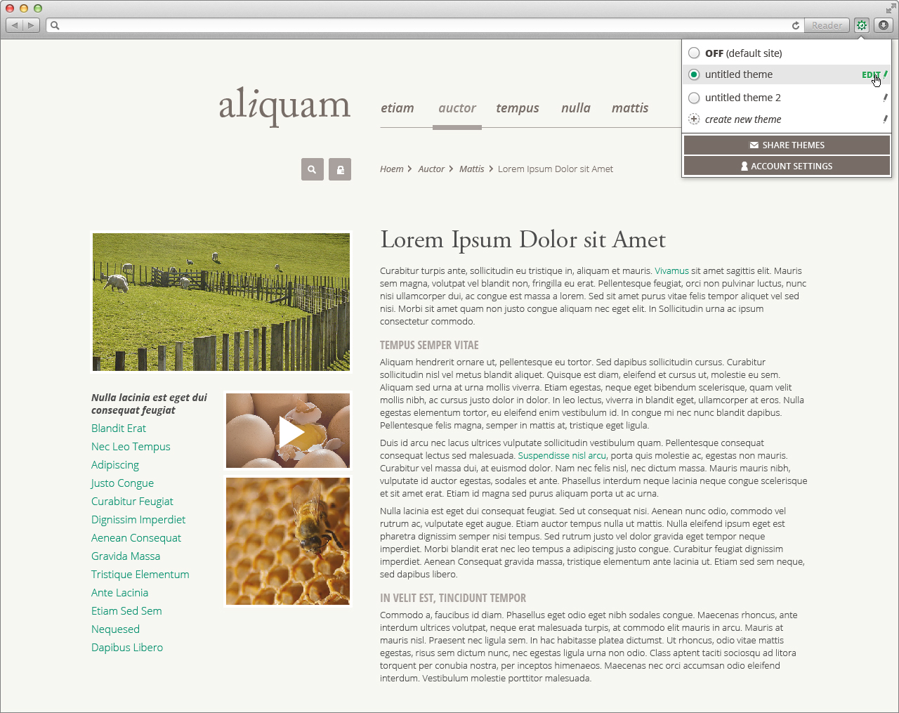
Browser extension
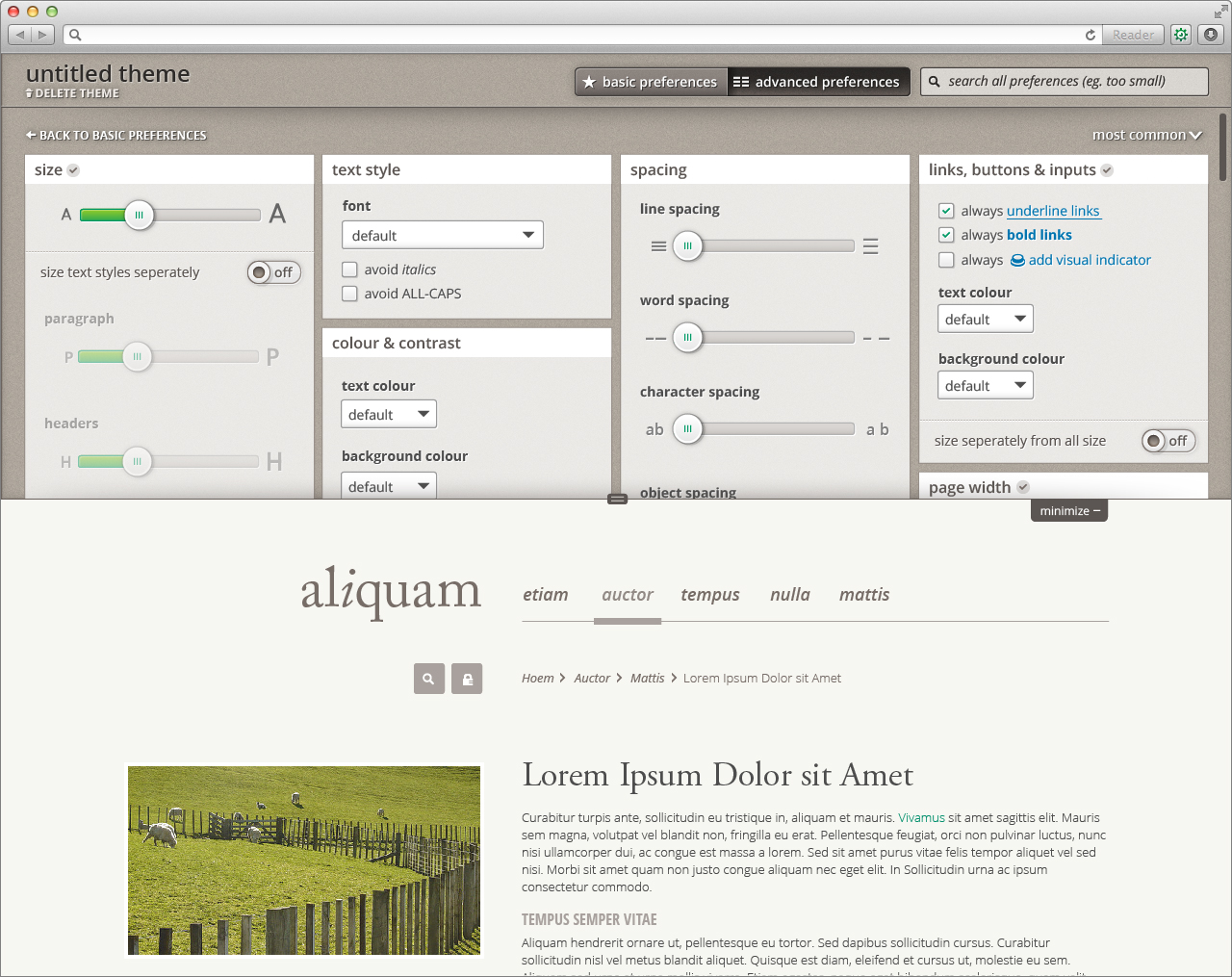
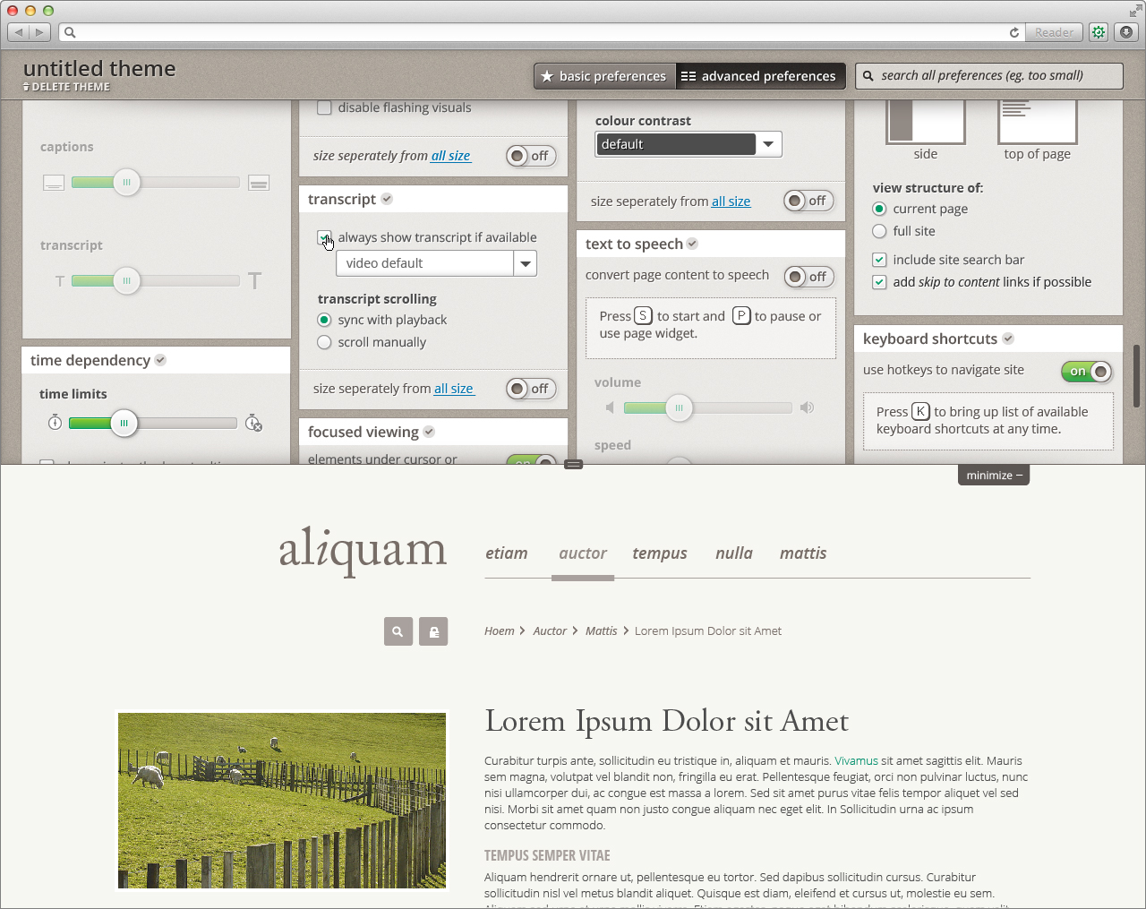
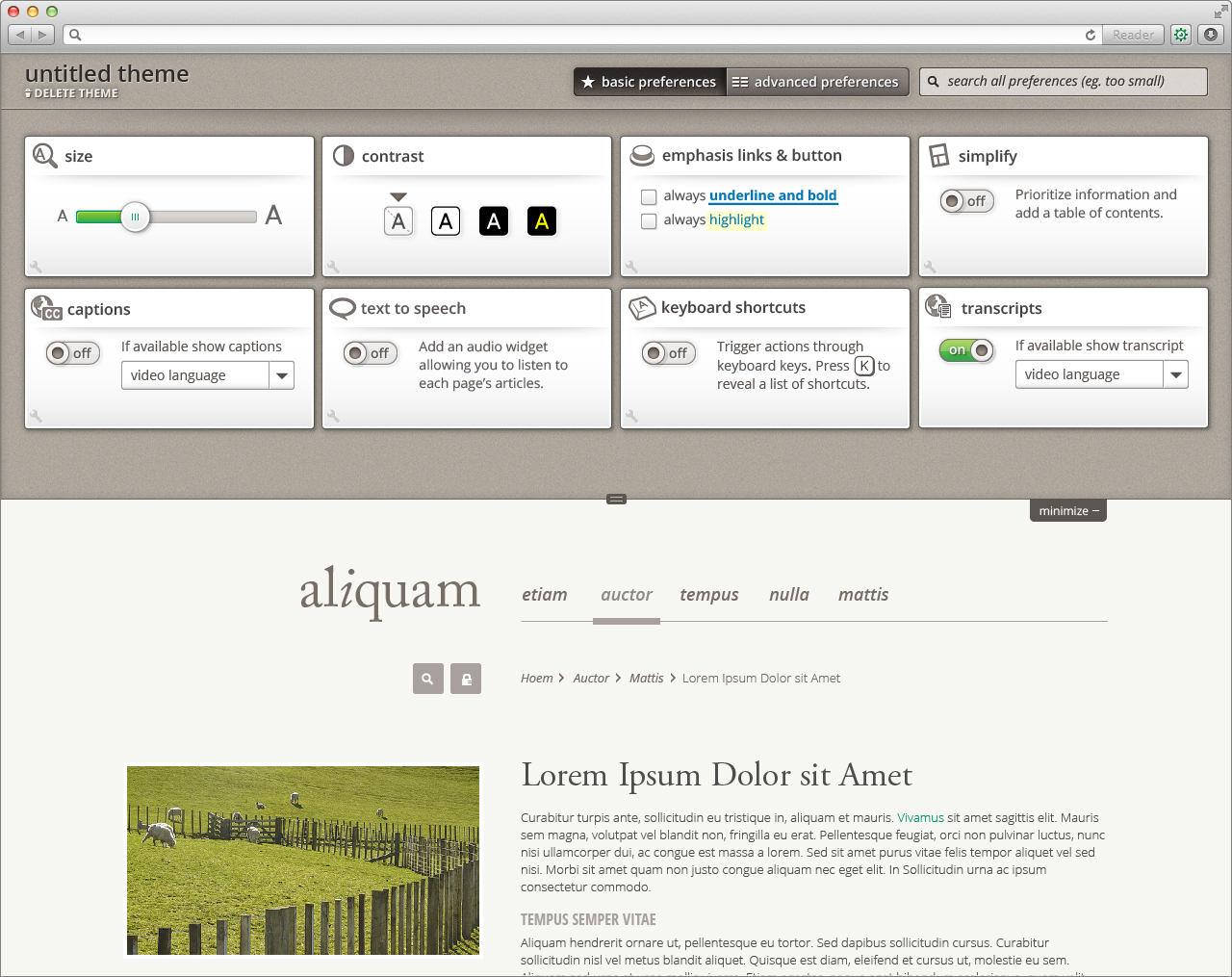
Mobile
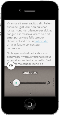
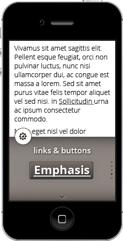
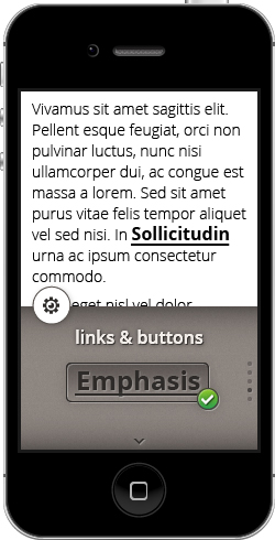
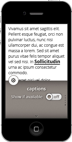
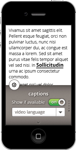
UIO button (gear in circle) appears on the bottom left corner when the user opens a page. The button disappears (transitioning downward) when the user scrolls down the page content. The button reappears (transitioning upward) when the user scrolls up the page content.
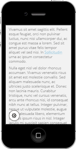
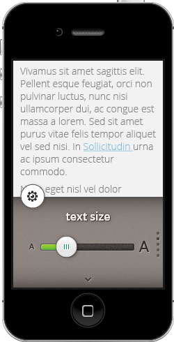
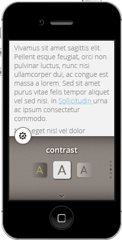
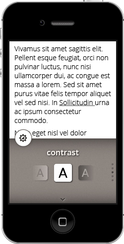
The preference panel opens (transitioning upward, overlapping content) when the user selects the UIO button.
The preference panel collapses when the user selects the UIO button, the user selects the content, or the user swipes down on the content.
General interaction:
- navigating between preferences
- swiping up and down
- or selecting the down arrow (moves only one direction)
- adjusting preferences
- swiping side to side (where applicable)
- or selecting interactive
Style
( section is incomplete )
Font |
|
Form element outline | 989898 |
Icon grey | 8D8681 |
Highlight background | E8EABE |
Blue Link | 3172AE |
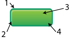
| 1 = Outline 009966 |
Options top gradient | 000000, 15% opacity |
Options bottom gradient | E7E6E6 |