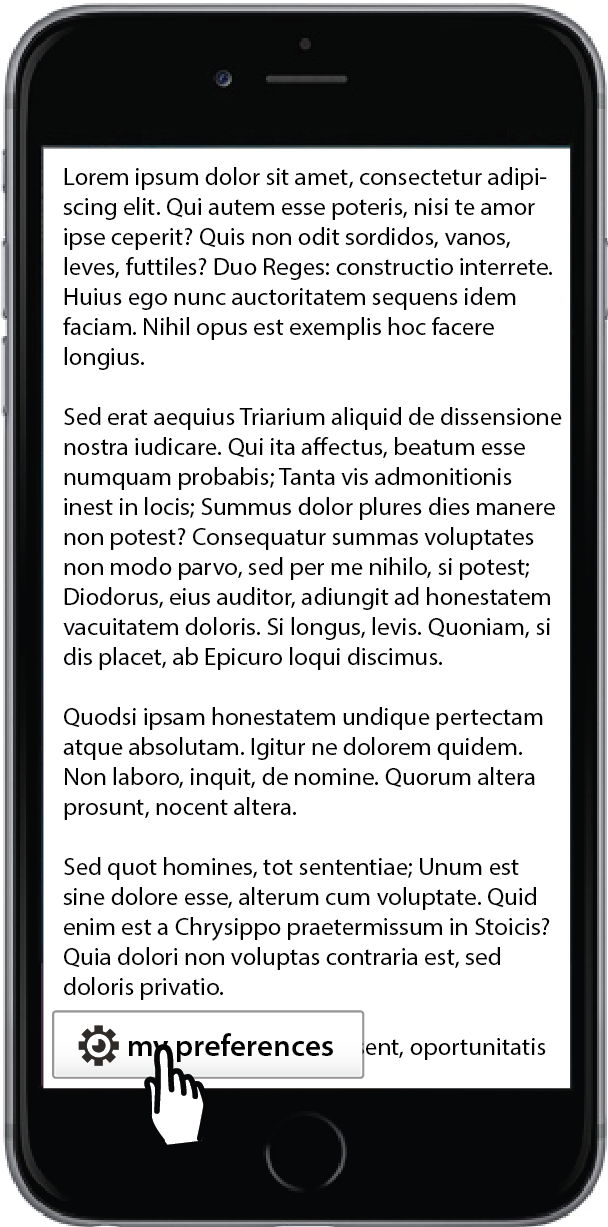
(Floe) User Interface (Learner) Options Mobile and Responsive Design
Please see (Floe) Learner Options / UI Options - Mobile Designs 2017 for latest designs.
Meeting Notes
Learner Options Desktop and Mobile Jan 19 2017
- unifying the desktop and mobile designs
- maintaining a horizontal layout for both
- changes to the individual adjuster designs based on usability testing feedback
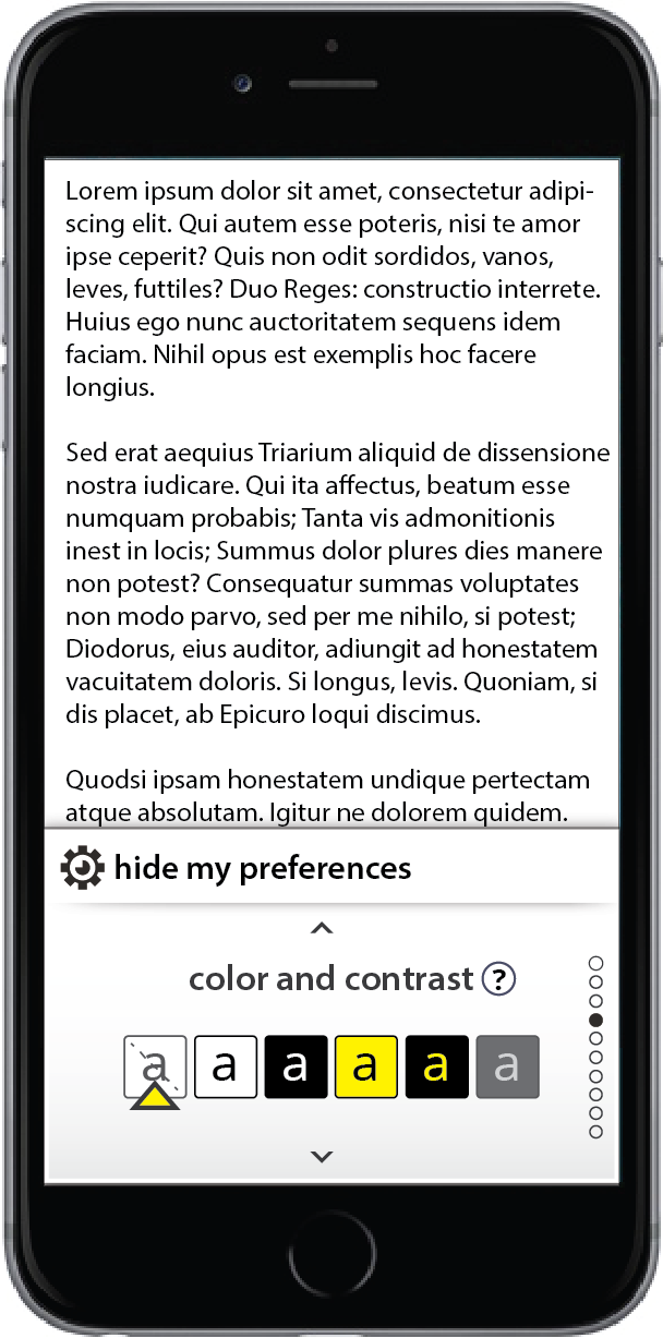
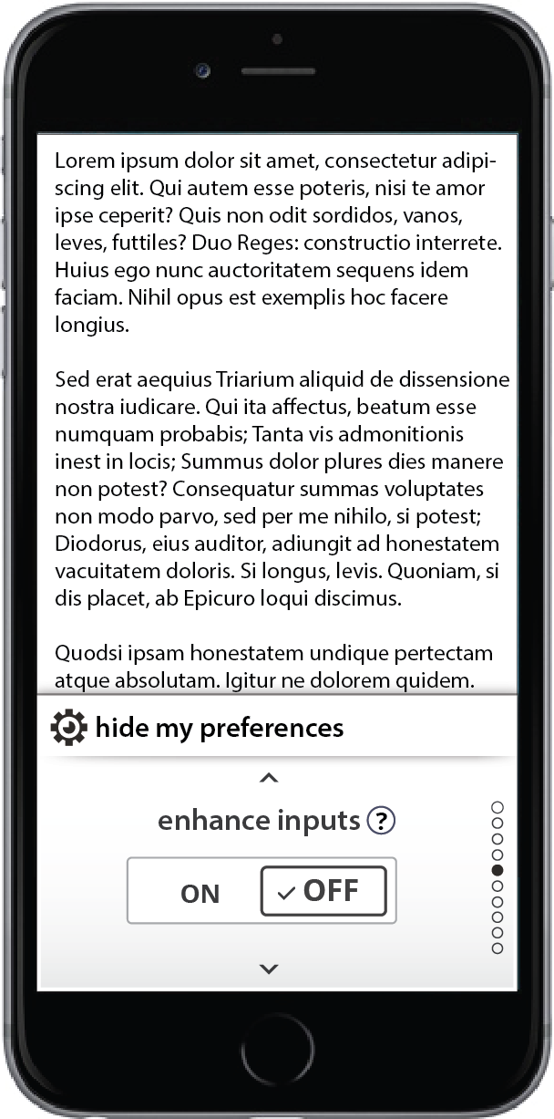
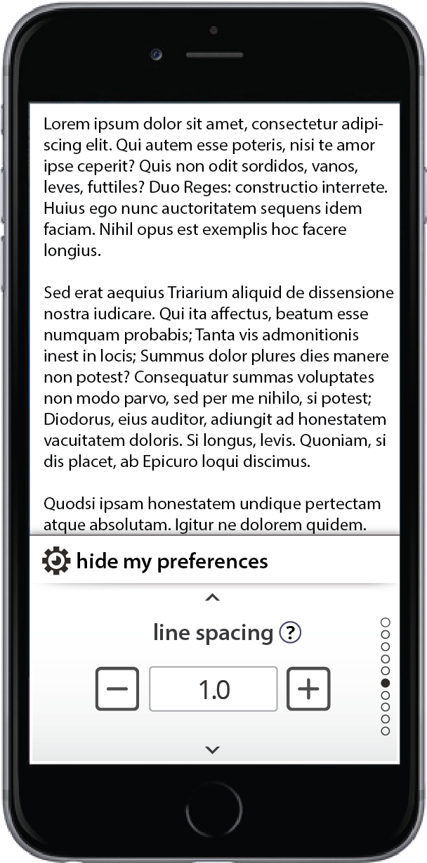
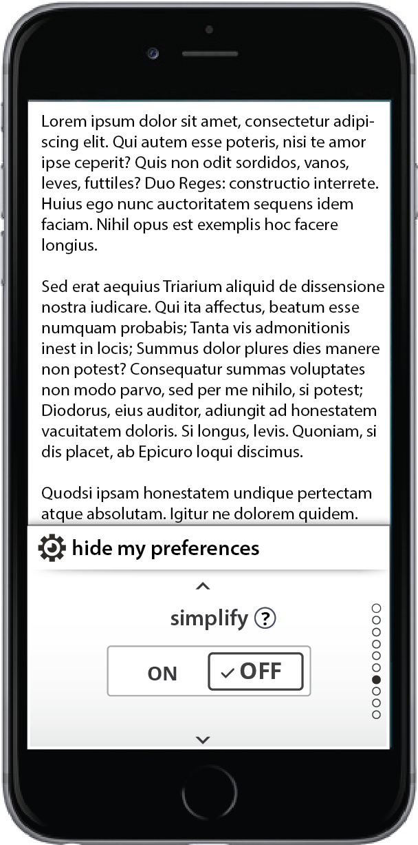
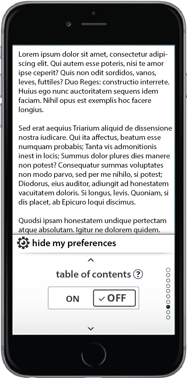
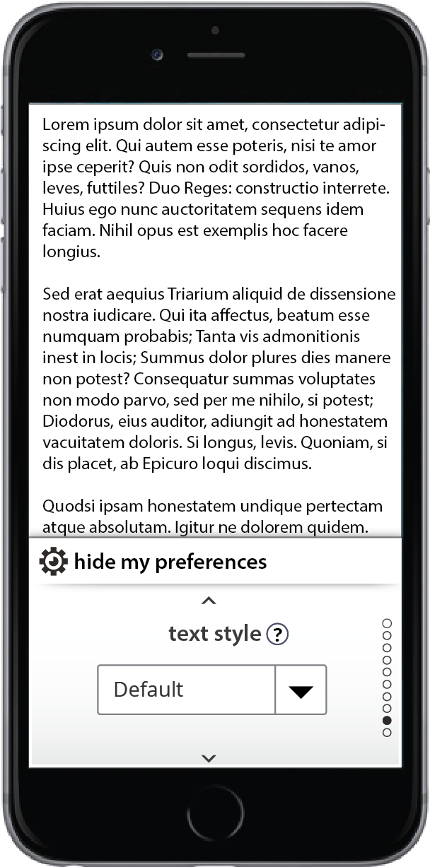
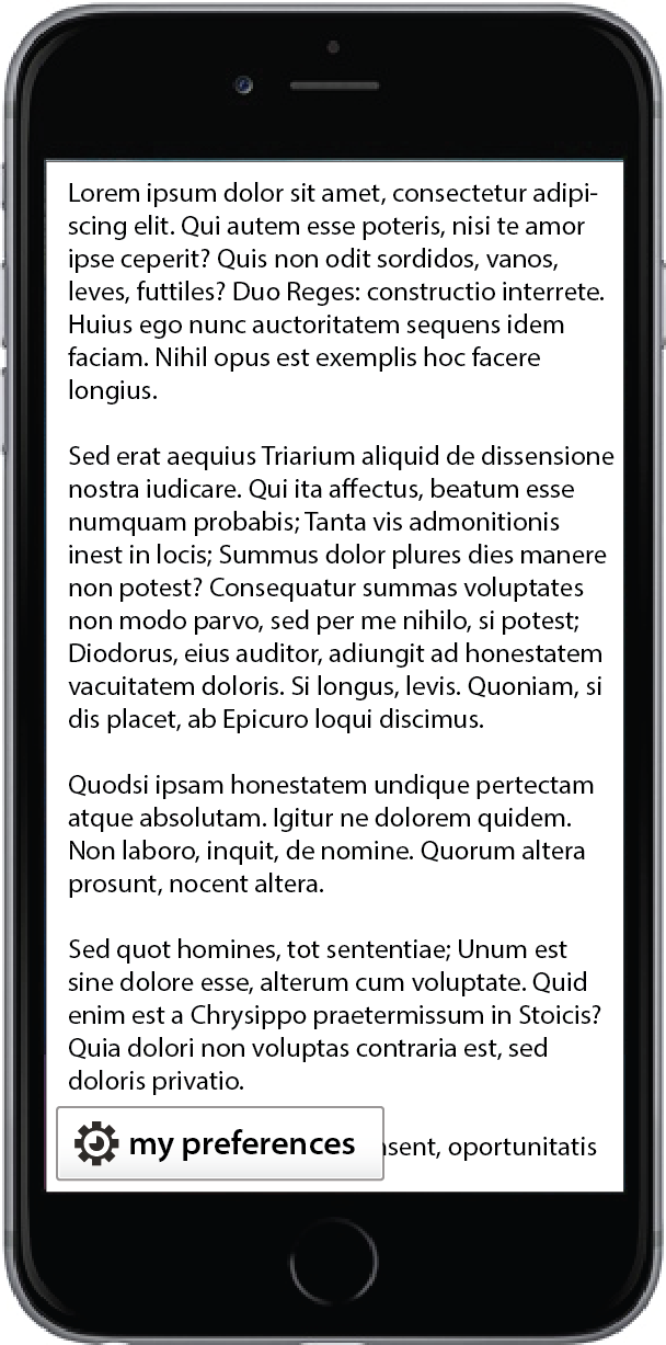
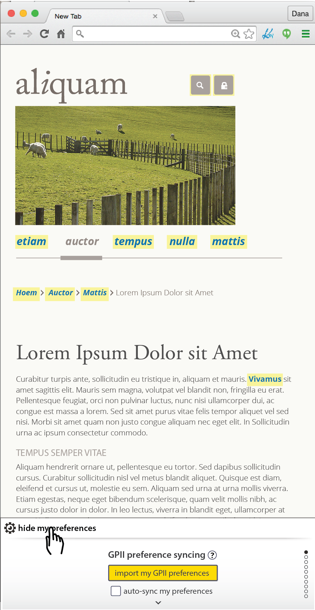
- keep the “hide preferences” tab on top of the open panel (rather than having it slide down and stay below the panel as it does now)
- allows for a better keyboard/screenreader navigational flow
- requires flexibility in the lateral position of the tab, resulting in the following mockups/exploration:
Older Mockups
Notes on interaction:
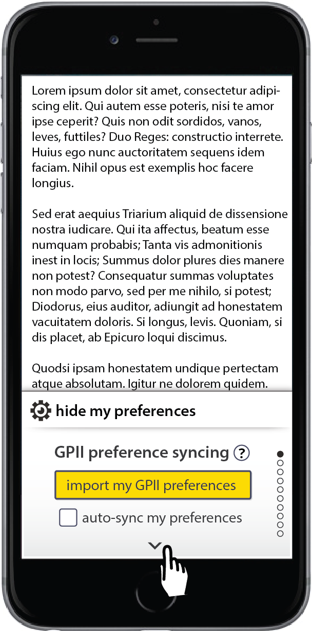
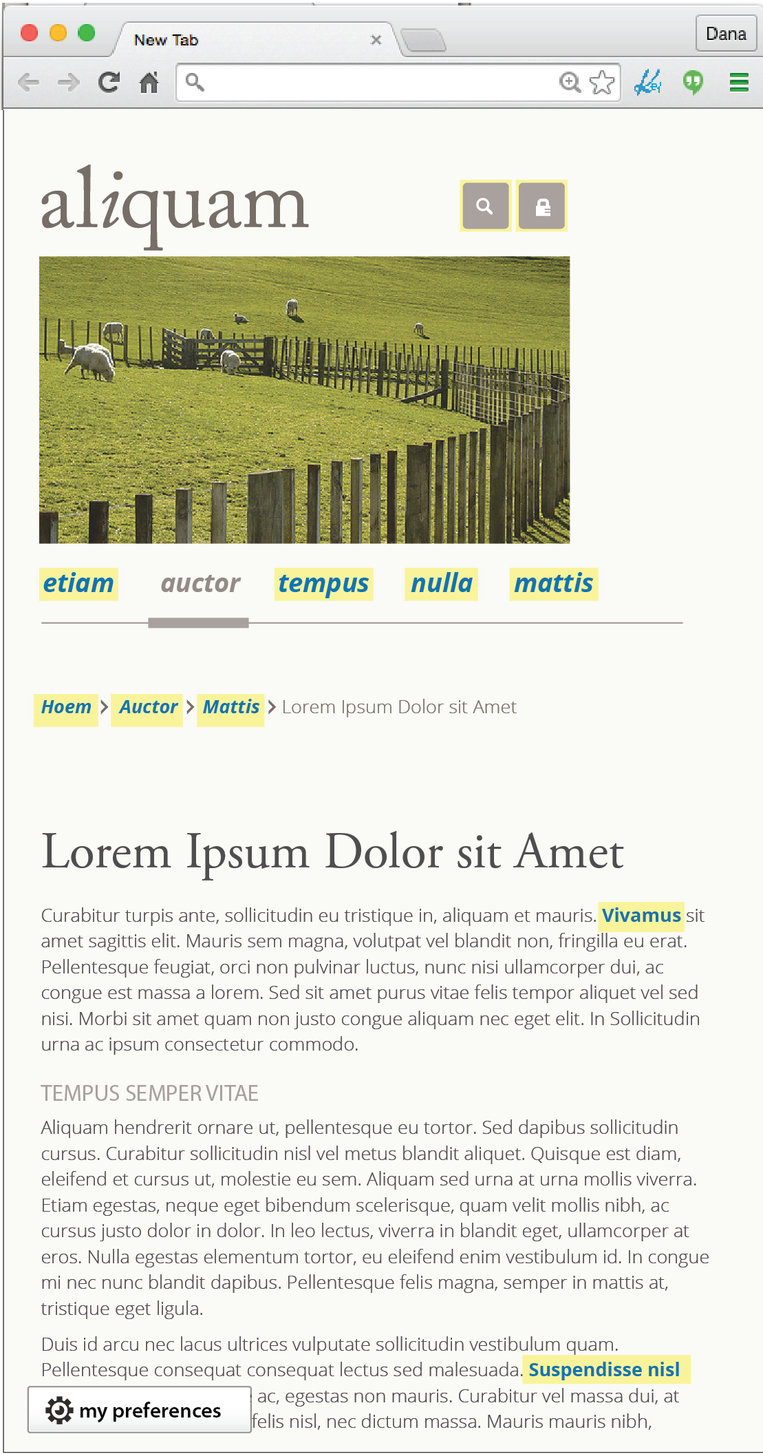
- when first opened GPII preference syncing panel shows up first
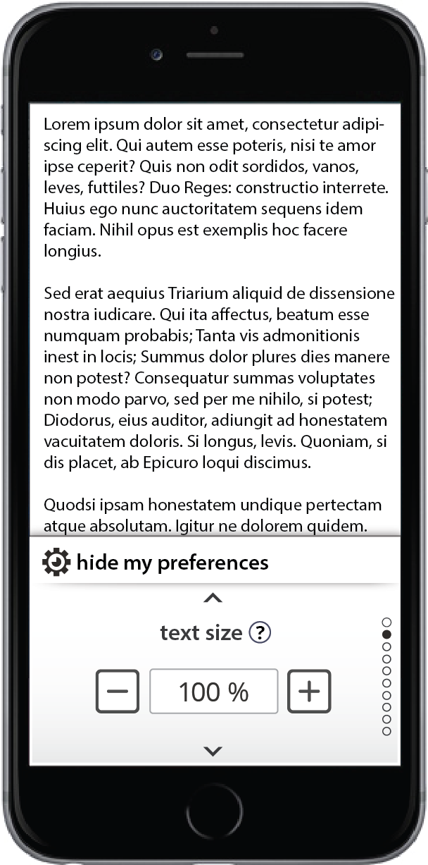
- when re-opened, my preferences should land on last-viewed/used panel in session
- export button appears when adjustments have been made and persists until prefs are exported
- reset option appears on +/- numeric preference panels when adjustments have been made (text size, line spacing, etc)
Mobile panel flow with GPII integration:
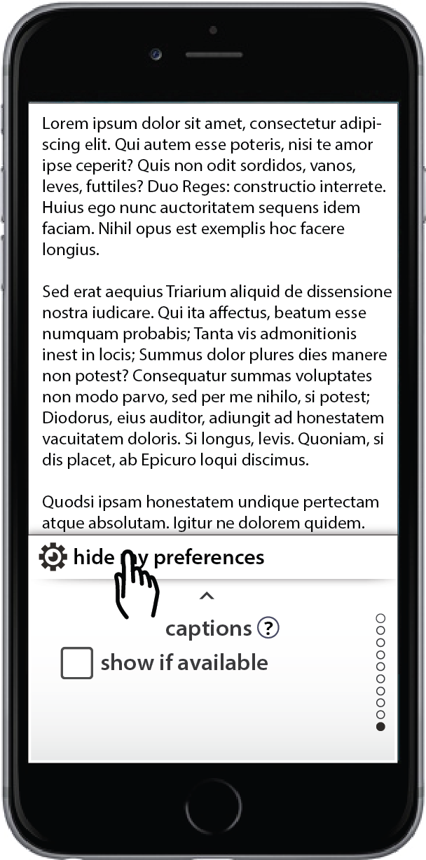
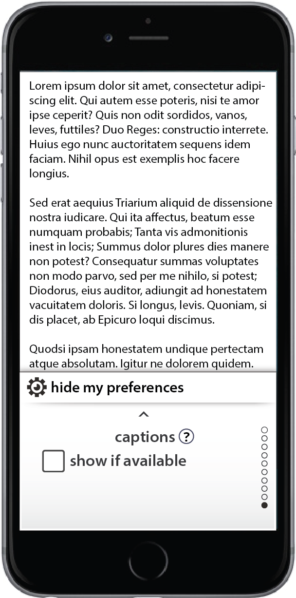
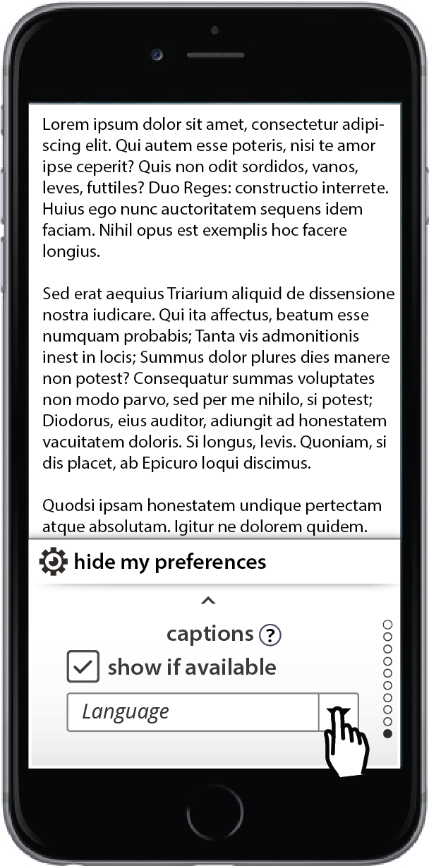
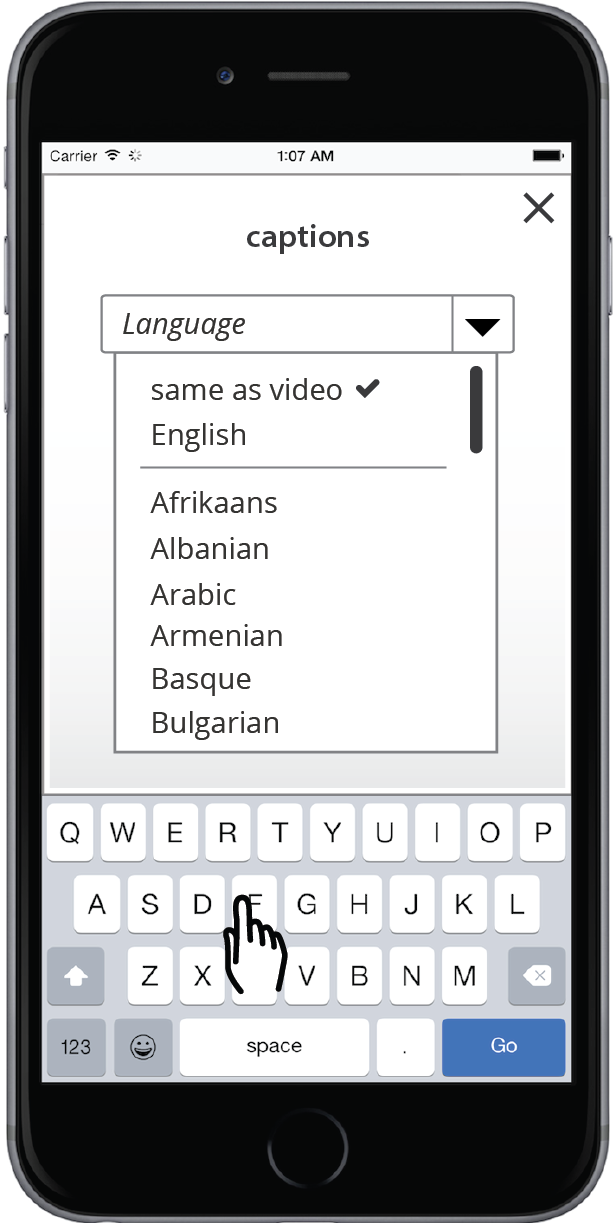
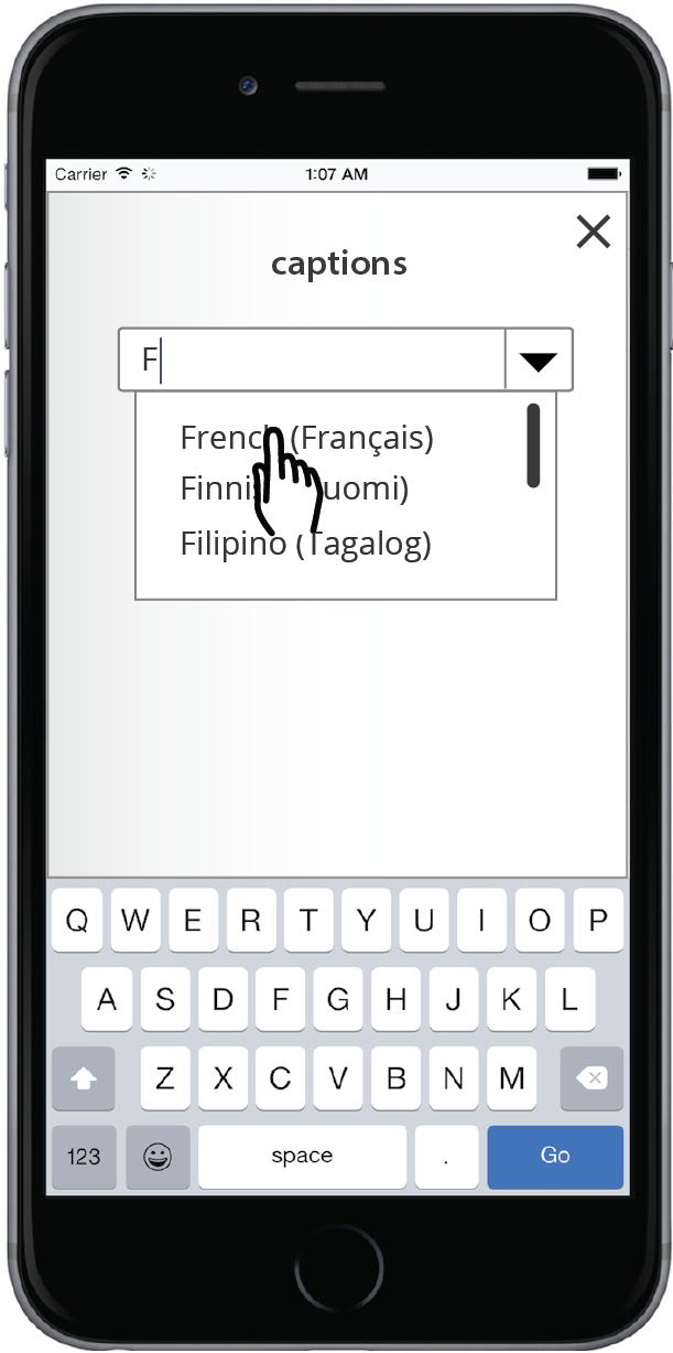
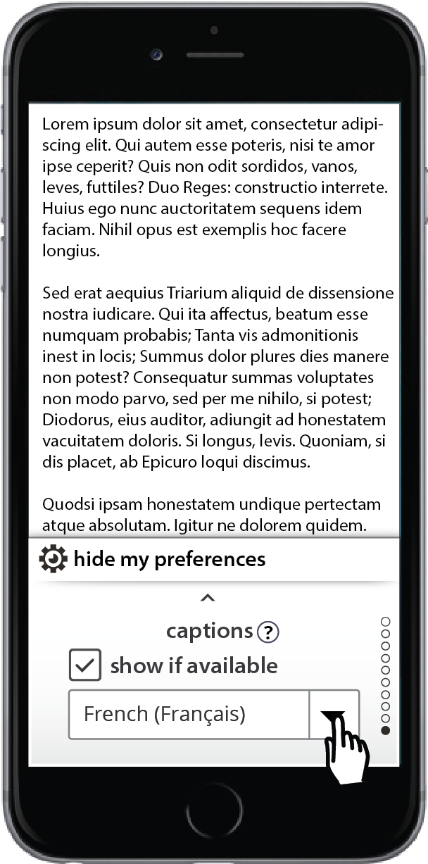
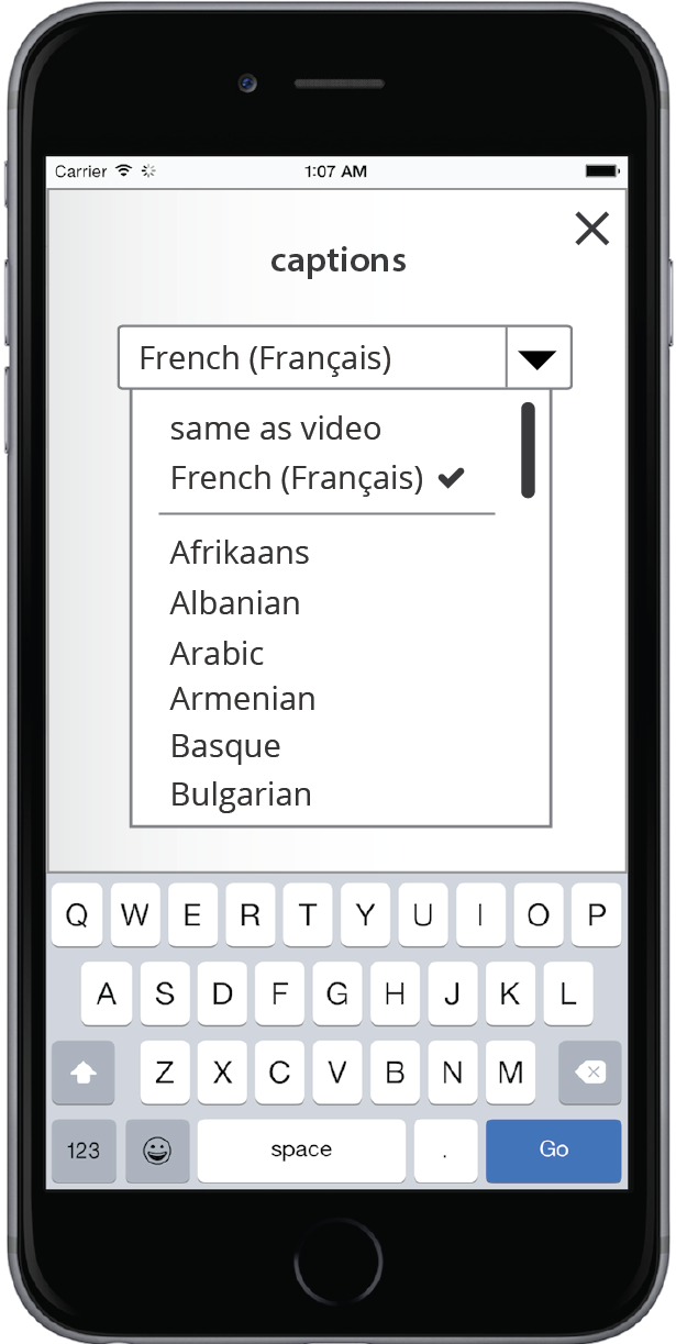
Captions flow:
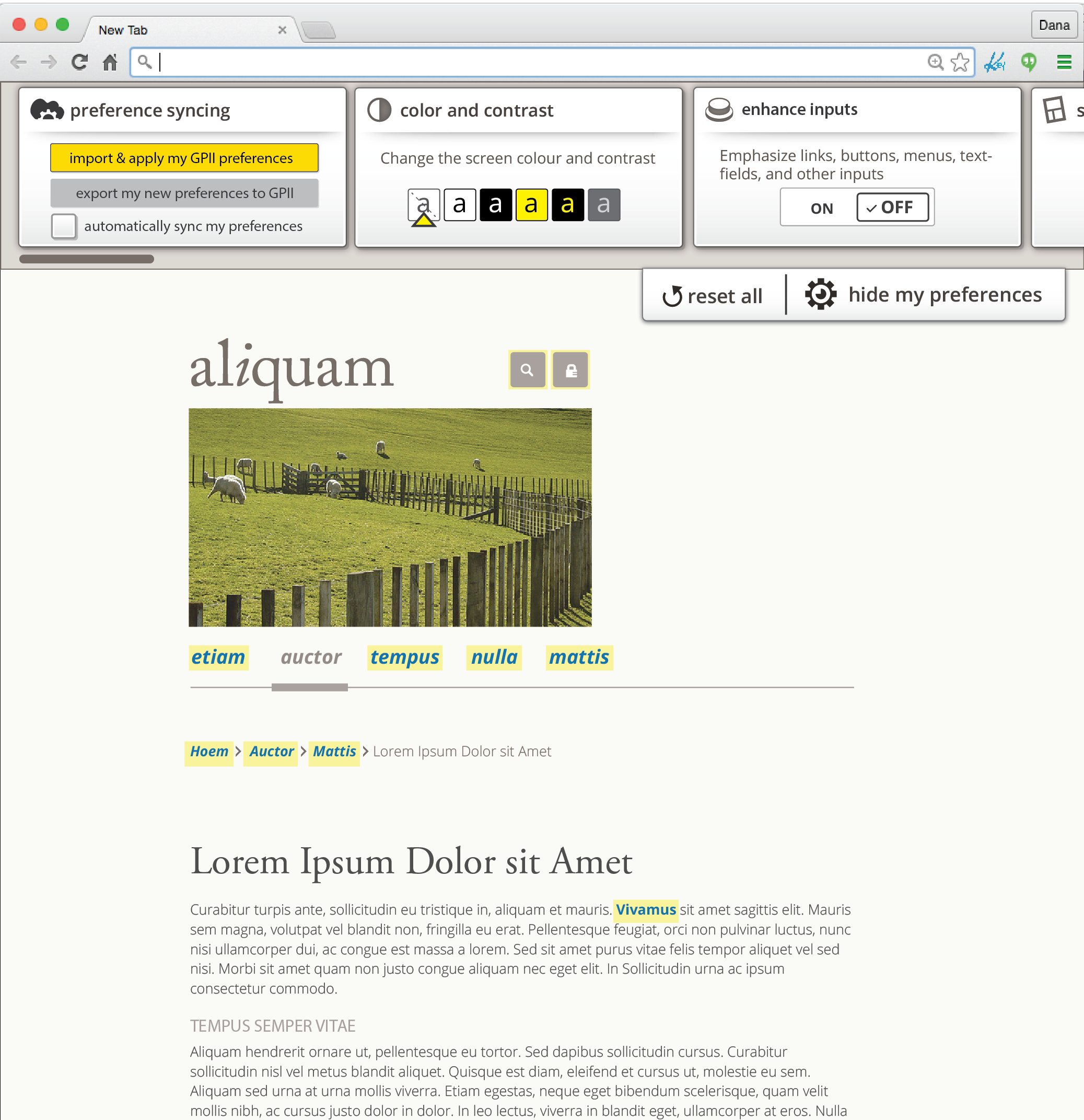
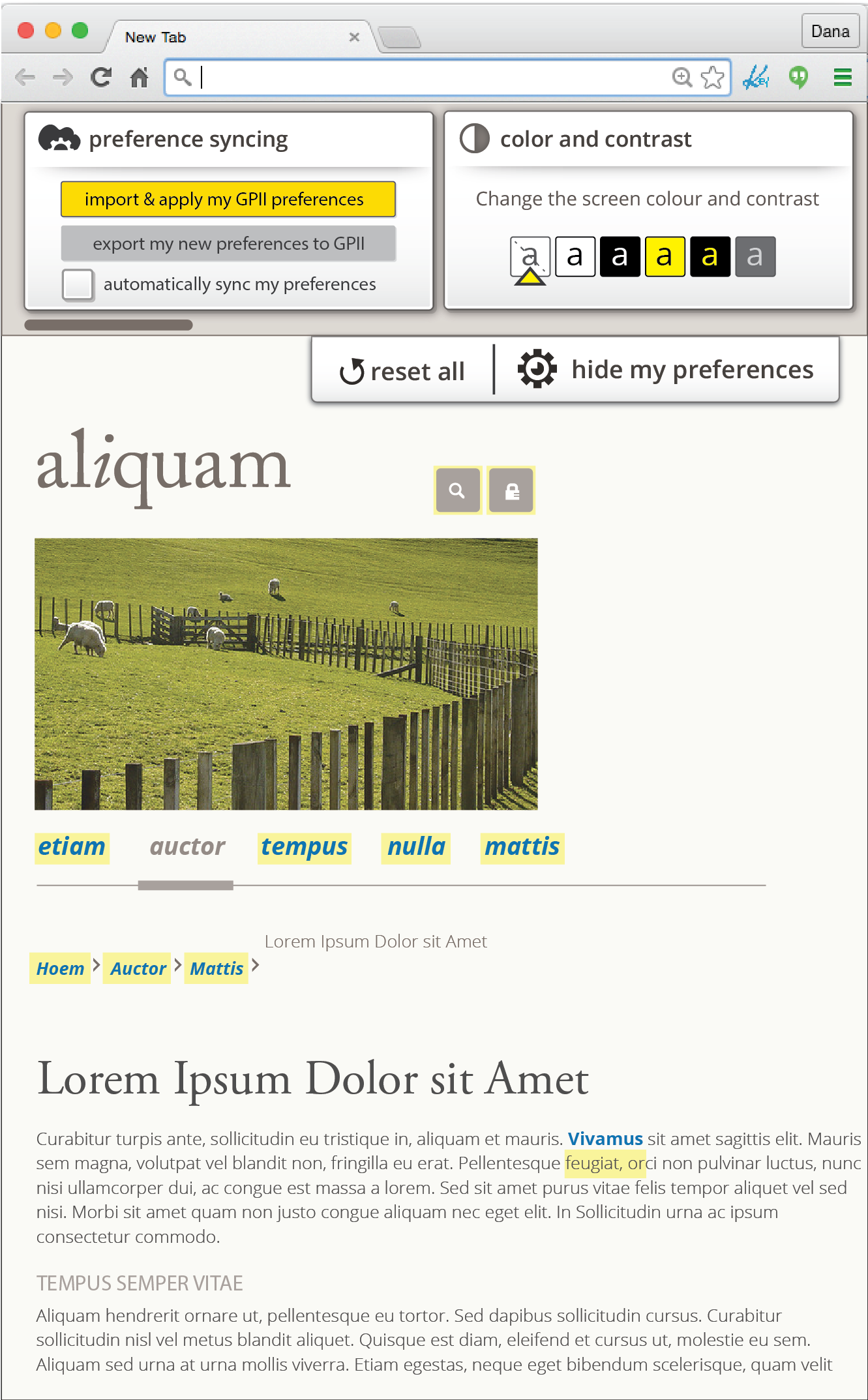
Responsive Design:
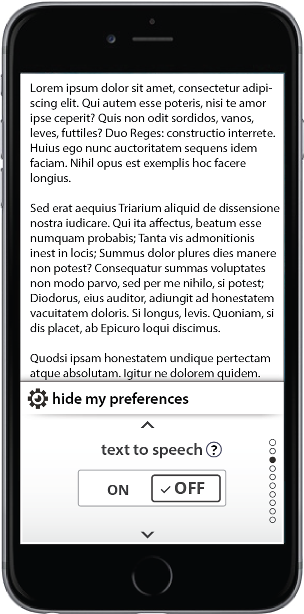
Mobile Panels with Adjustments
(Floe) User Interface (Learner) Options Mobile and Responsive Design