Uploader Wireframes (Design Iteration)
Work In Progress
These designs are still a work in progress, and are actively being worked on. Please treat this material as such.
Wireframe - Draft
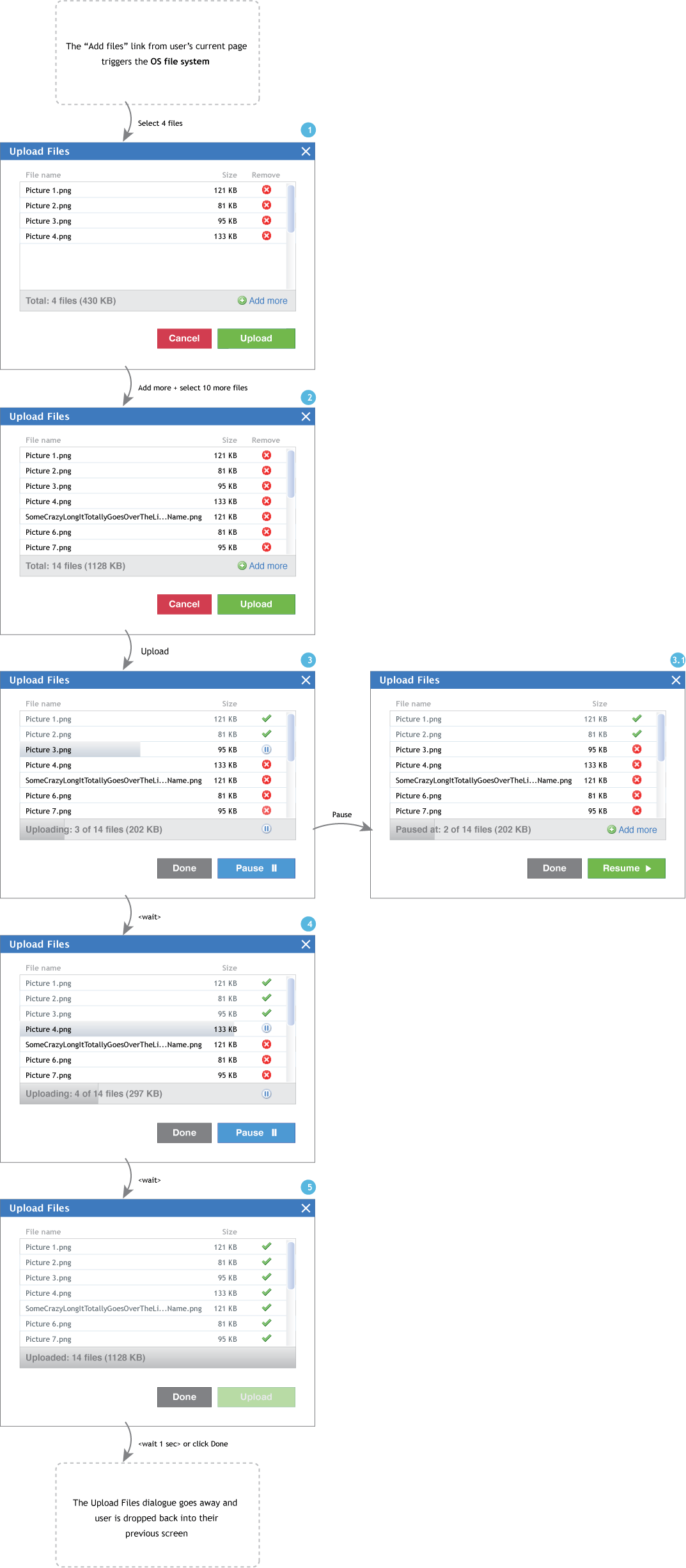
New design (version4):
Here are the changes:
- Once upload starts, the total progress will be shown with the progress bar as well as text "x of y files (z KB)".
- Done will dismiss the dialog keep the files uploaded to that point.
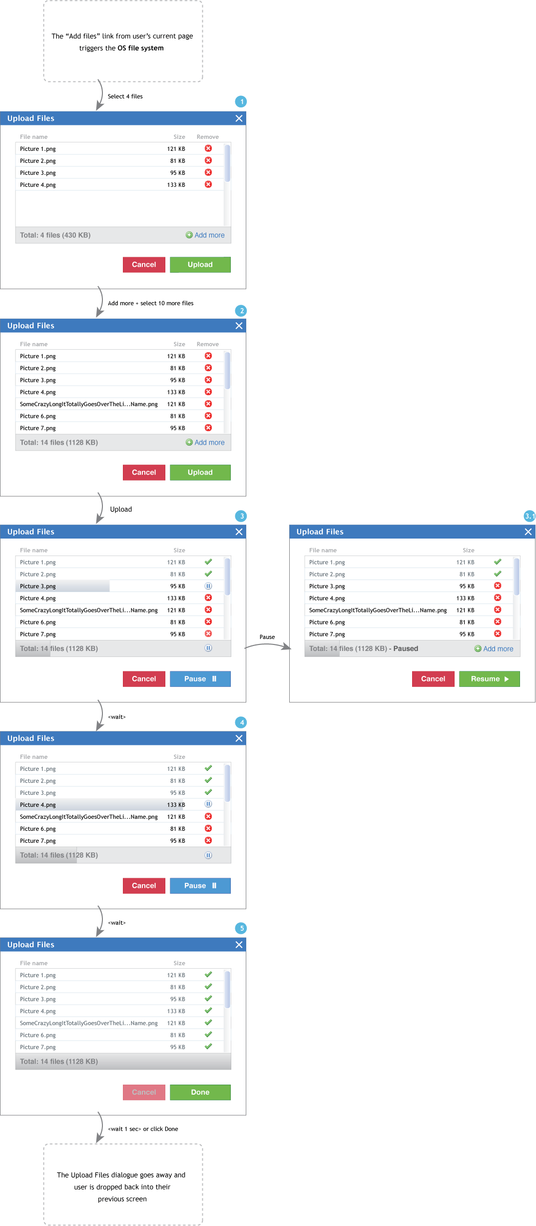
Old design (version3):
Here's a UI flow with some additional revisions after a discussion with Eli and Daphne. The changes include:
- Once upload starts, the Upload button changes to a Pause button. To make this change obvious, the colour of the button also changes (for users like me who tend not to read the labels).
- Cancel will dismiss the dialog and undo the upload done up to that point.
- X at the top right will dismiss the dialog and keep the already uploaded files.
- When paused, the progress bars will flash and the word "Paused" will appear to indicate that the upload is stopped. The button changes to Resume.
- When paused, the file that was being uploaded resets due to technical feasibility, hence remove button is displayed.
- Used icons from the "Silk" set
- Here's the keyboard interaction.
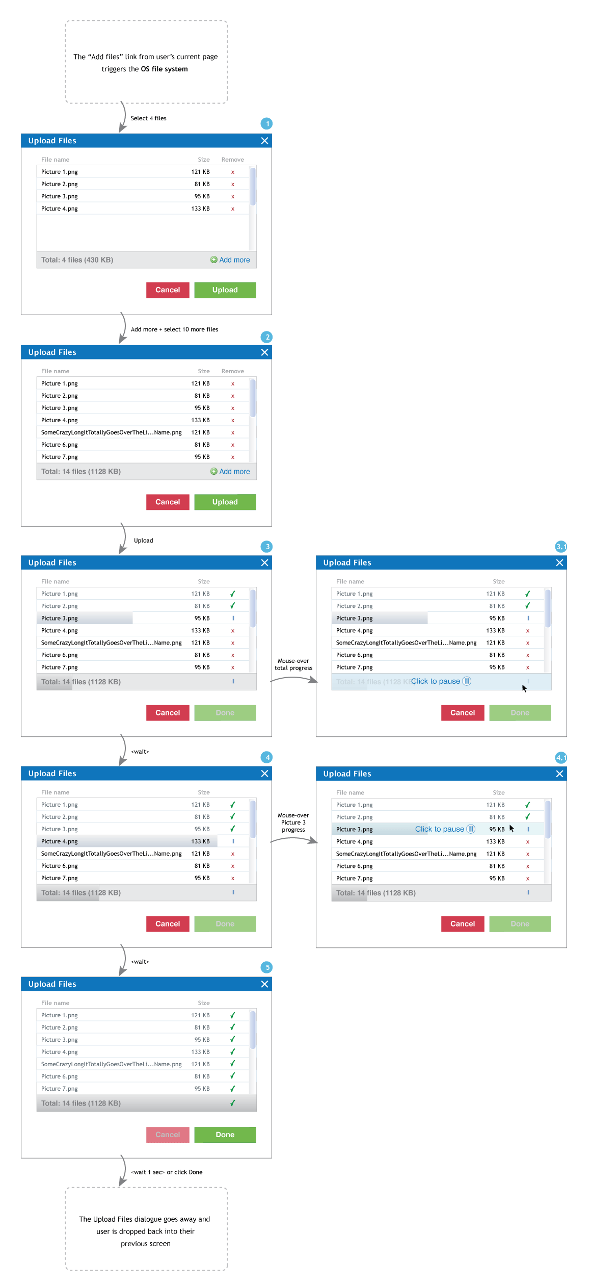
Older design (version2):
Description
The file upload component allows a user to load files from one file system into another file system.
Design Pattern
Problem Summary
The user needs a way to upload a single or multiple files within their current context. Full pattern...
Scenarios
Through looking at various contexts, we'd like to demonstrate that the file upload component indeed needs to be simple and basic to be applied everywhere.
- OpenCollection File Upload Contexts of Use
- Sakai File Upload Contexts of Use
- uPortal File Upload Contexts of Use
Tasks
Required |
Optional/context-specific |
|---|---|
|
|
Constraints
At the point of user selection of files to load, the file upload component must hand over the process to the user's current computer for navigating the user's file system(s). Therefore, that part of the interaction is out of the control of the file upload component.
Design Artifacts
Initial design for Image Gallery
Reference: http://bugs.sakaiproject.org/confluence/display/GAL/Add+Images
Review of initial design for Image Gallery
- Combine Steps 1 and 2: The wizard-approach design indicates that file upload in Image Gallery will occur in 3 steps: 1) Choose Images 2) Upload Images 3) Edit Image Information. However, the first two steps really happens together and don't need to be in separate screens. Once you choose the files to upload (Step 1), then while uploading (Step 2) you click Add more files (Step 1), which step are you on? It might make sense to combine the two steps into something like "Add files".
- Divide "Pause" into "Pause and Cancel" and "Pause and Add more" concepts: The term "Pause" captures the fact that you are pausing the current upload and not un-doing the uploads that are already done. Currently, when the user realizes they want to add more files while uploading, they either need to understand they can "Pause" the current upload to add more files or wait for it to finish uploading then add more files. By providing explicit options "Cancel" and "Add more" options on the upload progress screen, we can reduce users' mental load.
User Testing
Reference: Uploader User Testing - Round 1
Technical Information
Reference: Uploader Design Overview Technical Specification


