(Floe) User Interface Options (aka. Learner Options)
Design at a glance:
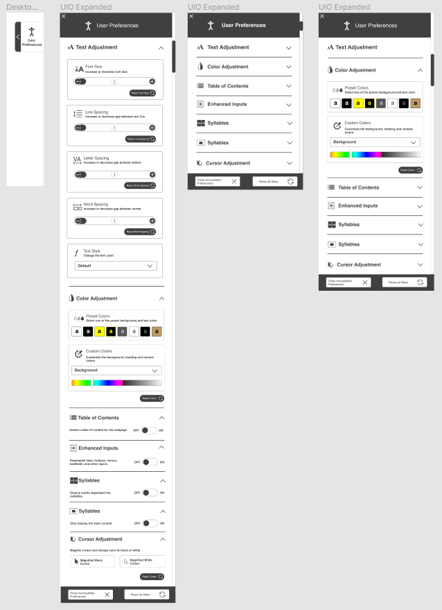 UIO 2.0
Design Functionality:
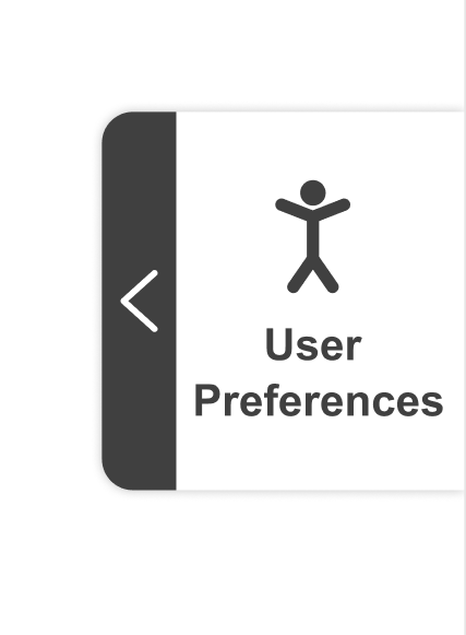
- The new design has the 'user preferences' button located on the right side of the page
- The button has dynamic scrolling with the page scrolling
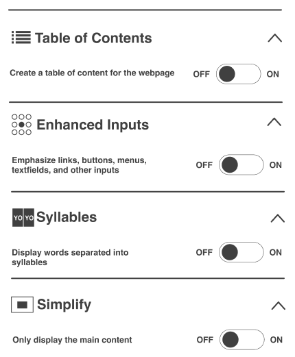
- The main panel has 7 main user preferences. Some of them have sub preferences.
- There are buttons such as a drop-down list, radio buttons, and sliders
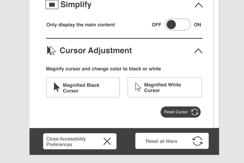
- There are 2 main buttons at the bottom: close accessibility panel (this is contract the expanded panel) and reset all filters (this will bring the web page to its default state)
Options:
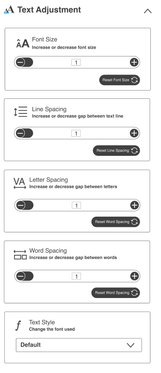
- Text Adjustment
- Font size
- Line spacing
- Letter Spacing
- Word spacing
- Text style
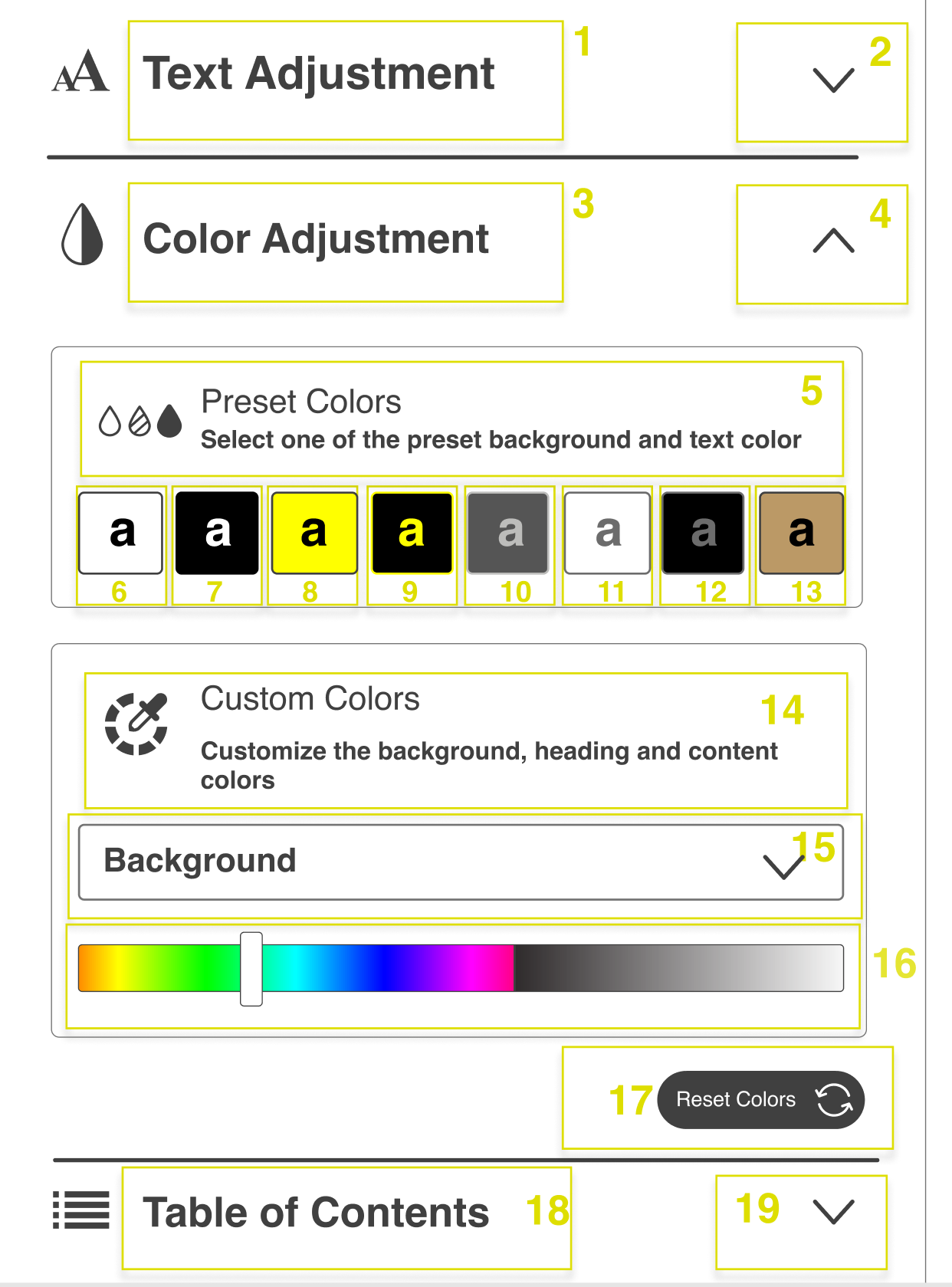
- Color Adjustment
- Preset colors
- Custom colors
- Table of contents
- Enhances Inputs
- Syllables
- Simplify
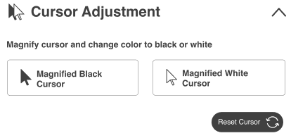
- Cursor adjustment
- Magnifies black cursor
- Magnifies white cursor
Navigating through the preferences (based on (Floe) UI Options Design Walkthrough, C.1)
- Arrow buttons
- clicking the down arrow button smoothly scrolls the boxes until the last overlapped box is first (or to in the closest spot to the left if remaining boxes would not fill full width)
- Scrolling / Swiping
- scrolling/swiping moves boxes depending on distance scrolled/swiped, on release boxes smoothly snap in order for the maximum amount to be fully visible and centered to the panel
- the is the verticle scroll bar located on the extreme right side
- Tab Order
- once the UIO panel is opened, the focus is moved to preference boxes (from first to last) followed by Close Preferences and Reset Filters button at the bottom
- focusing on preferences at the edge of the screen smoothly moves boxes over by one
- the focus will begin with the preference title and then the 'expand' arrow. If the user chooses to expand the section, then the focus will move to sub-sections.
Activating Preferences
- Mouse
- all UIO panel interactables switch to pointer cursor on hover
- slider uses both a pointer cursor on hover over the knob and the bar
- clicking on the icons at the beginning and end of a slider smoothly moves knob by 10%
- all UIO panel interactables switch to pointer cursor on hover
- Keyboard
- sliders and radio buttons are adjusted with arrow keys, check boxes and on/off switches are activated with space or enter
Widget Boxes Responsiveness
- adjusted margins to fit the maximum amount of boxes centred to the panel with 10-30% of next/previous boxes revealed on the sides
- minimum of 10px on right margins
User Preferences button
The button is located on right top corner when the user loads the pages. The button has dynamic scrolling as the user scrolls and navigates through the page
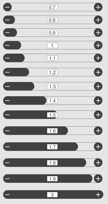
Section 1: Text adjustment
- This has 4 subsections. Each subsection has a reset button for further customization.
- The + and - buttons can be used to change the values.
- The default value will be 1 whereas 0.7 will be the minimum and 2 will be the maximum.
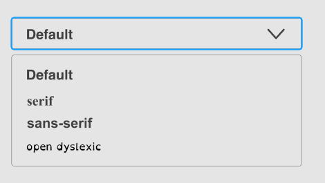
- The text style section had 3 main fount options
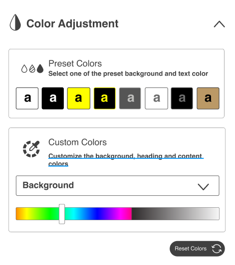
Section 2: Color Adjustment
- This has 2 subsections. The entire color section has 1 single reset button
- The preset colors section has the same uio colors based on the current design for quick changes
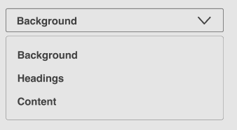
- users can you the custom colors section to change the background, headings and contents font
Section 3,4,5 and 6: Table of contents, enhances inputs, syllables
Based on the latest design on https://build-infusion.fluidproject.org/demos/prefsframework/ these sections are the exact same with similar buttons
Section 7: Cursor adjustments
- This section had 2 options to adjust and magnify and change the color of the cursor's appearance
- This section has its individual reset button
Bottom buttons
- There are 2 main buttons at the bottom: close accessibility panel (this is contract the expanded panel) and reset all filters (this will bring the web page to its default state)
User Interface Options in the nightly build demo site »
User Interface Options (also known as Learner Options) allows users to personalize interfaces and content to meet individual needs and preferences.
Features
With User Interface Options, the user can customize content the following ways:
- Text size and style
- Line spacing
- Colour and contrast
- Display a table of contents
- Emphasize links
- Simplify layout
- Enable text-to-speech without additional plugins or software
If used with the Floe Video Player, User Interface Options can also adjust:
- show captions and transcripts
- specify language
The General Idea
Computers are everywhere (on our smartphones, on a ticket kiosk, on a desktop computer, on a touch screen at the grocery store). The look and feel and presentation of content on those devices varies greatly and often doesn't meet individual needs and preferences. User Interface Options allows users to customize the presentation of material on devices to meet their unique needs and preferences.
A website developer will typically integrate User Interface Options into a site or application.
A number of sites already have User Interface Options implemented. Have a look:
The team is working on making a cloud-based UIO that will allow users to store "themes" in the cloud for easy reuse across our increasingly digital world.
That work is being led by the Floe Project and is also happening within the Cloud4All project and Preferences for Global Access Year 2 (2014-2015).