Android
Official Development Guide:
http://developer.android.com/guide/practices/ui_guidelines/index.html
Though slim, they are a must read. Separated into 4 sections: Icon Design, App Widget Design, Activity and Task Design, and Menu Design.
- Icon Design will be of limited use.
- App Widget Design could be handy if we are looking in ways to enhance the home page. These are little pieces of software that live on the desktop.
- Activity and Task Design describes much of the interaction management and philosophy between the user and the phone. Will be useful for our wireframes.
- Menu Design will be useful for our wireframes. They explain the difference between options and context menus, on the iphone.
Interface and Usablity
First, two reviews of the Android OS on T-Mobile's G1 that are worth looking at: here at Lifehacker and here at Gizmodo.
Notification Bar + Window Shade
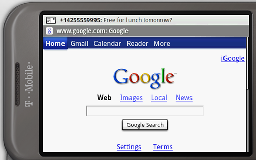
On the iPhone, while performing an activity, if your iPhone must alert you of something that has happened, it will interrupt you a pop up window that must be dismissed. The Android places these kinds of messages on the notification bar at the top. In the image below note the "Free for lunch tomorrow?"...
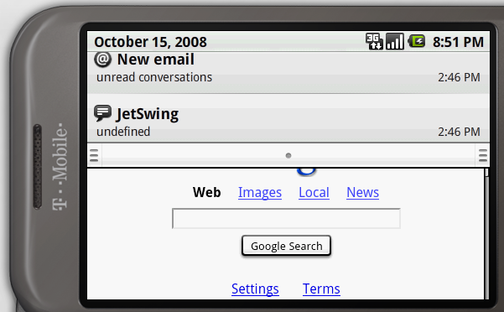
This is a very unobstrusive way to notify the user of events. To revisit these notifications and the user can pull that notification bar down like a window shade:
Users are able to add see a history of notification with this bar. This feature is something users respond very well too.
More Hard Buttons than iPhone
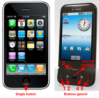
Its worth mentioning that a phone running android typically has:
- a trackball (which scrolls faster than the iPhone's swipe) or something similar for navigation
- a back button, which is used to navigate backward through activities. See the development guide on Activities and Tasks for more information.
Long Clicks
Like right-clicking on the mouse, they often pull up context menus. From the Gizmodo article. "One convention that's used often- but not consistently- is the long press. Long presses are a mix between right clicking and playing the lottery. Hold down an area of the screen- you may see a menu pop up or you may get absolutely nothing. Long click on the main screen and it asks you which app shortcut you want to move to your desktop. Long click on the text message screen and you'll be prompted to delete or view a thread. Long click on Google Maps or a page in the browser, however, and nothing happens."
No Multitouch
Possibly the single most complained about issue for the Android, it does not support multitouch, like the iPhone does. So we must be sure to design in a way that doesn't not use multitouch, no two finger swipes, no pinching, etc.
Android's Browser
Based on the webkit framework, much like iPhone's browser and Symbian's. Supports JavaScript and Google Gears. Cannot access Android Market for additional programs. Below is a screenshot of the browser inside the emulator from the software development kit (see below). The browser is accessing the Gustav Klimt tour from the Tate Liverpool. This was formatted for iPhone and iPod Touch and can be viewed within your browser right here: http://www.tate.org.uk/liverpool/exhibitions/gustavklimt/tour/iphone/#home
SDK Emulator:
The emulator can be downloaded here, and takes a tiny amount of command line work to run. I'll explain the most straight forward way to get it running. Download the windows version of the SDK, and extract the zip file. Open the window's command prompt (Start->Run->"cmd") and then the basics can be done in three commands:
1. Navigate to the "tools" directory, inside the main directory where you extracted the sdk.
2. android create avd -n my_android1.5 -t 2
3. emulator -avd my_android1.5
Then you can interact with the phone and browser to give yourself a better idea of how the browser behaves. Of course, it would be a more authentic experience to have the actual device, so if you can get your hands on one, ignore this.
A Web-based Android Simulator
This simulator offered by T-mobile is very easy to run right in your browser. This also lets you see what the Android Market looks like (but with limited functionality). The browser is not a real browser here though. :(
http://tmobile.modeaondemand.com/htc/g1/
Android Applications
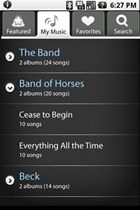
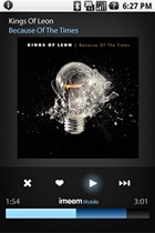
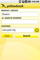
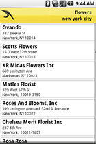
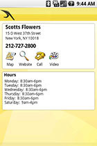
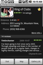
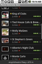
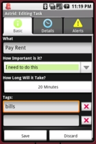
Apps are available for purchase in the Android Market. Though developing applications might not be our best choice, they serve as examples of good design. Below are screenshots from the Android Market place. If you wish to interact with these directly, you'll have to download and install them onto a mobile device already running Android (many are for free), or find their .apk files and install them into the emulator (will require patience).
Examples of good Design for applications:
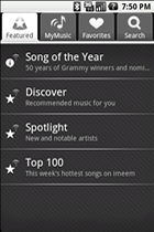
imeem Mobile
Yellowbook
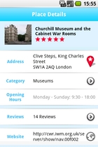
Places
USA Today (Ok, very busy, but still provides a consistent experience)
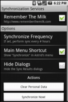
Astrid Task
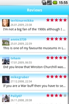
Qype Radar
DroidDraw
DroidDraw is a tool to help layout Android interfaces. http://www.droiddraw.org/
It is built to develop the code behind the layout, so your design may be easily portable into actual software.
PhoneGap
"PhoneGap is an open-source platform for developing mobile applications to run on a wide variety of handsets using only HMTL and Javascript. If you can write web pages, PhoneGap now makes you able to create mobile phone apps that will work on all kinds of phones; a neat trick given mobile phone apps use different languages. This program makes developing for all kinds of phones as simple as developing will be for the forthcoming Palm Pre. That's pretty hot.
Right now, PhoneGap works with the iPhone and Android, but the roadmap includes other platforms like Nokia, Palm, Blackberry, Windows, and other tools which include Dreamweaver, Eclipse, and Visual Studio." (pulled from www.readwriteweb.com)
Symbian
http://library.forum.nokia.com/ click on Design and User Experience library on the left.
http://gizmodo.com/5308440/nokia-n97-review-nokia-is-doomed Review of Phone running Symbian. Interesting quotation: "Symbian S60 5th edition user experience is garbage." We should take that lightly for the moment
