Infusion icons are used to visually represent a wide range of actions made possible by the infusion components. In order to create a coherent family of icons, the following visual style guide has been prepared to guide designers in creating new infusion icons.
Design Principals: simple, direct, and reduced to minimal form.
** The Google's Material Design-Icon Style has been consulted in order to structure this document.
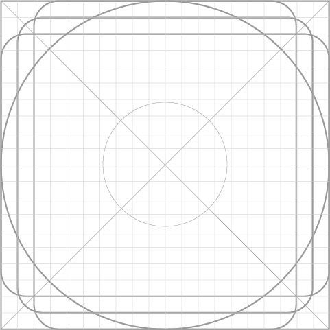
Grid
The following grid has been developed to create a consistent yet flexible framework for designing infusion graphic elements. The proposed grid system results in a coherent visual language among icons that have various shapes and positioning.
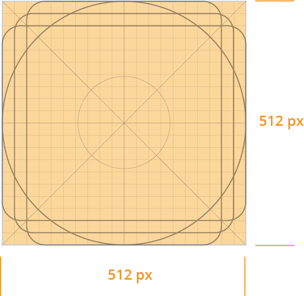
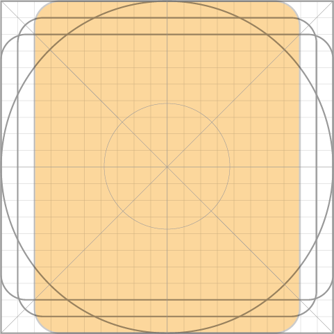
Content Area
The graphic elements should remain within the boundaries defined by the content area that is limited to 512px x 512px. Otherwise, there is a risk of cutting off a portion of the icon from view.
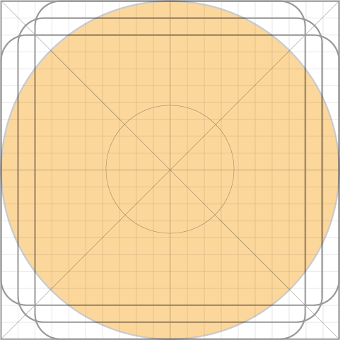
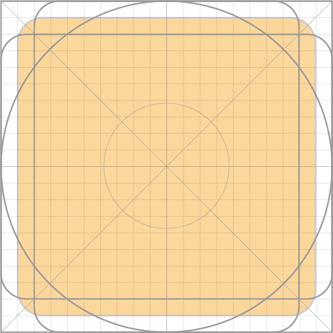
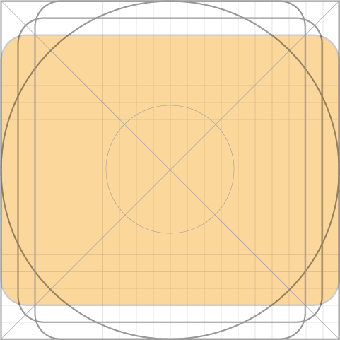
Shapes
The following templates provide a flexible guide for creating graphic elements within the grid system. Using these templates helps to maintain visual proportion and unify the final designs.
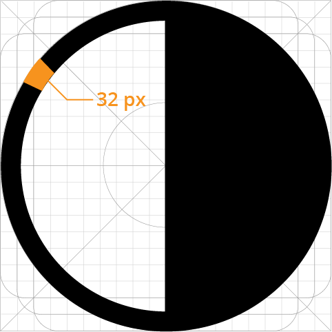
Stroke
Consistent stroke weights are key to unifying the overall visual language. Maintain a 32px width for all stroke instances, including curves, angles, and both interior and exterior strokes. Do not round the corners or cap of the stroke.
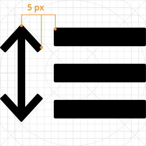
Corners
Consistent corner radius are key to unifying the overall visual language. A 5px corner radius is used on the silhouette form of the icon. Interior corners should be square.
Fonts
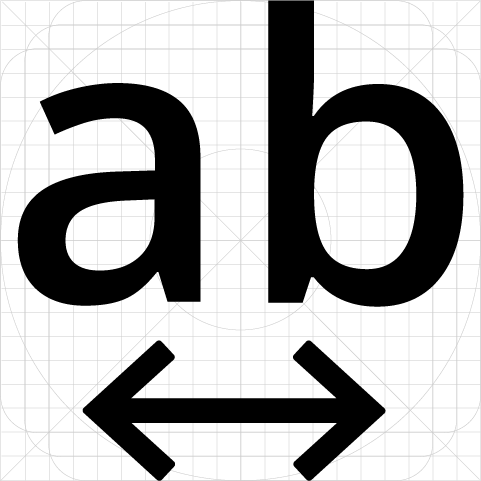
If there is a need to include type in an icon, use ‘Open Sans’ typeface. Use semi bold, or bold font weight.
** This is an open source Google font and can be found here: https://fonts.google.com/specimen/Open+Sans
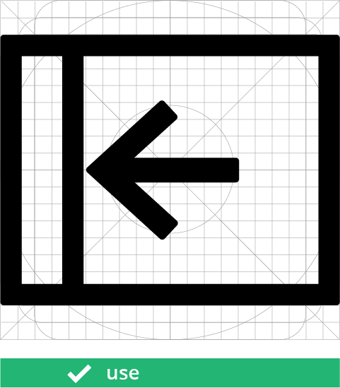
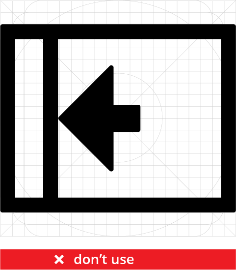
Arrowheads
The convention for the most legible arrow is a stroke with an open arrowhead. Avoid using solid arrowheads.
Best practices
Use uniform line width profile, don’t narrow or thicken the stroke width.
Don’t round the corners or cap of the stroke.
Don’t use thin, delicate stroke weights.
Don’t use strokes to represent solid shapes, such as rectangles.
Simplify icons to their essence, avoid complex details.
Make icons appear front-facing and sturdy, don’t tilt, or rotate.
Don’t skew or distort the forms.
Ensure readability and clarity in small sizes and high contrast settings.
Before exporting, position an icon “on pixel” – meaning the X and Y coordinates are integers and do not contain decimals.
Source Files
- Infusion Icons Master File - Updated: https://files.inclusivedesign.ca/s/JCULGOT068TXmGz
- Infusion Icon Master File - Original: https://files.inclusivedesign.ca/s/ISwyXhLLUemqagf