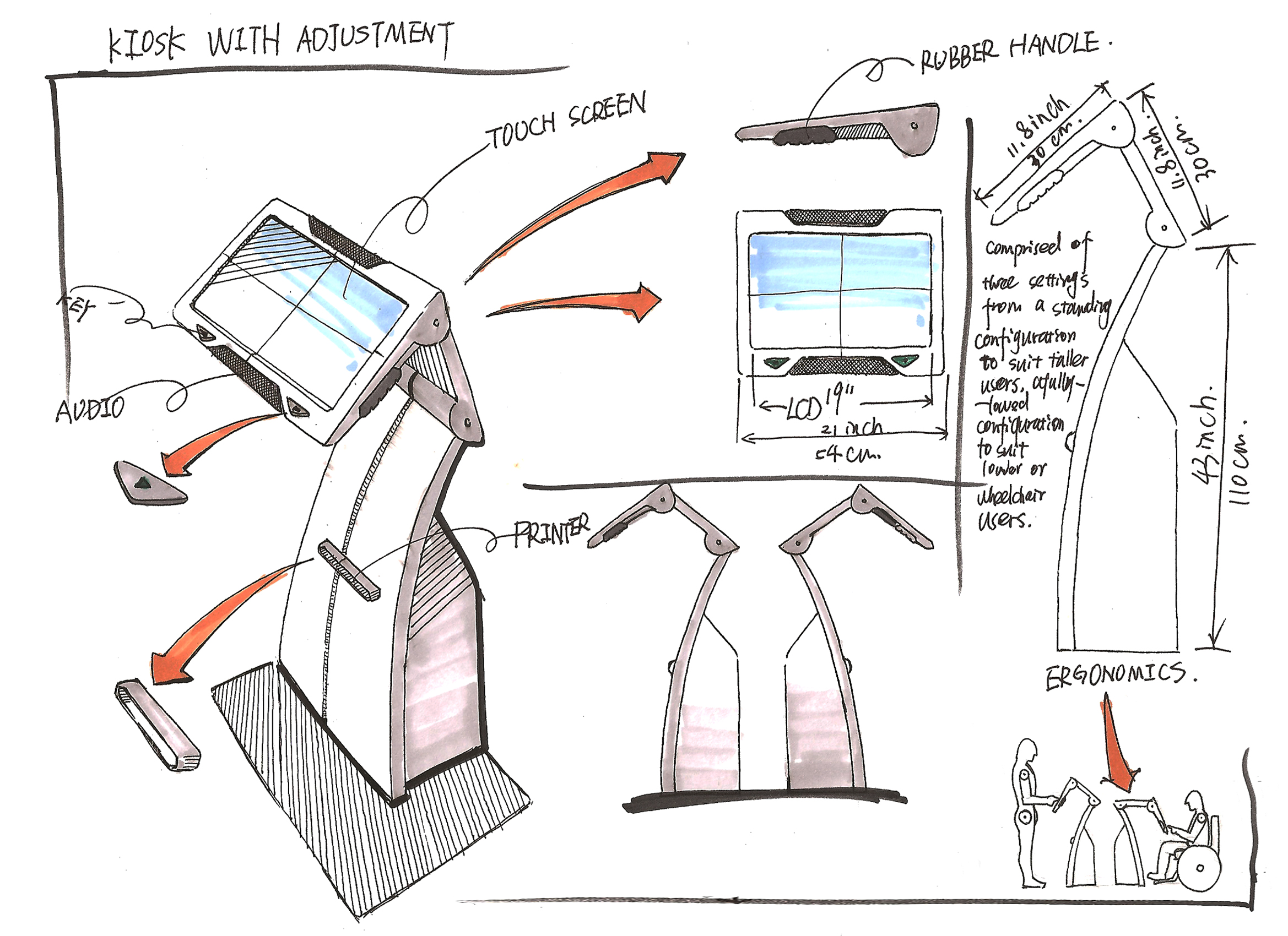
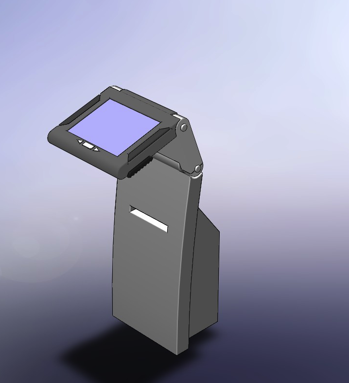
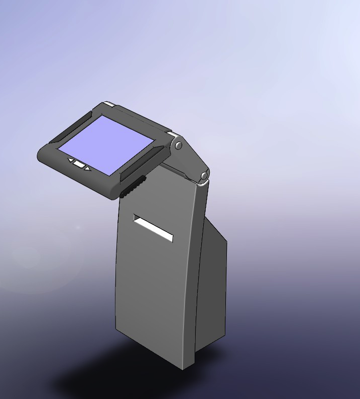
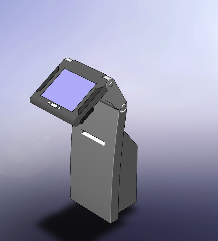
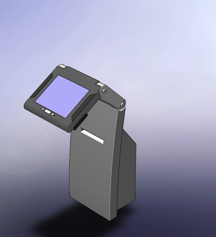
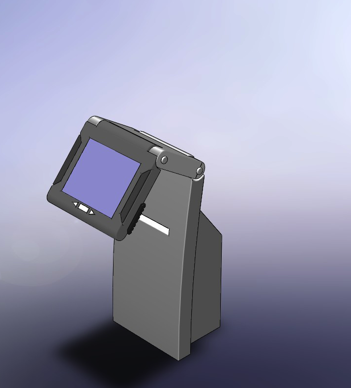
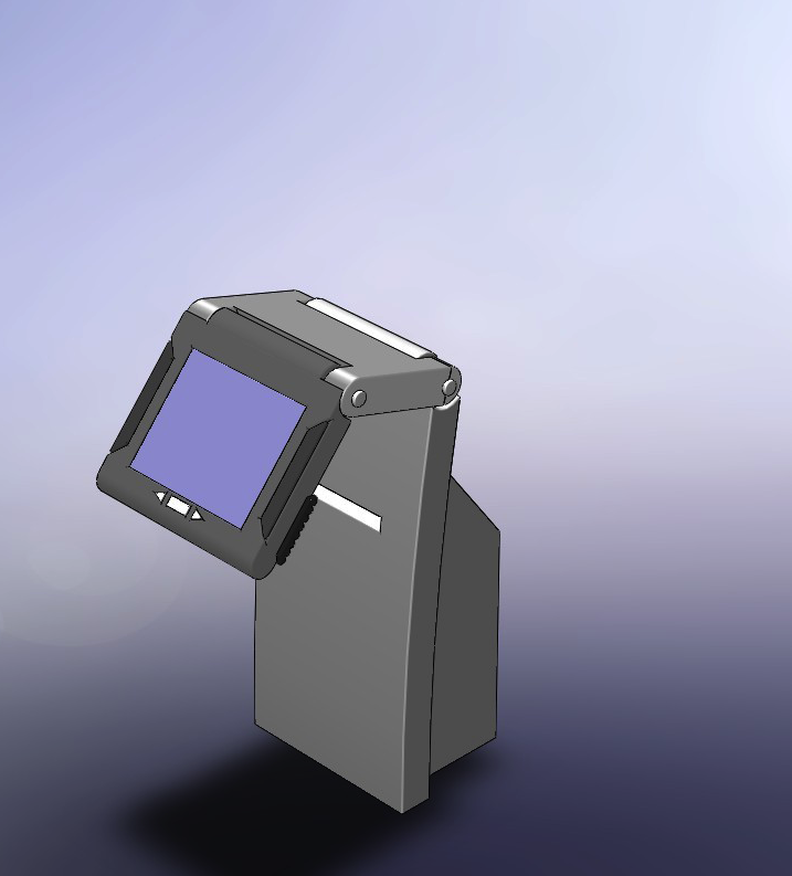
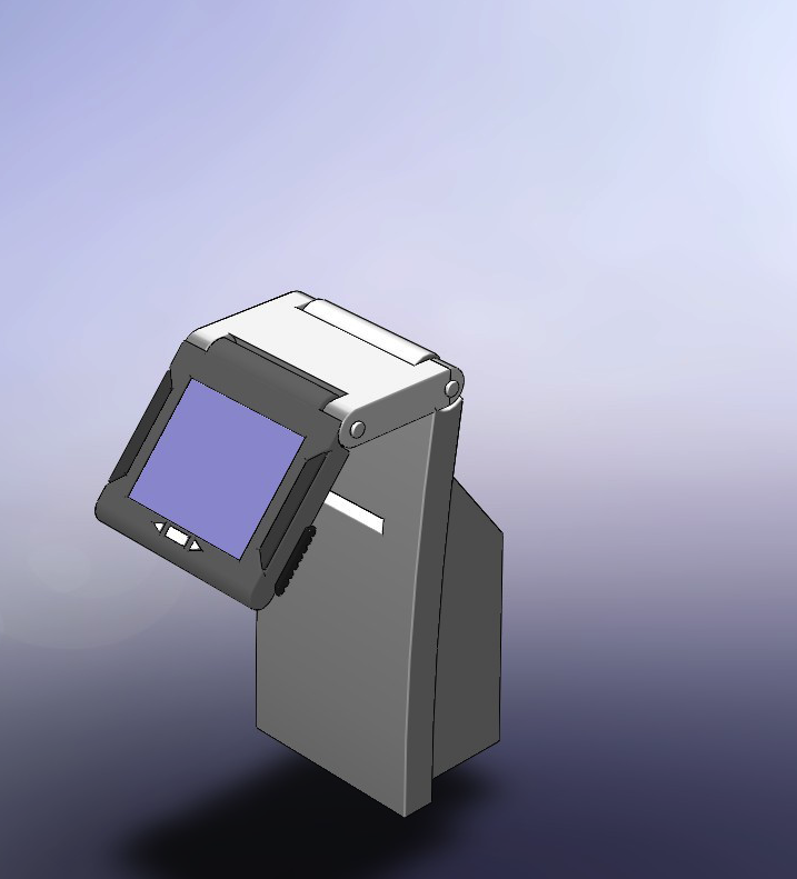
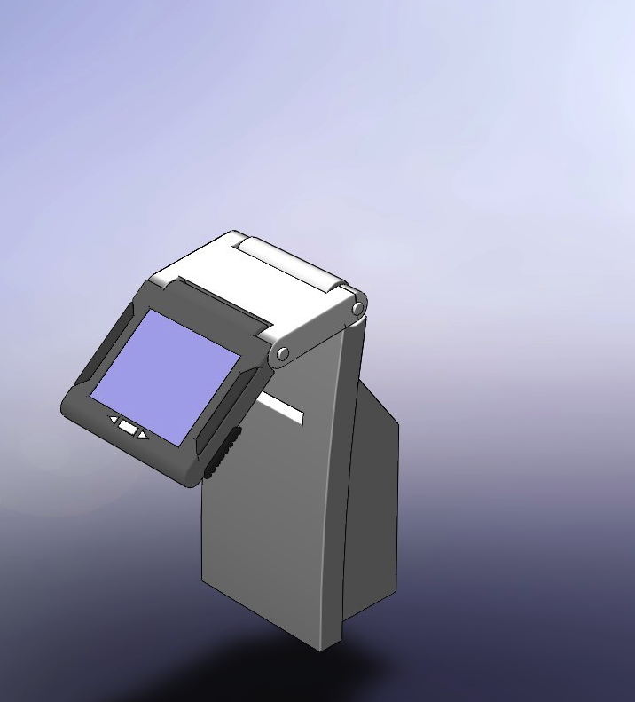
On this page we are documenting the 3D modeling concerns for the physical kiosk designs. The selected design is based on the previous concepts listed on this wiki page http://wiki.fluidproject.org/display/fluid/Accessibility+Design+Review Kiosk Model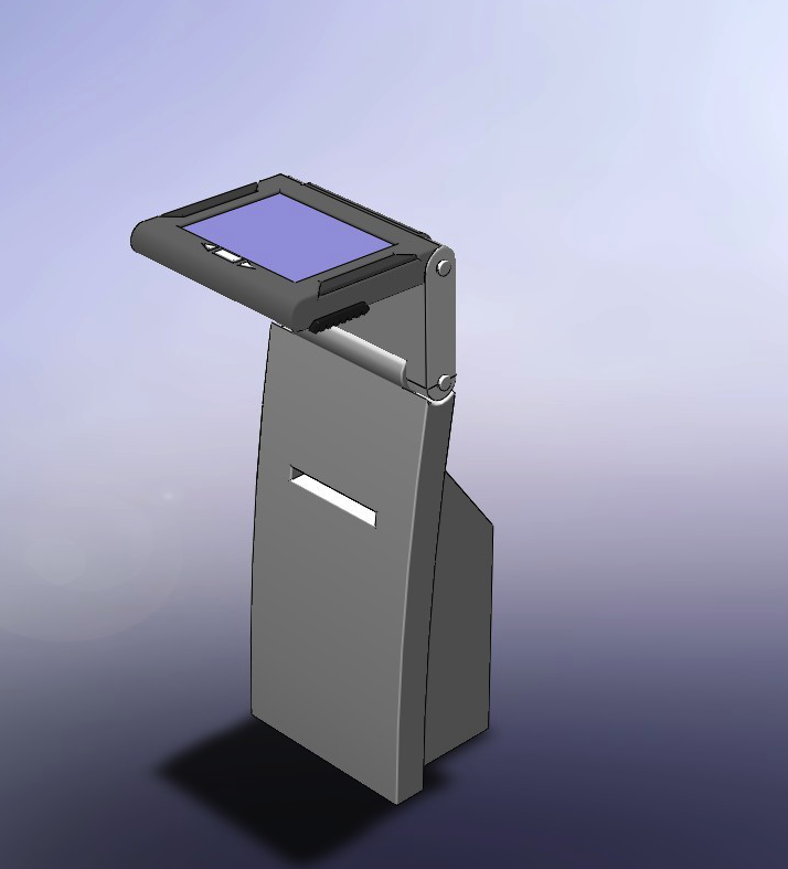 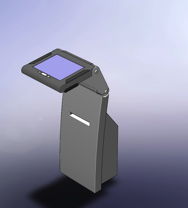
ErgonomicsWe have adopted universal design principles as away to accommodate the numerous dimensions of accessibility requirements. The Principles of Universal Design are presented on this web page http://www.design.ncsu.edu/cud/about_ud/udprinciplestext.htm 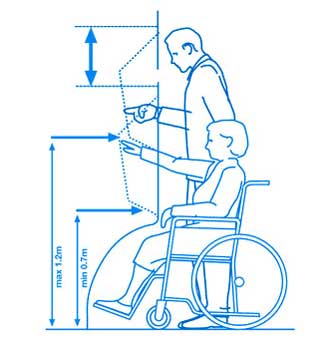
Base on the work documented this wiki page http://wiki.fluidproject.org/pages/viewpage.action?pageId=12911258, Option 2 were the buttons are separated from screen. As outlined considerations need to include: The physical button" size and features: - are easily differentiated from other parts of the kiosk
- provide some form of physical feedback when touched (you can tell when you press them)
- labelled with text and braille lettering
- order of buttons "back", "enter", "forward". Shape of buttons reflects purpose.
|