What is an Affinity Diagram?
| Excerpt |
|---|
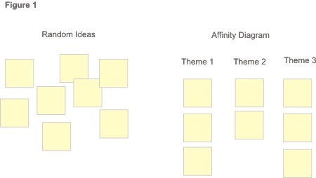
Affinity diagramming is a great way to synthesize and categorize large amounts of data by finding relationships between ideas. We tend to use them often for making sense of user research data. |
From: http://www.mindtools.com/pages/article/newTMC_86.htm
Why use Affinity Diagrams?
...
Analyze product evaluation data
- Make sense or of and prioritize User testing results
- Competitive analysis results
- Combine UX Walkthrough results from various reviews
...
We tend to use post-it notes and either the wall or large pieces of post-it note easel paper. The easel paper works great if you might need to move your subgroups around. Affintity Affinity diagram basics:
- Record each idea on cards or post-it notes
- Look for ideas that seem to be related
- Sort notes or cards into groups until all cards have been used
- Repeat as many times as needed
- Add labels to groups if appropriate
...
- Captured use case titles only
- Yellow post-its for current use cases
- Blue post-its for use cases we thought would be useful in a future system
- Wrote the participants' initials on back of each post-it note
- Mailed all post-it notes to one location
...
- a variety of pairs ran the sessions so noone no one had been to all of the sessions
3) Used video to connect the two locations
- 1 camera at Toronto and 2 2 at Berkeley, which was where the diagramming would physically happen.
- Idea behine behind 2 cameras was to have one that could be on the people talking and one that could be focused on the "wall of post-it notes"
- Toronto could control the cameras at Berkeley so they could move them to what they wanted to focus on.
4) Talked through each post-it note as a group and began placing them in groups on the wall
- This was iterative
- As soon as some themes started arising we created spaces easal easel-sized post-it note pages for those themes
...
- Sheets were strung all over our room
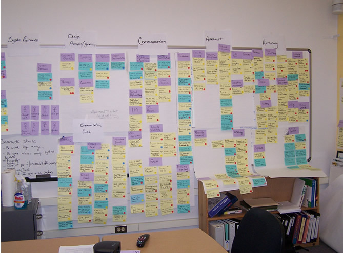
See all affintity affinity diagrams...
6) Used results to create a Use Case Frequency Matrix (full matrix available on content management research models page)
...
For more details on this project, check out the presentation given at the Sakai 2008 Paris Conference (.zip).
Lessons learned
- Use cases captured on the post-its were at a variety of levels of granularity. It would have been good to get more on the same page initially about the level at which we what level we wanted to initially work at.
- We lost the goals that led to the activities/use cases as we captured them from notes to post-its. The The goals are critical for innovation in creating a new system. We likely lost some forever and had to do a lot of backtracking to reconcile others. It would have been great to have captured them on the post-its in the first place.
- We were a little quick to combine post-its during the affinity diagramming. This was partly due to losing the context of the goals from notes to post-its.
- Could have "made mistakes faster" a little more on our first pass through with the post-its as several times we had much debate over where a post-it note belonged. It's better to go through the first time quickly and revisit with mulitple multiple quick iterations.
- There were many people involved in the research from a variety of institutions, so organizing time together was tricky (not to mention getting the video room scheduled). We had chunks of time together across several days. It would have been better to be heads down until we were done with at least one iteration. As it was, we had to get our heads in and out of it numerous times which carries high cognitive costs.