Drag and Drop - List Ordering Design Pattern
Problem Summary
The user needs to re-order items in a list of similar items, and does not need to visually preview the new layout before making the change.
Solution
In a Drag and Drop interaction, leave the original image in place as an avatar (a copy) of it is dragged. The original image should be altered to provide a visual cue that it is in a 'dragging' state (for example, set it to 50% opacity), and in the process of moving from its original location.
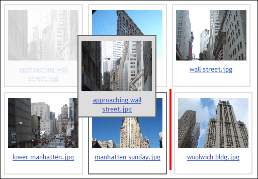
Use a drop target affordance such as a solid line, dotted line, or arrow to indicate the new potential position of a dragged item. As the item is dragged, the drop target affordance should follow the drag action, telling the user, "This is where this item will move if you drop here." Only after the item being dragged is released does it move to its new location.
Use When
There are many items viewable at one time, they are all of a uniform size and shape, and shifting them all around as one item is moved (as in the Drag and Drop - Layout Preview Design Pattern pattern) might be disorienting or cause a user to 'lose their place' within the list.
Some situations where this pattern may be used include:
- Ordering thumbnail images in an image gallery
- Ordering movies to be rented in a rental queue
How
Interesting Moment |
Example Visual Cue for Mouse |
Example Visual Cue for Keyboard |
Page Loaded |
Items shown as a list, grid, or other arrangement. Provide some sort of graphic drag affordances or textual description that tell the user dragging is possible. |
Same as for mouse. |
Mouse Hover |
Container border is highlighted and cursor changes from arrow to "hand." |
N/A |
Keyboard Select |
N/A |
User tabs to the draggable section, and the first item is selected. This is equivalent to the mouse "hover" action. Provide the user with a stronger visual cue than the one used for mouse "hover" to indicate that an item is actually selected (for example, container border is highlighted and object is in a gray frame). |
Mouse Down |
Enter "drag" mode. A visual indicator that the user is in a new mode may also be given (e.g. changing item to half-tone). |
N/A |
Control-Key Down |
N/A |
While the user is holding down the "Control" (CTRL) key, they are in "drag" mode. Item changes to half-tone to give the user a visual indicator that they are in a new mode. |
Mouse Up |
The user is no longer in drag mode. If the user was in the process of dragging an item, this completes the drag action. |
N/A |
Control-Key Up |
N/A |
The user is no longer in drag mode. If the user was in the process of dragging an item, this completes the drag action. |
Drag Initiated |
The user drags the item using the mouse to its new desired location. A half-tone preview of the item being dragged remains in its original location. |
While holding the "Control" (CTRL) key, the user uses the arrow keys to move the item to a new location. |
Drag Over Valid |
Preview the new placement by showing a horizontal bar between the items where the item being dragged will be dropped. |
Same as mouse. |
Drag Over Invalid |
The selected item "snaps" to the closest valid position (meaning a place where the item is allowed to be dropped). |
There are no "invalid targets" for a keyboard user, as they are only shown valid options. |
Drag Over Original |
No horizontal bar is shown. If dropped, item will return to its original location. |
Same as mouse. |
Drop Accepted |
Item placed in the drop location. The moved item has a highlighted border and is in a gray frame. The other items on the page re-arrange to form the new order. |
Item placed in the drop location. The moved item has a highlighted border and is in a gray frame. |
Drop Rejected |
Return to the original state (the original ordering). Additionally, the originally selected item remains in Mouse Hover mode. |
Return to the original state (the original ordering). Additionally, the originally selected item remains in Keyboard Select mode. |
Drop on Original |
Same as Drop Rejected. |
Same as Drop Rejected. |
Accessibility
Please refer to the parent Drag and Drop Design Pattern pattern for accessibility guidelines.
Examples
Related Fluid Components
Please refer to the parent Drag and Drop Design Pattern pattern for related Fluid components.
Related Patterns
- Drag and Drop Design Pattern - parent
- Drag and Drop - Layout Preview Design Pattern - sibling