Drag and Drop - Layout Preview Design Pattern
Problem
User needs a way to visually preview the new layout of a group of items after one item is dragged to a new position.
Solution
Provide an in-context preview of the item's new position within the current layout. This preview is visible during the 'dragging' stage of the Drag and Drop action. As the user drags around the item, the preview follows the drag action and indicates the potential new position if dropped.
Depending on the situation, this preview may be a high fidelity copy of the original item, or a low fidelity representation (i.e. a blank box with a dotted line). The important thing is that the preview is be the same dimensions and orientation as the original item, so that the user can see precisely what the new configuration will look like before they commit the change (by dropping the item).
Use When
Use this pattern with caution, as it can be visually disorienting to users to shift many items around as one item is moved might, or cause them to 'lose their place' within the list.
This pattern should be used when:
- It isn't possible to make clear how the layout will change using just an indicator (such as a bar or an arrow) of the new location of the dragged item
- A user needs to see the visual form (e.g. shape, balance, negative space) of the new layout in order to know whether to drop the object
- A user needs to see all the objects in their new order before making a decision that they should complete the movement of an object (in this case the preview will most likely be a high fidelity copy of the original item)
Some situations where this pattern may be used include:
- Reordering modules in a portal environment, especially if they are different sizes and can move horizontally as well as vertically
- Repositioning items in a WYSIWYG editor
How
Here are some examples of visual cues that might be used to reinforce the interaction:
Interesting Moment |
Example Visual Cue for Mouse |
Example Visual Cue for Keyboard |
Page Loaded |
Items shown as a list, grid, or other arrangement. Provide some sort of graphic drag affordances or textual description that tell the user dragging is possible. |
Same as for mouse. |
Mouse Hover |
Container border is highlighted and cursor changes from arrow to "hand." |
N/A |
Keyboard Select |
N/A |
User tabs to the draggable section, and the first item is selected. This is equivalent to the mouse "hover" action. Provide the user with a stronger visual cue than the one used for mouse "hover" to indicate that an item is actually selected (e.g, container border is highlighted and object is in a gray frame). |
Mouse Down |
Enter "drag" mode. A visual indicator that the user is in a new mode may also be given (e.g. changing item to half-tone). |
N/A |
Control-Key Down |
N/A |
While the user is holding down the "Control" (CTRL) key, they are in "drag" mode. Item changes to half-tone to give the user a visual indicator that they are in a new mode. |
Mouse Up |
The user is no longer in drag mode. If the user was in the process of dragging an item, this completes the drag action. |
N/A |
Control-Key Up |
N/A |
The user is no longer in drag mode. If the user was in the process of dragging an item, this completes the drag action. |
Drag Initiated |
The user drags the item using the mouse to its new desired location. A half-tone preview of the item being dragged remains in its original location. |
While holding the "Control" (CTRL) key, the user uses the arrow keys to move the item to a new location. A half-tone preview of the item being dragged remains in its original location. |
Drag Over Valid |
Preview the new placement by moving the original image into the new potential position. The item is moved immediately, previewed as a half-tone image until the user releases the mouse button. |
The item is moved immediately, previewed as a half-tone image until the user releases the "Control" (CTRL) key. |
Drag Over Invalid |
The selected item "snaps" to the closest valid position (meaning a place where the item is allowed to be dropped). |
There are no "invalid targets" for a keyboard user as they are only shown valid options. |
Drag Over Original |
The item appears in its original position, with the 'drag mode' visual cue still applied. |
The item appears in its original position with the 'drag mode' visual cue still applied until the user releases the "Control" (CTRL) key. |
Drop Accepted |
Item placed in the drop location. The moved item has a highlighted border and is in a gray frame. The other items on the page re-arrange to form the new order. |
Same as mouse. |
Drop Rejected |
Return to the original state (the original ordering). Additionally, the originally selected item remains in Mouse Hover mode. |
Return to the original state (the original ordering). Additionally, the originally selected item remains in Keyboard Select mode. |
Drop on Original |
Same as Drop Rejected. |
Same as Drop Rejected. |
Accessibility
Please refer to the parent Drag and Drop Design Pattern pattern for accessibility guidelines.
Examples
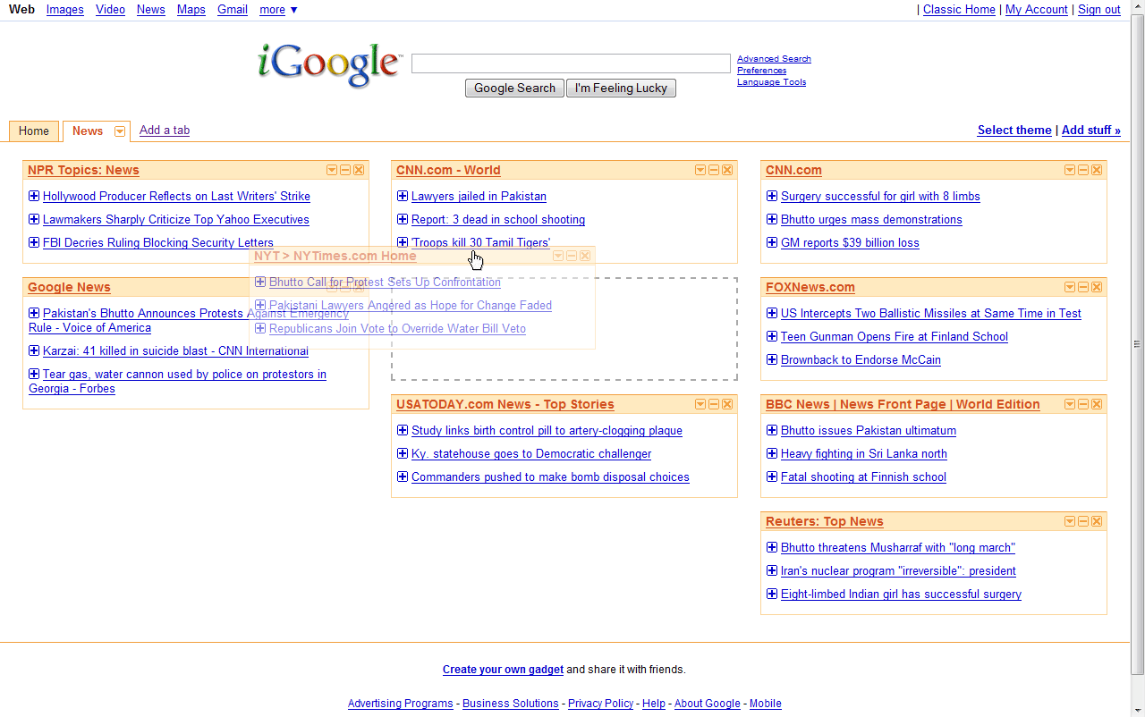
Related Fluid Components
Please refer to the parent Drag and Drop Design Pattern pattern for related Fluid components.
Related Patterns
- Drag and Drop Design Pattern - parent
- Drag and Drop - List Ordering Design Pattern - sibling