uPortal Walkthrough - Ed (Student) Persona (Dogle)
User Experience Walkthrough Report
Customized Walkthrough Reports
Available for:
Generic Walkthrough Report
(Accessibility and usability heuristic evaluations combined with cognitive walkthroughs)
Evaluation Completed by: [Insert evaluators name]
URL: https://my.ubc.ca/render.userLayoutRootNode.uP
Date: September 13, 2007
Heuristic reviews and cognitive walkthroughs were performed on a [computer type] at [screen resolution] resolution (most common resolution) and [color setting] colors (most common novice resolution; if graphics work at this resolution, they'll work in higher resolutions) using [Browser and Operating System] at a [type of connection is internet required] connection rate.
See Heuristic Evaluation for heuristics used in this evaluation.
Scope of Walkthrough
• Managing Conent
User profile(s) and context of use:
Profiles will generally only be used for the cognitive walk-through, not the heuristic evaluation. However, users may be set up with a certain role in the system (e.g. student, instructor) for the heuristic evaluation.
Scenarios
Scenarios will generally only be used for the cognitive walk-through, not the heuristic evaluation. However, it is fine to use these scenarios for the heuristic evaluation if it is helpful to evaluators in figuring out how to walk through the application.
- General Overview
- Ed has just completed his first-time student registration process and is now going to the portal to check his institution email for the first time. Ed is also curious about what online services are offered and what the university portal is like. (portal, login, webmail)
Kathy Moore (done) - Ed is finishing registering for spring semester classes for his freshman year and needs to clarify and verify the registration deadlines. (calendar and/or announcements)
Kathy Moore (done) - Ed wants to complete registration for spring semester classes for his freshman year. (SIS, course browsing, course registration, e-commerce)
- Ed wants to find and purchase used textbooks for his classes (LMS, web content, e-commerce)
- Ed needs to find the location of his class on the campus map.
- Ed needs to check his course for current assignment details. (LMS)
- Ed is searching for his instructor's contact information to email a question regarding the assignment (LMS, faculty directory)
- Ed wants to IM/chat with his classmates regarding the assignment (LMS, chat)
- Ed needs to submit his assignment. (LMS, dropbox)
- Ed wants to check his grade for his assignement (LMS, SIS)
- Ed needs to see when the next bus/shuttle will be coming and if he has enough time to finish watching his TV program before heading to the bus stop.
- Ed missed the college football game last weekend and wants to check the scores, coverage, news, and/or highlights from the game. (news, athletics content)
- Ed desires to find out about community/cultural events for the upcoming weekend when his family is coming to visit. (calendar, message boards)
- Ed would like to find out if anyone is selling a cheap couch that he can put in his dorm room. (classifieds)
Kathy Moore (done) - Ed wants to know when his library books are due - alternatively, he wants to see if the books he wants are available for check out. (library)
- Ed needs to pay for parking. (e-commerce)
- Ed wants to know what is on the menu for dinner at the cafeteria. (web content)
- Ed would like to find out the hours the recreation center is open and what time the box-aerobics class is scheduled. (web content)
- Ed is curious to see what part-time employment opportunities are available (web content, career services)
- Ed has finally acquired a set of wheels and wants to know what the availability and costs are for parking on campus.
Assumptions for this evaluation:
• [List any additional assumptions used in evaluation]
Positive Findings
All positive findings, from both the heuristic evaluation and the cognitive walk-through, should be placed in this section.
Usability Positives |
Tool |
Evaluator |
|---|---|---|
After logging in the system calls me by name so I clearly know I am logged in correctly |
general |
DO |
System allows me to minimize and maximize portlets as needed to rearrange my limited real estate |
general |
DO |
|
|
|
|
|
|
|
|
|
|
|
|
|
|
|
|
|
|
|
|
|
Accessibility Positives |
Tool |
Evaluator |
|
|
|
|
|
|
|
|
|
|
|
|
|
|
|
|
|
|
|
|
|
|
|
|
|
|
|
Summary of Usability & Accessibility Issues Found
All usability & accessibility issues found, in both the heuristic evaluation and the cognitive walk-through, should be placed in this section.
Priority Legend:
High = Task cannot be completed
Medium = Task completed with significant effort and failed attempts
Low = Task completed with minor complications and/or annoyance
Usability Issues |
Principle |
Link to screen shots |
Priority |
Suggestions for solution |
Tool |
Component Identified? |
|---|---|---|---|---|---|---|
General |
|
|
|
|
|
|
Can I customize my pages: "main", "webmail", "info finder", e-learning", etc.? If so, I can't figure out how to do anything except make portlets go away. |
User control & freedom |
|
High |
|
|
Page customizer |
User shoiuld be able to organize the portlets on a page to fit their needs. |
User control & freedom |
|
High |
Utilize the "organizer" component. It will need to be enhanced for this particular context |
|
Layout manager (organizer) |
Prior to Login |
|
|
|
|
|
|
|
|
|
|
|
|
|
|
|
|
|
|
|
|
Main |
|
|
|
|
|
|
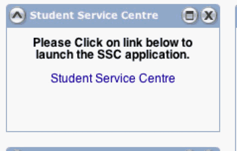
Bold text in the "Student Service Centre" draws the eye yet should be unessasary. The link itself should look like a link and be descriptive enough not to have text above it explaining to click it to launch the app. |
Minimalist Design - Every unit of information on the page competes with relevant units of information. |
|
Low |
|
|
|
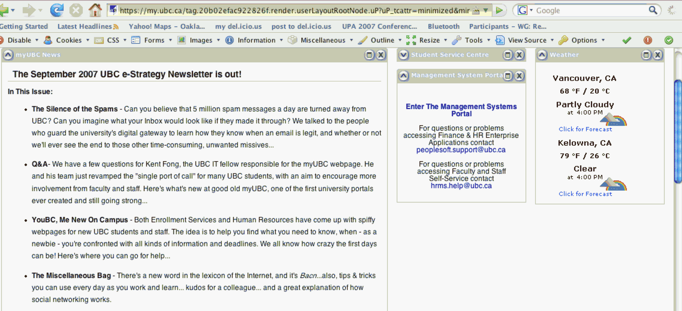
Clicking on the open close carrot to close the portlet, in this case "Student Service Centre" leaves the screen in a strange place. The screen auto-scrolls so the carrot is at the top of the page (see screen shot). The screen movement is jarring and there is no need to bring the carrot into focus in this case. |
Jarring & user looses sense of where they are since screen changes automatically |
|
Low |
|
|
Minimizer |
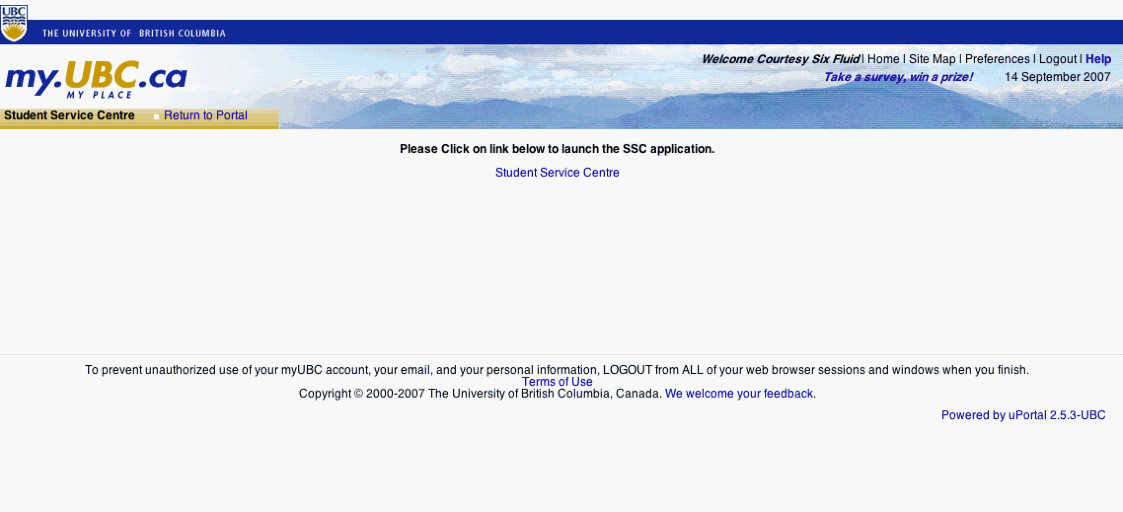
After maximizing the portlet, it is difficult to tell how to get back to the view I was just on. User has to see and click on the Blue "Return to Portal" link near the top left of the screen. Because of the location and the background it is very easy to miss. |
User control & freedom - users often choose system functions by mistake and will need a clearly marked "emergency exit" to leave the unwanted state quickly. |
|
Medium |
Make the link pop by making it look more like a link and move it away from the logo, etc. |
|
Undo and/or Back |
When a link will take the user to a new a window there should be some indication of that on the page for both sighted and non-sighted users. Window management is complex for some users and they will have difficulty getting back to the original window...especially if they were expecting the object to open within the existing window. This is especially true in the weather portlet where I expect clicking on "click for forecast" to show me more information in-line as it does when I'm on the weather website, weather.com. Even if the user knows they are opening an application, we should not assume they know it will open in a new window. |
Visibility of system status & |
|
Medium |
Add text or an icon to indicate a new window will open. If possible make it easy to get back to the original from the new window |
All portlets that spawn a new window |
Undo and/or Back |
After logging in, I have both the "student service centre" and the "management system portal" portlets available to me. The system should be smart enough to know who I am and tailor the portlets to me. I assume I would not have access to both of the systems. |
Minimilist Design - screens should not contain information which is irrelevant or rarely needed. |
|
Low |
Only show relevant portlets based on who the user is. |
|
Who am I? |
What if I want to change the cities showing in the weather portlet? As a student, I very likely want to see the weather back home along with in Vancouver (in the case of UBC). I can't figure out how to change it. |
Flexibility and efficiency of use |
|
High |
Allow users to customize the cities. If this is already the case, make it clear to users from this page how to do it. |
|
|
Choosing the X in the upper right hand corner of a portlet displays a message that says "are you sure you want to remove this channel?" No, I'm not, what does that mean to remove it. Can I ever get it back. Browsers use this icon to close (rather than remove) the window. After I removed it, it seems to be gone forever. |
Consistency and standards |
|
High (because you can't get the portlet back once it's gone) |
|
|
Portlet manager (remove & re-add, etc.) |
|
|
|
|
|
|
|
|
|
|
|
|
|
|
Webmail |
|
|
|
|
|
|
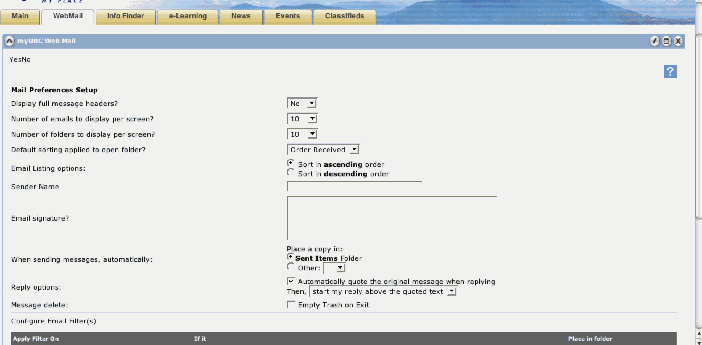
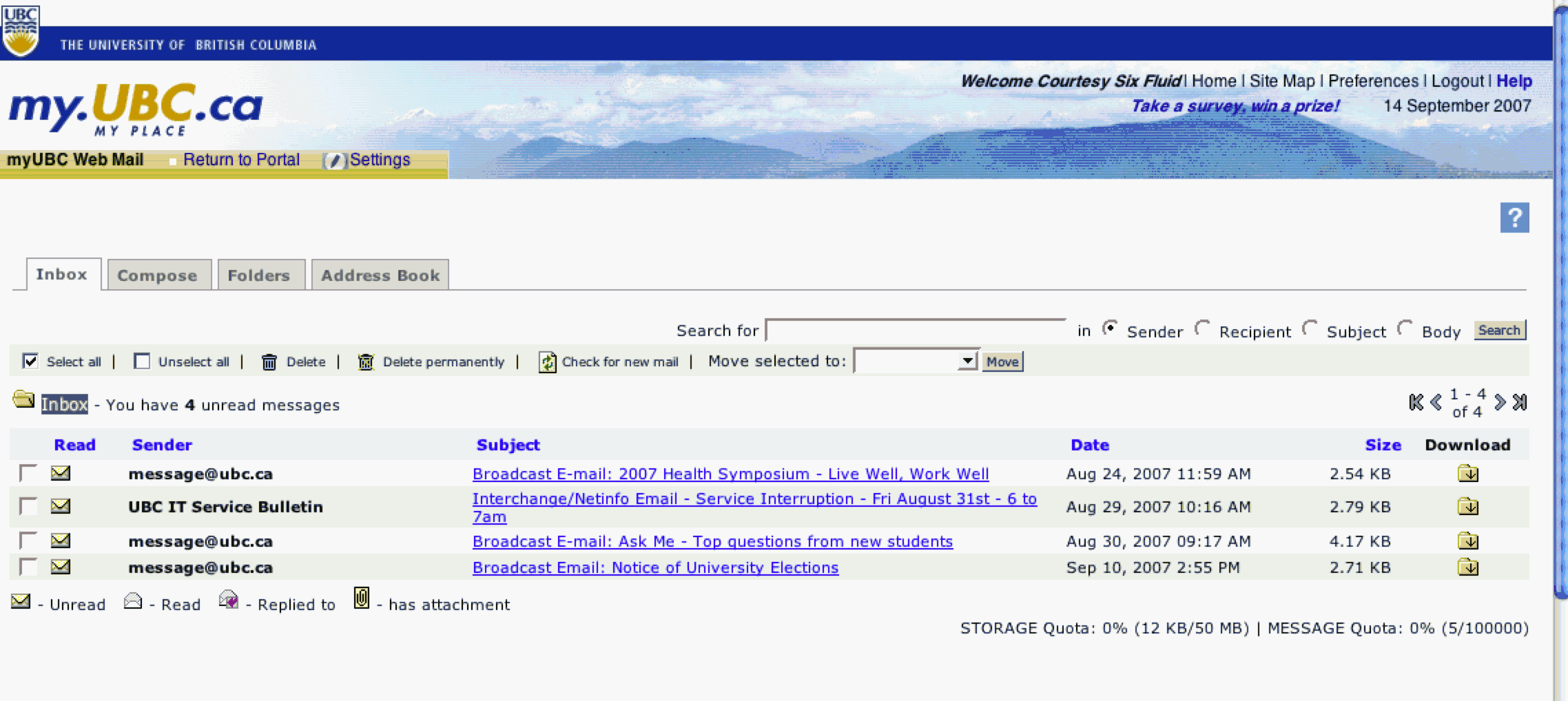
Webmail settings form's layout is very difficult to read: |
Minimilist design |
|
Low |
-Shorten labels and move inputs over OR left align labels to the input fields. |
|
|
The help ? should indicate it will open in another window. As referenced above, window management can be complex. Users's need to know when they will be managing more than 1 window |
User control & freedom - users often choose system functions by mistake and will need a clearly marked "emergency exit" to leave the unwanted state quickly. |
|
Medium |
|
Webmail |
"Open new window" notifier |
While in settings, which seems to be edit mode, of the portlet, the pencil icon is still available. Clicking on it seems to only refocus the screen so that tool bar is at top screen. |
Minimalist Design - screens should not contain irrelevant information |
|
Medium |
Hide the icon when it can't be used or at minimum grey it out to show there is nothing to do with it. |
Webmail |
|
While in edit mode, the save and cancel buttons are below the fold making it hard to see them. Not seeing the cancel button, it's natural to use the X in the top right corner to try to get out of where you are. This is BAD since it will remove the webmail. |
Error prevention & User control and freedom |
|
Medium |
Display buttons at top and bottom. |
Webmail |
"Undo or back to previous view" |
Once I went to settings and then canceled out, the tab navigation disappeared along with the portlet toolbar. I now have "settings" and "return to portal" links. Several issues here with navigation: |
Consistency & standards |
|
Medium |
Tabs should always be available. |
Webmail |
Top level navigation (like Sakai's tabs to sites) |
There is much to say about the webmail app itself but I'm not sure how much we can control. I assume this is an outside app. If not, it should be looked at more carefully from a heuristic perspective. |
|
|
|
|
|
|
|
|
|
|
|
|
|
Info Finder |
|
|
|
|
|
|
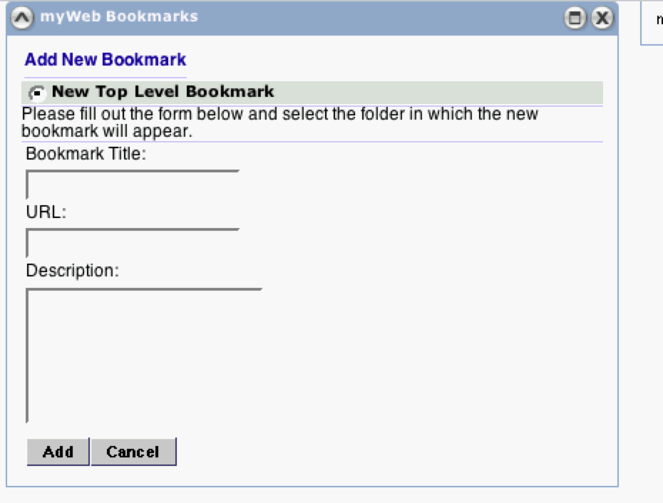
myWeb Bookmark's content completely changes when the icon for adding a new bookmark is clicked. It opens the form to add a new one which is great but there is no reason to lose the high level navigation. All the sudden it looks like something completely different and with the screen jumping that happens, it's very disorienting. |
Consistency & Standards. |
|
Medium |
|
|
|
Web Search: After typing in a search term and choosing "google search", a new window or tab opens with the search results. There doesn't seem to be much value in having this in the page when it is as easy as opening your own new window or tab to type in search results. Especially since this has the same window management issues referred to in several other issues...when it is unexpected. |
Minimalist Design |
|
Medium |
Show search results in-line in the portlet. |
|
Window manager? |
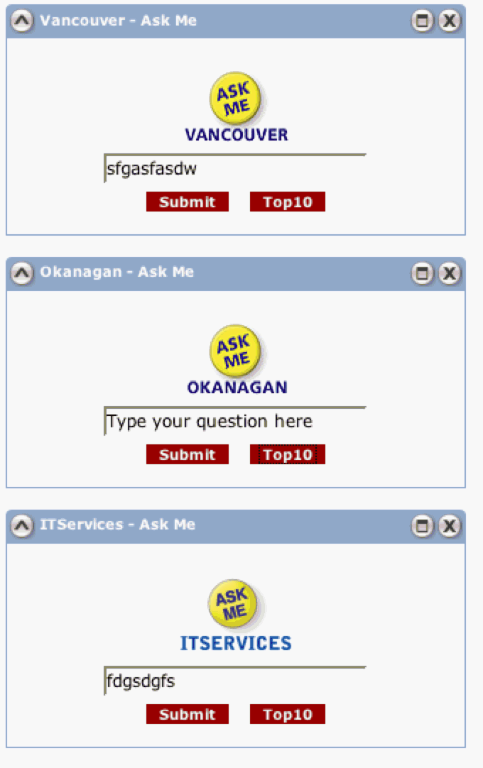
If I am a new student, it's not clear that the 3 different "ask me" portlets would make sense to users. Is it really necessary to have 3 different ones or could there just be one "ask me" that works like google? |
Minimilist Design |
|
Low |
Only include one "ask me" with either one search box or if 3 boxes are necessary, describe how each are different -- perhaps even, "Vancouver campus", "Okanagan campus" & "Technology questions" or something like that. |
|
|
E-Learning |
|
|
|
|
|
|
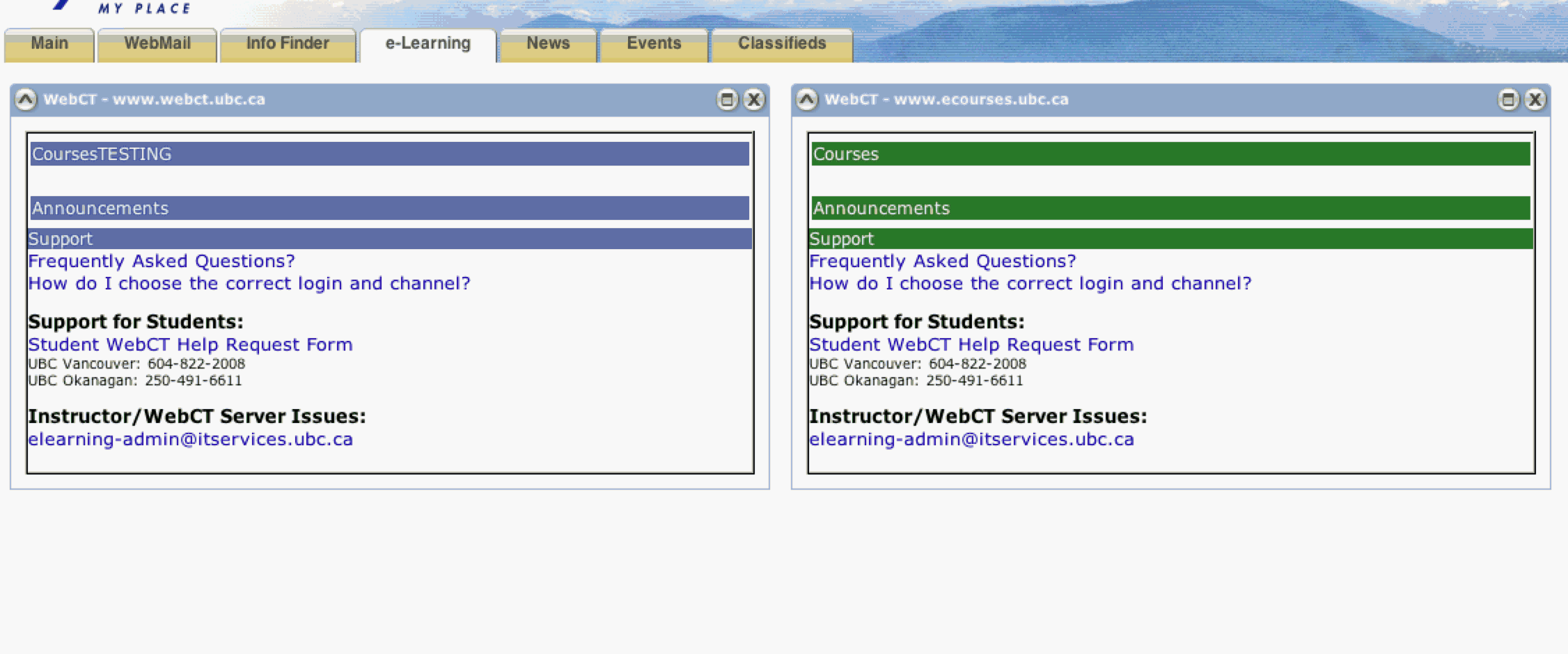
There are 2 webCT portlets on this page and no indication how they are different or which one I should use. I seems like they are different because they are different colors and have slightly different titles, "Courses" & "CoursesTESTING". As a student, I don't know what this means. |
Minimilist Design (if I don't really need both of these) |
|
Medium |
|
|
|
|
|
|
|
|
|
|
|
|
|
|
|
|
|
|
|
|
|
|
|
|
News |
|
|
|
|
|
|
|
|
|
|
|
|
|
|
|
|
|
|
|
|
Events |
|
|
|
|
|
|
|
|
|
|
|
|
|
|
|
|
|
|
|
|
Classifieds |
|
|
|
|
|
|
|
|
|
|
|
|
|
Accessibility Issue |
Principle |
Link to screen shot |
Priority |
Suggestions for solution |
Tool |
Component identified? |
|---|---|---|---|---|---|---|
|
|
|
|
|
|
|
|
|
|
|
|
|
|
|
|
|
|
|
|
|
|
|
|
|
|
|
|
|
|
|
|
|
|
|
|
|
|
|
|
|
|
|
|
|
|
|
|
|
|
|
|
|
|
|
|
|
|
|
|
|
|
|
|
|
|
|
|
|
|
|
|
|
|
|
|
|
|
|
|
|
|
|
|
|
|
|
|
|
|
|
|
|
|
|
|
|
|
Cognitive Walkthrough Worksheet
This section should be used by evaluators to keep track of the steps & screens they followed through the application in the cognitive walk-through. Any positive results or issues found should be included in the two sections above.
Scenario 1: Brief description
# |
Step |
Screen |
Comments/issues |
Principle |
Suggestions for solution |
|---|---|---|---|---|---|
|
|
|
|
|
|
|
|
|
|
|
|
|
|
|
|
|
|
|
|
|
|
|
|
|
|
|
|
|
|
|
|
|
|
|
|
|
|
|
|
|
|
|
|
|
|
|
|
|
|
|
|
|
|
Scenario 2: Brief description
# |
Step |
Screen |
Comments/issues |
Principle |
Suggestions for solution |
|---|---|---|---|---|---|
|
|
|
|
|
|
|
|
|
|
|
|
|
|
|
|
|
|
|
|
|
|
|
|
|
|
|
|
|
|
|
|
|
|
|
|
|
|
|
|
|
|
|
|
|
|
|
|
|
|
|
|
|
|
Scenario 3: Brief description
# |
Step |
Screen |
Comments/issues |
Principle |
Suggestions for solution |
|---|---|---|---|---|---|
|
|
|
|
|
|
|
|
|
|
|
|
|
|
|
|
|
|
|
|
|
|
|
|
|
|
|
|
|
|
|
|
|
|
|
|
|
|
|
|
|
|
|
|
|
|
|
|
|
|
|
|
|
|
Scenario 4: Brief description
# |
Step |
Screen |
Comments/issues |
Principle |
Suggestions for solution |
|---|---|---|---|---|---|
|
|
|
|
|
|
|
|
|
|
|
|
|
|
|
|
|
|
|
|
|
|
|
|
|
|
|
|
|
|
|
|
|
|
|
|
|
|
|
|
|
|
|
|
|
|
|
|
|
|
|
|
|
|
