uPortal Walkthroughs - Admin Staff Persona Brad Dieger (Kathy)
(Accessibility and usability heuristic evaluations combined with cognitive walkthroughs)
Evaluation Completed by: Kathy Moore
URL: http://wiki.fluidproject.org/pages/createpage.action?spaceKey=fluid&fromPageId=328018
Date: September 12, 2007
Heuristic reviews and cognitive walkthroughs were performed on a Dell pc at 1152 resolution and millions of colors using Firefox on Win xp over a T1 connection.
See UX Walkthrough Heuristics for heuristics used in this evaluation.
Scope of Walkthrough
• See uPortal Evaluation Plan
User profile(s) and context of use:
Persona: Brad Dieger, admin/staff, Faculty Support
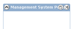
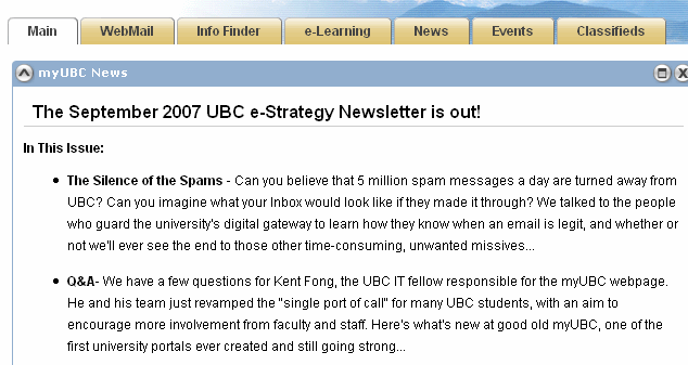
uPortal: Public/Guest page, Login, myUBC news, Events Calendar, RSS Aggregator, Management System Portal
• See Sakai Personas
Scenarios
Scenarios will generally only be used for the cognitive walk-through, not the heuristic evaluation. However, it is fine to use these scenarios for the heuristic evaluation if it is helpful to evaluators in figuring out how to walk through the application. See uPortal Content Management Scenarios for a list of all possible scenarios. Evaluators will likely only cover some of the scenarios, in one of the roles, in their individual evaluations.
• General Overview (heuristic evaluation)
• Finding.....
NOTE: heuristic and accessibility information here duplicates that posted at http://wiki.fluidproject.org/x/AAYa by the same reviewer (Kathy.)
• Scenario 1: Brad needs to make an announcement about the next session for faculty training.
• Scenario 2 : Brad wants to check his vacation days balance and see if he has enough time join his buddy for a fishing trip.
• [List any additional assumptions used in evaluation]
Positive Findings
All positive findings, from both the heuristic evaluation and the cognitive walk-through, should be placed in this section.
Usability Positives |
Tool |
Evaluator |
|---|---|---|
Tabs provide clear navigation |
Tabs |
Kathy Moore |
Window manipulation tools provide flexibility |
Minimize, maximize, delete, (detach) |
|
Page is clearly structured into (clearly-labeled?) logical sections |
Tabs, columns, channels |
|
|
|
|
|
|
|
|
|
|
|
|
|
|
|
|
|
|
|
Accessibility Positives |
Tool |
Evaluator |
Page is clearly structured into (clearly-labeled?) logical sections |
Tabs, columns, channels |
Kathy Moore |
Channel controls (shade, focus, remove) show alt/title tags |
Shade, Focus, Remove |
|
|
|
|
|
|
|
|
|
|
|
|
|
|
|
|
|
|
|
|
|
|
Summary of Usability & Accessibility Issues Found
All usability & accessibility issues found, in both the heuristic evaluation and the cognitive walk-through, should be placed in this section.
Priority Legend:
High = Task cannot be completed
Medium = Task completed with significant effort and failed attempts
Low = Task completed with minor complications and/or annoyance
Usability Issues |
Principle |
Link to screen shots |
Priority |
Suggestions for solution |
Tool |
Component Identified? |
|---|---|---|---|---|---|---|
"Channel" language may be unfamiliar |
Match between system and the real world: The system should speak users' language, with words, phrases, and concepts familiar to the user. |
|
Low |
Is "window" a more familiar term? |
Channel |
|
"Channels" do not all follow same behavior; One allows use within uPortal, another appears in new tab. A few links replace uPortal in existing window. |
Consistency and standards |
|
Medium |
Use different visual metaphors and language to describe "channels" that do or do not keep the user in uPortal. |
Channel/ |
|
Some text overlaps on Win xp Firefox even at normal size, 1152px width; were designers on mac? |
Visibility |
|
Medium |
Allow text to stack |
|
|
User can end up looking in many (plausible places) for a single bit of information; |
Efficiency of use |
|
|
|
|
What's new aggregator // this would also be useful in Sakai. |
|
|
|
|
|
|
|
|
|
|
|
|
|
|
|
|
|
|
|
|
|
|
|
|
|
|
|
|
|
|
|
|
|
|
|
|
|
|
|
|
|
|
|
|
|
|
|
|
|
|
|
|
|
|
|
|
|
|
|
|
|
|
|
|
|
|
|
|
|
|
|
|
|
|
|
|
|
|
|
|
|
|
|
|
|
|
|
|
|
|
|
|
|
|
|
|
|
|
|
|
|
|
|
|
|

Accessibility Issue |
Principle |
Link to screen shot |
Priority |
Suggestions for solution |
Tool |
Component identified? |
|---|---|---|---|---|---|---|
In win Firefox, Home screen scrolls horizontally at 800X600; rightmost of three columns is entirely hidden. |
screen should adjust to different resolutions |
|
Medium |
Lefthand column should collapse to share screen |
Channel? |
|
Is minimize (shade) omitted from the tab sequence? |
All functionality should be available via tabs |
|
|
|
|
|
Many links spawn new tabs/windows. Is this an accessibility issue? |
|
|
|
|
|
|
|
|
|
|
|
|
|
|
|
|
|
|
|
|
|
|
|
|
|
|
|
|
|
|
|
|
|
|
|
|
|
|
|
|
|
|
|
|
|
|
|
|
|
|
|
|
|
|
|
|
|
|
|
|
|
|
|
|
|
|
|
|
|
|
|
|
|
|
|
|
|
|
|
|
|
|
|
Cognitive Walkthrough Worksheet
This section should be used by evaluators to keep track of the steps & screens they followed through the application in the cognitive walk-through. Any positive results or issues found should be included in the two sections above.
*Scenario 1: Brad needs to make an announcement about the next session for faculty training.
# |
Step |
Screen |
Comments/issues |
Principle |
Suggestions for solution |
|---|---|---|---|---|---|
1 |
Scan first tab after login; |
|
Maybe |
|
|
2 |
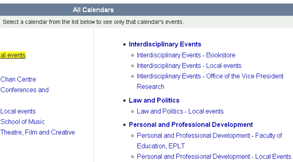
He could post to the Events Calendar; it even has a "Personal and Professional Development" category |
|
Maybe |
|
|
3 |
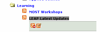
There's a "Learning" feed in the "news" listings; |
|
Maybe |
High --The ambiguity may effectively prevent Brad from reaching lis goal and faculty from reaching some of theirs |
What's new aggregator // this would also be useful in Sakai. |
|
|
|
|
|
|
|
|
|
|
|
|
|
|
|
|
|
|
|
|
|
|
|
|
|
|
|
|
|
|
|
|
|
|
|
|
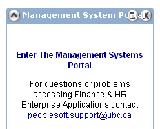
Scenario 2: Brad wants to check his vacation days balance and see if he has enough time join his buddy for a fishing trip.
# |
Step |
Screen |
Comments/issues |
Principle |
Suggestions for solution |
|---|---|---|---|---|---|
1 |
Scan first tab after login for possibilities |
|
Note overlapping text in win/FF |
Visibility |
Let text stack? |
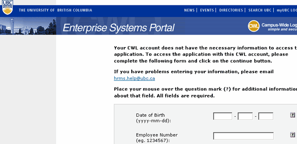
2 |
Give focus to desired window |
|
This is difficult to do because text overlaps buttons |
Flexibility and efficiency of use |
Use shorter titles |
3 |
Click "enter" |
|
We've left portal |
Consistency and standards |
Find a way to keep more content in portal. |
|
|
|
|
|
|
|
|
|
|
|
|
|
|
|
|
|
|