This documentation is currently being moved to our new documentation site.
Please view or edit the documentation there, instead.
If you're looking for Fluid Project coordination, design, communication, etc, try the Fluid Project Wiki.
Tutorial - Keyboard Accessibility Plugin
Currently undergoing revision
Join the infusion-users mailing list and ask your questions there,
or hang out in our IRC Channel.
This page will walk you through an example of adding the Infusion Keyboard Accessibility Plugin to your application.
This tutorial is based on the code that is used for our Keyboard Accessibility Demo. It assumes that:
- you are already familiar with HTML, Javascript and CSS,
- you are basically familiar with what the Keyboard Accessibility Plugin is and does,
- now you just want to know how to use it.
For technical API documentation, see Keyboard Accessibility Plugin API.
Scenario
You're creating a photo-album application that will let your friends rate the photographs you've taken. You've even found a nice little five-star rating widget to use. You want to make sure your application is accessible using the keyboard as well as the mouse.
There are three basic steps to adding Keyboard Accessibility to your application:
- Setup: Download and install the Fluid Infusion library
- Step 1: Prepare your markup
- Step 2: Write the script
- Step 3: Add the script to your HTML
The rest of this tutorial will explain each of these steps in detail.
Setup: Download and install the Infusion library
- Get the current source code from github as a ZIP file: https://github.com/fluid-project/infusion/archive/master.zip
- Unpack the zip file you just downloaded and cd into the "infusion-master" folder that results.
- If necessary install Node.js (http://nodejs.org/download/) and Grunt (“npm install -g grunt-cli”).
- Make your own custom build by running the “grunt” command in the Terminal. See the README.md file for instructions on how to make a custom build of Infusion.
- The grunt command will create a zip file in the products folder. Unzip that file and move the resulting
infusionfolder somewhere convenient for your development purposes, likely in alibfolder in your site hierarchy. This
infusionwill include a single file containing all of the JavaScript you need:infusion-custom.js. You will link to this file in the headers of your HTML files.
Step 1: Prepare your markup
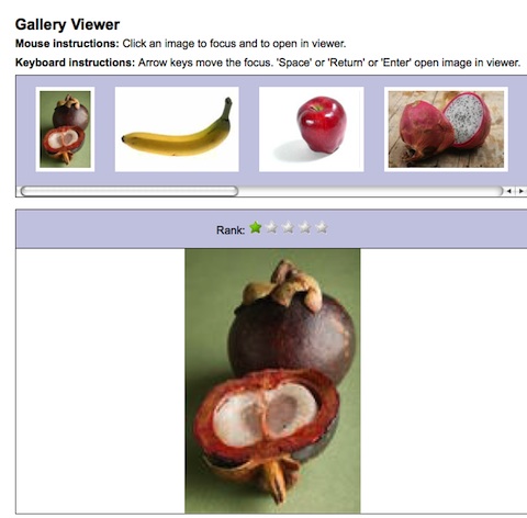
Let's say you're using an unordered list to display your thumbnails, and the five-star widget uses a set of five images. You follow that up with a <div> for the main image viewer. The HTML below illustrates this, and the picture on right shows what it might look like, with a row of thumbnails horizontally along the top, with the five-star ranker horizonally below that, and finally the main image viewer at the bottom.
<div>
    <!-- List of thumbnails -->
    <ul class="demo-container-imageThumbnails fl-centered">
        <li><img src="<url to thumnail1>" alt="<alt text for image 1>" /></li>
        <li><img src="<url to thumnail2>" alt="<alt text for image 2>" /></li>
        ...
    </ul>

    <!-- Markup for five-star widget -->
    <div class="demo-container-fiveStar fl-centered">
        <label for="ranking">Rank:</label>
        <div id="ranking">
            <img class="star-1" alt="one star" src="star-blank.gif" />
            <img class="star-2" alt="two stars" src="star-blank.gif" />
            <img class="star-3" alt="three stars" src="star-blank.gif" />
            <img class="star-4" alt="four stars" src="star-blank.gif" />
            <img class="star-5" alt="five stars" src="star-blank.gif" />
        </div>
    </div>

    <!-- Main image viewing area -->
    <div id="image-preview" class="demo-container-imageViewer fl-centered">
        <img class="demo-image-mainImage" src="<url to image>" alt="" />
    </div>
</div>
In this example, the classes starting with demo- are used for styling, such as laying out the thumbnails and stars in a horizontal row. The classes starting with fl- are Fluid Skinning System - FSS styles.
The plugin needs to know which elements on the page should be activatable using the keyboard. We can add the plugin's default selector, selectable to each of the thumbnails for this. (The stars already have a class attached to them, and we can use that to identify them.) So our list of thumbnails might look like this:
<div>
    <!-- List of thumbnails -->
     <ul class="demo-container-imageThumbnails fl-centered">
        <li><img class="selectable" src="<url to thumnail1>" alt="<alt text for image 1>" /></li>
        <li><img class="selectable" src="<url to thumnail2>" alt="<alt text for image 2>" /></li>
        <li><img class="selectable" src="<url to thumnail3>" alt="<alt text for image 3>" /></li>
        ...
    </ul>
    ...
Step 2: Write the script
You'll need to create a file, say setup.js, to contain your code - the script you write to apply keyboard accessibility to your tabs.
Setting Up
First, we'll define selectors for the various elements that we want to reference frequently:
demo.imageViewer = $.extend(demo.imageViewer, {
    selectors: {
        thumbContainer: ".demo-container-imageThumbnails",
        ranker: ".demo-fiveStar",
        image: ".demo-image-mainImage",
        thumbSelector: ".selectable",
        thumbImgSelector: "img"
    },
    styles: {
        selected: "demo-selected"
    }
});
We'd like our application to actually keep track of the rank given to each image, so we'll create a model that maps the image URL to its rank (each image gets a rank of 1 to start):
demo.imageViewer.setUpModel = function (thumbContainer) {
    var thumbnails = $(demo.imageViewer.selectors.thumbImgSelector, thumbContainer);
    var model = {};
    fluid.each(thumbnails, function (value, key) {
        model[$(value).attr("src")] = 1;
    });
    return model;
};
Finaly, we'll create the main initialization function, which will be called from the HTML. This function sets up some key things that we'll need to work with:
- the main container for the whole application,
- the container for the thumbnails,
- the container for the main image itself, and
- the model
demo.initImageViewer = function (container) {
    var that = {
        container: $(container),
        thumbContainer: $(demo.imageViewer.selectors.thumbContainer),
        image: $(demo.imageViewer.selectors.image)
    };
    that.model = setUpModel(that.thumbContainer);
};
Approach
Our photo ranking application displays two groups of things from which your users will want to pick something:
- the thumbnails
- the rank for an image
In each case, they'll need to be able to do two things:
- select the one they want i.e. move focus from one to another
- activate their choice i.e. trigger the selected thumbnail to be displayed in the main image viewer, or set the rank.
The Five-Star Widget
This demo assumes that the widget code is separate from your code, and that you don't want to have to modify it directly. The widget does have a public API we can use.
Selectable
For an item to be selectable, we need two things:
user have to be able to tab to the group
We can do this using thetabbablefunction of the plugin:starContainer.fluid("tabbable");
- users have to be able to adjust the rank using the arrow keys
We can do this using theselectablefunction of the plugin.selectableneeds to know a few things:- what to do when a star is selected (the
onSelectevent), - what to do when a star is unselected (the
onUnselectevent), and - which arrow keys should work (left/right or up/down)
- what to do when a star is selected (the
On select and unselect, we'll adjust the visual styling and call the ranker's API for hovering and resetting.We'll also set the orientation to horizontal so that the left/right arrow keys work (instead of the default up/down):
starContainer.fluid("selectable", {
    direction: fluid.a11y.orientation.HORIZONTAL,

    selectableSelector: fiveStarRanker.options.selectors.stars,

    rememberSelectionState: false,

    onSelect: function (starEl) {
        // show visual confirmation when focus is there
        starContainer.addClass(demo.imageViewer.styles.selected);
        fiveStarRanker.hoverStars(starEl);
    },
    onUnselect: function (thumbEl) {
        starContainer.removeClass(demo.imageViewer.styles.selected);
        fiveStarRanker.refreshView();
    }
});
- The stars don't have the default
selectableclass, so we use the selector provided by the widget itself to tell the plugin what should be selectable:fiveStarRanker.options.selectors.stars - Normally, the plugin will remember which selectable item had focus last time the user navigated to the group. In the case of the five-star widget, we don't want the widget to remember the ranking we selected for other images, so we'll want to override that default by setting
rememberSelectionStatetofalse. - This function makes use of some of the
fiveStarRanker's public API to handle theonSelectandonUnselectevents.
Putting these together, our function will look like this:
demo.imageViewer.makeFiveStarsNavigable = function (fiveStarRanker) {
    var starContainer = fiveStarRanker.container;

    starContainer.fluid("tabbable");

    starContainer.fluid("selectable", {
        direction: fluid.a11y.orientation.HORIZONTAL,

        selectableSelector: fiveStarRanker.options.selectors.stars,

        rememberSelectionState: false,

        onSelect: function (starEl) {
            // show visual confirmation when focus is there
            starContainer.addClass(demo.imageViewer.styles.selected);
            fiveStarRanker.hoverStars(starEl);
        },
        onUnselect: function (thumbEl) {
            starContainer.removeClass(demo.imageViewer.styles.selected);
            fiveStarRanker.refreshView();
        }
    });
};
Activatable
So now that the stars are selectable using the keyboard, we need to make them activatable. This is accomplished by defining an activation handler: a function that is called when the use activates their selection using the keyboard. This function is passed as a parameter to the plugin's activatable function.
The five-star widget has a public function, pickStar(), that is used when a user clicks on a star. We'll use this function in our activation handler.
demo.imageViewer.makeFiveStarsActivatable = function (fiveStarRanker) {
    fiveStarRanker.stars.fluid("activatable", function (evt) {
        fiveStarRanker.setRank(demo.fiveStar.getStarNum(evt.target));
    });
};
Finally, we need to update our main initialization function to call these functions:
demo.initImageViewer = function (container) {
    var that = {
        container: $(container),
        thumbContainer: $(demo.imageViewer.selectors.thumbContainer),
        image: $(demo.imageViewer.selectors.image)
    };
    that.model = demo.imageViewer.setUpModel(that.thumbContainer);

    var fiveStarRanker = demo.imageViewer.setUpFiveStarRanker(demo.imageViewer.selectors.ranker);
    demo.imageViewer.setUpImageViewer(that, fiveStarRanker);
};
Making Thumbnails Accessible
Selectable
As with the stars, we make the container of the thumbnails tabbable using the plugin:
thumbContainer.fluid("tabbable");
We make the thumbnails selectable using the selectable function of the plugin. Again, we need to tell the plugin:
- what to do when a thumbnail is selected (the
onSelectevent), - what to do when a thumbnail is unselected (the
onUnselectevent), and which arrow keys should work (left/right or up/down)
We'll apply some visual styling on select and unselect, and set the orientation to horizontal:thumbContainer.fluid("selectable", { direction: fluid.a11y.orientation.HORIZONTAL, onSelect: function (thumbEl) { $(thumbEl).addClass(demo.imageViewer.styles.selected); }, onUnselect: function (thumbEl) { $(thumbEl).removeClass(demo.imageViewer.styles.selected); } });
- what to do when a thumbnail is selected (the
So our function to make the thumbnails selectable will look like this:
demo.imageViewer.makeThumbnailsNavigable = function (thumbContainer) {
thumbContainer.fluid("tabbable");
    thumbContainer.fluid("selectable", {
        direction: fluid.a11y.orientation.HORIZONTAL,

        onSelect: function (thumbEl) {
            $(thumbEl).addClass(demo.imageViewer.styles.selected);
        },
        onUnselect: function (thumbEl) {
            $(thumbEl).removeClass(demo.imageViewer.styles.selected);
        }
    });
};
Note that we don't have to explicitly set the selectableElements or selectableSelector option because we've used the default selector, the selectable class. The plugin will look for anything inside thumbContainer with this class.
Activatable
So now that the thumbnails are selectable using the keyboard, we need to make them activatable. We'll define a handler function which will display the selected image in the main viewing area:
demo.imageViewer.makeImageActivationHandler = function (thumbContainer, image, fiveStarRanker, model) {
    return function (evt) {
        var thumb = $(evt.target);
        demo.imageViewer.displayImage(thumb, thumbContainer, image);
        // update the five-star with the image's rank
        fiveStarRanker.setRank(model[thumb.attr("src")]);
    };
};
and we'll need to register this function as the activation handler using the plugin:
    var handler = demo.imageViewer.makeImageActivationHandler(thumbContainer, image, fiveStarRanker, model);
    thumbContainer.fluid("activatable", handler);
We'll also want the same function to be used when users click on a thumbnail:
$(demo.imageViewer.selectors.thumbSelector, thumbContainer).click(handler);
So putting this all together, our function might look like this:
demo.imageViewer.makeThumbnailsActivatable = function (thumbContainer, image, fiveStarRanker, model) {
    var handler = demo.imageViewer.makeImageActivationHandler(thumbContainer, image, fiveStarRanker, model);
    thumbContainer.fluid("activatable", handler);

    $(demo.imageViewer.selectors.thumbSelector, thumbContainer).click(handler);
};
still to come: binding event handlers, setting up ARIA, initializing first image, rank
We'll consolidate all the setup functionality into a single function:
demo.imageViewer.setUpImageViewer = function (that, ranker) {
    demo.imageViewer.makeThumbnailsNavigable(that.thumbContainer);
    demo.imageViewer.makeThumbnailsActivatable(that.thumbContainer, that.image, ranker, that.model);

    demo.imageViewer.bindEventHandlers(ranker, that.model);
    demo.imageViewer.setARIA(that.container, that.thumbContainer, that.image);

    // set up with the first image
    var firstThumb = $("img:first", that.thumbContainer);
    demo.imageViewer.displayImage(firstThumb, that.thumbContainer, that.image);
    // update the five-star with the image's rank
    ranker.setRank(that.model[firstThumb.attr("src")]);
};
and update our initialization function to call the setup function:
demo.initImageViewer = function (container) {
    var that = {
        container: $(container),
        thumbContainer: $(demo.imageViewer.selectors.thumbContainer),
        image: $(demo.imageViewer.selectors.image)
    };
    that.model = setUpModel(that.thumbContainer);

    var ranker = demo.fiveStar(container);
    makeFiveStarsNavigable(ranker);
    makeFiveStarsActivatable(ranker);

    demo.imageViewer.setUpImageViewer(that, fiveStarRanker);
};
Step 3: Add the script to your HTML
If you use the MyInfusion.js file, then your <head> might look like:
<script type="text/javascript" src="infusion-1.5/MyInfusion.js"></script>
<script type="text/javascript" src="setup.js"></script>
Alternatively, the individual file requirements are:
<script type="text/javascript" src="infusion-1.5/lib/jquery/core/js/jquery.js"></script>
<script type="text/javascript" src="infusion-1.5/lib/jquery/ui/js/jquery.ui.core.js"></script>
<script type="text/javascript" src="infusion-1.5/framework/core/js/Fluid.js"></script>
<script type="text/javascript" src="infusion-1.5/framework/core/js/FluidDocument.js"></script>
<script type="text/javascript" src="infusion-1.5/framework/core/js/DataBinding.js"></script>
<script type="text/javascript" src="infusion-1.5/framework/core/js/jquery.keyboard-a11y.js"></script>
<script type="text/javascript" src="infusion-1.5/framework/core/js/FluidView.js"></script>
<script type="text/javascript" src="infusion-1.5/framework/core/js/FluidIoC.js"></script>
<script type="text/javascript" src="setup.js"></script>
But all of these individual Javascript files are not necessary to make it work - the MyInfusion.js file has everything you need.
The last thing to do is to call your inizialization script from within the HTML, at the bottom:
<script type="text/javascript">
    demo.initImageViewer(".demo-container");
</script>