Progress API
Progress Overview
The Fluid Progress component provides a usable and accessible linear progress display for use on its own or with other Fluid components. It was originally designed for the Fluid Uploader but was built to be highly flexible -- customizable for use in any context. It has a very simple API but achieves its flexibility through a number of configuration options which at first may not seem intuitive.
Fluid Progress does not currently come with a default presentation. We hope that through our design examples you can come up with your own designs that integrate well with your application or component. Fluid Progress is currently used in the Uploader and in the Fluid Project wiki to provide component progress indicators.
New in v1.3
The Progress component now provides the option to the integrator to switch between aria-valuenow and aria-valuetext. See the fluid:Options description below for more information.
The Progress component now fires events when progress begins and hides.
This component is in Preview status
Join the infusion-users mailing list and ask your questions there.
Creating a Progress bar
To instantiate a new Progress component on your page:
var myProgressBar = fluid.progress(container, options);
Returns: The Progress component object.
Note: the initial state of a progress element is assumed to be hidden with the minimum amount of progress.
Parameters
container: a CSS-based selector, single-element jQuery object, or DOM element that identifies the root DOM node of the Progress markup.
options: an optional data structure that configures the Progress component, as described in the fluid:Options section of this page.
Supported Events
The Progress component fires the following events (for more information about events in the Fluid Framework, see Events for Component Users):
Event |
Type |
Description |
Parameters |
Parameter Description |
|---|---|---|---|---|
New in v1.3: |
default |
This event fires once the progress display has appeared. Note that this is not a 'preventable' event. |
none |
|
New in v1.3: |
default |
This event fires once the progress display has been removed after progress is complete. |
none |
|
To add listeners to the firers one can use two approaches:
1) Using the listeners option to the component creator function (see #Options below for more information):
//onProgressBegin:
var myProgress = fluid.progress("#progress-container", {
    listeners: {
        onProgressBegin: myProgressShow //callback function
    }
});
//afterProgressHidden:
var myProgress = fluid.progress("#progress-container", {
    listeners: {
        afterProgressHidden: myProgressHide //callback function
    }
});
2) Programmatically:
//onProgressBegin:
myProgress.events.onProgressBegin.addListener(myProgressShow);
//afterProgressHidden:
myProgress.events.afterProgressHidden.addListener(myProgressHide);
Methods
Method |
Description |
Parameters |
|---|---|---|
|
Shows the element defined by the |
|
|
Hides the element defined by the |
|
|
Updates the |
|
|
Resets the position and size of the |
none |
Options
Name |
Description |
Values |
Default |
|---|---|---|---|
|
Javascript object containing selectors for various fragments of the Progress markup |
The object must contain a subset of the following keys: |
selectors: {
    displayElement: ".flc-progress",
    progressBar: ".flc-progress-bar",
    indicator: ".flc-progress-indicator",
    label: ".flc-progress-label",
    ariaElement: ".flc-progress-bar"
}
See #Selectors below for requirement details |
|
The strings that will be used by the component. This is where localization is handled |
The object must contain a subset of the following keys: |
strings: {
    ariaBusyText: "Progress is %percentComplete percent complete",
    ariaDoneText: "Progress is complete."
}
|
|
JavaScript object that defines the default animation for displaying the Progress |
The structure of the object mirrors and gets mapped to the parameters of jQuery's animate method. |
showAnimation: {
    params: {
        opacity: "show"
    },
    duration: "slow",
    callback: null
}, // equivalent of $().fadeIn("slow")
|
|
JavaScript object that defines the default animation for hiding the Progress |
The structure of the object mirrors and gets mapped to the parameters of jQuery's animate method. |
hideAnimation: {
    params: {
        opacity: "hide"
    },
    duration: "slow",
    callback: null
}, // equivalent of $().fadeOut("slow")
|
|
JavaScript object containing listeners to be attached to the supported events. |
Keys in the object are event names, values are functions or arrays of functions. |
See #Supported Events for more information. |
|
Integer which specifies the minimum width for the progress indicator element |
pixels |
minWidth: 5 |
|
delay before hiding the progress after the Progress.hide() method. |
millies (milliseconds) |
delay: 0 |
|
Integer representing the speed for the Progress animations. |
|
speed: 200 |
|
String indicating which directions of progress get animated. |
"forward", "backward", and "both". Any other value is interpreted to mean don't animate at all |
animate: "forward" |
|
Boolean indicating whether to hide the |
boolean |
initiallyHidden: true |
|
Deprecated: |
boolean |
updatePosition: false |
|
Moved in v1.3: |
string |
ariaBusyText: "Progress is %percentComplete percent complete" |
|
Moved in v1.3: |
string |
ariaDoneText: "Progress is complete." |
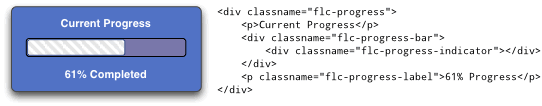
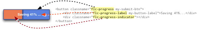
Selectors
Selectors are used to indicate which elements in DOM should behave as the different Progress elements.
The value for the option is itself a Javascript object containing name/value pairs:
selectors: {
    selector1Name: "selector 1 string",
    selector2Name: "selector 2 string",
      ...
}
Each selector has a default, as defined below.
Selector name |
Description |
Default |
|---|---|---|
|
[fluid:required] the element that gets displayed when progress is displayed, could be the indicator or bar or some larger outer wrapper as in an overlay or dialog effect |
".flc-progress" |
|
[fluid:required] The container for a file row progress bar. |
".flc-progress-bar" |
|
[fluid:required] The element that represents the "progressor" as it grows over time. |
".flc-progress-indicator" |
|
[fluid:optional] The container for the progress bar's label. |
".flc-progress-label" |
|
[fluid:required, except in the case where another element on the page carries the data required to present progress information to the screen reader, such as the case where there is a total progress indicator, and a sub-total progress indicator] |
".flc-progress-bar" |
Any selectors not provided as an option will revert to the default. Implementers may choose to use the default class names in their markup, or customize the selectors, or a combination of these two approaches.
Example using default selectors:
selectors: {
    displayElement: ".flc-progress",
    progressBar: ".flc-progress-bar",
    indicator: ".flc-progress-indicator",
    label: ".flc-progress-label",
    ariaElement: ".flc-progress-bar"
}
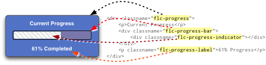
Example mixing up the selectors a bit for a different effect:
selectors: {
    displayElement: ".flc-progress-indicator",
    progressBar: ".flc-progress",
    indicator: ".flc-progress-indicator",
    label: ".flc-progress-label",
    ariaElement: ".flc-progress"
},

Dependencies
Progress dependencies can be met by including the minified InfusionAll.js file in the header of the HTML file.
<script type="text/javascript" src="InfusionAll.js"></script>
Alternatively, the individual file requirements are:
<script type="text/javascript" src="lib/jquery/core/js/jquery.js"></script>
<script type="text/javascript" src="lib/jquery/ui/js/ui.core.js"></script>
<script type="text/javascript" src="lib/jquery/plugins/bgiframe/js/jquery.bgiframe.js"></script>  <!-- New in v1.3 -->
<script type="text/javascript" src="framework/core/js/Fluid.js"></script>
<script type="text/javascript" src="components/progress/js/Progress.js"></script>