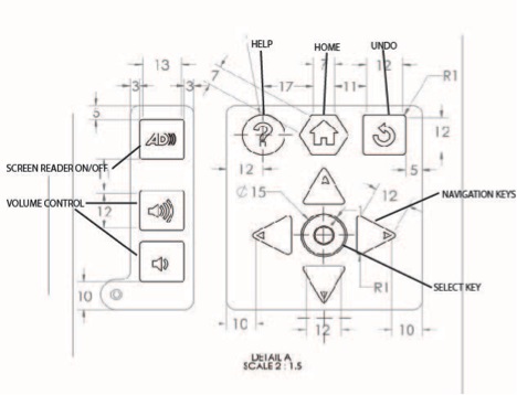
CMHR Keypad - Functional Description
Provided by the Inclusive Design Research Centre, March 20, 2013
Please note – the ideas expressed below are open to discussion and subject to change based on further development and discussion of the keypad design both within IDRC and between IDRC and CMHR/RAA.
A note about screen readers
Screen readers function by allowing a user to jump from link to link on a web page using the tab key (typically from left to right and top to bottom), and to shift-tab backwards through the same. The user can then select a desired link, or dive further into the content on the page using a key command. The keypad is designed in such a way as to provide a user with screen reader controls, but is limited by the number of available keys. As a result, the success of the keypad will depend largely on the semantic structure of the content. In this document however, we have attempted to describe the function of the keypad based solely on the wireframe mockups and accompanying descriptions that we currently have access to.
Please refer to diagram on the last page.
Navigation and Select Keys
- The user can navigate through content using the left-, right-, up- and down-Navigation keys, where
- Right = Next (equivalent to tab) and Left = Previous (equivalent to shift-tab)
- The Up and Down arrow keys may also be used to navigate through content where appropriate
- The Select key will be used to select an item, and may also provide a “finish” function (for example, a user selects zoom mode, uses the up/down keys to set the zoom level, and presses the Select key again to accept the zoom level and return to previous mode).
- In cases where navigation is more complex, the up/down-Navigation keys may provide additional navigational functions. This will be dependent on the individual interactables (e.g. up/down-Navigation keys could be used to navigate through time where timeline/Period view exists, or could be used to navigate visually up and down through the grid of images in the HR Journey exhibit).
- Where up/down navigation is not necessary, the up/down-Navigation keys may be deactivated for simplicity, or the up/left and down/right arrow keys may be functionally paired.
- Note that a user who is familiar with screen readers may choose to use only the left and right Navigation keys. Thus, access to information must not be dependent on the use of the up/down arrow keys.
- Wherever possible, functional consistency of the keypad keys must exist across all interactables._
First Time Approach
- The user may activate the interactive (from attract mode) using any key on the keypad.
- Once activated, the normal operating functions of the keypad will become active.
Single Option
- When the user has only one option to choose from (for example, the “Close” option from the initial information box), that option should be highlighted (i.e. focus state ON), and the user may choose that option using only the Select key (all other navigation keys may be deactivated).
Scrolling
- Scrolling left or right (e.g. through a series of images) may be done using the left and right Navigation keys only, or the navigation key functions may be paired such that the right arrow key and the up arrow key both invoke the Next function, while the left arrow key and the down arrow key both invoke the Previous function.
Zooming
The up/down-Navigation keys may be used to increase/decrease zoom level, once the user has selected the zoom function (zoom will either be selected from the screen, or selected with a key on the keypad – note that a zoom key is not currently included in the keypad design).- Note: the final keypad design includes two zoom buttons: zoom in and zoom out (nav keys will not be used for zooming)
Undo Key
- The Undo key undoes the last function/takes the user to the previous content/layer.
Home Key
- The Home key takes the user to the main menu page (as appropriate for each interactable).
Help Key
- The Help key will open up a help window which may provide information about the exhibit, explain how the keypad works, provide a Table of Contents, show a map of the museum, other?
Screen Reading / Volume Control Keys
- The Screen Reading/Audio button (label TBD) will turn the screen reader on and off, and the volume control buttons will increase and decrease the volume of the screen reader (and video player?).
Figure 1. Drawing of keypad with key functions labelled.
NOTE: This drawing is an earlier design iteration: for up-to-date design please see final keypad design drawings.
