...
| Div | |||||||||||||||
|---|---|---|---|---|---|---|---|---|---|---|---|---|---|---|---|
| |||||||||||||||
|
...
Consider an example: the Infusion Pager. This component allows users to break up long lists of items into separate pages. You've probably seen pagers used for search results, etc. The Infusion Pager is actually implemented as a number of smaller components working together. The Pager Subcomponents page explains the different subcomponents.
Declaring subcomponents
Using the Inversion of Control system, subcomponents are declared in a special property of the parent's defaults called components. The components object is collection of key/value pairs:
...
| Code Block | ||||
|---|---|---|---|---|
| ||||
// Define one subcomponent
fluid.defaults("tutorials.subcomponent1", {
    gradeNames: ["fluid.littleComponent", "autoInit"]
});

// Define another subcomponent
fluid.defaults("tutorials.subcomponent2", {
    gradeNames: ["fluid.littleComponent", "autoInit"]
});

// Define the parent component, to use the subcomponents
fluid.defaults("tutorials.parentComponent", {
    gradeNames: ["fluid.littleComponent", "autoInit"],
    components: {
        child1: {
            type: "tutorials.subcomponent1"
        },
        child2: {
            type: "tutorials.subcomponent2"
        }
    }
});
|
Configuring Subcomponents
In addition to the type of subcomponent, other configuration information can be given. These include:
- the container to use (for view components)
- a list of subcomponent
options, for overriding the defaults of the subcomponent - properties for controlling the timing of subcomponents, such as
priorityandcreateOnEvent
Example: User Interface Options
The Infusion (Floe) UI Options (2008-2009) (UI Options) component component presents a collection of controls that allow a user to specify their preferences for customizing the presentation of the user interface and content resources. It works with the User Interface Enhancer (UI Enhancer), which carries out the transformations based on the recorded preferences.
...
| Section | ||||
|---|---|---|---|---|
|
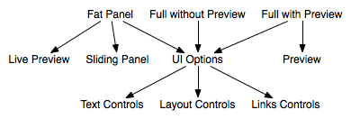
The code for this looks as shown belowThese relationships can be expressed using the following definitions:
| Code Block | ||||
|---|---|---|---|---|
| ||||
fluid.defaults("fluid.fatPanelUIOptions", {
    gradeNames: ["fluid.viewComponent", "autoInit"],
    components: {
        uiOptions: {
            type: "fluid.uiOptions",
            container: ".flc-slidingPanel-panel"
        },
        slidingPanel: {
            type: "fluid.slidingPanel",
            priority: "last",
            container: "{fatPanelUIOptions}.container"
        },
        preview: {
            type: "fluid.uiOptions.livePreview"
        }
    }
});

fluid.defaults("fluid.fullNoPreviewUIOptions", {
    gradeNames: ["fluid.viewComponent", "autoInit"],
    components: {
        uiOptions: {
            type: "fluid.uiOptions",
            container: "{fullNoPreviewUIOptions}.container"
        }
    }
});

fluid.defaults("fluid.fullPreviewUIOptions", {
    gradeNames: ["fluid.viewComponent", "autoInit"],
    components: {
        uiOptions: {
            type: "fluid.uiOptions",
            container: "{fullPreviewUIOptions}.container"
        },
        preview: {
            type: "fluid.uiOptions.preview",
            createOnEvent: "onReady"
        }
    }
});

fluid.defaults("fluid.uiOptions", {
    gradeNames: ["fluid.viewComponent", "autoInit"],
    components: {
        textControls: {
            type: "fluid.uiOptions.textControls",
            container: "{uiOptions}.dom.textControls",
            createOnEvent: "onUIOptionsTemplateReady",
            options: {
                textSize: "{uiOptions}.options.textSize",
                lineSpacing: "{uiOptions}.options.lineSpacing",
                model: "{uiOptions}.model",
                applier: "{uiOptions}.applier"
            }
        },
        layoutControls: {
            type: "fluid.uiOptions.layoutControls",
            container: "{uiOptions}.dom.layoutControls",
            createOnEvent: "onUIOptionsTemplateReady",
            options: {
                model: "{uiOptions}.model",
                applier: "{uiOptions}.applier"
            }
        },
        linksControls: {
            type: "fluid.uiOptions.linksControls",
            container: "{uiOptions}.dom.linksControls",
            createOnEvent: "onUIOptionsTemplateReady",
            options: {
                model: "{uiOptions}.model",
                applier: "{uiOptions}.applier"
            }
        }
    }
});
|
...