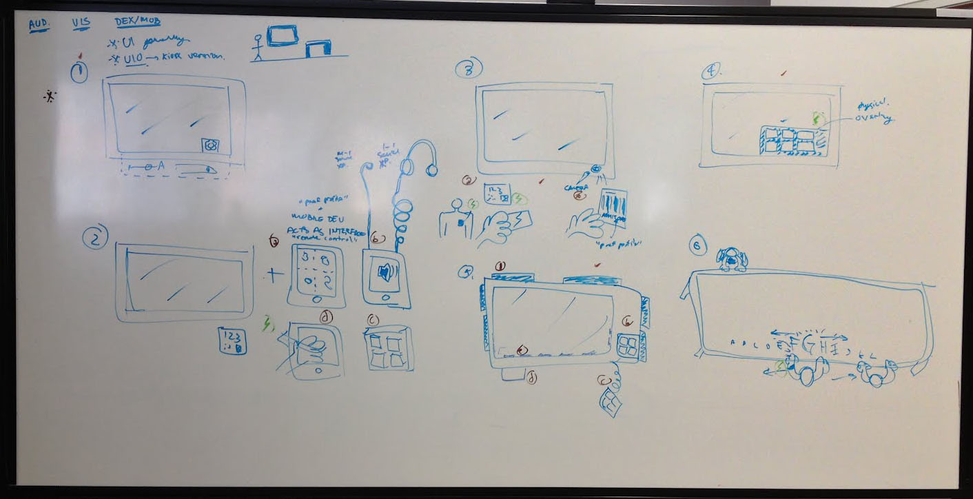
The concepts below illustrate some design solutions around accessibility generally. The ideas cover different spaces of the accessibility spectrum.
1. Interface options built into kiosk UI
Concept:
At the kiosk itself, the user is able to adjust some accessibility-related settings (such as size and contrast) on the screen interface, with changes made in real-time.
Narrative:
Billy, the museum docent, is taking a small tour group around the space. Billy wants to point out some text and pictures of interest on a particular kiosk, in case the visitors want to investigate further later. Upon arriving at the kiosk, he pulls up the interface options panel, and adjusts the size of the content and the audio volume to be visible and audible to everyone crowding around the kiosk.
advantages
- quick temporary adjustments specific to current kiosk content
- unobtrusive to the exterior of the kiosk design
- requires no finger pressure
disadvantages
- user has to re-enter all preferences from kiosk to kiosk
- no alternative to touchscreen interaction
- layout may be confusing for users picking up after someone has adjusted preferences
- users may require assistance to indicate preferences
2. Handheld device acting as interface to kiosk content
Concept:
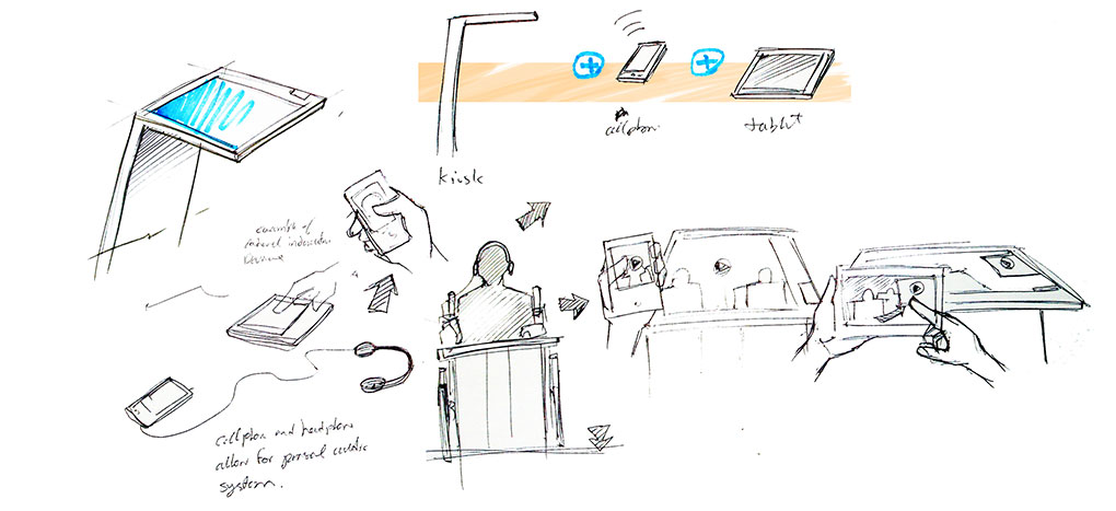
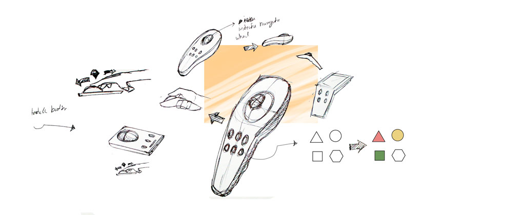
Users would have a mobile device (either their own or the museum's) that they take with them throughout the course of their visit. Instead of interfacing with the kiosk directly (i.e., the screen or tactile interface of the kiosk), they would be given the option of using their mobile device to control what occurs on the kiosk. Different interfaces on multi-purpose devices (e.g., smartphones) or different devices can be used to provide some personalization of the experience. Examples: a) smartphone screen with very large, easy-to-target buttons; b) smartphone with headphones for audio-based experiences; c) smartphone screen with gestural touch input for interacting without needing to see the screen; d) portable tactile buttons device
Narrative:
Tiffany, who has limited mobility in her arms, can't reach very far. Unable to easily extend her arm to control either the touchscreen or the keypad on the kiosks, she was given a mobile device allowing her to control and experience the kiosks from a reasonable distance. Upon approach to various kiosks, the kiosk and mobile device recognize each other, and Tiffany is given control to the kiosk from the device.
mobile touch-screen with alternative interfaces depending on user needs
advantages
- customizable interface for different user needs, for example:
- large, easy to target buttons for users with limited mobility
- gestural touch input and audio feedback for blind users
- customizable for different interaction, for example:
- page flipping
- rotating globe
- going through timeline
- unobtrusive to the kiosk design
- requires no finger pressure
- mobile
- users only indicate preferences once, for example:
- turn on audio descriptions once
- plug-in headphones and adjust volume once
disadvantages
- lack of tactile feedback
- complications in pairing devices?
portable tactile buttons
advantages
- clear, consistent interactions that users would only have to learn once
- tactile feedback
- unobtrusive to the kiosk design
- mobile
- users would only have to indicate their preferences once, for example:
- turn on audio descriptions once
- plug-in headphones and adjust volume once
disadvantages
- fixed layout, interaction may not be ideal for every user or exhibit
- complications in pairing devices?
- requires finger pressure
3. Portable preferences via token
Concept:
Prior to use of any kiosks, the user is given an opportunity to create a preferences profile. Preferences may include: language, size, contrast, volume, captions. The profile is then carried with them throughout their visit thru a token, and paired with the kiosk at experience time. Examples of tokens: a) 2D barcode on the visitor ticket; b) RFID card, bracelet, or other token; c) mobile device (via 2D barcode on screen, proximity detection, NFC, etc.)
Narrative:
Claire, 73, is a near-sighted francophone visiting the museum. Before heading to the museum, her son, Robert, bought and printed her a ticket through the website. At the time of purchase, they were given the option of describing preferences she might have. Robert was able to tell the museum that his mother speaks French and prefers larger sized content. The printed ticket has a 2D barcode serving two purposes: 1) verifies the ticket purchase upon museum arrival, and 2) every time Claire approaches a kiosk, she can scan the barcode, and the kiosk's content and interface are immediately adapted to French and larger size.
advantages
- device instantly responds to users needs
- entire kiosk interface could be customized depending on user needs, for example:
- high contrast, larger inputs and text
- gestural touch input and audio feedback for blind users
- kiosks could maintain more of their unique interactions
- unobtrusive to kiosk design
- requires no finger pressure
- users only indicate preferences once, for example:
- when buying their ticket in the museum
- when buying their ticket online
disadvantages
- more difficult group interactions
- users would be required to plug-in headphone from kiosk to kiosk
- lack of tactile feedback
- may be be difficult for users with limited mobility
4. Physical overlay for kiosk screen
Concept:
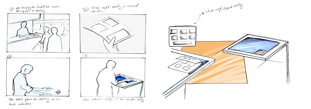
Users who have difficulty pointing accurately (because of vision, mobility, or other difficulties) can carry a physical overlay for the kiosk screens and apply it over the screen upon use of the kiosk. The interface could be customized for the cutout upon detection of the overlay on the screen. Possible physical overlays include: a) a flat plastic sheet with cutouts for where the touch interface interactions would be and braille labels; b) a soft silicon overlay with bumps and grooves and capacitive underlay.
Narrative:
Charles is blind. After purchasing his ticket, he is given a physical overlay to use with touchscreen kiosks. He is instructed to place the overlay at the corner of the screen. At the kiosk, he places the overlay, runs his fingers across the surface to read the labels and finds the appropriate grooves on the overlay to use the kiosk.
advantages
- clear, consistent interactions that users would only have to learn once
- some tactile feedback for touchscreen interaction
- unobtrusive to the kiosk design
disadvantages
- more difficult group interactions
- may be difficult for users with limited mobility to access
- user has to repeat some actions from kiosk-to-kiosk, for example
- turn on on audio-descriptions
- plug in headphones and adjust volume
5. On-kiosk tactile interface
Concept:
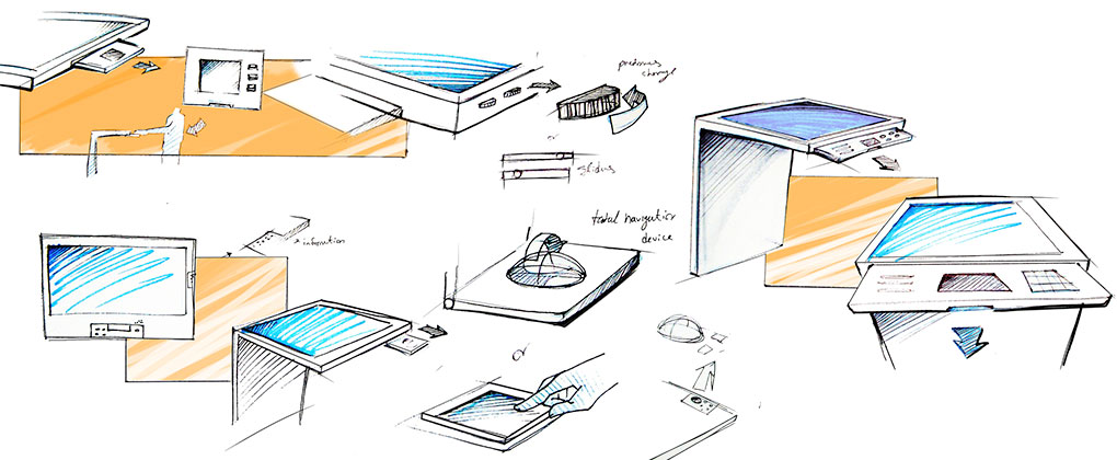
Each kiosk is fitted with tactile buttons and widgets. Potential placements include (not necessarily independent of each other): a) cluster of buttons at a corner, as in the RAA designs; b) along the edge of the kiosk (to assist blind users in finding the buttons by feeling the borders of the kiosk); c) volume sliders or knobs; d) buttons along the edge of the screen, corresponding to the buttons on the screen (if the UI is globally consistent). Tactile buttons could be useful for users with vision or mobility difficulties, as well as users who simply prefer tactile interactions (e.g., Blackberry users).
Narrative:
Charles is blind. Upon discovering a kiosk, he feels the edges of the kiosk to get a sense of the form and discovers braille-labeled buttons along its edges to control the kiosk.
advantages
- clear, consistent interactions that users would only have to learn once
- blind users could feel around the kiosk to discover its purpose through the buttons
- tactile feedback
- users can switch back and forth from the touch screen to keypad
disadvantages
- could be confused as sole kiosk interaction
- may be difficult for users with limited mobility to comfortably reach
- requires finger pressure
- user has to repeat some actions from kiosk to kiosk, for example
- turn on on audio-descriptions
- plug in headphones and adjust volume
6. Portable preferences + group interactions
Concept:
Individual users would declare their individual preferences at the start of or prior to their visit. Preferences may run the spectrum from the essential (e.g., language, captions, text size, etc.), to useful (e.g., children-appropriate content vs. mature content), to playful (e.g., preference for blue themes). These preferences are then carried with the user via a token. At large group-based kiosks (e.g., large table kiosk), users experience a preference "lens". These lenses extend for a small space around the user, and blend in with other users. Such kiosks would exemplify diversity of humanness on a common ground.
Narrative:
Claire (73, francophone, far-sighted)
Robert (48, bilingual)
Freddie (8)
Claire uses kiosk, bubble of French and larger content around her zone
Freddie sees Claire moving about and using it, thinks it's cool, goes up to simultaneously uses it, bubble of blue-themed children's content around his zone
Robert sees Claire and Freddie, thinks it's pretty cool, goes back to front desk to create profile, and comes back to join in the fun
- Encouraging articulating and use of preferences
- Attraction of playfulness/interestingness
- Diversity of humanness
advantages
- displays of the diversity of humanness - encourages articulating and use of preferences
- device instantly responds to users needs, preferences follow user as they move through kiosk, attracting others through playfulness
- users only indicate preferences once
- requires no finger pressure
disadvantages
- users would be required to plug-in headphones from kiosk to kiosk
- lack of tactile feedback
- maybe be difficult for users with limited mobility
solution ideation
