(Floe) UI Options Design Exploration, B.1
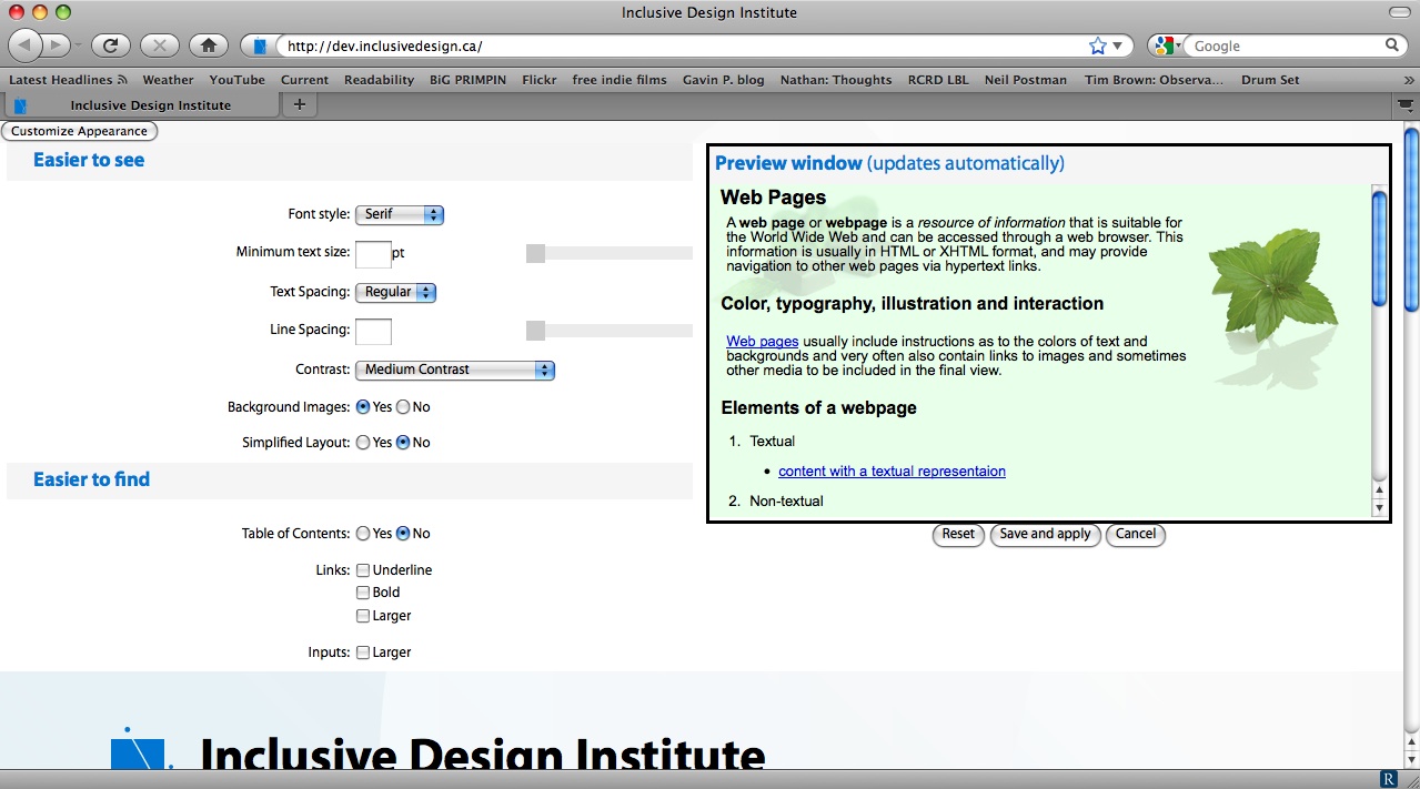
Original design:
http://dev.inclusivedesign.ca/
Version with Preview pane:
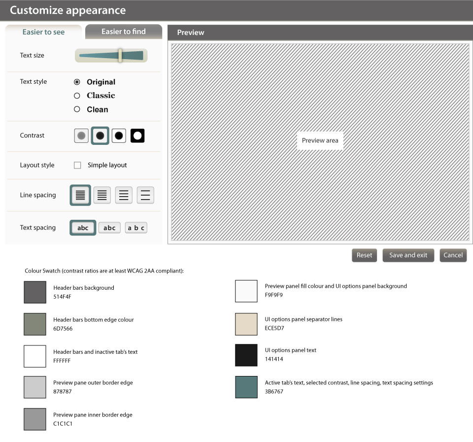
"Easier to see" Tab selected with colour swatches added:
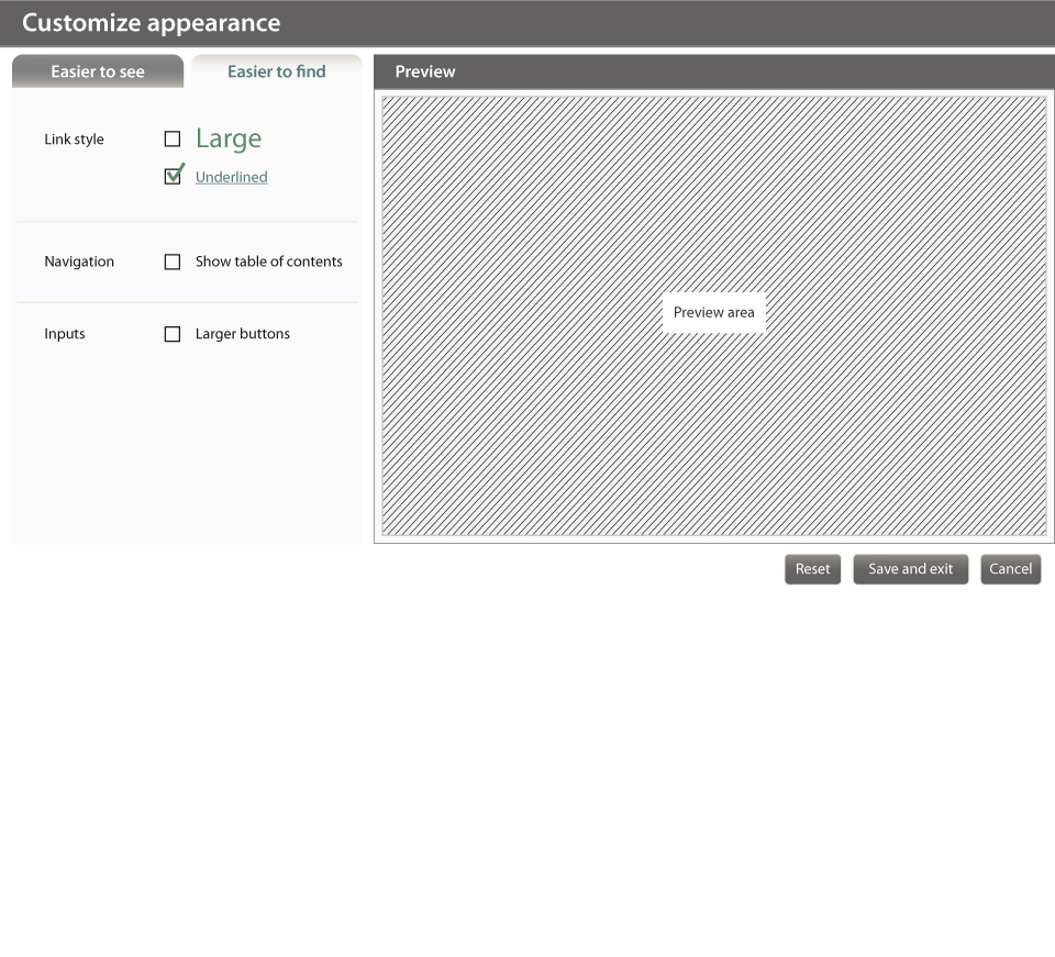
"Easier to find" Tab selected:
Version without Preview pane:

Notes on UI Options:
- Menu styles: minimized the use of drop-down menus to reduce the number of clicks required to select settings
- Text size slider bar: the slider can be used with a keyboard or a mouse (keyboard users can tab to the slider and use arrow keys to adjust the slider position). Lizna suggested that some users like to specify their font size etc., but it's difficult for the user to know what text is being adjusted when inputting a pt size (e.g. a header may be bigger than body text on a given page). Therefore, we decided to use a slider for this iteration. The range:
-8pt to 30pt - Text style: reduced number of options to minimize confusion for less sophisticated users. Per Lizna, it would be good to include a typeface that has "a" and "g" characters that are like those found in comic sans, as they are easier to read for some users. The only web-friendly font that has the suggested "a" and "g" characters is comic sans. Per discussion with James, we will try to revisit this in the next version of UI options, maybe by embedding a font that offers the the "a" and "g" we want. The text styles to be used:
- Original = default
- Classic = Georgia
- Clean = Arial - Contrast: all contrast setting themes should omit background images, except for the default setting. Per discussion with James, it's difficult to anticipate what the integrator's default website style will look like, so our contrast settings relative to the default will vary.
- "Simple layout" option: incorporates "no background images" setting, per discussion with Lizna (users who are inclined to use simple, linear layout option tend to be those who benefit from less visual clutter/no background images). When active:
- linear, single-column layout
- no background images - Line spacing: Per Lizna, most users prefer more granularity between single-spacing and double-spacing. The 4 settings:
- 1
- 1.25
- 1.5
- 2 - Text spacing:
- regular
- wider
- widest - Removed "bold" links option. Per review of WCAG guidelines, no explicit recommendations or benefits were noted from bolding links
- Reworded "larger inputs" to be "larger buttons" since the old wording was confusing to Lizna and others. Per discussion with James, "larger buttons" is easier to understand and we will allow the user to discover that it will coincide with larger input fields (e.g. text input boxes)
- UI Options Menu Text:
- Header font size 24 semibold
- Tab text size and Preview header text 16 semibold
- Panel text size 14
- Text style options 16 pt bold
Feedback is definitely welcome!