(Floe) Benchmarking website interface options
Website interface options
Ported over from googledocs (link: http://spreadsheets.google.com/ccc?key=0Ata3ATYOvErTdEdOdU1rZlRnRTVCTWtXQVNlYXZmN0E&hl=en&authkey=CLrN-owE)
The googledocs has several other sites and a side-by-side comparison of features.
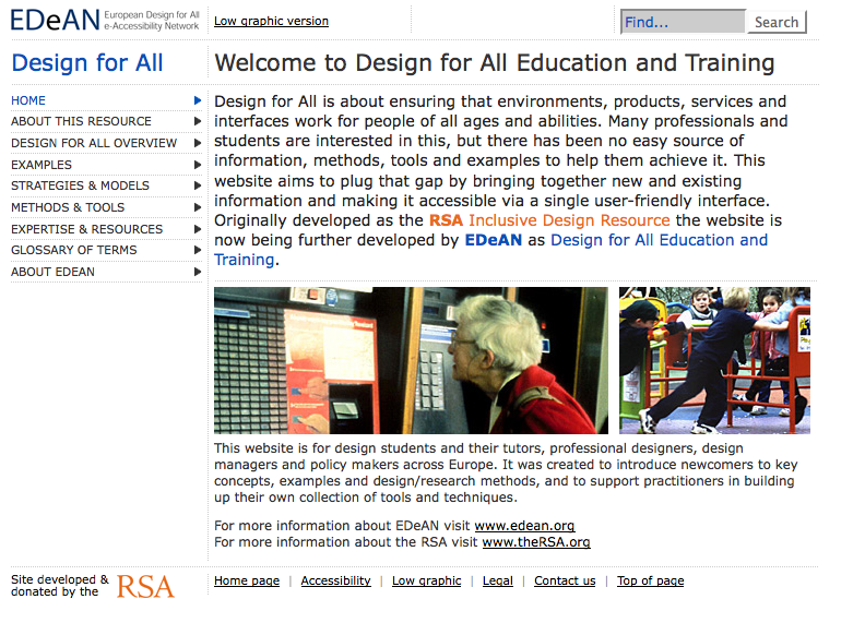
European Design for All e-accessibility Network
http://www.education.edean.org/index.php
http://www.education.edean.org/index.php?qual=low&opt=text&filters=f44
"Low graphic version" is the key feature offered to users at the top of the page. There is also a "low graphic" link at the bottom, beside "accessibility"
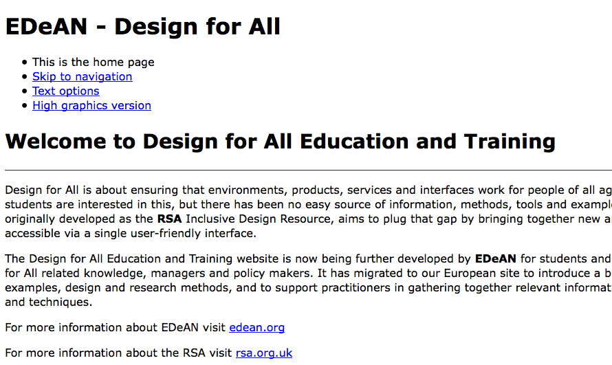
Low graphic version has a single-column layout and larger fonts:
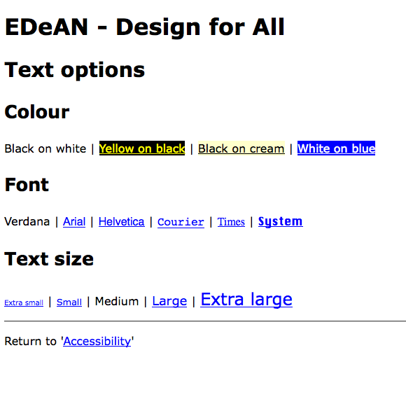
Under the "accessibility" link, there is a "text options" link that brings the user to a page where they will see the colour contrast, font, and text size options panel below:
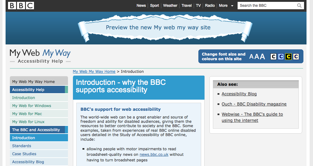
BBC
http://www.bbc.co.uk/accessibility/bbc/introduction.shtml
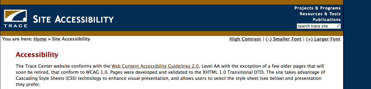
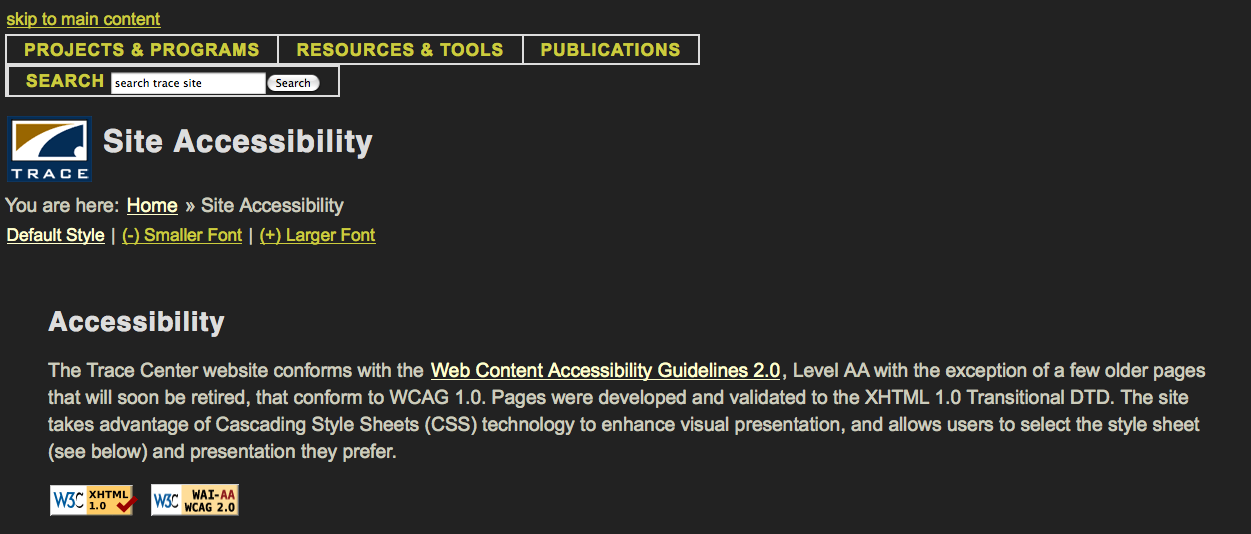
Trace Research and Development Centre
http://trace.wisc.edu/sitehelp/
High contrast mode changes layout as well as colour:
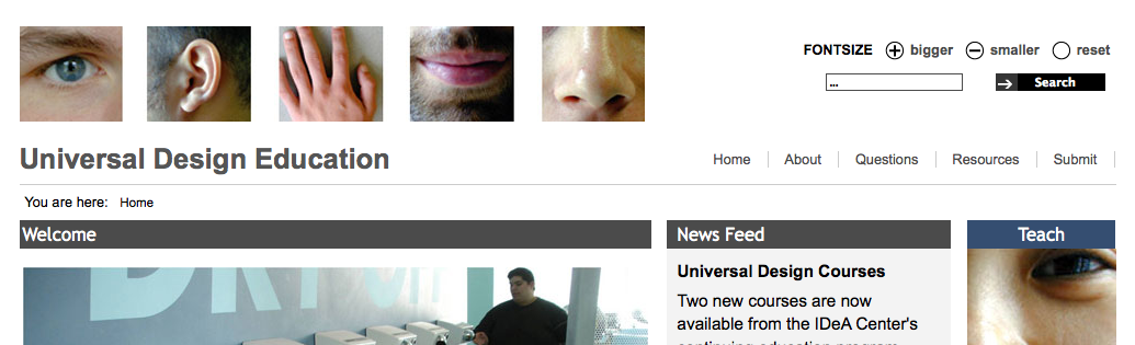
Universal Design Education
Many websites had similar simple tools for adjusting font size. Not many had a reset option though.
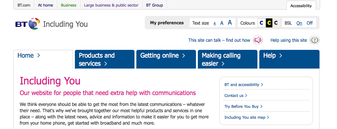
BT (British Telecom)
http://www.bt.com/includingyou/
The BT website supports "BrowseAloud" (screen reader that can be downloaded to complement a browser). It also offers videos with British Sign Language translations.
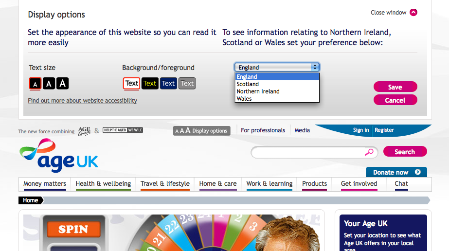
Age UK Magazine
Display options panel pushes down when centre button at the top is pressed.
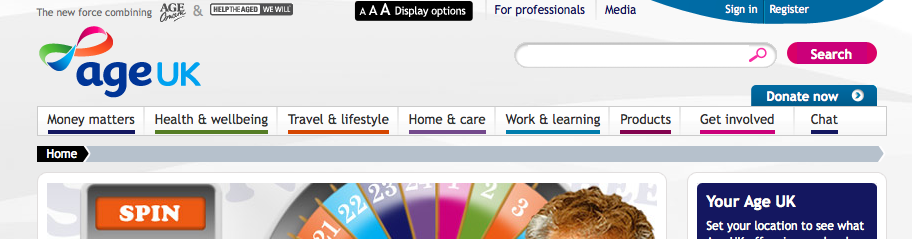
Text size, colour contrast, and location-based customization options are offered. There is no instant preview, so the user must save changes to see the effects.
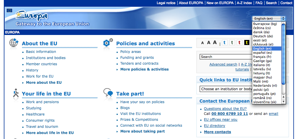
Europa (EU website)
Toolbar at the top right corner is presented very visually:
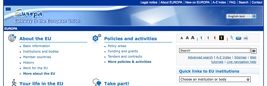
Multiple languages are offered:
EIDD - Design for All Europe
http://www.designforalleurope.org/ 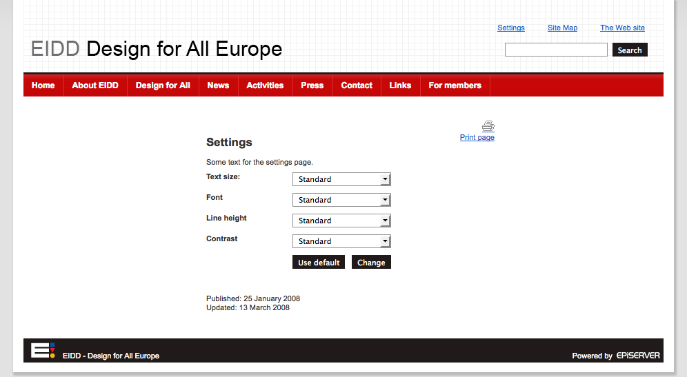
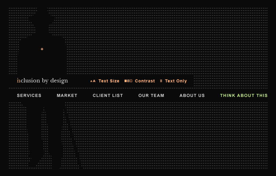
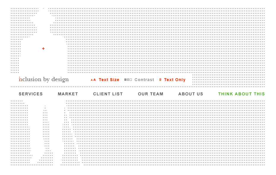
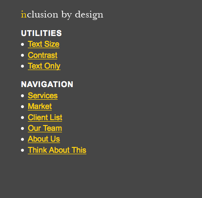
Inclusion by Design (design consultancy)
All of the colour contrast settings are wcag compliant, while looking visually appealing!
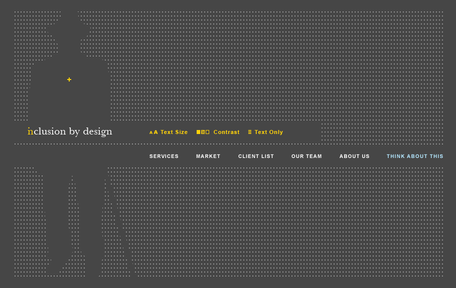
User can toggle between larger vs smaller text size. Above is the default, below is the larger size setting: 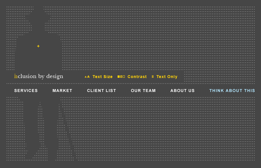
Similarly, the contrast settings cycle through three preset styles: the one above and the two below:
"Text only" mode displays the website in a linear layout with text-based navigation. The "text only" link below has been misnamed, as it toggles back to the visual layout above.
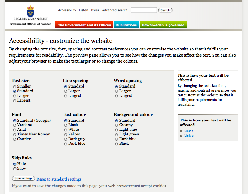
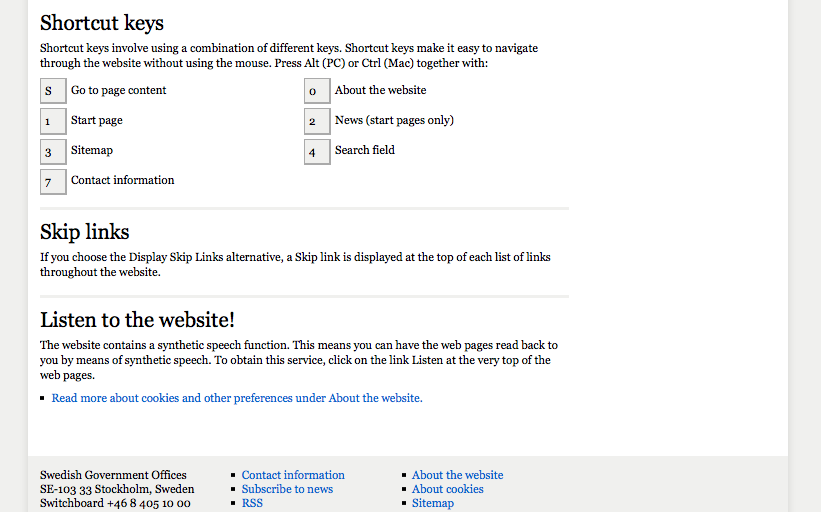
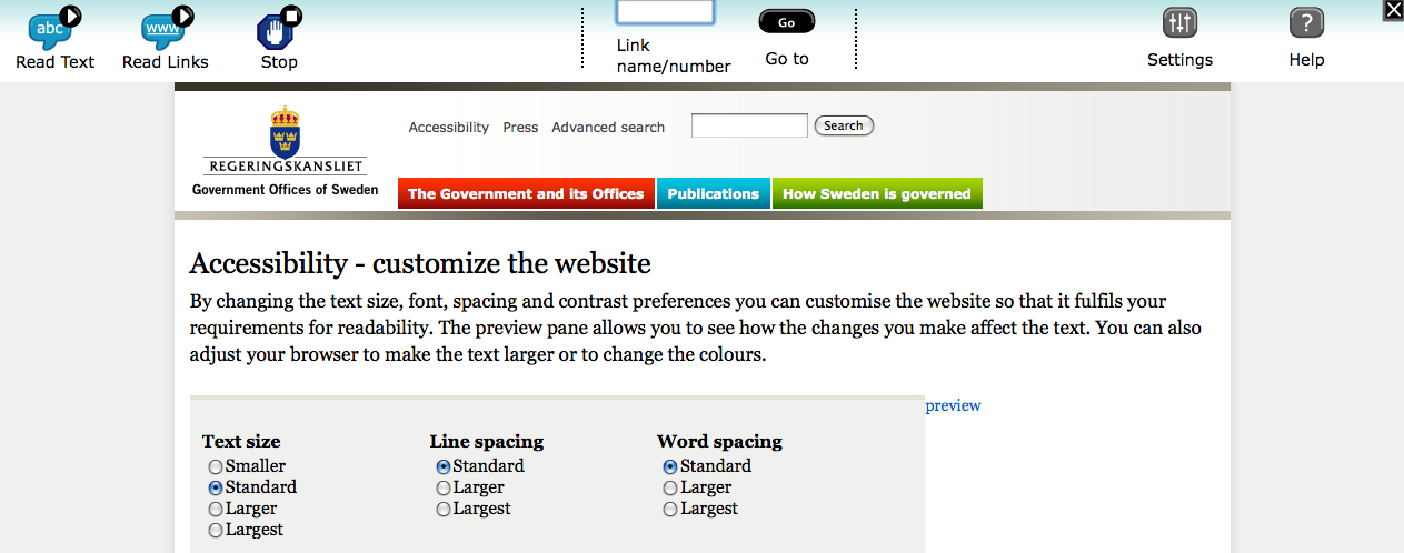
Government of Sweden
http://www.sweden.gov.se/sb/d/6909/doResetCustomizationSettings/true
The website has an accessibility page that offers a user multiple options. There is no instant preview, so the user must save changes to see the effects, but can reset to default.
Scrolling further down the same page...
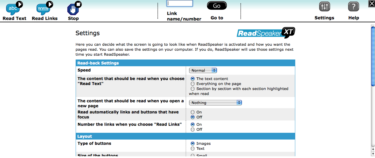
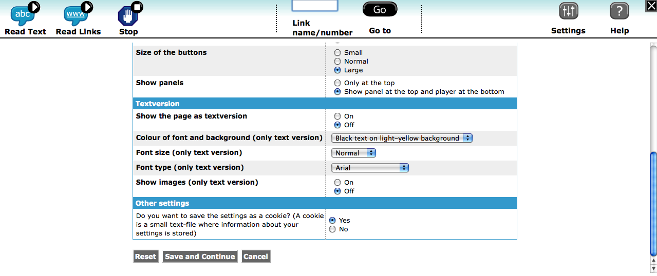
The website also has a screenreading function built-in. When the user presses the "Listen" link at the top of a page, a toolbar appears at the top with various ways for them to navigate:
When the user clicks on "settings," they see the panels below for further customization:
Scrolling down...
Government of Norway
http://www.regjeringen.no/en.html
Several languages are supported and text sizes:
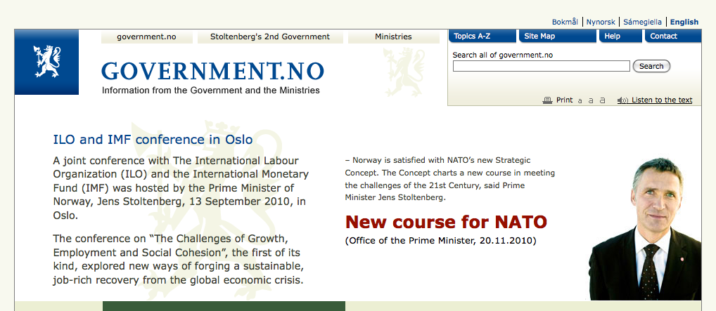
"Listen to the text" option brings up the same panel as the Government of Sweden screendreader. It also offers the same setting panel, which offers font size, colour etc. options.
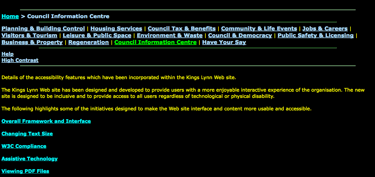
Borough Council of King's Lynn & West Norfolk
http://www.west-norfolk.gov.uk/default.aspx?page=15711
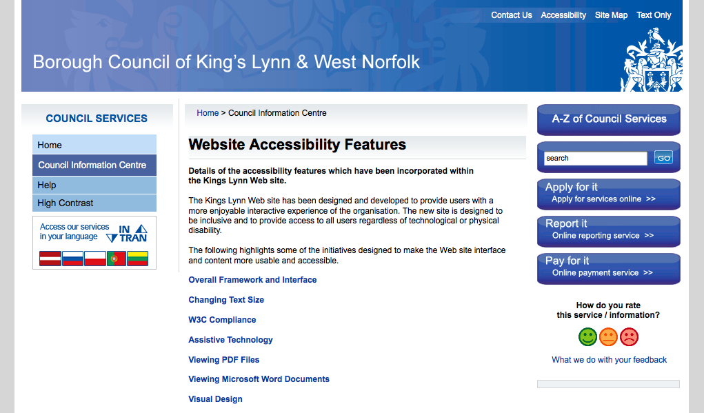
Text only mode: