Kathy's Evaluation
Sakai User Experience Walkthrough Report
(Accessibility and usability heuristic evaluations combined with cognitive walkthroughs)
*Evaluation Completed by:Kathy Moore
http://wiki.fluidproject.org/pages/editpage.action?pageId=1705336
9/10/07
Heuristic reviews and cognitive walkthroughs were performed on a Dell pc using an 1152px resolution and millions of colors using Win xp Firefox 2.0.0.6 on a T1 connection.
See Heuristic Evaluation for heuristics used in this evaluation.
Scope of Walkthrough
Announcements, Home, Assignment, Drop box, Email Archive, Forums, Mail tool, News, Resources, Syllabus, Web content,
*User profile(s) and context of use: Ed, student
Profiles will generally only be used for the cognitive walk-through, not the heuristic evaluation. However, users may be set up with a certain role in the system (e.g. student, instructor) for the heuristic evaluation.
• See Sakai Personas
Scenarios
Scenarios will generally only be used for the cognitive walk-through, not the heuristic evaluation. However, it is fine to use these scenarios for the heuristic evaluation if it is helpful to evaluators in figuring out how to walk through the application. See Content Management Scenarios for a list of all possible scenarios. Evaluators will likely only cover some of the scenarios, in one of the roles, in their individual evaluations.
- General Overview (heuristic evaluation)
- Scenario: Your instructor has made next week's assignment available. You are to write a 10 page paper reflecting on what you've learned half way through the term. Complete and turn in the assignment (since this is a paper you likely do this over a number of sittings). NOTE: You must have created this assignment as an instructor first.
- Scenario: Each week you need to post a topic and comment on one other student's post. Do your homework for this week's topic. You can respond to your own comment.
- Scenario: Figure out what the instructor expects you to do this week for class.
Assumptions for this evaluation:
• [List any additional assumptions used in evaluation]
Positive Findings
All positive findings, from both the heuristic evaluation and the cognitive walk-through, should be placed in this section.
Usability Positives |
Tool |
Evaluator |
|---|---|---|
Viewing an individual announcement, student sees helpful navigation buttons (Previous, Return to list, Next. Good navigation. |
Announcements |
Kathy |
Viewing an individual email, student sees helpful navigation buttons (Previous, Return to list, Next. Good navigation. |
Email Archive |
|
After opening an assignment, the student sees buttons above and below the assignment leading back to the full listing. Good navigation. |
Assignments |
|
Could that pattern be usefully applied to other Sakai tools? Could it possibly work in Resources? Here's a design pattern that Sakai uses well in a number of places; are there more where it could be used? |
|
|
Clear indication of status: After beginning the assignment and saving a draft, the student who returns and opens an assignment sees 'Assignment - In progress |
Assignments |
|
Feedback that an assignment has been submitted is very clear, in the assignments listing and because the user can send himself a confirmation. |
Assignments |
|
|
|
|
|
|
|
|
|
|
Accessibility Positives |
Tool |
Evaluator |
Page is structured into logical sections |
Home |
Kathy |
Important navigational elements are high on the page |
Home |
|
Tab order is logical and prioritizes major navigational elements: Login, sites, tools |
Home |
|
Page and type resize in response to user actions |
Home |
|
|
|
|
|
|
|
|
|
|
|
|
|
|
|
|
Summary of Usability & Accessibility Issues Found
All usability & accessibility issues found, in both the heuristic evaluation and the cognitive walk-through, should be placed in this section.
Priority Legend:
High = Task cannot be completed
Medium = Task completed with significant effort and failed attempts
Low = Task completed with minor complications and/or annoyance
Usability Issues |
Principle |
Link to screen shots |
Priority |
Suggestions for solution |
Tool |
Component Identified? |
|---|---|---|---|---|---|---|
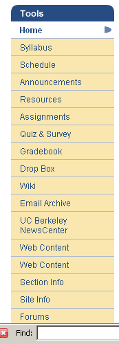
Tool menu difficult to scan, no obvious organizational principle |
Flexibility and efficiency of use |
|
Medium |
- Alphabetize, |
Home |
Drag and drop utility? |
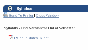
In Syllabus tool, document attachment doesn't offer immediate view of content |
Flexibility and efficiency of use |
|
Low |
Is there a way to show word or pdf doc in own i-frame? |
Syllabus |
|
In Syllabus tool, print button appears when only an attachment is visible; it has no meaning since it vanishes when document opens and can be printed. |
Error prevention Match between system and real world |
|
Medium |
Do not display print button if the only content is an attachment |
Syllabus |
|
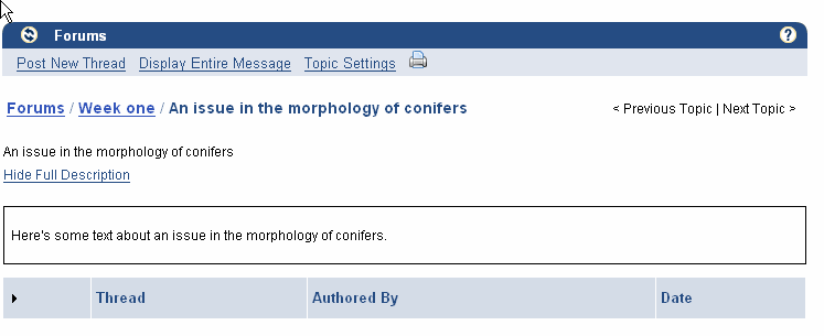
In forums, page is blank if there's been no instructor input |
Visibility of system status; Help and documentation |
|
Medium |
Display default text for students (and instructors?) |
Forums |
Automatic notification of last changes/ next step |
In Worksite setup, By default, student does not have ability to do anything but edit/delete "My Workspace" |
Visibility of system status; Help and documentation |
|
Medium |
|
Worksite setup |
Default text for students |
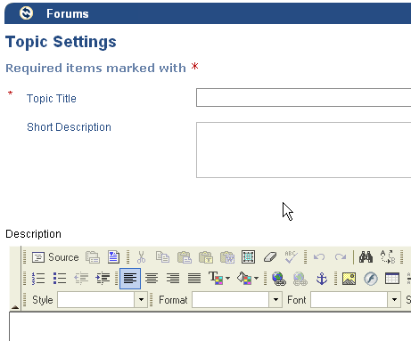
Default name for "Web Content" tells user nothing. |
Does a page title accurately describe its purpose? |
|
High |
Do not allow user to add tool without custom name; eliminate default in "add tool" process for this tool. |
Web Content |
|
Initial News page and links come up in Sakai but clicked links open in new tab |
Visibility of system status; |
|
Medium |
Continue to show content within Sakai?(Discuss accessibility of alternatives.) |
News |
Provide portal-like display widgets to give user control of link display. (uPortal/LMS convergence?) |
In absence of clear direction from Instructor, student must look in many places to see what is new in a class. (Syllabus, Schedule, Announcements, Assignments, Gradebook, Forums, Resources |
Flexibility and efficiency of use |
|
High: not insurmountable but a constant annoyance likely to impact success of pedagogy |
A "What's New" tool /utility might be a good thing This could be useful in uPortal as well. |
Home |
A "What's New" tool /utility might be a good thing This could be useful in uPortal as well. |
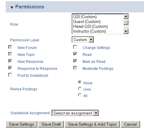
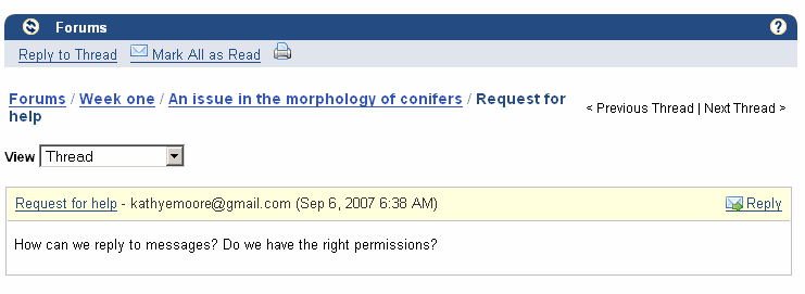
Permissions section in Forums is forbidding and intrudes itself into student attempt to post Topic |
Aesthetic and minimalist design |
|
Medium |
Allow faculty to set defaults, subject to change only upon request; |
Forums |
New permissions utility |
Does "Gradebook Assignment" belong under the "Permissions" heading? |
Are headings and titles clear and distinct? |
|
Medium |
Put this elsewhere and label it meaningfully |
Forums |
|
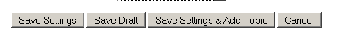
Submit buttons in Forums bury "Go" among too many choices |
Is navigation consistent and intuitive? Does the application follow platform and usability conventions? |
|
Medium |
Rethink integration of settings here Break buttons into two rows; one shows standard Save/Cancel |
Forums |
|
No confirmation after posting |
System visibility: |
|
Medium |
|
Forums |
|
There's more |
|
|
|
|
Forums |
|
|
|
|
|
|
|
|
|
|
|
|
|
|
|
|
|
|
|
|
|
|
|
|
|
|
|
|
|
|
|
|
|
|
|
|
|
|
|
|
|
|
|
Accessibility Issue |
Principle |
Link to screen shot |
Priority |
Suggestions for solution |
Tool |
Component identified? |
|---|---|---|---|---|---|---|
False? User is forced to tab through sometimes-lengthy tool menu to reach tool controls within page (Is this true?) |
Are shortcuts or skip links provided? |
|
Medium |
Are there shortcuts that aren't obvious to me? |
All |
Shortcut utility/coding |
I-frames constrain type awkwardly when user requires small screen/big type |
Is text still visible? Does it overlap? |
|
Medium |
|
Home |
|
WSYWYG editor doesn't seem keyboard-accessible; |
Are there any areas where you get stuck and have to use a mouse? |
|
High |
|
Schedule, others |
|
Action buttons in Resources (Add, Actions) do not seem accessible by tab |
|
|
High |
|
Resources |
|
|
|
|
|
|
|
|
|
|
|
|
|
|
|
|
|
|
|
|
|
|
|
|
|
|
|
|
|
|
|
|
|
|
|
|
|
|
|
|
|
|
|
|
|
|
|
|
|
|
|
|
|
|
|
|
|
|
|
|
|
|
|
|
|
|
|
|
|
|
|
Cognitive Walkthrough Worksheet
This section should be used by evaluators to keep track of the steps & screens they followed through the application in the cognitive walk-through. Any positive results or issues found should be included in the two sections above.
- Scenario: Your instructor has made next week's assignment available. You are to write a 10 page paper reflecting on what you've learned half way through the term. Complete and turn in the assignment (since this is a paper you likely do this over a number of sittings). NOTE: You must have created this assignment as an instructor first.
Tool: Assignments
# |
Step |
Screen |
Comments/issues |
Principle |
Suggestions for solution |
|---|---|---|---|---|---|
|
1 |
|
After opening an assignment, the student sees buttons above and below the assignment leading back to the full listing. Good navigation. |
Flexibility and effieciency of use |
|
|
2 |
|
After beginning the assignment and saving a draft, the user who opens an assignment sees 'Assignment - In progress |
Clear indication of status |
|
|
3 |
|
Feedback that the assignment has been submitted is very clear, in the assignments listing and because the user can send himself a confirmation. |
Clear indication of status |
|
|
|
|
|
|
|
|
|
|
|
|
|
|
|
|
|
|
|
|
|
|
|
|
|
|
|
|
|
|
|
|
|
|
|
|
|
Scenario: Each week you need to post a topic and comment on one other student's post. Do your homework for this week's topic. You can respond to your own comment.
# |
Step |
Screen |
Comments/issues |
Principle |
Suggestions for solution |
|---|---|---|---|---|---|
1 |
After filling in other fields, scroll down to find submit button; whoops, there's more... |
|
The permissions section is more than I need. Should students even see this?I don't know much about most of the custom roles, do I? Can't I do a blanket setting? |
Aesthetic and minimalist design |
Make permissions a section to be opened on demand rather than displaying all this by default |
1 |
After filling in other fields, scroll down to find submit button; whoops, there's more... |
|
Does "Gradebook Assignment" belong under the "Permissions" heading? |
Are headings and titles clear and distinct? |
This might make more sense somewhere else on the screen. |
1 |
Still looking to submit new topic |
|
"Post" button is buried in middle of four. Finding the right ("post message") button requires a larger mental load than necessary. |
Is navigation consistent and intuitive? Does the application follow platform and usability conventions? |
Rethink integration of settings here. |
2 |
Add Topic (with third button above) |
|
No confirmation |
Visibility of system status |
Show confirmation or list of topics |
3 |
Try to "reply" (thinking that topic has begun the thread) |
|
No obvious way to reply to post |
System Visibility |
|
3 |
Try to reply, post new message |
|
There's a lot of room for confusion between "forum." "topic," and "thread." |
Match between system and real world;Is plain language used? |
|
|
|
|
|
|
|
|
|
|
|
|
|
- Scenario: Figure out what the instructor expects you to do this week for class.
# |
Step |
Screen |
Comments/issues |
Principle |
Suggestions for solution |
|---|---|---|---|---|---|
1-8 |
Check |
|
This is a lot of places to check. The instructor has probably made it clear what the procedure is, but... |
Flexibility and efficiency of use |
A "What's New" tool /utility might be a good thing This could be useful in uPortal as well. |
|
|
|
|
|
|
|
|
|
|
|
|
|
|
|
|
|
|
|
|
|
|
|
|
|
|
|
|
|
|
|
|
|
|
|
|
|
|
|
|
|
|
|
|
|
|
|
|
Scenario 4: Left in place just in case...
# |
Step |
Screen |
Comments/issues |
Principle |
Suggestions for solution |
|---|---|---|---|---|---|
|
|
|
|
|
|
|
|
|
|
|
|
|
|
|
|
|
|
|
|
|
|
|
|
|
|
|
|
|
|
|
|
|
|
|
|
|
|
|
|
|
|
|
|
|
|
|
|
|
|
|
|
|
|