Ashish's Resources Walkthrough
Scenario
Cognitive walkthroughs was performed on a Windows Vista OS using a 1280 X 800 pixels resolution and 32 bit colors using Mozilla Firefox 2.0.0.7 at a broadband connection with 6 Mbps connection rate.
System Definition
Resource tool is used to upload files/folders/images or a new html page within the worksite. This is extensively used by teachers for distributing class readings and other important stuff, which she can upload to the course worksite and send everyone the link/email about the same. This tool is also used by students for submitting their assignments or projects without flooding the mailbox of the TA or the course instructor. This can also be used to promote interaction and sharing of resources between the project team or class.
User Persona
Sara taught at the University of Pennsylvania before joining MIT 2 years ago. She is married with 2 kids and stays extremely busy teaching an undergrad psychology course for the 2nd year and a new on-line course in organizational management. She is fairly comfortable with computers. She's excited to be using technology to help with her teaching but she sees as a means to an end in order to stay in touch with students and allow them access to course resources when they need it. In fact, the LMS will replace her face-to-face communication with students for her on-line course.
She knows that even students she sees in class twice a week would like to her to be more responsive and looks to the course site to help with that. She used Blackboard at PA and notices that she has expectations based on that experience...some good, some bad.
Goals
- Build on course materials from term to term
- Not to have to ask for help
- To spend as little time as possible doing administrative work; she'll delegate to her TA's
- To get tenure (get credit for tenure for everything she does)
- Use technology to help create an engaging and interactive environment for her on-line students where she can track their progress
- To be respected by students, colleagues and dean of school
Level of Expertise / LMS Use
- Teaching for 10 years, uses software apps like Word, excel, ppt, email, on-line research.
- Has used other LMS's and has used Sakai as a compliment to her f2f interaction with students in the classroom for 2 semesters.
- She interacts with the system a lot at the beginning of the term as she sets up her site. Throughout the semester her use is sporadic.
Context of use
Sakai is an online Collaboration and Learning Environment. The typical usage which we are focusing on right now is in educational environment where it is used to support teaching and learning, ad hoc group collaboration, support for portfolios and research collaboration.
Tasks
A sample set of task was provided to the user to perform and his expectations and system status were then carefully observed by the evaluator.
- Login with your username and password.
- Click 'Resource' from the navigation menu on the left.
- Click 'Upload File' from the 'Add' dropdown menu of the 'My Workspace'
- Click the 'Browse' button to select the file to be uploaded
- Add another file by clicking on 'Add Another File' link.
- Click the 'Browse' button to select the file to be uploaded
- Click 'Upload Files Now'
- Delete one of the uploaded file. Select 'Remove' from the dropdown menu of the file.
- Click on 'Remove'
Summary of Issues Found
Issues |
Justification |
Severity |
Suggestion for Solution |
|---|---|---|---|
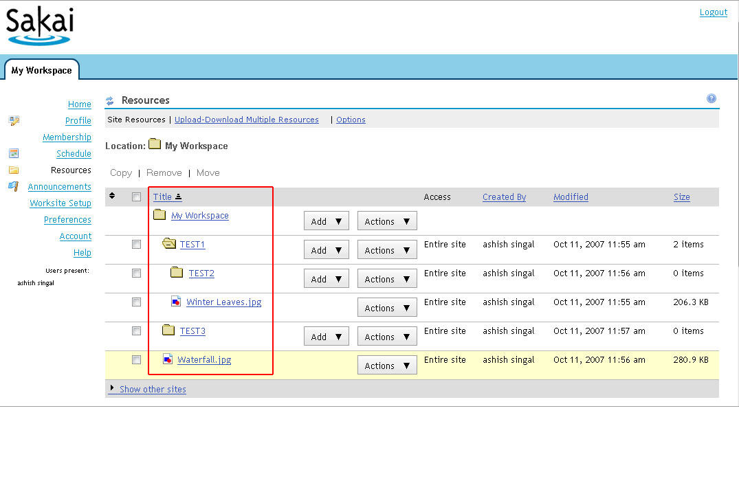
Unnecessary Breadcrumbs: (Refer to Image 1 in Appendix) These breadcrumbs add to the visual clutter of the page without providing much of the information. Also these are different from what users generally perceive them in this context, i.e. for navigation. |
Aesthetic and minimalist design. Mismatch between system and mental model |
Medium |
This can be avoided completely. According to another survey, these breadcrumbs are very less productive and efficiently used. |
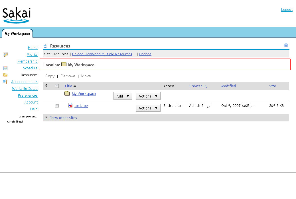
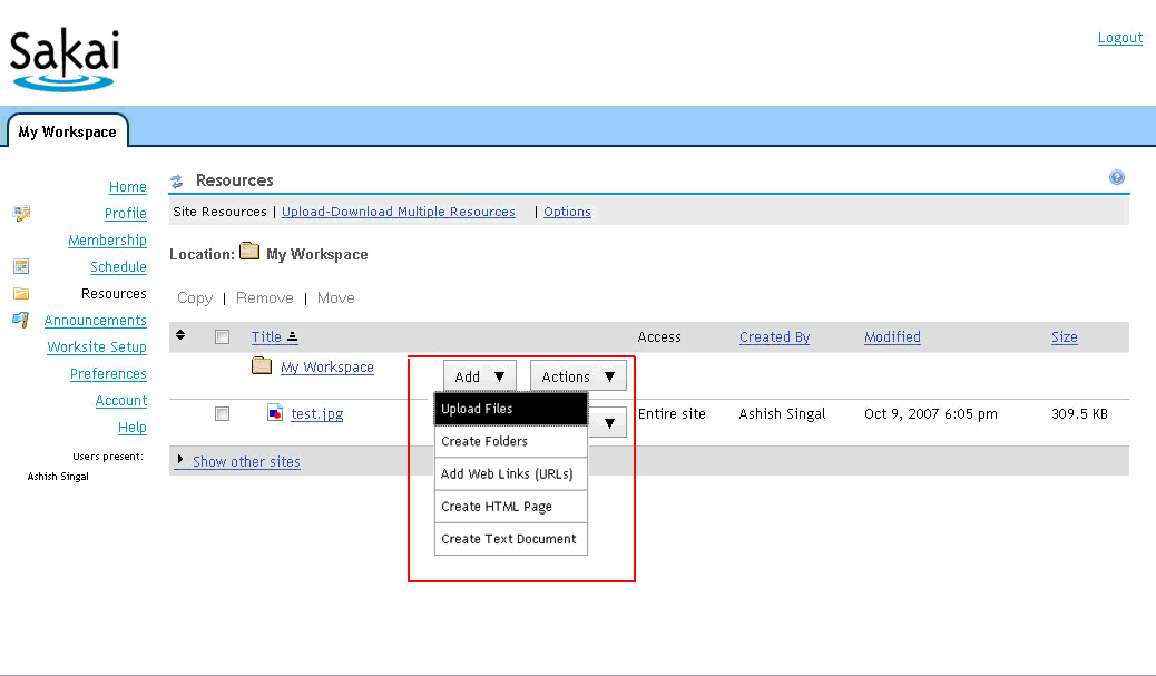
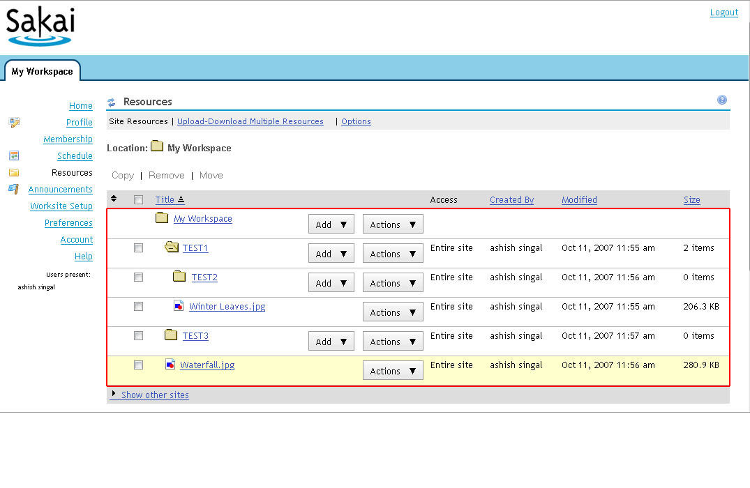
Multiple Dropdowns: (Refer to Image 2 in Appendix) Alignment and positioning of the drop downs make it difficult to recognize and differentiate between different columns of the table |
Recognition rather than recall Aesthetic and minimalist design |
High |
Grouping similar attributes related to particular feature. Clear labeling of different sets of available options in two dropdowns |
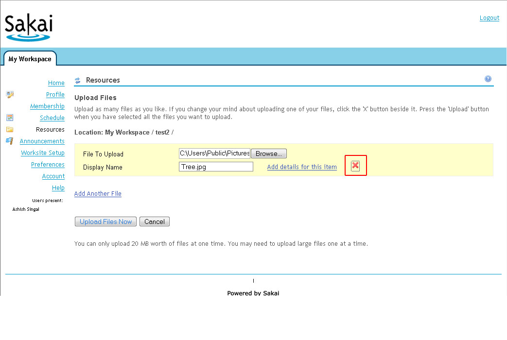
Delete Icon: (Refer to Image 3 in Appendix) The delete button doesn't works in case of a single file being uploaded. |
User Control and Freedom |
Medium |
Remove the button in case of a single file upload. Should be used only when multiple files are being uploaded |
Help Text: (Refer to Image 4 in Appendix) The help text provided is placed at a wrong place. |
Error Prevention |
Medium |
Should be placed right below the 'Files to Upload' field |
Upload Table: (Refer to Image 5 in Appendix) The tree hierarchy structure for different folders and files in this table are very confusing. User has to wait and perceive the correct structure of the folders before moving forward |
Match between system and the real world. Consistency and standards |
High |
Proper structuring/indentation/formatting is required for this. A mapping of window folder structure onto this table can also be one of the solutions, something like dotted lines augmenting the hierarchy of the folders and files |
Rearranging the files: (Refer to Image 6 in Appendix) If the user wants to rearrange some files/ archive them, it takes a lot of steps to complete the task. There are no easier and shorter ways to achieve this task |
Flexibility and efficiency of use |
Low |
A simple and rich structure like AJAX widgets or drag drop boxes will provide the user with ease to perform task. |
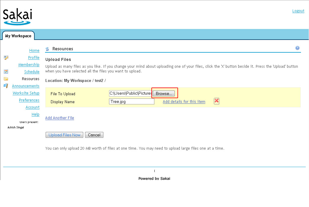
Upload Files dialogue: (Refer to Image 7 in Appendix) The browse button and the label field are too close to each other, breaking the grid and visual harmony |
Aesthetic and minimalist design. Consistency and standards |
Medium |
A careful and well-aligned structure should be followed |
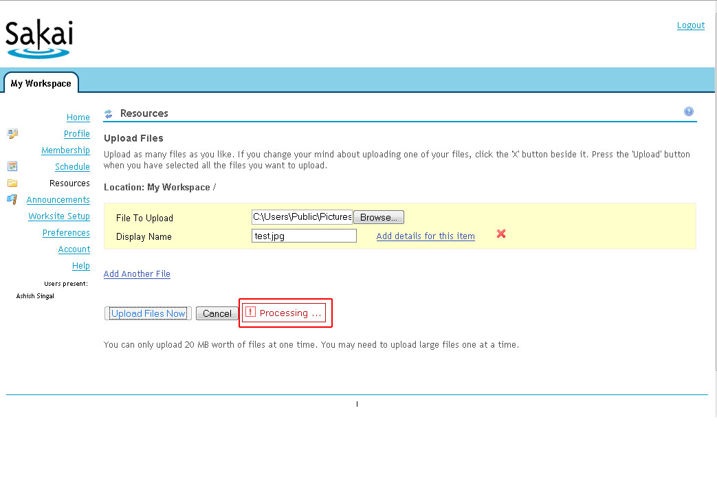
Process Update: (Refer Image 8 in Appendix) The progress bar/update bar doesn't matches the user's mental model of this as an information, rather is perceived as error. This 'process update' bar is different when creating folders. |
Match between system and the real world. Consistency and standards |
Medium |
Change the color from red (which implies error) to a subtle color (say, purple) providing the correct visual cue for information textboxes/bars. |
Priority Legends:
High/ Extreme = Task is very difficult to complete and design needs urgent attention
Medium = Task completed with significant effort and failed attempts
Low = Task completed with minor complications and/or annoyance
APPENDIX
Picture 1: Unnecessary Breadcrumbs |
|
Picture 2: Multiple Dropdowns |
|
Picture 3 : Delete Icon |
|
Picture 4 : Help Text |
|

Picture 5 : Upload Table |
|
Picture 6 : Arranging/Rearranging the files |
|
Picture 7 : Upload Files Dialogue |
|
Picture 8 : Process Update |
|