(Floe) UI Options Design Explorations, C.1
Please download the PDF file for proper rendering of the content.
In reverse-chronological order from most recent to oldest
Winter 2012
Configurations Mockups
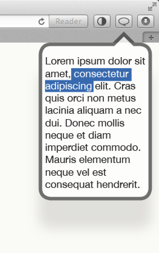
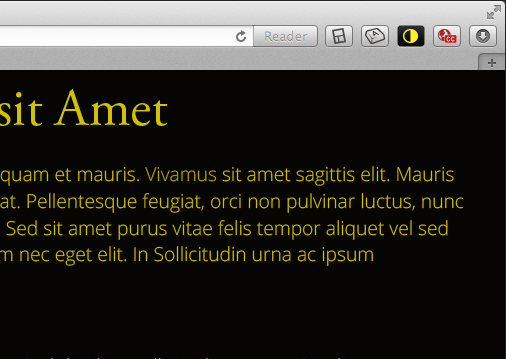
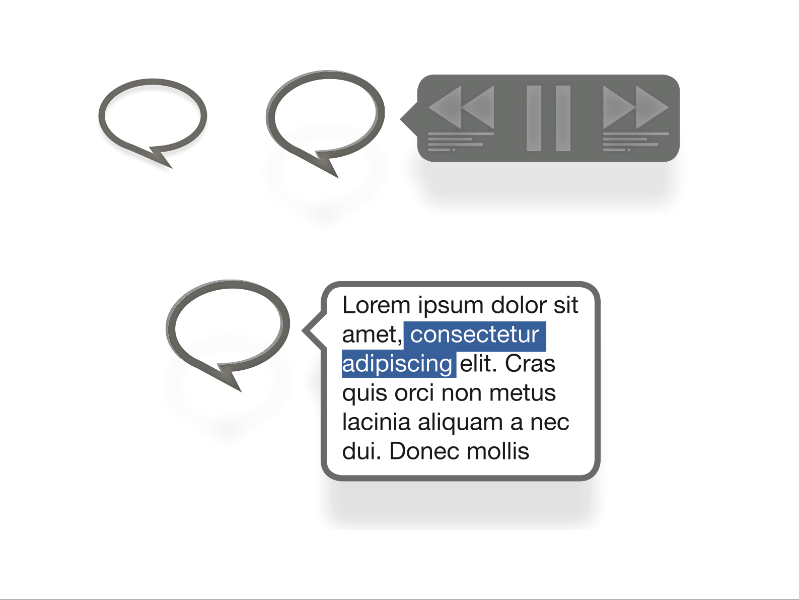
Browser Toolbar
Download Exploration set 2 PDF
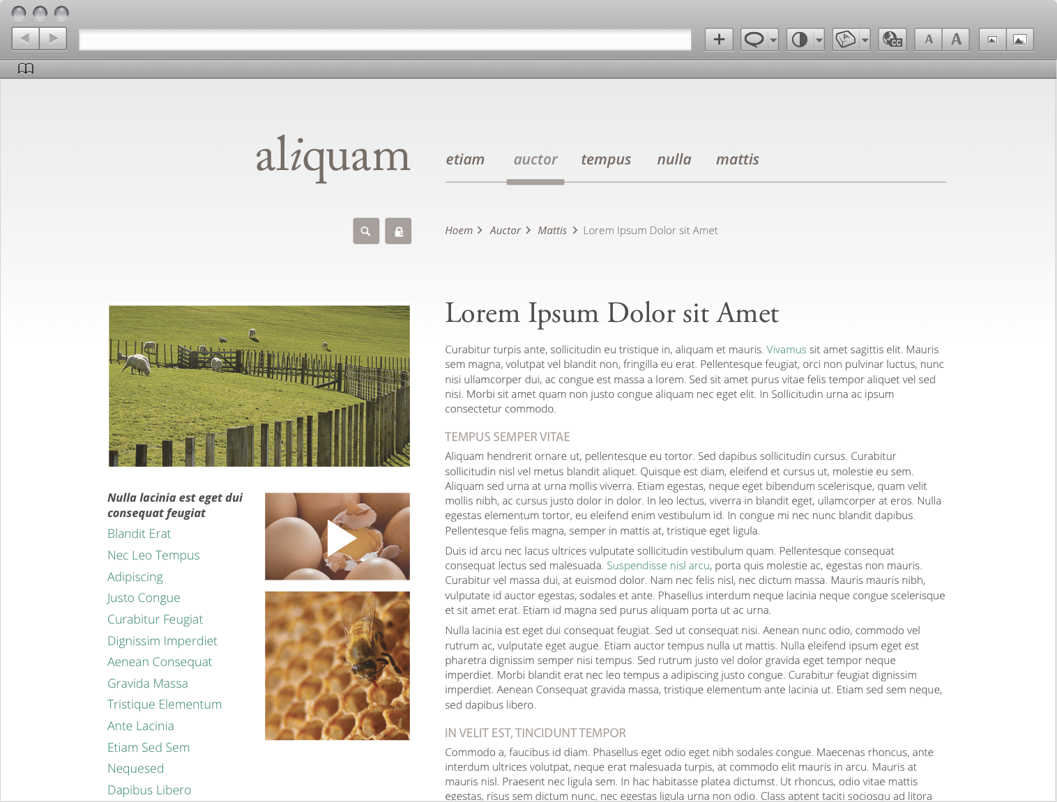
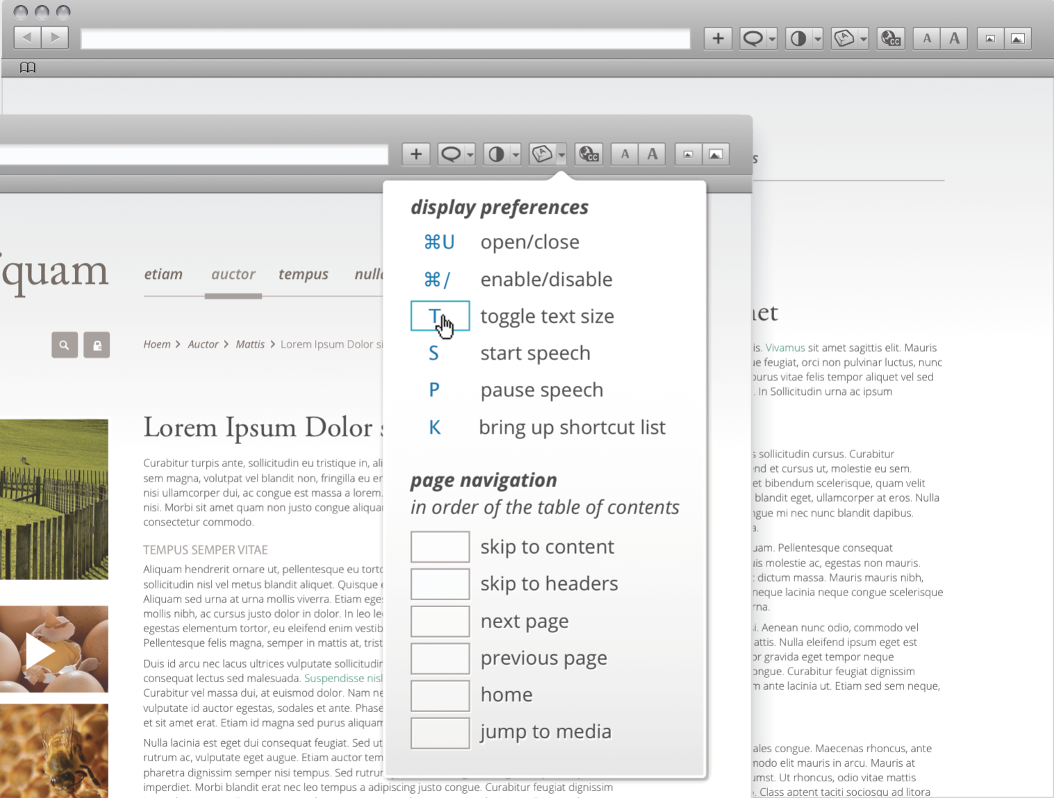
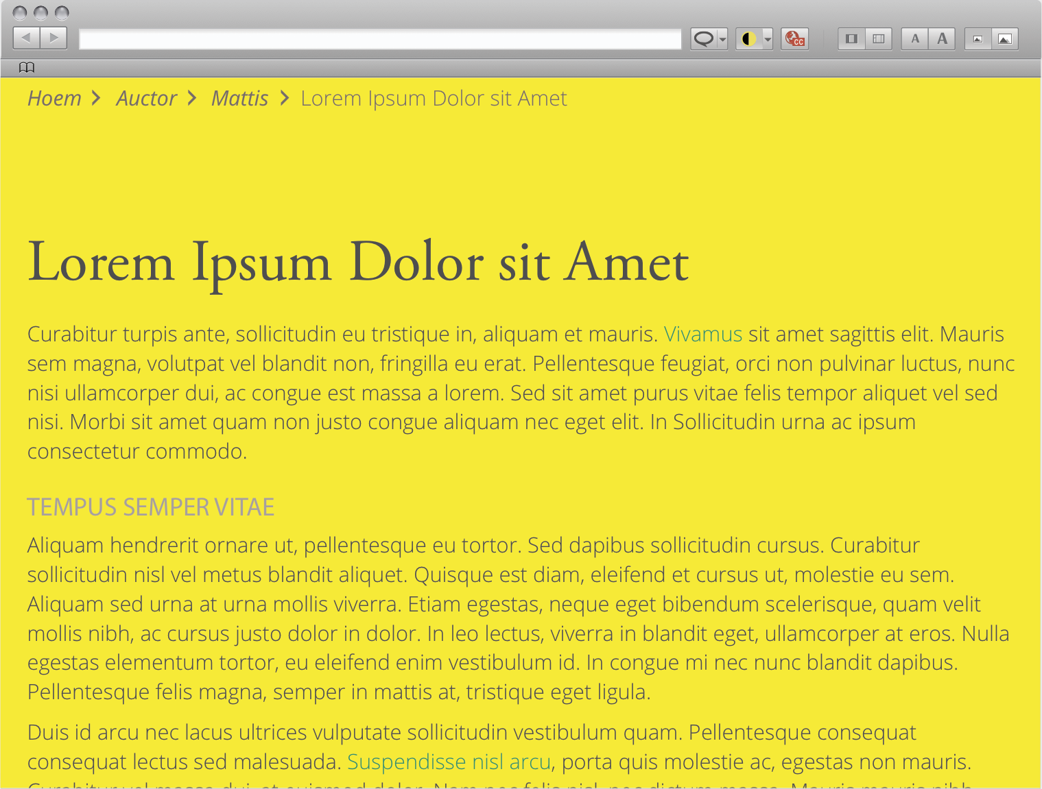
Download Exploration set 1 PDF
Browser Extension
Download Exploration set 5 PDF
Download Exploration set 3 PDF
Download Exploration set 2 PDF
Download Exploration set 1 PDF
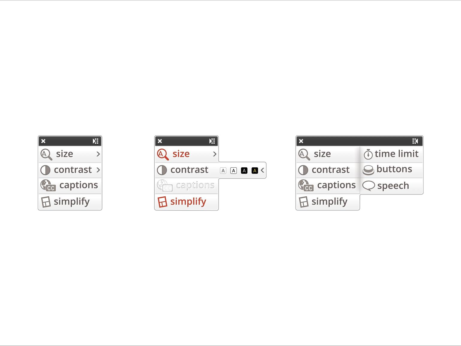
Float Panel
Download Exploration set 1 PDF
Summer 2012
Configurations Wireframes
On-Page Search
Download Exploration set 2 PDF
Download Exploration set 1 PDF
Initial Screen:
- search bar appears after display preferences has been clicks
- recommendations & categories on default screen
Making Searches:
- reset button replaced by on/off switch
- check-mark indicator when preference has been modified
- preferences in expandable/collapsable menues
- multiple themes can be selected except default
- after preferences have been modified default gives a quick links to view them
- 'my preferences' is inputed into the search field
> reset button available under this search - if no preferences have been configured message shows
> recommendations & categories show below - if a preference is not available recommendations show and option to send a request
- multiple options for simplify depending of users familiarity with the site
> focus view: only elements the mouse cursor/ focus is on are at full opacity
> minimize content: users indicate content they do not wish to see
> site columns: taken from responsive version of the site - Using with Content:
> if content is selected, relevant terms are inputed into search fields
> if nothing is selected relevant recommendations are given
Fatty
Download Exploration set 3 PDF
Download Exploration set 2 PDF
First page
- Options appear in a grid like structure. User can drag to resize the panel and show more options.
- Limited number of options are available to the user (frequently used options appear in panel). User can use the search function to find more options.
- Search appears in space on the right of the panel. Search results appear below search bar, users can click on individual results to show them in the grid or select to show all the results within the grid.
- Box on bottom left of page indicates what might happen when a user is tabbed onto or hovering in a grid space. Option to pop the box out onto the page (if appropriate, i.e. site/page menu, text-to-speech control), user could possibly click on background of box to make a 'more like this' option appear.
- Simplified grids in bottom right indicate how grid would behave when resized. Gray box indicates the search panel.
Second page
- Grid structure of options continues
- Search bar now fills space at top of panel, when a user makes a search, results automatically appear in the panel (panel resizes to fit all options).
- When no search is inputed a limited number of frequently used options appear within the panel.
- Simplified grid in bottom left indicates how panel will behave when resized, search always remains at top while boxes move
Third page
- Search bar remains hidden until user clicks on search button in top right
- Alternative to searching by keyword; user can click and drag search icon onto the page and over content (i.e. words, images, video) to bring up relevant options in the panel
- Possible integration of search function into 'display preferences' tab for easy access
Download Exploration set 1 PDF
- Horizontal panel collapsed. Appears as a simple bar, with a search box (to search for UIO features). This configuration can be applied to desktop and tablet (landscape orientation).
Page 2
- Panel collapsed, mouse over. When the mouse is over the bar or over the search box, the UI Options categories are displayed (categories in this mockup are provisional).
- "Your favorites" lead to all the Options that have been previously modified by the user.
- "Presets" lead to themes or global configurations.
Page 3
- The panel expands when the user clicks on the menu. Only main options are initially displayed.
- Secondary or more specific options remain hidden but available under "Show more options".
- When the mouse is over a feature, some options may appear (eg. "reset" in the mockup).
Page 4
- The panel may contain many primary options. In this case, the user can scroll them.
Page 5
- Proposal 1 for secondary features: appear in an scrollable, resizable panel.
Page 6
- Proposal 2 for secondary features: appear in a fixed panel.
Page 7
- Proposal 3 for secondary features: appear in a menu.
Page 8
- The panel drags as the user scrolls the page.
Following pages
- Vertical panel, with a similar behavior. This configuration can be applied to desktop, tablet and mobile (portrait orientation).
Full Page
Download Exploration set 2 PDF
Download Exploration set 1 PDF
Page 1 (proposal 1)
- Horizontal menu of categories
- All the primary and the secondary options appear at the same time, but the levels are visually differentiated.
- Features are ordered, when necessary, but subcategories (like Headers or Links, in the mockup).
- Preview covers the right column. Preview is draggable.
Page 2(proposal 2)
- Vertical menu of categories
- Preview window. Preview is draggable and the preview window is resizable.
Page 3(proposal 3)
- Modular full page.
Features and Functionality Wireframes
Download Exploration set 4 PDF
- Features and functionality explored in the above designs:*
Features - Table of contents
- Emphasize key elements
- Distance between columns
Behavior - Options included in the features-1: in some occasions, the user will be able to customize the way in which a feature is applied. Page 2 shows how the user can select the table of contents position.
- Table of contents as a draggable layer. In case the table of contents is large, the layer is resizable (page 3).
- Options included in the features-2: in some occasions, the user will be able to customize the items affected by a feature. Page 4 shows how the user can select the elements to emphasize.
- Undo (only for features that can be undone): undo button appears when on mouse over the panel.
- Displaying the area affected by a feature: when possible, the area affected by a feature is colored, to indicate the user what he is transforming (page 5). In cases in which displaying this area my lead to confusion, the effect is avoided (page 6)
Download Exploration set 3 PDF
Features and functionality explored in the above designs (not in any particular order):
- Menus for page and site navigation
- Cursor and focus styling options
- Preset profiles
- User generated profiles
- Sharing profiles with other users
- Timed profiles
Download Exploration set 2 PDF
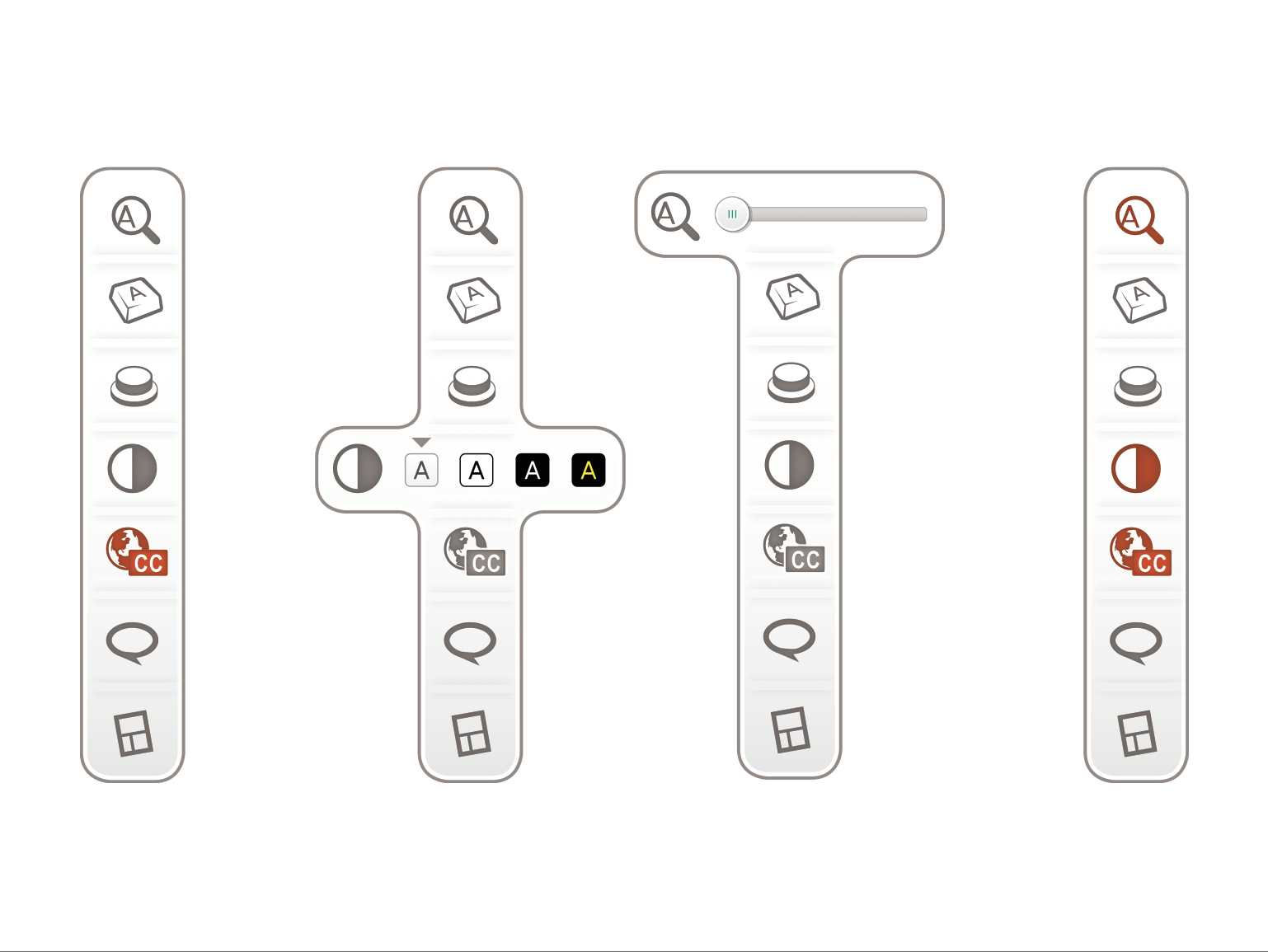
Easier Readability:
- text size
> paragraph and heading values separate when 'size headings separately' box is checked off - image
> size images with text
> enable fullscreen on all images - contrast
> tooltip gives contrast theme name - line spacing
- type style
Identification, Tracking, Orientation:
- emphasis
> enlarge mouse cursor: tooltip animates cursor enlarging
> highlight text cursor
> bold & underline links - focus interaction
> colour choice for focus style
> radio buttons for background or outline
> enlarge input fields
> group similar elements: tooltip with more information - emphasis headings: turning it on enables options
> size: adjusting size automatically separates text size into two values
> bold & underline checkboxes - orientation
> show table of contents
> constant tooltips
> show skip to content links
Interaction:
- time dependency
> version one: radio buttons for default settings, slow down, pause & stop
> version two: slider from default to stopped, check boxes for related options
> version three: slider including all options - buttons & links
> bold & underline
> audio interaction feedback: on hover sound plays
> visual interaction feed back
Keybindings:
- keyboard shortcuts: can be turned on/off
> full keyboard appears on fullscreen: unavailable, in use, and available keys highlighted
> check box to show keyboard shortcuts hints throughout site
> keybindings are editable
Download Exploration set 1 PDF
- Features and functionality explored in the above designs (not in any particular order):*
- Text size (w/ lock for scaling with icon size; should also include scaling lock option for images generally, i.e., à la modern browser zooming)
- Line height
- Contrast (should also include customized contrast options, both wrt to colours and contrast ratio)
- Text style
- Audio and video captions
- Interactive transcript (w/ option to lock transcript-scroll syncing with playback)
- Text-to-speech (should we also include gender, accent, localization options?)
- Further explored on Page 2
- Note option to start midway in content, activated via text selection
- Localization
- Further explored on Page 3
- Note dictionary integration when the translation is side-by-side with the original
- Keyboard shortcuts
- Further explored on Page 4
- Link highlighting
- Cursor highlighting (distinguishing between mouse and key cursors)
- Header highlighting
- Table of contents
- Input size
- Always-on tooltips
- Further explored on Page 5
- Problematic design: above designs are doctored to avoid showing overlapping tooltips, but the general case might introduce overlapping tooltips
- Audio feedback
- Timing adjustments
- Further explored on Page 6
- Three considerations:
- Scaling of time (e.g., slowing down time by a factor of 1.2x)
- Stopping time (i.e., converting time-based interactions to non-time-based ones, e.g., requiring previously time-based fading status messages to ones that require an interaction to close)
- Pausing time (i.e., temporarily freezing any time-dependent interactions, e.g., keeping a fading status message visible)
On this page