UX Walkthrough pilots - Daphne, Clayton & Colin
(Accesibility and usability heuristic evalutions combined with cognitive walkthroughs)
Evaluation Completed by: Daphne Ogle (DO), Clayton Lewis (CL), Colin Clark (CC)
URLs:
- Tools Heuristic Overview: https://sak-qa.berkeley.edu/portal/; using the '107 Plant Morphology' site as our target since it is suggested as a "typical" course site
- Scenario Walkthroughs: http://bspace.berkeley.edu;
Each evaluator used a unique instructor login created for the evaluation and created individual course sites.
Date: August 15, 21, & 22, 2007
See UX walkthrough guidelines for heuristics and cognitive walkthrough questions used in this evaluation.
Scope of Walkthrough
Functional areas (Sakai content-management related Tools) focused on for review:
- Announcements
- Home
- Assignments
- Drop Box
- Email Archive
- Forums
- Mail Tool
- Resources
- Syllabus
- Web Content
User profile(s) and context of use:
Persona: Sarah Windsor - Overwhelemed Faculty
Scenarios:
- General Overview of content management tools (traditional heuristics-style)
- Create course site
- Add syllabus to site
Assumptions for this evaluation:
- Through working in groups, usability and accessibility perspectives will both be represented
- bSpace (Berkeley's instance of Sakai) is a decent representation of Sakai instances. Evaluators will look for issues related directly to the skin which is much different than the Sakai out-of-the-box skin.
Summary of Positives found
Usability Positives |
Tool |
Evaluator |
|---|---|---|
Permissions matrix format is mostly consistent across tools. Users can leverage learning in one tool for usage in others. |
All tools > Permissions |
CL |
When adding participants to a site via their email address, the system checks for valid email address. Protection against users entering the wrong address and not realizing it. |
Worksite Setup & Site Info > Add participants |
CL |
|
|
|
|
|
|
|
|
|
|
|
|
|
|
|
|
|
|
|
|
|
Accessibility Positives |
Tool |
Evaluator |
Tool & content distinction pretty clear |
|
|
While creating course, default of current semester is good - in most cases user won't have to move down in drop down. |
|
|
WYSIWYG editor listens to common keyboard shortcuts |
|
|
|
|
|
|
|
|
|
|
|
|
|
|
|
|
|
|
|
|
Priority Legend:
High = Task cannot be completed
Medium = Task completed with significant effort and failed attempts
Low = Task completed with minor complications and/or annoyance
Summary of Issues Found
Usability Issues |
Principle |
Link to screen shots |
Priority |
Suggestions for solution |
Tool |
Component Identified? |
|---|---|---|---|---|---|---|
General |
|
|
|
|
|
|
On initial view of system it is not clear why I see what I see (what role am I) and how that compares to what others see. This is particularly important because of the hierarchical structure of a class and the need to protect students confidential information. |
Visibility of system status |
|
High |
Display users role on every page. Allow instructors to "see what students" see. Rough designs were started on this for the gap work during Sakai's grant days. |
All |
"Role identifier" and/or "Student View" |
Permissions settings are not human readable ( ex. "all.groups", "new") |
Match between system and real world - System should speak user's language |
Medium |
Use terminology that matches user's mental model of the action. The label should be in the "verb + noun" format. For example, "new" in the Assignments Tool could be replaced with "create assignments". Tool tips on the permission settings could add additional information if needed. |
All |
|
|
Permissions table is not clear. It is not immediately clear is the row or column is the 'role' |
Minimalist design |
Medium |
If it's meant to be spreadsheet like then make it look more like a spreadsheet with gridlines and the such. |
All > Permissions |
Permissions |
|
If the user plays around with permissions, there is no way to get back to the default unless they remember. |
Recognize rather than recall |
|
High |
Add a "revert to default" button (better terminology than default should be used) |
All > Permissions |
Permissions |
Gradebook |
|
|
|
|
|
|
"Release assignment" is jargon -- not likely a term familiar to instructors. |
Match between system and real world - System should speak user's language |
|
Medium |
New GB designs for 2.5 have a definition link built into several terms like this. Term is always displayed clickable link that on click displays the definition. Need to confirm this was implemented with IU. Not sure this is accessible. |
Gradebook |
Term Definer |
Home |
|
|
|
|
|
|
"Worksite info" is not a familiar term to users. It doesn't align with the idea that they are working in their Course site. |
Match between system and real world - System should speak user's language |
Medium |
Rename to "Course site information". The appropriate course type should be inserted for "course". |
Home |
Home |
|
Arrangement of tools is inflexible and doesn't always match user needs. For instance, new announements may be most important as deadlines approach yet they are buried below the fold. |
User control & freedom |
|
Low |
Allow users to easily reorganize this page as appropriate for current situation |
Page layout/organizer |
|
Syllabus |
|
|
|
|
|
|
If user has uploaded a pdf of their syllabus it displays as a link to the pdf rather than the contents displaying in-line on the page. The users viewing the pdf are required to manage multiple windows since the pdf opens seperately. This particularly cumbersome for keyboard and screen reader users. |
Minimalist design |
Medium |
Display contents of the pdf on the page (as if an image). The root of the issue is the metaphor the tool currently uses -- syllabus are created within the tool so each document uploaded is treated as if an item in the syllabus. The more typical user model is to have an existing syllabus document that they can either display in this tool or copy and paste into the tool. |
Syllabus |
Resources Viewer (look at what Cambridge is doing here) |
|
Schedule |
|
|
|
|
|
|
Intra-tool navigation links at the top of the page are not clear from their labels -- they are not explicit and some use language that will be unfamiliar to users in this context. |
Match between system and real world - System should speak user's language |
Low |
Use explicit terminology in the form of "verb + noun". Use terms that match users model of the action (i.e. "Display more schedules" rather than "Merge"). |
Schedule |
|
|
If user has no other schedules to merge (they don't own other site for instance), when they arrive at the "Merge" page, there is nothing listed. This is further confused by the unclear label of the page itself. |
Match between system and real world - System should speak user's language |
Medium |
Rather than a blank list, display a message: "You do not have any other schedules to display. You may only display schedule items from other sites you own." (needs better language). |
Schedule > Merge |
|
|
Title of Merge page and instructions refer to "calendar" but "schedule" is used everywhere else |
Consistency & Standards |
Low |
Use either calendar or schedule everywhere when referring to the same thing. |
Schedule > Merge |
|
|
Calendar is more common terminology for what that schedule tool is (ical, Oracle calendar, Outlook calendar, etc.) |
Consistency & standards |
|
Low |
Change tool name and all related references to Calendar. |
Schedule |
|
On the Fields page, it's not clear what "fields" are (same goes for intra-tool nav label). Am I choosing new fields, do I need to choose from this list? Also, what kind of interaction will these have for users creating new items: date for instance? |
Recognition rather than recall - User should not have to remember information from another part of the system. |
Medium (edge case functionality not used often) |
Rename this functionality to something that better matches the user's mental model. Even something like "Schedule item attributes" would be better (although attribute is pretty geeky). |
Schedule > Fields |
|
|
On the Fields page, the remove checkboxes do not look connected to the fields. Also the initial inclination is that checked items will appear and unchecked won't since this is a common interaction in Sakai. |
Consistency and Standards |
Medium |
At a minimum make the left table column less wide so there is a visual connection between the item in the list and it's checkbox. Even better change the interaction so there is no doubt what the user is doing. Some ideas are a "wysiwyg interface" (described in issue above) or a different layout where the fields are checked if they're included. |
Schedule > fields |
Form editor (perhaps far reaching but could somehow be related to the form creation in OSP assuming they start with a good default) |
|
User expects to be able to click on date to enter a new activity. |
Consistency and Standards |
|
Medium |
Clicking on date should open form to add a new date with known information filled in (i.e. date & time) |
|
Calendar, Add calendar item |
Assignments |
|
|
|
|
|
|
List navigator widget defaults to "show 200 items per page" even though there is only 1 item in the list. Would there ever be 200 assignments? |
Visibility of system status |
|
Low |
Default to more reasonable number. The style guide says the default is 25. Since the number of assignments varies by teaching style it would be even better if this widget was "smart" and remembered the users last setting. The few times they set it differently than their norm they simply change it back (better than changing it every time). |
Assignments |
List Navigator |
In permissions, the site ID displays at the top of the page which means nothing to users. In fact it looks pretty scary. |
Minimalist design - every extra unit of information competes with the relevant information |
Low |
Hide the site ID. It adds no value to users. |
Schedule > permissions |
|
|
Email Archive |
|
|
|
|
|
|
Site ID as email address means nothing to users. There is NO WAY they will remember that address. It is not needed since the user creates an address. |
Minimalist design |
Low |
Hide the site ID email. In fact, there is no need to create one since users are forced to create one for the site. |
Email Archive |
|
|
News |
|
|
|
|
|
|
Choosing "graphic version" links opens a new window which displays the graphic version forcing the user to manage multiple windows (additionally difficult for keyboard and screen reader users) |
Visibility of system status & Accessibility? |
|
Medium |
At minimum add text letting the the user know the link will open in a new window so it is not as jarring. Even better display the graphic version inside the tool -- replacing the text version. For the latter a "text only" link would also be needed that toggles with the "graphic version". |
News |
|
Only 1 RSS feed is allowed which is very similar to the web content functionality aside from the URL. |
Consistency and Standards -- because of other RSS readers users expect an aggregator |
|
Low |
Treat this tool as an aggregator and allow several RSS feeds to be added. The page will need some redesign to allow for multiple to display. |
News |
RSS Aggregator |
News requires the user connect to an RSS feed to display in the window. However, the form asks only for a URL with no indication that it must be an RSS format. |
Error prevention |
Medium |
Add example and/or text to explain this is for an RSS feed. A bonus would be to list possible RSS's users in higher ed might be interested in. This would need to be customizable by institution. |
News |
RSS Aggregator |
|
Web Content |
|
|
|
|
|
|
If the user does not rename their web content tool and includes more than 1 in a site, it is impossible to tell the difference between the 2 without opening each tool (left nav labels are identical) |
Recognition rather than recall |
Medium |
User's shouldn't have to remember what is behind "web content". Given the function of the tool, to display another website within the site. Make renaming the tool required rather than optional. |
Web Content (left Nav) |
|
|
The options form asks for both 'tool title' and 'page title'. It's not clear what the difference is or which one will change the name in the left navigation. |
Match between system and real world. |
High (edge case functionality?) |
Use labels that clearly state what these labels point to -- in the user's language. Users may have the concept of a tool but likely not a page. |
Web Content > Options |
|
|
Site Info |
|
|
|
|
|
|
"Site Info" is not a term familiar to most faculty. For instructors the tool is more than "info" it is an administrative tool. |
Match between system and real world - speak the users language. |
|
Low |
For roles that are allowed to edit the site, such as instructors, rename to "Course Site Administration" (where "course" is replaced with the appropriate site type). For roles without site edit ability rename to "Course site Info" since it is just a read-only tool for them. Adding the site type helps with the overall terminology confusion of "site", "worksite", "course site" being used interchangeably throughout Sakai. |
Site Info |
|
Various terminology on the site info page is confusing. "Site", "worksite", "course site" are used interchangeably throughout Sakai. We should be explicit so user's don't need to guess what is meant. |
Match between system and real world - speak the users language. |
Low (but easy fix) |
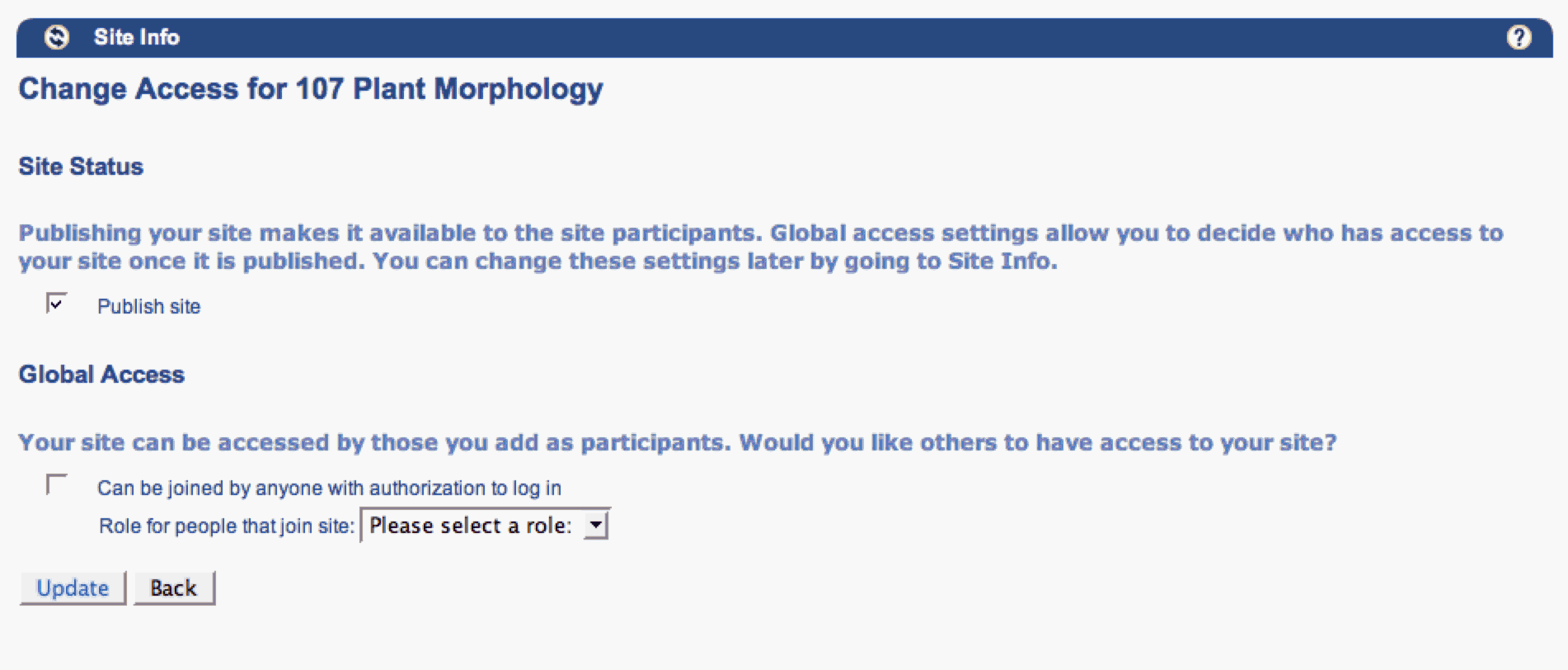
Rename title "107 Plant Morphology" to "Course site for 107 Plant Morphology". |
Site Info |
|
|
Intra tool navigation links include "edit tools" and "tool order". As an instructor it is unclear the difference between these 2. |
Recognition rather than recall. |
Medium |
At a minimum, move the links closer together so it's clear they are 2 different options. The more usable fix is to integrate the 2 into one area of functionality. Both of these functions scream for a wysiwyg interface -- user sees their current tool bar on the page and they work directly on it to add tools and change their order. |
Site Info / Worksite Setup |
|
|
The "Import from site" intra-tool nav link doesn't clearly express what will happen when clicked. The page itself doesn't clearly express how this functionality works either. As a user I'm left asking, which material? how & where does it get imported? What about dated materials? Etc. |
Recognition rather recall - Instruction for use of the system should be visable or easily retrievable whenever appropriate. |
Medium (High) |
This functionality conceptually "Imports material into this site from other sites the user owns". How to say this in a few words will take some more thinking. At a minimum: 1) add a tool tip to the intra-tool nav link on the main Site Info page to describe what it does, 2) add instructions to the page itself to explain what happens on import. Explaining dates, etc. could get long so perhaps a short set of instructions with an "extras on demand" design pattern to see more would be best. |
Site Info > Import from Site |
|
|
The "Import from file" intra-tool nav link doesn't clearly express what will happen when clicked. The page itself doesn't clearly express how this functionality works either. As a user I'm left asking, which material? how & where does it get imported? What about dated materials? Etc. |
Recognition rather recall - Instruction for use of the system should be visable or easily retrievable whenever appropriate. |
Medium (High) |
Same applies as with above issue for "Import from Site". In fact, these 2 activities should be intergrated under one intra-tool nav link, "Import course material". |
Site Info > Import from File |
|
|
Import from file functionality does not give any feedback after a file has been imported. I uploaded a word doc (not sure if this is allowed) , clicked on import, the file name disappeared from the brose box and I was left on the same page. |
Visibility of system sttus |
|
High |
See above solution for "import file" about letting users know what they can upload via instructions. Once they have uploaded a file, let them know whether it was done successfully via a message or by showing them the imported file. |
Site Info > Import file |
Messaging component |
Add participants page: Expectation is to allow email addresses to be separated by commas. If addresses are copied from an email, they will be in that format when user pastes. |
Consistency & Standards |
|
Low |
Allow email addressed to be separated by commas. |
Site Info > Add Participants |
Add participants |
Add participants: box for adding guests is confusing. What is a guest? Guest is too vague in this context. Is it someone outside the institution? |
Match between system and real world |
Medium |
Be explicit in title of the "guest" box. This may be different things for different institutions so we should make it configurable while creating a good default. |
Site Info > Add Participants |
|
|
When choosing roles for participants being added to a site, the role choices display descriptions of access for those roles setting expectations about what those users will and will not be able to do on the site. However, this works with permissions within tools and if they are changed, the access described on this page is not correct. |
Recognition rather than recall - don't expect users to remember the connection between this setting and permissions. |
High |
Add text to explain this works in conjunction with the permissions. These are examples of what people in these roles can do by default. |
Site Info > Add Participants > Choose roles |
|
|
Assigning all added participants the same role versus assigning each individually, visually looks quite different. |
Consistency & standards |
Low |
Perhaps style them similarly. The dropdown for individually assigning and radio buttons for assigning multiples makes sense but the descriptions could be styled more similarly. |
Site Info > Add Participants > Choose roles |
|
|
After adding site participants, the user is asked if they would like to send an email to let the participants know but there is no context about what the email will say. |
Recognition rather than recall |
|
High |
There is plenty of room on this page, show the user what the email will say. Even better allow them to edit the email in a wysiwyg design. |
Site Info > Add participants > Choose role > automatic email sent? |
Notifier |
"Edit Class Roster" language is confusing given the Roster Tool. The user is left to figure out how they are similar or different. |
Recognition rather than recall |
|
Medium |
|
Site Info |
|
Back & Cancel are used interchangeably across pages within Site Info. "Manage Access" uses Update & Back Buttons while "Edit Rosters" uses Update and Cancel buttons for instance. |
Consistency & standards |
|
Medium |
Complete analysis of pages and activities across Site Info to identify discrepancies in language use. Elsewhere in Sakai, Back is typically used in wizards along with Cancel where "back" goes back a step and "cancel" cancels out of the entire transaction. Otherwise, cancel should be consistently used. |
Site Info > various intra-tool navigations |
Back/forward navigation buttons |
Manage access: Choices on this page are confusing. It's hard to tell what title goes with what instructions and controls. |
Recognition rather than recall |
|
Low |
Better visually connect the appropriate instructions with the heading and the control. |
Site Info > Manage access |
|
Manage access: "Can be joined by anyone with authorization to log in" is systemy and vague terminology. The user doesn't likely know who has authorization to log in. Additionally as a instructor it is no immediately clear to me why I might want to do this. |
Match between system & real world - speak users terminology |
|
High |
Explicitly describe who can log in i possible -- "anyone affiliated with UC Berkeley" for instance. Perhaps this should be a local customization. |
Site Info > Manage access |
|
Manage access: Publish site is fairly vague terminology and means something specific to faculty ("getting published"). The instructions state that "global access" allows you to decide who has access but this isn't exactly true. For course sites, students automatically have access. |
Match between system & real world - speak users terminology |
|
Medium |
Change terminology and instructions. Perhaps something like "open site to participants" in place of "publish site". Also update instructions to reflect the state of access. This should be different for course sites and project sites since students automatically have access to course sites. |
Site Info > Manage access |
|
Edit Tools: It is not clear who is affected by the tool editing -- "does this change for everyone?" |
Use clear language |
|
Low |
The "your site" is a nice personalization but may lead to some of the confusion. Replace "your" with "the" to make it clearer the site is being changed not just "your" view. |
Site Info>Edit Tools |
Tool/Portlet management |
"Edit Tools" is a misleading label since you can really only add and remove sites from here. Editing the tools is available from within the tools in most cases. |
Match between system & real world - speak users terminology |
|
Low |
Change the label to "add/remove tools" or something conceptually the same. |
Site Info > |
|
If there are more than 1 web content tools in a site, the default name is confusing -- this holds true for edit tools and also when in the site. |
Recognition rather than recall |
|
Medium |
Require the user to rename the tool since it is always displaying a website outside Sakai. Users working inside the site will know what is behind the tool rather than needing to remember what's behind web content based on their last visit. |
Site Info > Edit Tools |
|
Tool names look like links but are not. Clicking the tool name activates the checkbox. |
|
|
Low |
Change the visual representation of tool names so they don't look like links everywhere else in Sakai. |
Site Info > Edit Tools |
|
Tool Order: |
Recognition rather than recall - Speak the user's langauge. |
|
High |
Combine these 2 pages if they do separate functions. If not, one should be removed. |
Site Info > Tool Order |
Tool Orderer or Manager |
Tool Order: Changing the order of the tools requires an additional click of the "save" button while adding and deleting do not. |
|
|
|
|
|
|
Tool Order: Drag and drop in not obvious. This is a new kind of interaction in web apps which raises the importance of an affordance even more. |
Affordance |
|
Medium |
Use the Lightbox as a model for affordance in drag and drop |
|
Tool Order |
Tool Order: There are numerous usability issues here. For the sake of time, I'm just going to note we need a component for this. |
|
|
|
|
|
Tool Order |
Create a Site Scenario |
|
|
|
|
|
|
Not sure what My Workspace is all about. |
Match between system and real world |
|
Medium |
Distinguish My Workspace from other sites. This will likely require UI architecture changes. |
After login |
Dashboard view - specific to the aggregator that My Workspace is. |
See table below -- will add to this table after summit |
|
|
|
|
|
|
|
|
|
|
|
|
|
|
|
|
|
|
|
|
|
|
|
|
|
|
|
|
|
|
|
|
|
|
|
|
|
|
|
|
|
|
|
|
|
|
|
|
|
|
|
|
|
|
|
|
|
|
|
|
|
|
Accessibility Issue |
Principle |
Link to screen shot |
Priority |
Suggestions for solution |
Tool |
Component identified? |
|---|---|---|---|---|---|---|
Global/General |
|
|
|
|
|
|
Visual cue for showing focus is very faint especially on tabs and tools |
Visibility of system status; Where am I? |
|
Medium |
This is browser based but is there any way to emphasize it? |
|
Component: In focus identifier |
Navigating between tools becomes cumbersome if the user only using their keyboard. |
|
|
Low |
Are there access keys for jumping between tools. If so, include them on the label. |
|
Tool Navigator |
Schedule |
|
|
|
|
|
|
Box around today on calendar view looks like it's indication focus |
Visibility of system status; Where am I? |
Schedule |
Medium |
Use different visual indicator or today -- perhaps highlight the day as many other calendars do. |
|
Component: Calendar View |
Home |
|
|
|
|
|
|
Doesn't seem like the words "Worksite information" are read at the right time. |
|
|
|
Needs more analysis post summit |
|
|
Jump to content doesn't seem to be working correctly. |
|
|
|
Should jump to Worksite setup and then read through synoptic tools. |
|
|
No context for "reset' in teh schedule synopsis. |
|
|
|
Read the tool title and then the reset. |
|
|
Creating Site |
|
|
|
|
|
|
Not clear where to get started creating site. This is also a usability issue but more prevelant with keyboard and screen reader since they rely on remembering what has been read. |
|
|
|
|
|
|
Half way through the process, user chose cancel expecting to go back a page. |
|
|
High |
If work has been done, cancel should prompt a "save work message" |
|
Component: "save work" message |
Continue looks greyed out as user moves through wizard. It should be the assumed next step. |
|
|
Medium |
Focus on "continue" |
|
Component: Wizard "continue, back, cancel" navigation |
Metaphor should be tab between various areas and arrow between things but doesn't seem to be the case everywhere. |
|
|
|
Assume Sakai accessbility QA is tackling this but should confirm with Mike. |
|
Integrate this behavior into component design |
Class information layout is confusing. Note needs to be connected to the label for input. Read after label. |
|
|
Medium |
Redesign layout of page. |
|
|
Spacing of labels and forms is bad -- this is really a usability problem |
|
|
Medium |
Redesign layout of page. |
|
Component: Form layout |
Heading for class information is not the right description since this is really about the course site. |
|
|
Low |
Re-title to Class site information. Screen reader will read appropriately |
|
|
User wants to cut and paste from or into syllabus since it is likely shared information. This kind of interaction might very difficult for keyboard and screen reader users since it requires movement between tools. |
|
|
Medium |
Allow user to easily send information to syllabus in a way that also allows them see how it will be placed |
|
|
Short description has character limit but no user feedback as they use up space. It also silently truncates so user believes they have created a different short description that they really have. The box is also bigger than the amount of text allowed. |
Visibility of system status |
|
|
Dynamically show user how many characters are left as they type. This should also be read by screen reader. |
|
Component: Site description manager |
Scroll bars don't allow users to see the entire context as they are createing the description |
|
|
Medium |
Box could size to content. Currently the box is very narrow. It should be made a little wider but so much to make it difficult for reading. |
|
Component: Site description manager, text input box. |
Adding tools - overwhelmed by the number of choices. User likely needs to read most descriptions to know what tools do. All descriptions start with "For" |
Minimalist Design |
|
Medium |
Shorten descriptions to only what's necessary for better scanning. |
|
Tool Manager |
Checkbox focus is very faint and hard to see |
Visibility of system status |
|
Medium |
Increase visual indication of focus |
|
|
Sometimes enter engages related button (save, continue, etc.) and sometimes it does nothing. This should be consistent to allow user to build expectations across system. If dialogue box, user wants to be able to hit enter without thinking about it. |
Standards & consistency |
|
Medium |
Analysis across system to make enter engage the correct button in a consistent way. |
|
|
Alerts that display at top of pages may not be read by screen reader. If page focus is such that alert is out of sight, keyboard only user will likely miss it as it's even less likely for them to scroll around. |
Visibility of system status |
|
Medium |
Important alerts could be modal with enter closing them (is this accessible). Alerts should always be immediately read by screen reader. |
|
Alerts |
Site setup confirmation - difficult to scan this page |
Minimilist design |
|
|
Bold labels & better connect labels to content |
|
Confirmation page (include details) |
Progress indication after engaging action button needs to be read by screen reader (not sure if it is). Also design of progress indicator seems a bit juvenille. |
Visibility of system status |
|
|
Redesign progress indicator taking advantage standards in the field. Ensure this message is read by screen readers. |
|
Progress indicator |
After setting up site, user doesn't know what to do next. They know they have much work to do to set up tools, etc. but not sure how to do it. Difficult to see that I even set up my site. Not in my tabs, bold in site list on Mac but not PC. |
Visibility of system status |
|
|
Drop use in their site after they are created. This is a little weird with the site setup workflow in worksite setup. Would be better if this was standalone. |
|
Site setup checklist |
WYSIWYG editor is nearly unusable for keyboard only user. User gets stuck in it. |
|
|
|
|
|
WYSIWYG editor |
Add attachment |
|
|
|
|
|
|
Didn't expect to be on new page -- confusing. Attachment is pretty standard terminology for attaching a file. There is also pretty standard interaction for this in the browse field. The browse field here allows user to type in field but it requires knowing the entire path -- not likely. |
Consistency and standards |
|
|
Rather than wizard this should happen inline. |
|
Attachment manager |
|
|
|
|
|
|
|
|
|
|
|
|
|
|
|
|
|
|
|
|
|
|
|
|
|
|
|
|
Cognitive Walkthrough Worksheet
(issues should be included in summary above)
Scenario 1: Create a Site
# |
Step |
Screen |
Comments/issues |
Principle |
Suggestions for solution |
|---|---|---|---|---|---|
|
Choose Worksite Setup > New (user is already in My Workspace at login) |
|
New user (Clayton) stumbled around quite a bit where to go. I finally had to tell him. |
User control & freedom |
"Create site" should jump out at users. There has been some design work to make this a link off the home page. |
|
Entered basic site information |
|
Not clear what the difference is between "description" and "short description" |
|
Make more explicit and show users where short description is displayed. |
|
Enter site email address |
|
It's not clear to user what this is. How does a faculty know how to choose an email address? What is it and how does it get used? |
|
Perhaps default to site name, add example of how the email will be used and make it very easy to change the address in the context of the email tool. |
|
Enter web content and news tool titles |
|
Again, not sure what the context of this it. |
|
Show users where the title is displayed. Could even display a static image of the left navigation. Could suggest the website or RSS feed name as the title. Or allow easy tool title changing within the context of the site. |
|
Settings for site access |
|
See above issues reported. |
Minimilist Design |
After site is added give users a confirmation message. |
|
Back to Worksite setup |
|
Not sure what to do next |
Visibility of system status |
Confirmation should contain instructions for going to site. New site should be in focus and highlighted in list of sites. |
|
|
|
Checkboxes next to items for taking action but actions are up at the top. |
|
Worksite titles could take you to edit. The actions should be closer to the list of items. Style guide suggests these type of links should be just above the table. Top links, where these are, should be held for navigation within the tool. |
|
|
|
I'm not done editing because I still need to add my syllabus and other content. How do I continue working on my site. Creating a site is much more than site administration to faculty. |
|
Implement site setup checklist. Start of design exists from the course management project (see Stanford UCB Scope presentation attached here.) |
|
|
|
Confusing to have a tab and a title in the list. Are they the same interaction? How are they different? Which one should I use to get to my site? Note: If user had more sites, they wouldn't even see new site as a tab only in "more" dropdown. |
|
Worksite setup should be about site administration not navigation. The titles were made into links to the get to site to alleviate usability issues with tabs & more sites. Current Fluid work around will continue to tackle the root usability problem then Worksite setup list can be about managing site. |
|
Go to site > Syllabus tool |
|
Took some direction to get this far. See above comments on syllabus tool. Adding an attachment is confusing: Don't know difference between upload local file and select a resource. Depending on the user's mindset, the other is a distraction. Need better feedback that I've done what I think I've done. |
Match between system & real world |
Component: Attachment manager, Syllabus manager, confirmation message |
|
|
|
Images are not accessible. Accessibility of PDF? |
|
|
|
|
|
The workflow of creating your syllabus is quite quirky and confusing. If I'm interrupted during this work (likely for faculty), I am completely lost. |
Match between system and real world. |
See suggestions above. This is a prime candidate for a wysisyg interface so the user sees their syllabus as they are creating it. |
|
|
|
It's not clear how students will see this? User gave up and couldn't figure out what they needed to do. |
Recognition rather than recall |
Component: See what student's see, wysiwyg page builder |
|
|
|
After entering a bunch of information, the user chose "redirect" and lost a bunch of information. BAD! |
|
Do not allow user to lose work. Either make it a modal workflow or give the user a "are you sure" message. |
Scenario 2: Brief description
# |
Step |
Screen |
Comments/issues |
Principle |
Suggestions for solution |
|---|---|---|---|---|---|
|
|
|
|
|
|
|
|
|
|
|
|
|
|
|
|
|
|
|
|
|
|
|
|
|
|
|
|
|
|
|
|
|
|
|
|
|
|
|
|
|
|
|
|
|
|
|
|
|
|
|
|
|
|
Scenario 3: Brief description
# |
Step |
Screen |
Comments/issues |
Principle |
Suggestions for solution |
|---|---|---|---|---|---|
|
|
|
|
|
|
|
|
|
|
|
|
|
|
|
|
|
|
|
|
|
|
|
|
|
|
|
|
|
|
|
|
|
|
|
|
|
|
|
|
|
|
|
|
|
|
|
|
|
|
|
|
|
|
Scenario 4: Brief description
# |
Step |
Screen |
Comments/issues |
Principle |
Suggestions for solution |
|---|---|---|---|---|---|
|
|
|
|
|
|
|
|
|
|
|
|
|
|
|
|
|
|
|
|
|
|
|
|
|
|
|
|
|
|
|
|
|
|
|
|
|
|
|
|
|
|
|
|
|
|
|
|
|
|
|
|
|
|