Kiosk button and audio navigation considerations (Draft 6)
Note: This page presents options for how button navigation will work on the DIA kiosk.
On this Page:
Background
Options for button placement, look, and feel on the kiosk
Button navigation - example walkthroughs of current kiosk wireframes
Audio options
Other design challenges to address
Background
On the Web, it is an accessibility best practice to make all the functionality of a Web page operable from the keyboard. Similarly with the Engage kiosk, button navigation could help people who can't use the touch screen component of the kiosk. I can also be used in concert with the screen reading or self-voicing features of the kiosk. Another assumption is that providing button navigation does not preclude using the talking fingertip technique.
Sources: http://www.access-board.gov/sec508/refresh/report/
Options for button placement, look, and feel on the kiosk
Buttons on a kiosk require some general considerations. It goes without saying that the look, feel, and function of the buttons is tightly connected to the interface design. But some following principles could work generally.
- height of buttons - need to be physically differentiated from surrounding area, and tactilely discernible without activating the button
- shouldn't be too close together, easily differentiated spatially - buttons operable with one hand
some broad options:
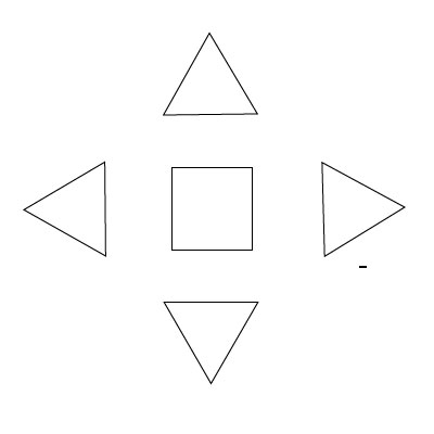
"back" "enter" "forward" or "back" "forward" "enter"
north south east west enter (see picture below)
The following are some options for button placement on the kiosk.
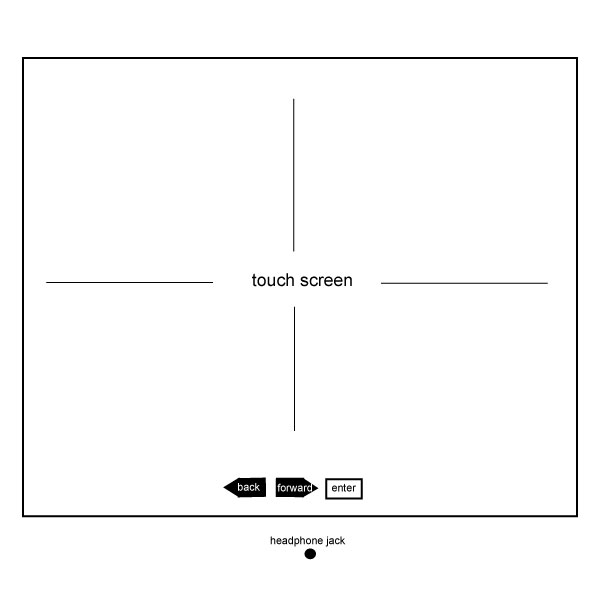
In Option 1 Overlay Buttons (image below) there is a reserved section of touch screen real estate dedicated for "buttons". The buttons themselves are not below the LCD monitor, but sit on the monitor in the reserved section.
As illustrated in Option 1 image, "overlay buttons" have the following features:
- are easily differentiated from other parts of the touch screen
- are functionally equivalent to a regular mechanical button
- provide some form of physical feedback when touched (you can tell when you press them)
- are gentle to the kiosk touch screen itself
- labelled with text and braille lettering
- order of buttons is (1) "back", "forward", "enter" or (2) "back", "enter", "forward". Shape of buttons reflects purpose.
- headphone jack is below screen
Option 1 image
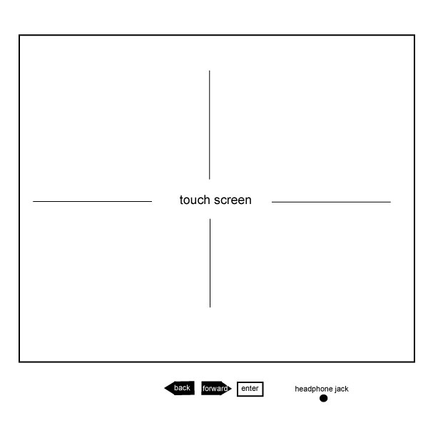
In Option 2, (image below) there is a section below and separate from touch screen for buttons.
As illustrated in Option 1 image, physical button" have the following features:
- are easily differentiated from other parts of the kiosk
- provide some form of physical feedback when touched (you can tell when you press them)
- labelled with text and braille lettering
- order of buttons is (1) "back", "forward", "enter" or (2) "back", "enter", "forward". Shape of buttons reflects purpose.
- There is also a headphone jack labeled "headphone jack" visually and with braille lettering.
Option 2 Image
Button navigation - example walkthroughs of current kiosk wireframes
This section explores button navigation as applied to the Flow sketches inspired by playstation PS3, using the following keys: Backward; Enter: Forward.
Broad characteristics of button navigation:
- wherever an element has focus, there is a visual (and corresponding, audio) indicator of focus.
- focus always begins with the top left element in a grid
- backward/forward buttons move focus, enter selects an element (e.g. a theme or gallery thumbnail)
- focus doesn't "wrap". I.E. there is no keyboard trap on kiosk screens. You can always "move in" or "move out" of a kiosk screen.
Walkthrough of kiosk functions
Image 1 (see below) is the first "screen" that is shown on the kiosk. In the center of the screen is a lozenge/rectangle shape, where the DIA's themes are displayed as a grid of thumbnail-like images with titles. The title of this grid is: "Pick a tour theme". The themes displayed with a thumbnail are: Travel; Furniture; Identity; Morality; Spaces; Family; Power & Politics. Visually, we could give one of these thumnails visible keyboard focus. Navigating with the Backward and Forward keys would move between thumbnails, from left to right and top to bottom, and pressing enter would activate a theme.

Image 2 (see below) depicts what occurs after a user has selected the identity theme. A lozenge/rectangle with the the title: "Tour theme: Identity" is foregrouned. It contains thumbnail-like images with titles of all the galleries in the theme. To the top right of this secction, there are "Print" and "Map" buttons also visible. The previous lozenge/rectange entitled "Pick a tour theme" is no longer foregrounded, but is visibible in the lower right hand corner of the screen. Looping through all the thumbnails with the arrow keys would move the user back, first to the "Print" and "Map" options, and then back to the previous "Pick a tour theme" page.

Image 3 (see below) appears after a user has activated a gallery thumbnail from the previous "Tour theme: Identity" screen. A 360 degree map is shown of the selected gallery. The gallery could receive keyboard focus, and be navigatable with on screen buttons. A concern here would be how to avoid keyboard trap and facilitate an interaction with only back, forward, and enter keys.
Generally in Image 3, the 360 degree map view is foregrounded. The previous screens, "Tour theme: Identity" and "Pick a tour theme", are not foregrounded however they are visible.

Audio options
Whether audio is delivered by speaker or through a wand, the kiosk will need to give visitors audible feedback about how to navigate the kiosk and access content. Access by headphones means we include a headset or wand. We should also think about whether we want an option to turn audio off or on "mid experience", and if so, how that would happen.
"Self voicing"
Description: the kiosk emits sound out of a speaker that tells the visitor(s) how to operate the kiosk and also delivers the content. Audio could be triggered by a motion sensor as someone approaches, or turned on or off with a switch or button (on-screen or off).
Pros: Affords a more social audio experience than if headphones are relied on, for example, if people are using the kiosk in a small group - e.g. a small family or a couple. Since nothing has to be held in one hand, the visitor has their hands free to use the touchscreen and / or navigation buttons. A speaker is more hygienic than a wand or headphones.
Cons:Possible privacy and noise level concerns. These could be addressed through a volume control.
Assumptions: Having a self-voicing option does not preclude having a standard ( 2.5mm or 3.5mm) audio jack
Headphones or audio wand
Description: the kiosk emits sound out of securely attached headphones or an audio wand. The audio could either be always on, or turned on by a switch or button (on-screen or off).
Pros:
Cons: An individualized, private experience may not be desired - e.g. if people are using the kiosk in a small group (e.g. a small family or couple planning their visit).
Adopting a commercial or open source screen reader
Description: Adopting a commercial or open source screen reader would involve adopting the operating system platform that is used by the screen-reader of choice, and then developing the kiosk application against standards (web or software) supported by the selected application.
Pros: Other than following standards for accessible web or application design no additional work would be required to make the kiosk accessible to print impaired users. Using an open source solution like Orca (linux/gnome) or NVDA (Windows) would have 0 software acquisition cost. VoiceOver for Mac is another promising option.
Cons: Text-to-speech voices included with most commercial and open source screen-readers are mechanical sounding (although third party voices are available that are more human sounding). Decreased control over how the screen-reader interacts with the kiosk application, cost (for commercial solutions).
Assumptions:
Custom self-voicing solution
Description: A custom self-voicing solution would require that software be designed to allow speech feedback. This software would have to track user input, monitor focused and selected UI components, and render the required speech.
Pros: Complete flexibility over the user interaction model, many text-to-speech libraries and libraries to select from with APIs that can be used for development.
Cons: Vast amount of development time required to research, design, develop and test the custom solution.
Canned MP3 option
Description: A canned mp3 option would have the same general description as a custom self-voicing option, with the exception that speech would be stored in mp3 format, and not generated on the fly.
Pros: No resources used in researching, acquiring and implementing text-to-speech engine.
Cons: Issues of maintaining (updating and modifying) existing mp3 library when UI components or content in the kiosk are changed.
Other design challenges to address
- Linearizing a non-linear design: Visually, the kiosk affords for a highly non-linear experience. For example, a user could easily move between a gallery index page to a theme index page. Navigating with audio or a keyboard will require some different affordances. A future design challenge is to address how we can afford for a more linear interaction that at the same time offers the user some freedome to skip around. It should be very clear to an audio/keyboard user to figure out where they are located, at any given time, in the interface, and what they need to do to move back or forward.
- Technology-specific challenges: Theses challenges will depend on the platform, development technology and assistive technologies selected: how can complex UI widgets be made accessible to these platforms?