User Testing of Sonified Pie Chart Data (Floe Chart Authoring Tool)
Research done by Dana Ayotte, Alan Harnum, Colin Clark, Lisa Liskovoi, Sepideh Shahi
Overview
This research aims to explore how charts information could be represented with sound in order to provide users/learners with multi-modes of understanding, accessing and using information. With a participatory design approach, the research team collaborated with a community of open source developers, researchers, designers and users to explore different directions in converting chart data into sound (sonification). A variety of sonification approaches to small data sets were selected by the community and evaluated through user testing. As part of the participatory design approach of the research, user feedback is sought not only on the specific sonification approaches, but on the general concept of sonification and the users’ own ideas for how it might be used in their lives. This is an iterative design and development process and the results from this research will be applied to further explore the applications of sonification to represent chart and graph information.
Introduction
Charts and graphs are highly visual representations of information, thus, they are often accessible only to individuals who can perceive and process information visually. Users/learners who rely on other modalities for accessing, understanding and using data representations often experience difficulty accessing chart information. Many of these charts and graphs are created by authoring tools or proprietary design software that do not support the creation of accessible outputs. As a result, the exported charts and graphs are flat images that are not accessible by screen readers and scanning software, and it is not possible to navigate their content using a keyboard. One solution that is often used to mitigate the inaccessibility of these visual tools is the addition of descriptive text or information tables along with each chart or graph. [1] However, listening to descriptive text or tabular data does not provide the same rich experience as the visual expression of a chart or graph.
The research team is focusing on both the development of an accessible chart authoring tool as well as the experience of users/learners in consuming the output of the tool. In each case, personalization is key. From the authoring standpoint, the research team is building a customizable chart authoring tool interface that will enable educational resource authors to create accessible, multi-modal charts/graphs and embed the output in their desired content. From the users/learners perspective, the research team is working toward creating an explorative space where users/learners can easily customize the way information is presented to them, and where they can discover and declare how they wish to consume content based on their unique and individual needs and preferences.
This project is ongoing and consists of several phases, however, this paper will focus on one aspect of the project: the representation of a pie chart with sound, and how users/learners perceive the resulting audio information. By starting with a fairly simple data set the research team wanted to set a foundation for future chart sonification work. Given the relative simplicity of pie charts, it was anticipated that using sonification to represent the data may seem superfluous to some users. However, this study provided a framework in which to explore various approaches to sonification including the translation of numerical data into sound as well as approaches to audio representation of the immediate, at-a-glance experience of a pie chart. We believe this learning will provide a foundation from which to explore the sonification of more complex data sets and graphs.
The first part of the paper discusses how sonification could impact a personalized learning experience and provide an equal opportunity for users/learners with diverse set of needs and preferences to access information through sound.
The second part of the paper begins with a description of the participatory design methods applied for converting simple pie-chart type datasets into sound. This section is followed by a summary of a user testing of four of those sonifications among both visually-impaired and sighted users, as part of a larger project to develop a multimodal open source web authoring tool. Results from all four sonifications are reported, along with general feedback from users on the general concept of sonification. The paper is concluded with the expected direction of future development and research in this area.
Research Phase 1: Sonification Design
Method
A participatory and iterative design approach was taken in order to explore how simple and small data sets could be effectively converted into sound. Over a period of a few months, the research team developed several sonifications (audio prototypes) using an exploratory design process. For each sonification, the research team experimented with different sound parameters and combinations of parameters for the same data set. These parameters included pitch, density of beats, duration, timbre, instrumentation and volume.
On a weekly basis, each sonification was shared with an open source community of designers, researchers, developers, and end users with and without visual impairment. These collaborative “listening parties” not only revealed what worked and what did not, but also inspired the community to generate new ideas and approaches. In this participatory and collaborative process, each member of the community brought their unique knowledge and expertise to the table, providing diverse perspectives and input into the design process.
This process is ongoing as we continue to explore the sonification of different types of data as well as different ways of sonifying particular data sets. However, the goal of Phase I of the project was limited to brainstorming and exploring many different ways of sonifying pie chart data. As a result of this process, four sonifications were selected from Phase I to be tested in Phase II.
Results
To prepare a feasible usability test plan for Phase II, the team reviewed and compared the wide variety of sonification approaches that had been explored over the course of Phase I of the project. Based on this examination, the following four categories emerged as most representative of the different sonifications that had been created. From each category, a specific sonification was selected for usability testing in Phase II.
Mapping chart data to sounds representing numerical units
For instance, a sound was chosen to represent units of ten and a second sound either with similar qualities or a different sound was chosen to represent units of one. The two sounds were played sequentially for each pie segment, for example, a value of 25 was represented by 2 ten-unit sounds followed directly by 5 one-unit sounds. Various combinations of tone length as well as the length of the gap between each sound were explored. In addition, the ability to “zoom in” and “zoom out” on the audio track was explored and was determined to be a useful personalisation feature of the final chart. (see Figure 1)
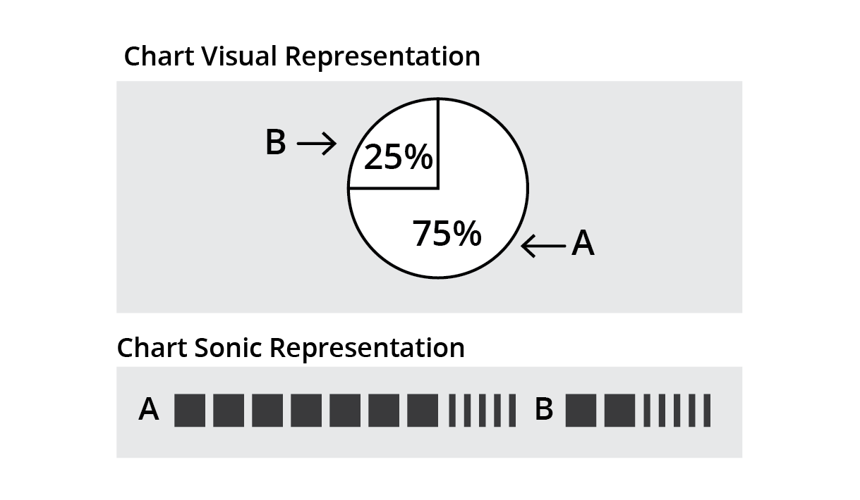
Figure 1. Mapping chart data to sounds representing numerical units.
Mapping chart data to the total duration of a sound
Here the length of the sound assigned to each segment of the pie is proportional to its value and is calculated based on an arbitrary total duration representing 100%.The research team explored the pitch and quality of the sound used for each segment and created several variations by increasing or decreasing the pitch, or keeping it identical throughout a segment. In some variations the team added other interpretational components to the sonification, such as a backdrop tone representing a value of 100%, a tone indicating the beginning of each segment, or a metronome sound to help with counting time. (See Figure 2)
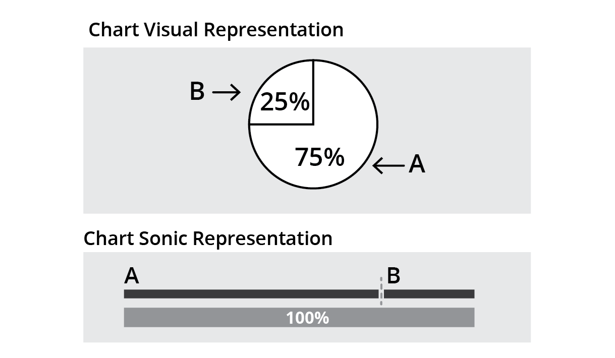
Figure 2. Mapping chart data to total duration of sound.
Mapping chart data to total duration and timbre
The logic used to determine the duration of each segment was similar to #2, however, rather than representing each segment with the same sound, a unique sound was used for each. In some cases, percussive sounds were explored, and in others, symphonic instruments, vocal sounds or sounds from nature were used. (See Figure 3)
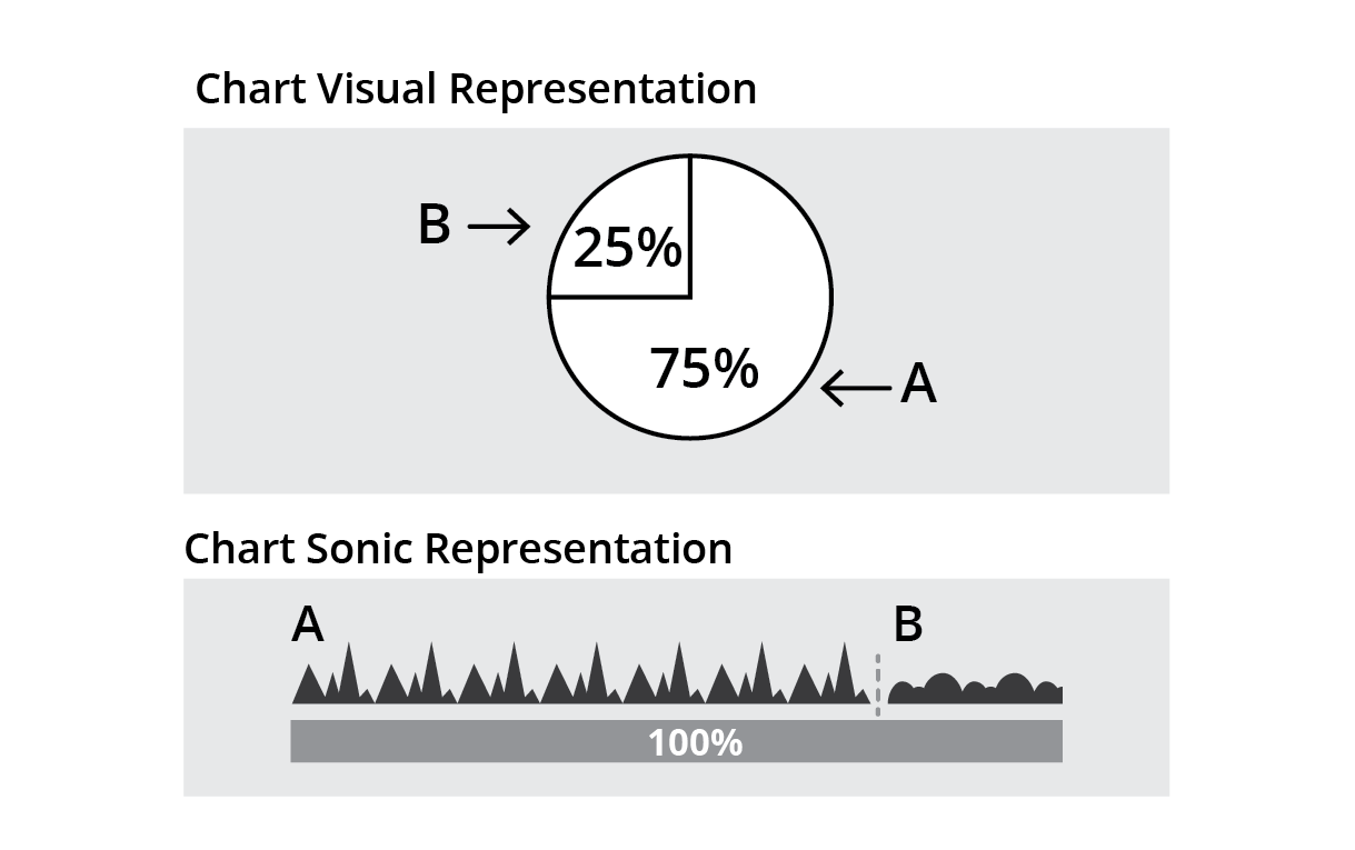
Figure 3. Mapping chart data to total duration and timbre.
Stacking sounds that map chart data to total duration and timbre
Each individual segment was sonified as in #3, but rather than playing sequentially, all sounds were played together and stacked in various ways (e.g. “left justified” such that they all began at once and dropped out one by one, “right justified” such that they all ended at the same time, or “centred”). (See Figure 4)
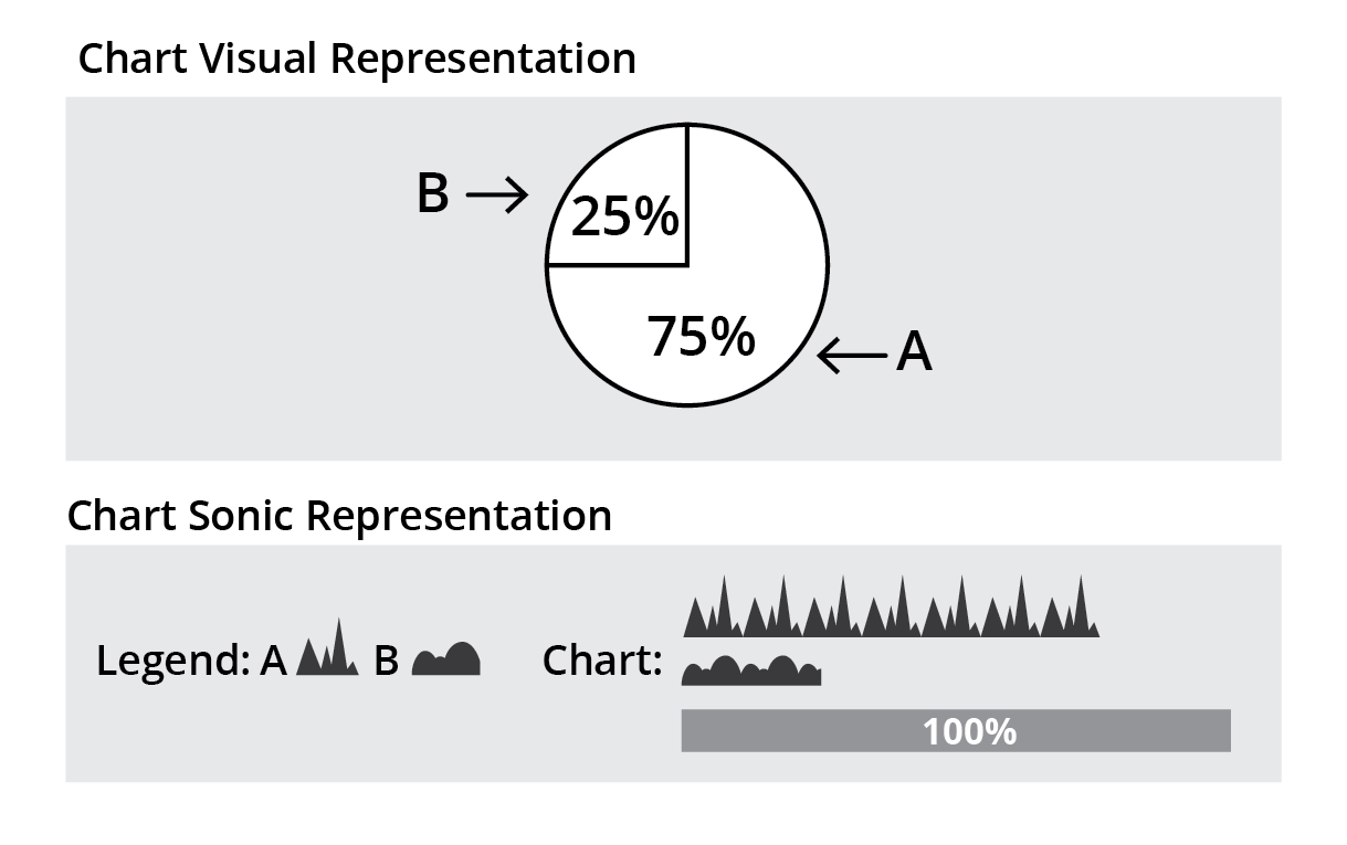
Figure 4. Mapping chart data to total duration and timbre.
In all cases, the text label for each segment (the audio “legend”) was presented to the user in different ways - either integrated sequentially with the segments (i.e. read out to the user prior to hearing each segment), or the full audio legend was presented to the user prior to hearing the segment tracks.
Research Phase 2: Usability Testing
Method
One specific sound sketch was selected from each category to be used during a user testing study. In this study the research team investigated the user's ability to derive data/meaning from the selected sonifications and solicited feedback about the user’s experience of each sonification. All four sonifications represented the same data set derived from a simple pie chart titled “Canadian Smartphone Marketshare 2015”. This pie chart contained 5 segments for the following values: Android 48%, Apple 28%, Blackberry 18%, Microsoft 4%, All Others 2%.
Stimuli
- Sonification#1 - first category: In this sonification units of ten are represented by a long beep and units of one by a short beep. The beeps are of similar quality but units of one are represented by a sound of lower pitch and shorter duration. This sonification consists of 5 sequential segments. Each segment starts with a spoken label followed by a series of long and short beeps that represent the corresponding value for that segment. For instance, the Android section is composed of four long beeps and 8 short beeps and the Microsoft section only includes 4 short beeps. The segments are presented in a descending order from the largest piece to the smallest. [2]
- Sonification#2 - second category: This sonification consists of 5 sequential segments. Each segment starts with a spoken label followed by a long tone. To build this sonification, the value of 100% was assigned a duration of 10 seconds, and the duration of each segment was calculated as X% of 10 sec. For instance, the duration of long tone for Android is 4.8 seconds and for Microsoft is 0.4 seconds. The segments are presented in a descending order from the longest segment to the shortest. [3]
- Sonification#3 - third category: This sonification consists of 5 sequential segments. Each segment starts with a spoken label followed by a specific synthesized sound. In this case, a unique, repetitive and percussive sound was chosen for each segment. A similar logic as in the previous sonification was used to calculate the duration of each segment. The segments are presented in a descending order from the longest segment to the shortest. [4]
- Sonification#4 - fourth category: This sonification consists of 5 segments. A similar logic as per two previous sonifications was used to build each segment. This sonification starts with an audio legend. Each label is spoken, followed by a 2 second preview of its corresponding sound. The audio legend is followed by the stacked audio sonification representing the entire chart. Depending on each segment’s duration, each sound has a different starting point. For example, Android, having the highest value, comes in first, while Apple joins in after 2 seconds, and so on until all sounds are playing together and all end at the same time. [5]
Participants
15 individuals participated in the study. Nine of the participants were non-sighted or partially sighted and relied on screen readers or other assistive devices to access visual and textual information. The other six participants were fully sighted and did not use assistive devices to access visual and textual information.
Procedure
The study was composed of three parts. In the first part the participant was asked two general questions regarding their past experiences with sound and music.
The second part of the study consisted of two blocks. In each block, each of the four selected sonifications was played in turn, and in each case participants were asked to provide their approximate guess at the relative size and numerical value of each piece of data. Additionally, participants were asked for their subjective opinions about each sonification. The order of the sonifications were randomized for each participant. In the first block participants were not given any contextual or background information about the data. However, prior to starting the second block, participants were informed that the sonified data was derived from a set of percentage values used to create a pie chart. Participants who stated that they were not familiar with pie charts were provided with both a verbal and a visual description of a generic pie chart.
In the last section of the study, participants were provided with the specific percentage values that were represented in the sonifications they had heard. They were asked about their overall experience with the sonifications, to describe what they would do differently to convert the data into sound, and whether or not they would find sonification useful in their daily lives.
Each session ran for approximately 60 minutes.
Results
Sonification #1
The majority of users intuited that the two different types of sound conveyed different information, but several were not able to guess the meaning of each. Users commented “I'm just a little curious as to why the initial tones were higher than the others ones… why the first four had that higher pitched sound before they went into the lower one... that puzzles me. I'd need to know why that distinction, why that difference, what that means, in any charting" (user 12) and “I can’t tell [what that means], but it’s something that’s important to know, I think the beats mean something” (user 8). Some were able to assign meaning to the different sounds, either very broadly, for example “maybe an increase in percentage, or space being occupied” (user 13), or by making more specific associations between sound and meaning, such as one user theorizing that “each long beep [is] a value of 10%... short beeps are empty spaces, unshaded areas of the graph if you will” (user 11). A few were remarkably accurate at identifying the meaning of the two different types of sounds. One user commented “I just treated it like there's different amounts of the first beep or the second... initially I was thinking it might be a decimal point... but since it's out 100 it's ones and tens..."(user 10), another noted “if you think of an abacus they might have a higher value... so it could be in the way of the weighting of the values" (user 12).
A number of users associated the size of the marketshare portion with duration. One participant said that they used overall length to judge the size of each piece (user 2), another user kept referring to the number of seconds each marketshare played when talking through their answers (user 1). Yet another user noticed that the sounds “lined up from most longest to shortest... so the relativity is about length” (user 13). Although several of the participants were not able to provide exact numbers, they were often able to accurately rank the different portions, pointing out for example “I can’t really tell the number... not the exact numbers, but I know that this is bigger or this is less.” (user 14).
A common reaction to the second set of beeps, representing single digits, was that participants felt they were played too fast. User 4 mentioned that they would like “a way to slow it down”, user 7 noted that they would prefer if the beeps were more spaced out, and user 8 said “I think it depends on the beep, but it’s hard to count because it’s really fast.” Many users described the set of shorter beeps as a continuous “tune” or “music”.
Sonification #2
The majority of users were able to recognize that the duration of the tone is correlated with the size of a segment. They were also able to guess the descending order of the sound segments from largest to the smallest. However, it was difficult for many participants to associate a numerical value to each segment.
They mentioned that although this sonification gave them an overall impression of the order and the proportion of different pieces, it was hard to associate a number or a percentage value for each piece. Users commented “as for numerical value I couldn't guess, but definitely I was able to tell that shares were different... the longer beep signifies a larger share of the market" (user 7), “people could probably tell which is the longest, but they wouldn’t be able to tell how long it is…” (user 8). "It was clear, straightforward... maybe it won't give the exact number but it would give an idea of how big each is" (user 14). A few participants also mentioned that it was difficult to anticipate a numerical value for each segment because the difference among the segments was too small to be counted, “when you really go to estimate it - it’s not very easy by just listening, it might differ just by a fraction of a second” (user 3),
Several participants also mentioned that use of long and consistent tones that doesn’t change pitch implied a bar chart. Most participants who took notes and made sketches to illustrate their thinking process while listening to this sonification drew bar charts or straight lines representing a bar graph, one user stated “the sound is consistent and there's no difference... when I imagine a pie it's really difficult to imagine a consistent sound as a circle” (user 13).
Although the majority of participants did not like the sound choice for this sonification and described it as unpleasant, harsh, distracting and even stressful, they found this type of sonification easy to decipher “easiest to guess" (user 1), “Clear and easy to pick up” (user 4), “it's the only one I could just do it all in my head...casually and not actively" (user 10). According to the participants, interpreting this sonification needed less concentration and could be done casually along with other activities.
Sonification #3
Several users found this sonification confusing, saying it was “the most confusing of [the sonifications]” (user 4), that segments were “hard to compare because [they are] all different” (user 3), and that “this may take longer for users to learn the complexity of reading different data together” (user 6).
Most users assigned meaning to the number of beats of the different sounds or their loudness/weight “it's the weight that matters” (user 4). Although they speculated that the number of the beats or their loudness had some meaning, many were not sure how to interpret the information.
Participants who counted the beats for each sound were puzzled “I was counting the number of beats, but I find it confusing because some had more beats but they were faster” (user 10), "there's one with different numbers of beats, but knowing how much value to attribute to each beat is tricky" (user 9), “some beats are faster speed, some beats are slower speed… it would help to know what’s happening on the graph, so also the beats are different.” (user 8), “I honestly wouldn't know [numbers or proportions]... I would have no idea what numerical values they had, because both Android and Apple have four beats, even if Apple was a softer sound... I can't pin a numerical value to it" (user 7).
Participants who assigned meaning to the loudness/weight of the sounds were also confused. “I think the heavier and the low bass the sound, in my mind it represents the higher value data... and high pitched ones are at the other end of the scale" (user 6) "the boldest sound, the highest number” (user 14)
A couple of users noted that they would have benefited from a key or legend of some kind. “if you're going to use this sonification system you're going to use a key... every sound is so different and every rate is so different, there's really no indicator as to what is what" (user 11), “[I'd want] a description of how I'm supposed to interpret it" (user 10).
This sonification seemed complex “Multi-level pitch and frequency, if pitch means something and frequency means something else, and then you have a series of these that you need to interpret” (user 6). This sonification seemed to impose a higher cognitive load and required higher concentration and active listening. As several participants suggested, use of similar sounds or least sounds that had the same rate of beats and same level of loudness might have reduced the complexity of this sonification.
Sonification #4
The majority of participants liked the combination of sounds in the second part of this sonification and described it as a fun, pleasant and enjoyable experience. However, most of them found it “very difficult to tease out the representation of each sound when it’s all blended. it’s kind of a cool effect but it’s hard to get a sense of the length of each one. I find it the least accurate, the hardest one to try to figure out” (user 9).
Although several participants recognized the purpose of the audio legend, a few users assumed that the audio legend was part of the chart data itself, and believed that the medley of sounds represented additional information or a comparison between different parts of the chart. “It’s like waves, it starts slow and then speeds up, can see progression from left to right, toward the top right.” (user 6)
Several participants expressed that they “don’t even understand what the rules are” (user 10). They were looking for specific patterns to explain the information that was being communicated to them. They tried different approaches, such as relating the size of each segment to the loudness/weight/clarity of each sound, number of beats, their comparative length in the legend or in the medley, and the way each sound beat fit into other sound beats. Despite all these efforts, the majority of participants could not identify a specific logic for extracting information “hard to track everything like that – could tell a general order but it makes it harder to track – having a group of sound played like that is confusing, if you try to pull out a piece of data from multiple sources that they are coming all at once, it’s hard to do that. It needs much more concentration. (user 7) “This one is so distracting because sounds have different volume, intensity… it is confusing, overwhelming, hard to compare with each other” (user 15).
Although playing all sounds together helped them compare different segments, several users expressed that “some sounds can’t be heard… because everything is played at once.” (user 8) and others mentioned it is hard to break things apart, unless they are told to look for a specific sound. They suggested prior description of what users should expect to hear, spacing out the pieces in the legend and using sounds with the same beat rate may help with making this sonification more comprehensible. Some users also found the particular sound chosen for the Apple section either irritating ("that damn Apple sound again!", user 15) or inaudible ("didn't hear anything there", user 2).
Summary Table
Table 1 summarizes the user testing results for all four sonification and provides a high level comparison among these four explored directions based on the participants’ insights.
| Sonification | Mapping Rationale | Affinity (Personal Experience) | Ability (Cognitive Load) | Applicable Context | Need for Customization |
|---|---|---|---|---|---|
| #1 | Mapping chart data to sounds representing units of ten and one | Nice sounds | Moderate (recognizing and counting two types of beeps for each segment) | Formal setting where precise values are needed e.g School or business | Option to change the speed (slow down or speed up) |
| #2 | Mapping chart data to the total duration of constant tone | Harsh, distressing, unpleasant sound | Low (counting duration of a constant tone and comparing different segments) | Informal setting where approximate values are sufficient e.g. newspaper article | Option to add a backdrop tone for 100% value Option to add sounds that help with counting duration Option to change the sound or its pitch |
| #3 | Mapping chart data to total duration and timbre. | Pleasant sounds | High (memorizing different sounds for each segment, counting the duration of each sound, comparing different segment) | Informal setting where approximate values are sufficient e.g. newspaper article | Option to change the sounds |
| #4 | Stacking sounds that map chart data to total duration and timbre. | Fun, pleasant, joyful mix of sounds | High(memorizing an audio legend, associating each sound in the chart to the audio legend, comparing the duration of each sound while playing together) | Informal setting where approximate values are sufficient and e.g. newspaper article | Option to change the sounds Option to separate the sounds and listen to them individually |
General Feedback on Sonification
User Preference for Style of Sonification is Shaped by Context of Information Consumption
Users noted that the context in which they were consuming information might determine their preference for a particular form of sonification. Several highlighted a distinction between contexts where deriving precise value was important and contexts where it would be sufficient to know only approximate values: “For recreational purposes this one [Sonification #4] could be used and for school or business the sequential beeps [Sonification #1] could be used… if it was school I wouldn't, but if it's a newspaper article, totally that one [Sonification 4]…” (user 4), “for these purposes [testing] relative would be good enough, for business purposes it probably has to be [precise]” (user 5), “I think that if I was using sonification as a way to get information for anything serious, I think I would want something like this [Sonification #1]” (user 10); others gave examples of contexts where partial attention might be in play and lead to a preference for a less complicated sonification, such as while riding a bike (user 10) or washing dishes while listening to changes in their stock portfolio (user 11).
Other comments related concepts such as cognitive load vs. information contained in the sonification, with users aware of context shifts occurring as they focused both on listening to the sonification and extracting value from it: “I have a lot of trouble listening to a sound with my left brain, then translating them to numbers (right brain)... conceptual vs. analytical... it's a context-switch.” (user 4).
User Preferences for Sonification Are Varied and Customization is Desired
A desire to customize, control or change aspects of the sonification was repeatedly expressed. This includes areas such as speed ("I'm not talking about slowing it down too much... 25% or less", user 7), types of sound (“[nature sounds] would promote how receptive you are to receiving that information”, user 6), or even personal strategies for sonification based on their own capabilities (“I would just use different pitches because I have perfect pitch”, user 11).
Users Expect Context to Aid Interpretation and Recognize Ability to Become Better at Using Sonifications
The specific sonification strategies used were deliberately not revealed to the users, as a means of eliciting a broader range of feedback. Part of the feedback from many users was that, while they were able to derive often-accurate frames of interpretations, they expected more instruction as to what they should be listening for: “provide a key [to make it less complicated]” (user 11), "[I'd want] a description of how I'm supposed to interpret it" (user 10).
Users also recognized, even during the testing itself, that interpreting sonifications was a skill they could improve on over time: “Once you know what you're looking for, it's less concentration” (user 7), “it's a new skill, it's not something I do... so I could probably get better at it” (user 4). A comparative analogy made by some screen reader users was that over time they have been able to increase the speech rate setting in their screen reader software.
Users Indicated Many Areas Where Sonification Might Play a Role in Their Use of Information
When asked to think freely about where they might make use of sonification in their lives, users offered many suggestions:
- Using musical tones to indicate subway or bus stops for the visually impaired (user 1)
- Wayfinding and directional indication for the visually impaired (user 4)
- Non-verbal indications of traffic patterns when driving (user 6)
- Indicating patterns over time, such as in their phone bill (user 8) or investments (user 11)
- As part of an interactive tool to aid exploration of parts of a chart by the visually impaired (user 9)
- Wind direction and speed when participating in a sailing club for the visually impaired (user 12)
- As a multimodal supplement to aid in interpreting charts and graphs (user 13)
Visually Impaired Users Highlight Other Access and Collaboration Issues In Chart Usage
While not specifically solicited, a number of visually impaired users offered valuable feedback and information about their experience of charts and graphs generally. Specific points of interest included the potential value of tactile representation of charts (users 7, 8 and 9) and the challenges of workplace collaboration between sighted and non-sighted users when charts are in use (“I work in a department where people are very visual and want to use very visual representations of data”, user 9). The second point is particularly of interest to us in demonstrating how non-sighted users not only want to be able to comprehend chart information themselves, but receive it in a way that assists effective collaboration with others.
Conclusion and Future Work
Direction of Participatory Design Process
The research team is planning to apply the lessons learned from the user testing study to reiterate the explored directions and also try the new approaches that were not considered prior to conducting the user testing. Similar to the primary design phases discussed in this paper, a community of designers, end users, researchers and scientists will be involved in the future development of this research, and help with shaping and framing sonification as an effective method of communicating charts and graphs information.
The intention of this future work is to build a common language around a personalizable sonification experience and its application for open education. Although this research efforts may not lead to creation of an ultimate chart authoring tool/environment that provides variety of options for users with diverse needs and preferences, it should create an exemplar along with guides and instructions for anyone who is interested in taking this research further and applying it in their work.
Direction of Authoring Tool Development
At time of writing, the authoring tool can produce pie charts with sonifications in the style of sonifications #1 and #2, based on data entered by chart creators, and is built entirely in open-source web technologies including Javascript and the browser speech and audio APIs. We expect to continue development to accommodate different styles of charts and different sonifications, along with the export, sharing and remixing of sonified charts in a web context.
Informed by the results of our user testing, our long-term vision includes ample end-user configurability for produced sonifications - it would not be inaccurate to say that the authoring tool will itself produce artifacts that can be further changed or re-authored by the audience. So far, user testing validates our sense that for sonification to be useful it must accommodate a diverse range of end-user tastes and preferences, and that what works best for one user may not for another.
It should also be noted that, in addition to the authoring tool, a gradual and sequential learning process is needed to ensure users are familiar with different concepts and approaches of sonification as a new means for communicating information. Once users have built up that preliminary knowledge of sonification vocabulary, they would be able to more effectively interpret sonified data and choose their prefered method of receiving information through sound.
References
[1] Cooper, M., Kirkpatrick, A. and O Connor, J. G92: Providing long description for non-text content that serves the same purpose and presents the same information. In Techniques for WCAG 2.0. https://www.w3.org/TR/WCAG20-TECHS/G92.html.
[2] Pie Chart Sonification #1. https://dl.dropboxusercontent.com/u/10724518/sonifications/sonification1.ogg.
[3] Pie Chart Sonification #2. https://dl.dropboxusercontent.com/u/10724518/sonifications/sonification2.ogg.
[4] Pie Chart Sonification #3. https://dl.dropboxusercontent.com/u/10724518/sonifications/sonification3.mp3.
[5] Pie Chart Sonification #4. https://dl.dropboxusercontent.com/u/10724518/sonifications/sonification4.mp3.