Lumen Learning Analysis of Utility Simulation
Introduction
The Floe Project assisted Lumen Learning by performing an analysis of some of the interactive assessments and learning tools within their platform. Floe provided Lumen short-term and long-term recommendations to help improve accessibility and inclusion. From this partnership, Floe created the "(Inclusive) Web Games and Simulations" entry in the Inclusive Learning Design Handbook as a resource to help other organizations.
The following is an analysis of the 'Utility Simulation'. The findings below are not exhaustive - rather it provides examples of the kinds of issues to be aware of. Where appropriate, recommendations, resources, and possible solutions are given.
Also see Inclusivity and Accessibility of Interactive Web Games and Simulations for additional resources and guidance on creating accessible and inclusive interactive content.
Table of Contents
Significant Issues
| Issue | Reccomendation |
|---|---|
For students who are more willing to explore and experiment, this simulation works well for them. If a student is more cautious or likes to understand things before acting, this simulation is unforgiving. Many times the learner is:
|
|
Screen readers offer higher degree of control of navigation than just conventional keyboard interaction. This unfortunately allows a screen reader user to get into states which break the experience of the simulation:
|
|
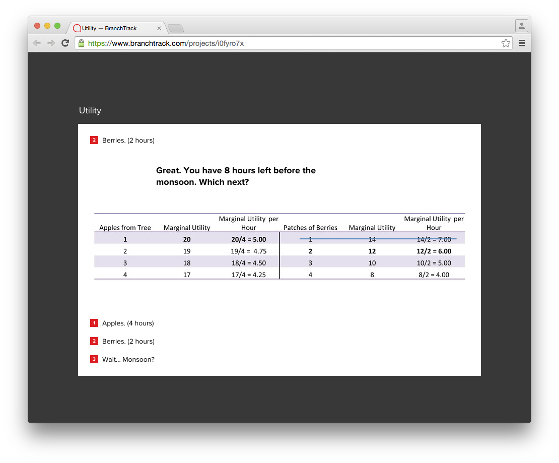
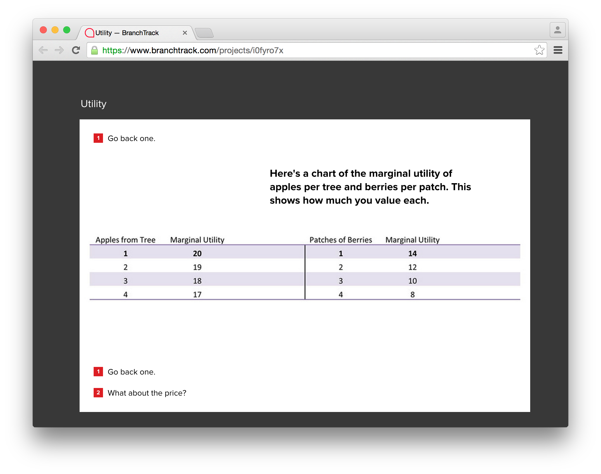
| Important visuals (like graphs and tables) are background images which are inaccessible to screen readers. These images also lack any text descriptions. |
|
Choices
| Issue
Recommendation
|
  | Issue
Recommendation
|
| Issue:
Recommendation:
|
Interface Vocabulary
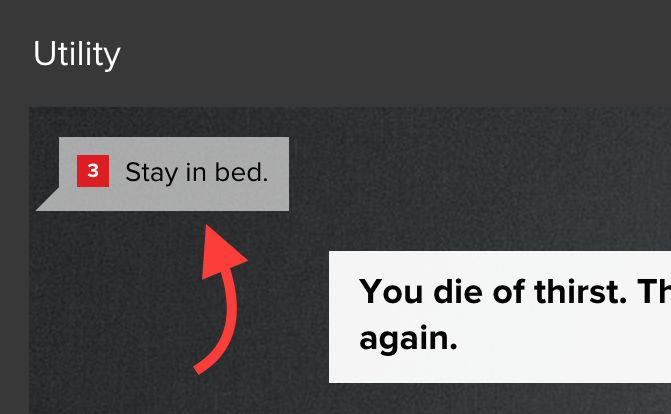
While the overall tone of the simulation is humorous, there are instances where the vocabulary used may be at odds with the state of the player. This creates a disconnect between the player and the game - especially for users who may be having a hard time understanding the concepts.
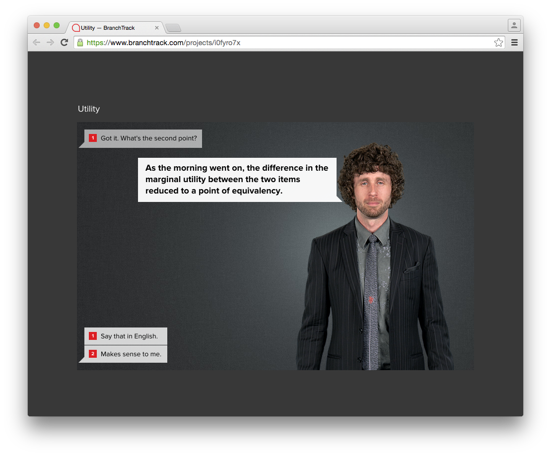
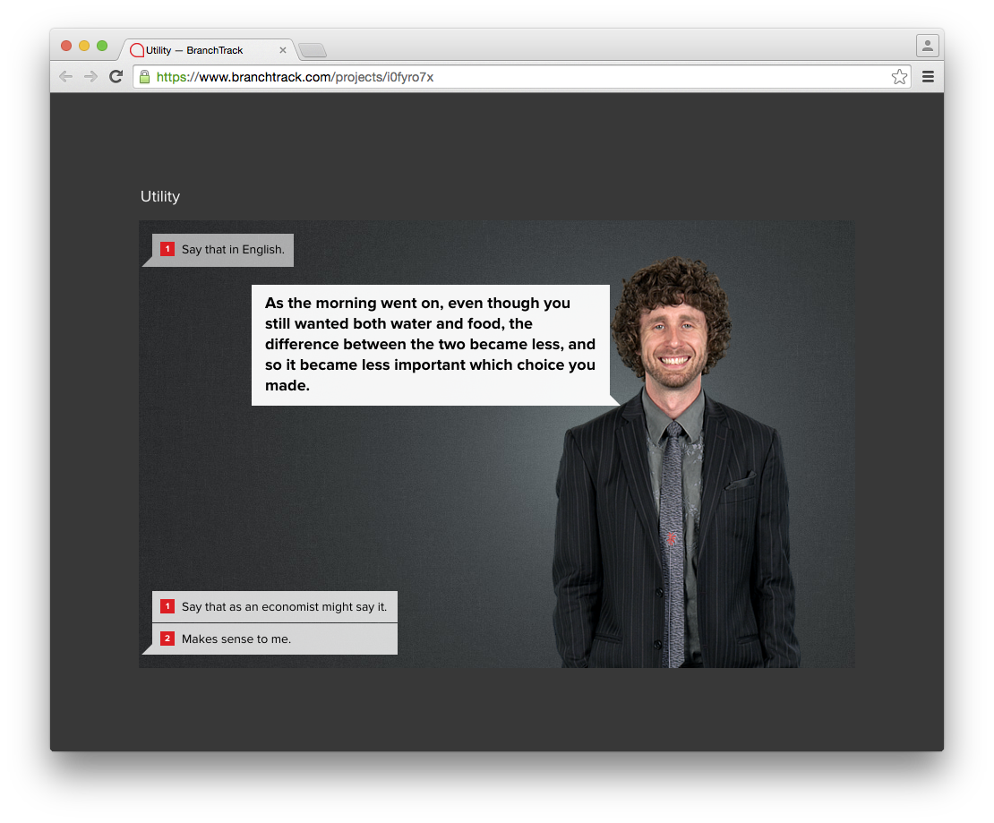
For example, a number of times the interface only gives the player the option to advance by selecting "Got it", "I agree" etc. when in fact the player may not "get it" or even understand enough to "agree".
In these cases it may be more appropriate to assume a more accommodating tone.
| Current Phrase | Example Revision |
|---|---|
| Got it. | Okay. Let's continue. |
| Say it in English. | Can you say that more simply? |
| Say that as an economist might say it. | How would you say that in more technical terms? |
| Go back one. | Go back to previous screen. |
| The "utility" - the value - of water... | The "utility" (value) of water ... |
| Hold on there, cowboy What do you mean... | Hold on there. What do you mean ... |
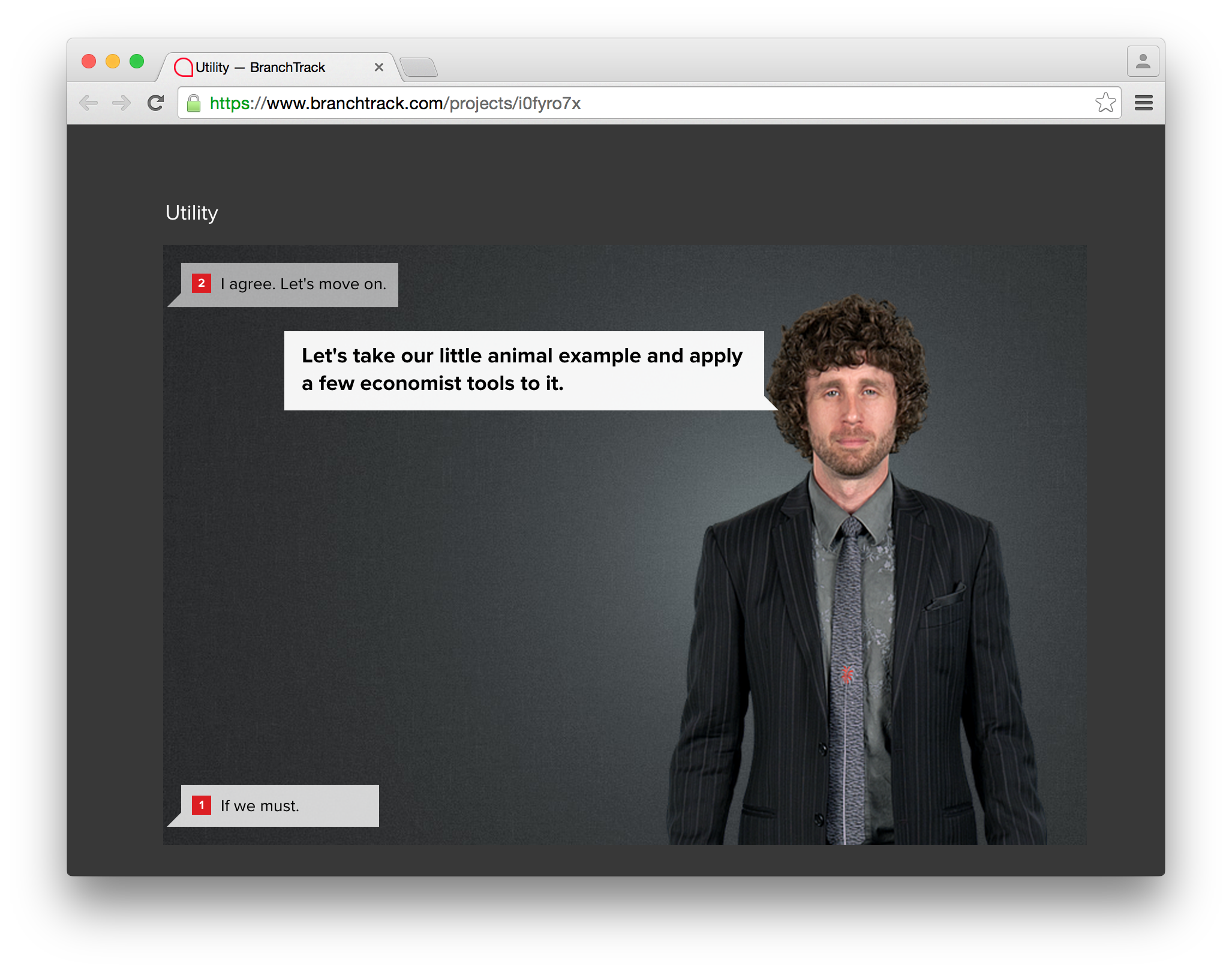
| I agree. Let's move on. | Okay. Let's move on. |
| If we must. | Okay, if we must. |
| I'm getting bored. What else? | That's a pretty graph. What's next? |
| Makes sense. | Alright, what's next? |
| Grumble. This is why people don't like Econ classes. | Grumble. This is why people don't take Economics classes. |
| Apples. (4 hours) | Apples. (Takes 4 hours) |
Grammatical Errors
For screen readers, punctuation helps control flow of speech and there are a few cases of missing punctuation.
Examples:
| Phrase | Error |
|---|---|
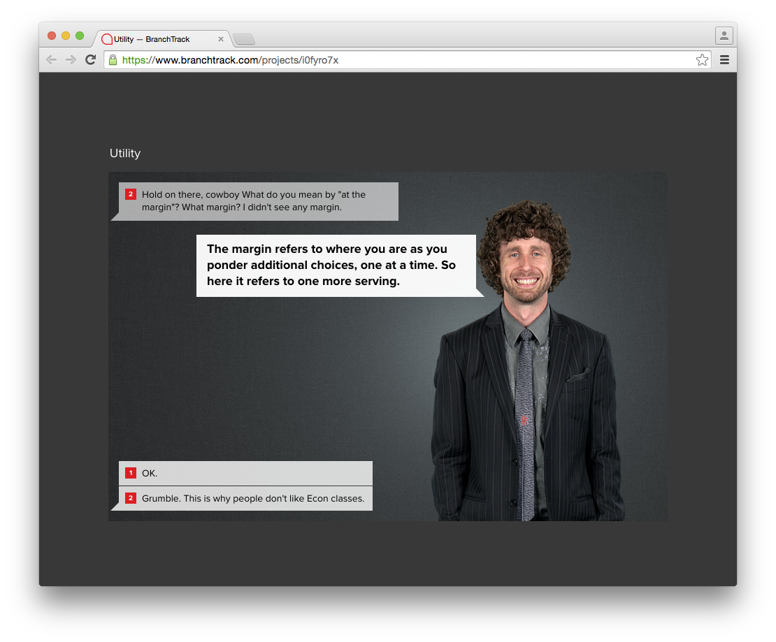
| Hold on there, cowboy What do you mean by "at the margin"? | Missing period |
| The "utility' -the value - of water ... | Mis-matched quote. Use either a single quote, or double quote. |
| Economists don't like terms like "very thirsty" or "not very hungry." | Period should be placed after last quote. |
Keyboard Navigation and Mouse Interaction
 |
|
Nodes and Progress
 | Issue
Recommendation:
|
 |
|
Cognitive Load
There’s no indicator of how many steps are left or how far they have come.
it is helpful for users to gauge their progress and orient themselves in the simulation.
At various points of the simulation, the user is sometimes required to mentally recall the choices they made in the past in order to understand the content that is in front of them. This creates a cognitive burden for users.
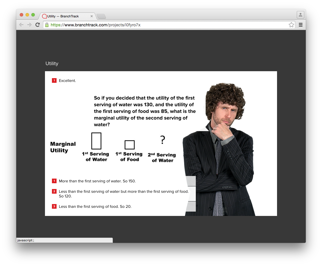
Example: When giving the number value of utility for the 2nd drink of water, player needs to be able to recall the scenario to provide an appropriate answer.
- In general, simplifying and reducing cognitive load is desirable.
- Resource: Designing interfaces to meet the needs of users with cognitive disabilities
Content Accessibility / Screen Readers
 |
|
Image showing Apple VoiceOver screen reader navigating to elements which are visually hidden, but accessible to screen readers. | Issue:
|
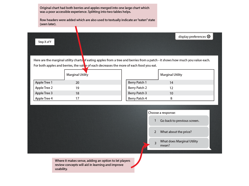
Choices Section
Choices should be grouped within a <section> element and have an <h1> to label it:
 <section>
	<h1>Choose a response:</h1>
	<ol>
		<li><a href=...>Go back one.</a><li>
		<li><a href=...>What about price?</a><li>
	</ol>
</section>
Punctuation
Some missing punctuation.
Example: At the end of the animal gathering scenario, it says: “Hold on there, cowboy What do you mean by "at the margin"? What margin? I didn't see any margin.” Missing a period.
Colours and Contrast
Also see: Inclusivity and Accessibility of Interactive Web Games and Simulations#VisualPerception
White on Red used in choices is not WCAG AAA compliant. Check colours using the Color Contrast Analyser (http://www.paciellogroup.com/resources/contrastanalyser/)
Charts
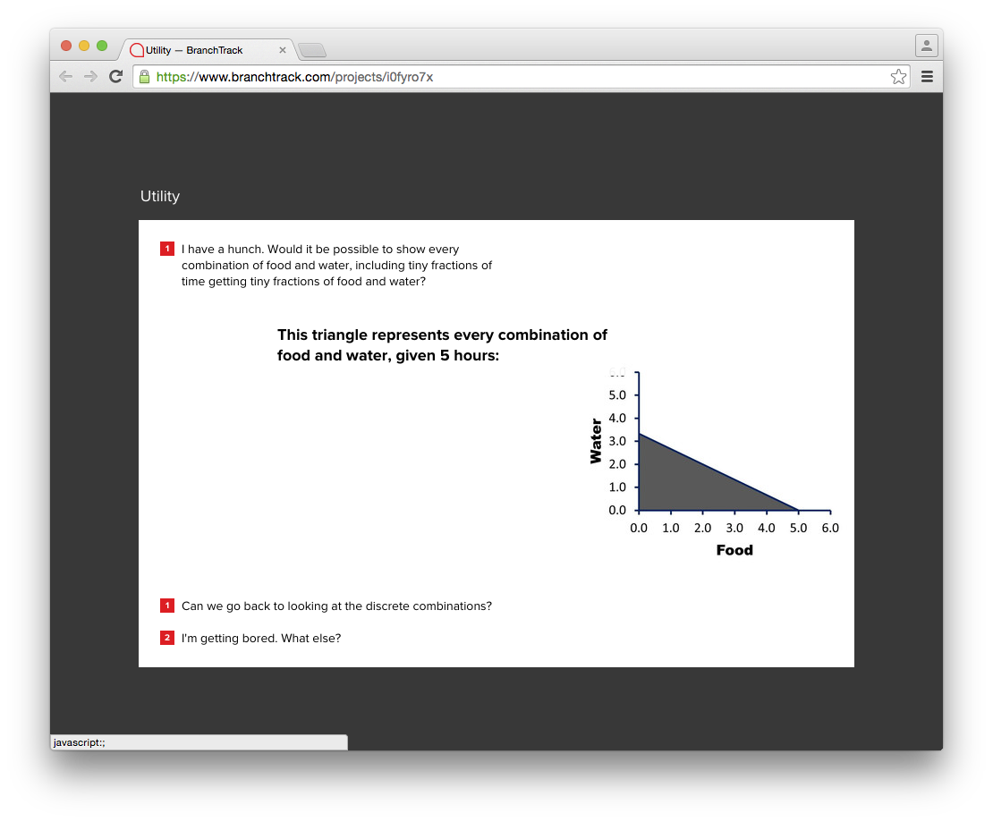
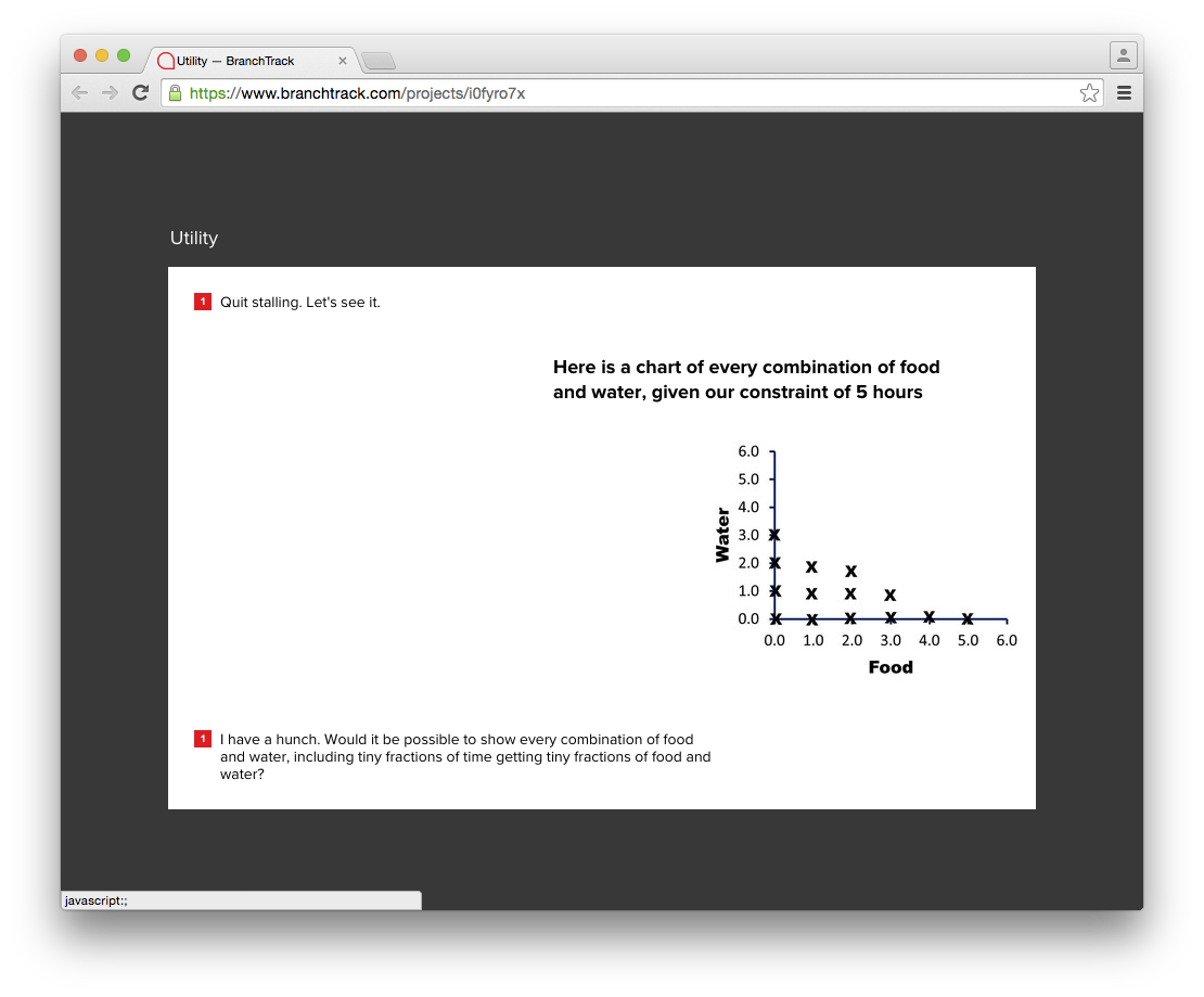
| Water vs. Food line Chart
Recommendation:
| ||||||
|
Marginal Utility Chart showing apples and berries:
Recommendation:
Excerpt page from the Design Sketch showing accessibility changes. |
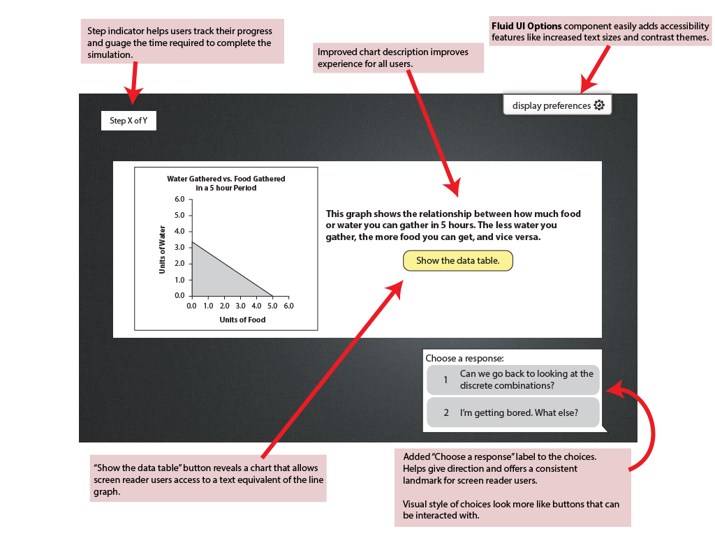
Data Table Hide Show Data Table Button
Approach: Following the <figure> structure documented at W3C, coupled with Aria and Javascript.
Before "Show Data Table" button press:
<figure role="group">
    <img
        src="chart.png"
        alt="Bar chart showing monthly and total visitors for the first quarter 2014 for sites 1 to 3">
    <figcaption>
		<p class="button">
			<button id="button1" class="buttonControl" aria-controls="t1"><span>Show</span>Show Data Table</button>
		</p>
    </figcaption>
</figure>

After "Show Data Table" button press:
<figure role="group">
    <img
        src="chart.png"
        alt="Bar chart showing monthly and total visitors for the first quarter 2014 for sites 1 to 3">
    <figcaption>
		<table>
			<caption>Possible combinations of water and food gathered in a 5 hour period.</caption>
			<tr>
				...
			</tr>
		</table>
		<p class="button">
			<button id="button1" class="buttonControl" aria-controls="t1"><span>Show</span>Hide Data Table</button>
		</p>
    </figcaption>
</figure>
Math
Some nodes have some basic math notation. Ensure that screen reader has the expected behaviour.
Design Sketch with Accessibility and Inclusivity Changes
The following is a design sketch showing some possible improvements that improve accessibility, inclusiveness, and usability. The sketch incorporates some of the suggested improvements documented above.