Sketch: Integrating workshop feedback into designs
Visual sketches in (pdf):
As is, these images do not necessarily communicate clarity, but are rather artifacts that Dana and I used in a recent design conversation. They are labeled starting with the number '2' to match the numbering on the bottom of the pdf image.
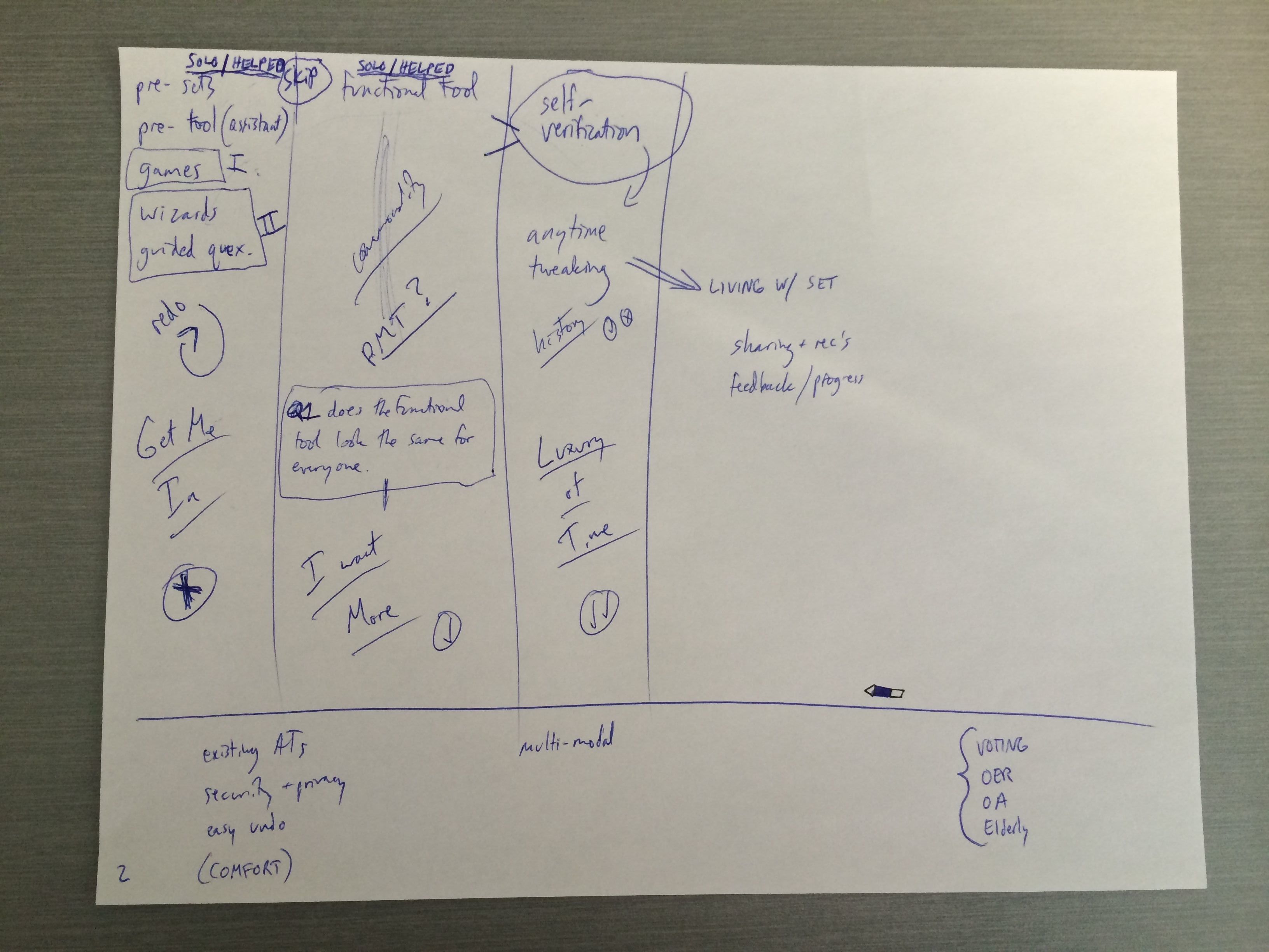
Image 2:
In three columns I tried to capture the points of engagement with different tools (or different layers in one tool).
Column1: Initial/Primary Engagement
Solo or with helper
Tools may include:
- Pre-sets
- Pre-tool (assistant)
- Games (1)
- Wizards (2)
- Guided questions (2) what are the numbers?
- Redo (to check)
Just Get Me In
-some users could stop at this step and might not re-engage the tool
Column2: Secondary Engagement
Solo or with helper
- functional tool
- this is where the commonalities will be
- this might resemble some of the functionality of the PMT
- Q1: does the functional tool look the same for everyone?
I Want More
The user has come to this “tool” to dive in deeper…
Column3: (Not sure how this differs from 2, except for the self-verification part, which could happen in 1 or 2, I think)
- self-verification
- anytime tweaking
- could be a history or something similar with a √ or X next to changes
Luxury of Time
These “activities” are the sorts of things users will do if they have time and motivation.
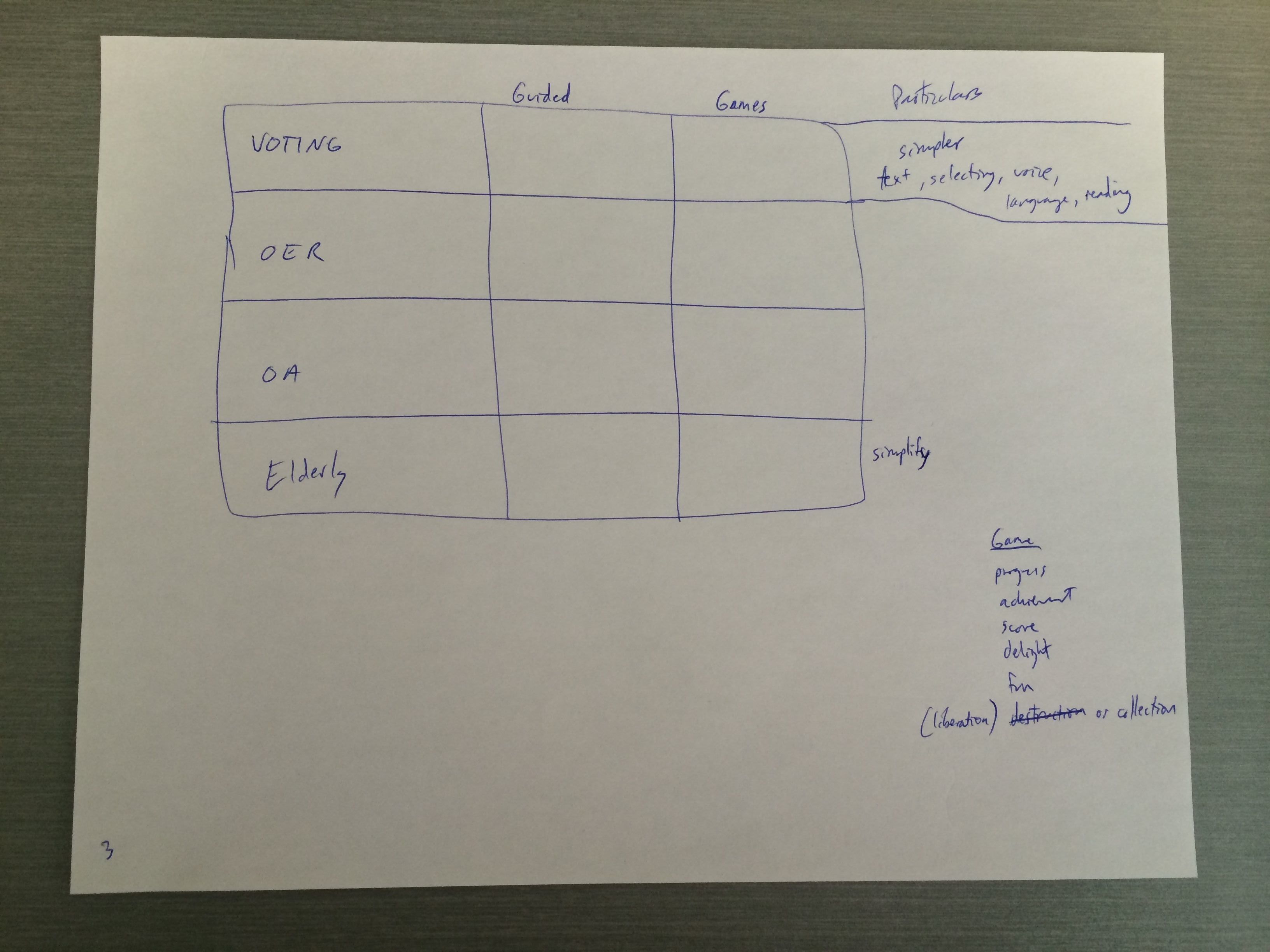
Image 3:
This image is a chart with 3 columns and 4 rows.
The rows are the 4 topic areas (voting, OER, OA, Elderly)
The columns are ‘Guided’ and ‘Games’
Here we were discussing what it might mean to create interfaces for each of the 4 areas that include interactions along the spectrum of guided “wizards” and games.
We listed some of the features a game might have:
- progress
- achievement
- score
- delight
- fun
- liberation or collection of things
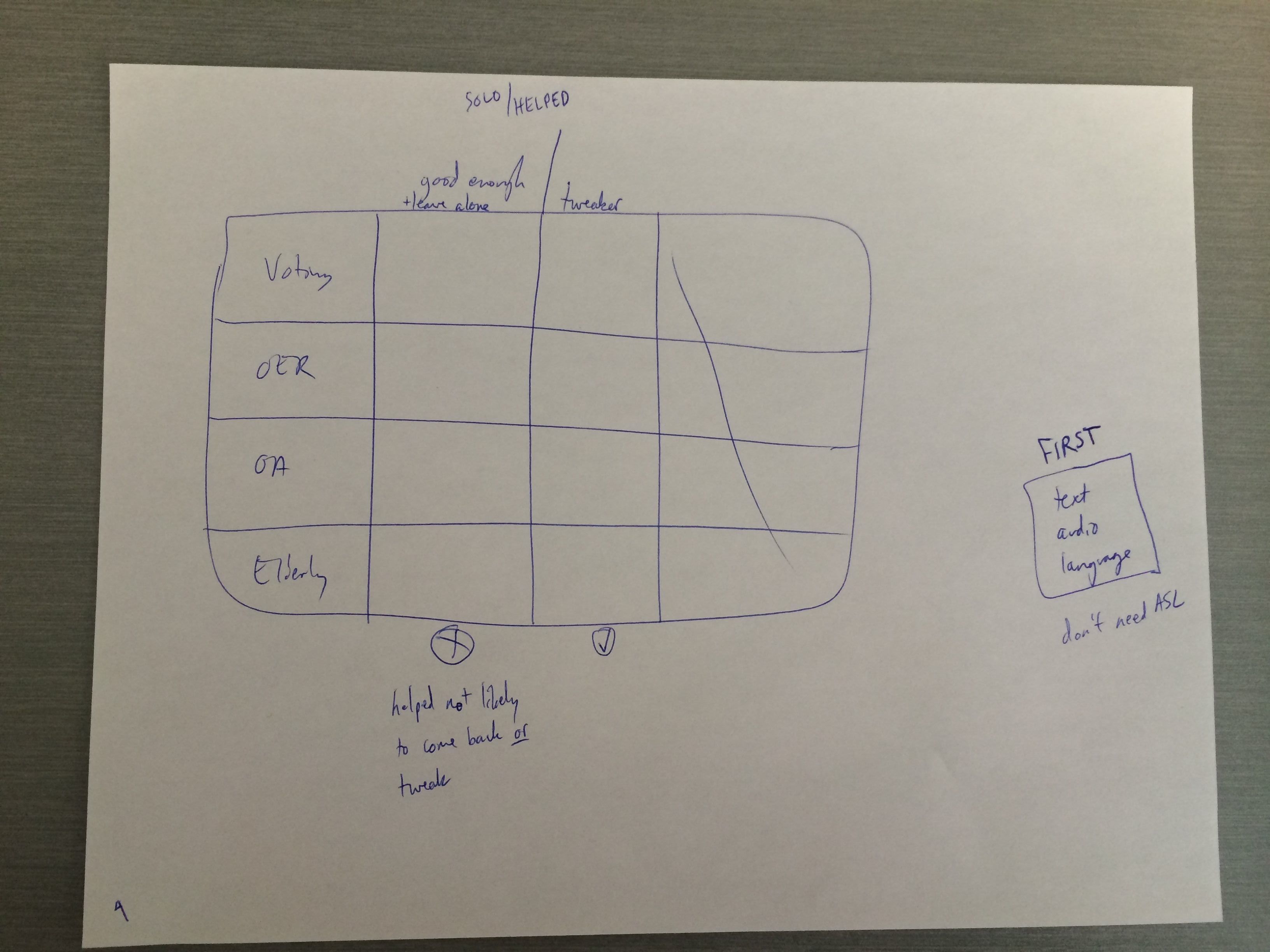
Image 4:
This image is a chart with 3 columns and 4 rows.
The rows are the 4 topic areas (voting, OER, OA, Elderly)
The columns are ‘good enough + leave alone’ and ‘tweaker’
The point here is that the user who just wants to achieve ‘good enough’ is unlikely to come back and tweak – or is able to move forward with the good enough and there is no requirement for them to come back.
First needs:
Text
Audio
Language
(don’t seem to need ASL at first)