| Span |
|---|
| | Production Status: PREVIEW |
| Div |
|---|
| 
|
| Include Page |
|---|
| _UIO overview |
|---|
| _UIO overview |
|---|
|
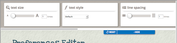
The User Interface Options component (UI Options) is a convenient way to add a simple separated-panel preferences editor to any page. The interface will automatically support the set of "starter" preferences provided by the Preferences Framework, in their default configuration. If you require any customization of the preferences editor, you should use the Builder tool of the Preferences Framework directly. See Also
Tutorial - User Interface Options
Builder
Preferences Framework
| Div |
|---|
| Creator | fluid.uiOptions.prefsEditor(container, options)
|
|---|
Supported Events | onReady
Fires after the interface has been rendered into the iframe and the UI Options component is fully instantiated.
onPrefsEditorReady
Fires after the interface has been rendered into the iframe.
|
|---|
Methods | none |
|---|
| Options | listeners
See Supported Events for information
tocTemplate
A relative path to the template that table of contents is based on templatePrefix
A relative path to the framework-provided templates
messagePrefix
A relative path to the message files
prefsEditor
The data structure that configs the internal prefsEditor component prefsEditorType
The name of a grade component of the internal prefsEditorLoader enhancerType
The name of a grade component of the internal uiEnhancer storeType
The name of a grade component of the internal store |
|---|
| Modifiable Preference Defaults | UI Options comes with 7 preference out-of-box. The default information of these preferences, such as its default value, the limits of its range, can be modified by redefining corresponding starter primary schema components before instantiating the creator function fluid.uiOptions.prefsEditor. Text Size The starter component: fluid.prefs.schemas.textSize
Line Space The starter component: fluid.prefs.schemas.lineSpace
Text Font The starter component: fluid.prefs.schemas.textFontContrast The starter component: fluid.prefs.schemas.contrastTable of Contents The starter component: fluid.prefs.schemas.tableOfContentsEmphasize Links The starter component: fluid.prefs.schemas.emphasizeLinksInputs Larger The starter component: fluid.prefs.schemas.inputsLarger |
|---|
|
CreatorUse the following function to create a UI Options component:| Div |
|---|
| Method | fluid.uiOptions.prefsEditor(container, options);
|
|---|
Description | Instantiate a separated panel version of the UI Options component, which displays the controls in a sliding panel at the top of the page. |
|---|
Parameters | container
A CSS-based selectors, single-element jQuery object, or DOM element that identifies the root DOM node where the UI Options interface should be placed.
options
An optional data structure that configures the UI Options component, as described below.
|
|---|
Returns | The UI Options component |
|---|
Examples | | Code Block |
|---|
| var myUIO = fluid.uiOptions.prefsEditor("#myContainer", {
tocTemplate: "../../components/tableOfContents/html/TableOfContents.html"
}); |
|
|---|
Notes | The UI Options uses the page itself as a live "preview:" As users adjust controls, the page is modified accordingly. |
|---|
|
Supported Events| Include Page |
|---|
| _supported events intro |
|---|
| _supported events intro |
|---|
|
onReady
| Div |
|---|
| Description | This event fires when the UI Options component has been rendered and is ready for use. onReady event ensures the UI Options component is fully instantiated and ready to use. |
|---|
Type | default |
|---|
Parameters | uio The instantiated UI Options component. |
|---|
Availability | Infusion 1.4 and later (note that the component signature changed in 1.5) |
|---|
|
onPrefsEditorReady
| Div |
|---|
| Description | This event fires when the UI Options interface has been rendered into the iframe. Note: In the case that your listener needs to ensure UI Options component is not only rendered but also ready to use, use onReady event. |
|---|
Type | default |
|---|
Parameters | prefsEditorLoader
The instantiated preference editor loader component. |
|---|
Availability | Infusion 1.5 and later |
|---|
|
Options| Include Page |
|---|
| _options intro |
|---|
| _options intro |
|---|
|
| Code Block |
|---|
| var uio = fluid.uiOptions.prefsEditor(".myContainer", {
<option1Name>: <option1value>,
<option2Name>: <option2value>
...
}
}); |
The options supported by UI Options are described below. tocTemplate
| Div |
|---|
| Description | The tocTemplate option allows you to specify a custom relative path to the templates used by generating table of contents. This template can be found in the source tree of the Infusion distribution. |
|---|
Default | "../../components/tableOfContents/html/TableOfContents.html" |
|---|
Example | | Code Block |
|---|
| fluid.uiOptions.prefsEditor("#myContainer", {
tocTemplate: "html/myTocTemplate.html"
}); |
|
|---|
See also | Table of Contents API
|
|---|
|
templatePrefix
| Div |
|---|
| Description | The templatePrefix option allows you to specify a custom relative path to the templates used by the UI Options interface. These templates can be found in the source tree of the Infusion distribution. |
|---|
Default | "../../framework/preferences/html/" |
|---|
Example | | Code Block |
|---|
| fluid.uiOptions.prefsEditor("#myContainer", {
templatePrefix: "../infusion/framework/preferences/html/"
}); |
|
|---|
See also | messagePrefix
|
|---|
|
messagePrefix
| Div |
|---|
| Description | The messagePrefix option allows you to specify a custom relative path to the templates used by the UI Options interface. These message files can be found in the source tree of the Infusion distribution. |
|---|
Default | "../../framework/preferences/messages/" |
|---|
Example | | Code Block |
|---|
| fluid.uiOptions.prefsEditor("#myContainer", {
messagePrefix: "../infusion/framework/preferences/messages/"
}); |
|
|---|
See also | templatePrefix
|
|---|
|
prefsEditor
| Div |
|---|
| Description | The prefsEditor option allows you to specify a data structure to config the prefsEditor component. |
|---|
Default | null |
|---|
Example | | Code Block |
|---|
| fluid.uiOptions.prefsEditor("#myContainer", {
prefsEditor: {
listeners: {
onReady: function (internalEditor) {...}
onReset: function (internalEditor) {...}
}
}
}); |
|
|---|
|
prefsEditorType
| Div |
|---|
| Description | The prefsEditorType option allows you to specify a custom prefsEditorLoader grade component. |
|---|
Default | "fluid.prefs.separatedPanel" |
|---|
Example | | Code Block |
|---|
| fluid.uiOptions.prefsEditor("#myContainer", {
prefsEditorType: "myNamespace.myPrefsEditor"
}); |
|
|---|
See also | Internal Prefs Editor
|
|---|
|
enhancerType
| Div |
|---|
| Description | The enhancerType option allows you to specify a custom enhancer grade component. |
|---|
Default | "fluid.pageEnhancer" |
|---|
Example | | Code Block |
|---|
| fluid.uiOptions.prefsEditor("#myContainer", {
enhancerType: "myNamespace.myUIEnhancer"
}); |
|
|---|
|
storeType
| Div |
|---|
| Description | The storeType option allows you to specify a custom store grade component. |
|---|
Default | "fluid.globalSettingsStore" |
|---|
Example | | Code Block |
|---|
| fluid.uiOptions.fullNoPreview("#myContainer", {
storeType: "myNamespace.mySettingsStore"
}); |
|
|---|
See also | Cookie Settings Store
|
|---|
|
Modifiable Preference DefaultsText Size
| Div |
|---|
| Description | To change the text size of the page by a multiplier factor. The corresponding starter primary schema component for "Text Size" preference is fluid.prefs.schemas.textSize. To modify its default information, you can redefine this component before calling the Creator fluid.uiOptions.prefsEditor. |
|---|
Default | | Code Block |
|---|
| fluid.defaults("fluid.prefs.schemas.textSize", {
gradeNames: ["autoInit", "fluid.prefs.schemas"],
schema: {
"fluid.prefs.textSize": {
"type": "number",
"default": 1, // The default is the original text size
"minimum": 1, // The minimum value allowed
"maximum": 2, // The maximum value allowed
"divisibleBy": 0.1 // The stepper value for the slider
}
}
}); |
|
|---|
| Example | | Code Block |
|---|
| fluid.defaults("fluid.prefs.schemas.textSize", {
gradeNames: ["autoInit", "fluid.prefs.schemas"],
schema: {
"fluid.prefs.textSize": {
"type": "number",
"default": 5,
"minimum": 1,
"maximum": 10,
"divisibleBy": 1
}
}
});
fluid.uiOptions.prefsEditor("#myContainer", {
    tocTemplate: "html/myTocTemplate.html"
}); |
|
|---|
|
Line Space
| Div |
|---|
| Description | To change the line space of the page by a multiplier factor. The corresponding starter primary schema component for "Line Space" preference is fluid.prefs.schemas.lineSpace. To modify its default information, you can redefine this component before calling the Creator fluid.uiOptions.prefsEditor. |
|---|
Default | | Code Block |
|---|
| fluid.defaults("fluid.prefs.schemas.lineSpace", {
gradeNames: ["autoInit", "fluid.prefs.schemas"],
schema: {
"fluid.prefs.lineSpace": {
"type": "number",
"default": 1, // The default text size is 1, the original line space
"minimum": 1, // The minimum value allowed
"maximum": 2, // The maximum value allowed
"divisibleBy": 0.1 // The stepper value for the slider
}
}
}); |
|
|---|
| Example | | Code Block |
|---|
| fluid.defaults("fluid.prefs.schemas.lineSpace", {
gradeNames: ["autoInit", "fluid.prefs.schemas"],
schema: {
"fluid.prefs.lineSpace": {
"type": "number",
"default": 1,
"minimum": 0.5,
"maximum": 2.5,
"divisibleBy": 0.1
}
}
});
fluid.uiOptions.prefsEditor("#myContainer", {
tocTemplate: "html/myTocTemplate.html"
}); |
|
|---|
|
Text Font
| Div |
|---|
| Description | To change the text font of the page. The corresponding starter primary schema component for "Text Font" preference is fluid.prefs.schemas.textFont. To modify its default information, you can redefine this component before calling the Creator fluid.uiOptions.prefsEditor. |
|---|
Default | | Code Block |
|---|
| fluid.defaults("fluid.prefs.schemas.textFont", {
gradeNames: ["autoInit", "fluid.prefs.schemas"],
schema: {
"fluid.prefs.textFont": {
"type": "string", // The data type
"default": "default", // The default is the original font
"enum": ["default", "times", "comic", "arial", "verdana"] // The enumeration of possible values
}
}
}); |
|
|---|
| Example | | Code Block |
|---|
| fluid.defaults("fluid.prefs.schemas.textFont", {
gradeNames: ["autoInit", "fluid.prefs.schemas"],
schema: {
"fluid.prefs.textFont": {
"type": "string",
"default": "arial",
"enum": ["default","comic", "arial"]
}
}
});
fluid.uiOptions.prefsEditor("#myContainer", {
tocTemplate: "html/myTocTemplate.html"
}); |
|
|---|
|
Contrast
| Div |
|---|
| Description | To change the foreground and background contrast of the page. The corresponding starter primary schema component for "Contrast" preference is fluid.prefs.schemas.contrast. To modify its default information, you can redefine this component before calling the Creator fluid.uiOptions.prefsEditor. |
|---|
Default | | Code Block |
|---|
| fluid.defaults("fluid.prefs.schemas.contrast", {
gradeNames: ["autoInit", "fluid.prefs.schemas"],
schema: {
"fluid.prefs.contrast": {
"type": "string", // The data type
"default": "default", // The default is the original contrast settings
"enum": ["default", "bw", "wb", "by", "yb", "lgdg"] // The enumeration of possible values
}
}
}); |
|
|---|
| Example | | Code Block |
|---|
| fluid.defaults("fluid.prefs.schemas.contrast", {
gradeNames: ["autoInit", "fluid.prefs.schemas"],
schema: {
"fluid.prefs.contrast": {
"type": "string",
"default": "bw",
"enum": ["default", "bw", "wb"]
}
}
});
fluid.uiOptions.prefsEditor("#myContainer", {
tocTemplate: "html/myTocTemplate.html"
}); |
|
|---|
|
Table of Contents
| Div |
|---|
| Description | To create and render a section of "Table of Contents" at the top of the page. The corresponding starter primary schema component for "Table of Contents" preference is fluid.prefs.schemas.tableOfContents. To modify its default information, you can redefine this component before calling the Creator fluid.uiOptions.prefsEditor. |
|---|
Default | | Code Block |
|---|
| fluid.defaults("fluid.prefs.schemas.tableOfContents", {
gradeNames: ["autoInit", "fluid.prefs.schemas"],
schema: {
"fluid.prefs.tableOfContents": {
"type": "boolean", // The data type
"default": false // Not to show table of contents by default
}
}
}); |
|
|---|
| Example | | Code Block |
|---|
| fluid.defaults("fluid.prefs.schemas.tableOfContents", {
gradeNames: ["autoInit", "fluid.prefs.schemas"],
schema: {
"fluid.prefs.tableOfContents": {
"type": "boolean",
"default": true
}
}
});
fluid.uiOptions.prefsEditor("#myContainer", {
tocTemplate: "html/myTocTemplate.html"
}); |
|
|---|
|
Emphasize Links
| Div |
|---|
| Description | To underline and bold links on the page. The corresponding starter primary schema component for "Emphasize Links" preference is fluid.prefs.schemas.emphasizeLinks. To modify its default information, you can redefine this component before calling the Creator fluid.uiOptions.prefsEditor. |
|---|
Default | | Code Block |
|---|
| fluid.defaults("fluid.prefs.schemas.emphasizeLinks", {
gradeNames: ["autoInit", "fluid.prefs.schemas"],
schema: {
"fluid.prefs.emphasizeLinks": {
"type": "boolean", // The data type
"default": false // Not to emphasize links by default
}
}
}); |
|
|---|
| Example | | Code Block |
|---|
| fluid.defaults("fluid.prefs.schemas.emphasizeLinks", {
gradeNames: ["autoInit", "fluid.prefs.schemas"],
schema: {
"fluid.prefs.emphasizeLinks": {
"type": "boolean",
"default": true
}
}
});
fluid.uiOptions.prefsEditor("#myContainer", {
tocTemplate: "html/myTocTemplate.html"
}); |
|
|---|
|
| Div |
|---|
| Description | To enlarge input fields on the page. The corresponding starter primary schema component for "Inputs Larger" preference is fluid.prefs.schemas.inputsLarger. To modify its default information, you can redefine this component before calling the Creator fluid.uiOptions.prefsEditor. |
|---|
Default | | Code Block |
|---|
| fluid.defaults("fluid.prefs.schemas.inputsLarger", {
gradeNames: ["autoInit", "fluid.prefs.schemas"],
schema: {
"fluid.prefs.inputsLarger": {
"type": "boolean", // The data type
"default": false // Not to enlarge input fields by default
}
}
}); |
|
|---|
| Example | | Code Block |
|---|
| fluid.defaults("fluid.prefs.schemas.inputsLarger", {
gradeNames: ["autoInit", "fluid.prefs.schemas"],
schema: {
"fluid.prefs.inputsLarger": {
"type": "boolean",
"default": true
}
}
});
fluid.uiOptions.prefsEditor("#myContainer", {
tocTemplate: "html/myTocTemplate.html"
}); |
|
|---|
|
|